Choice Painting
|
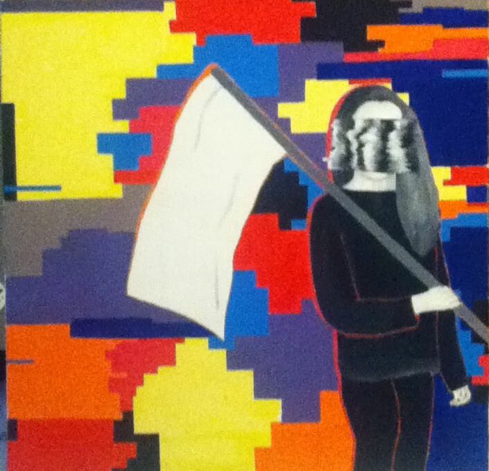
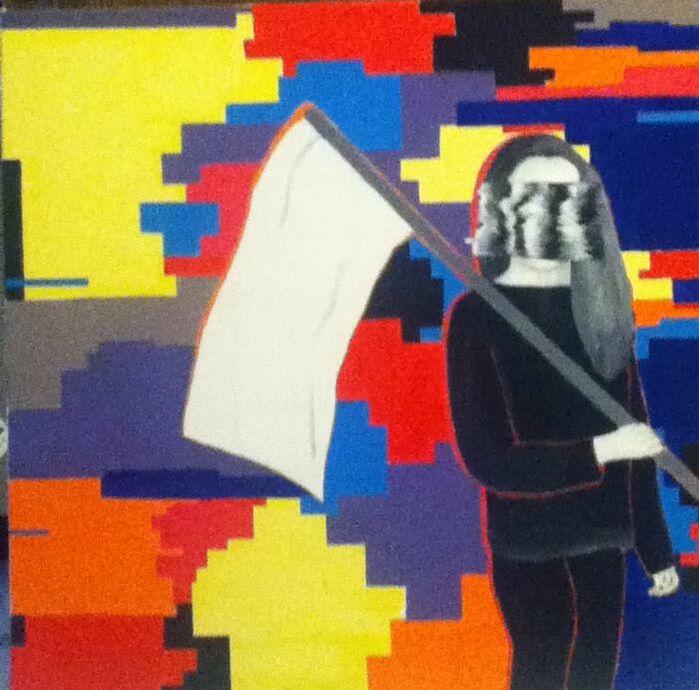
Title: "Brainwashed Into the Same System"
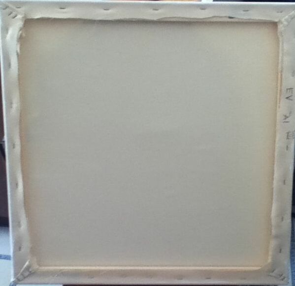
Size: 60.96 cm. x 60.96 cm. Medium: Acrylic on canvas Completion: April 2019 |
|
|
Title: "Brainwashed Into the Same System"
Size: 60.96 cm. x 60.96 cm. Medium: Acrylic on canvas Completion: April 2019 |

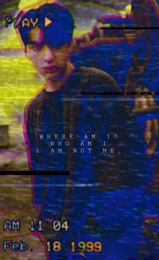
"Hyunjin Glitch Edit", 2018.

"A Sign, An Omen, A GLITCH", 2018.
|
Stray Kids is a K-pop boy band that debuted in 2017 and has currently released 3 albums and a pre-debut mixtape. Compared to other Korean groups, Stray Kids’s music is greatly inspired by their lives and experiences as budding teens, which allows them to connect with a wide fan base that standardly ranges from pre-teens to young adults. Many of their songs focus on issues experienced by teens - a recurring one being the pressure felt to know who you will grow up to become at a young age and the discomfort that comes with these pressures plus the overall “mold” pushed onto youth by society. In particular, the title track of their album “I Am Not”, which is an into to the album that is under 2 minutes long, is a wonderful summary of the confusion and almost anxiety that teens experience when trying to find out who they are when society is breathing down their neck. I have been a fan of the group for almost 2 years now, and as someone who is currently anxiety-ridden over everything from scholarships to being released into the real world in about a year, their music focusing on this struggle is something a greatly connect to. I hoped that, by using the lyrics from “I Am Not” as a starting point, I could brainstorm a piece that both connects to their music and displays my take on their lyrics/themes.
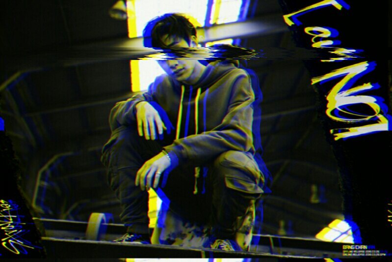
When beginning my research on the group, I already had prior knowledge on the group’s use of glitching and mirrors to give their themes further depth and symbolism. It was during this research that I stumbled upon the Amino app, which allows people with similar interests to join an “Amino” that correlates to said interest and connect with people in the same fandom. There just so happened to be a Stray Kids Amino, on which there were many amazing fan artworks and edits based off of Stray Kids’s “glitching” themes in their songs/videos. I was immediately drawn to two particular edits: “Hyunjin Glitch Edit” by the user StrayPieceOfTrash, and “A Sign, An Omen, A GLITCH” by the user ||S-H, Minjo♡ || #$Oftgang. Both are edits of individual members of the group, but each one puts their own creative spin on the idea of “glitching”. The member Hyunjin is edited to be incredibly colorful, with various neon sections both on and behind him, with the lyric “Where am I? Who am I? I am not me” from their song “Mirror”. Meanwhile, the leader of the group, Bangchan, was given a black-and-white filter with slight blurred effects in the background and a large black/white glitch covering his eyes. To me, both of these displayed determination in the face of suppression, and I hoped to pull major components from both pieces and use their lyrics as a guide to create a piece revolving around various teen identity issues. |
|
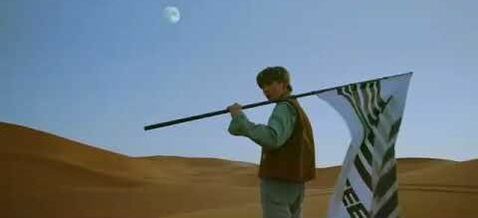
This first sketch of mine incorporated the idea of glitching into the background and the glitch-y smear over the eyes from both of my inspirations. To try and communicate the vulnerability and desperation that comes with the confusion of not knowing one's place in society, I depicted the figure in my sketch holding a large white flag of surrender. To draw said flag, I referenced another k-pop group that I listen to, ATEEZ, because many of their music videos display them holding a large flag with their logo on it. The video that I remembered the flag being in the most was "Treasure", which I referenced for the flag and linked on the right. To add contrast to the piece, I decided to color myself in shades of gray like my "GLITCH" inspiration, then make the glitching background as colorful as it is in "Hyunjin".
|
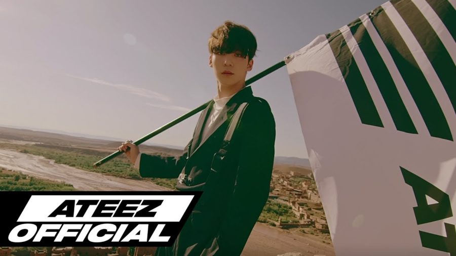
Shots from the "Treasure" music video which I referenced (top and bottom)
|
|
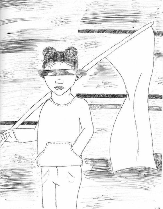
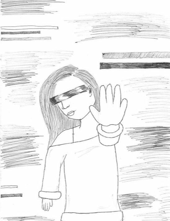
After completing my first sketch, I really liked the idea of taking the 2 most notable components of my inspirations (colors of "Hyunjin", black and white smear of "A Sign") and mainly experimented with different poses while keeping those 2 components constant. In my second sketch, the figure is depicted with their hand outstretched towards the viewer. I tried to make the message behind this sketch more open than the specificity of the first sketch's white flag - the outward hand could be interpreted as either being held up in a "stop" symbol, directed towards society, or it could be reaching out for help to display a vulnerable side. Seeing this combination, though, didn't really interest me and appeared static (pun intended) and emotionless, for almost no apparent reason. My first sketch's position is emotionless as well, to me, but at least the presence of the flag gives a bit more meaning to it and may allow the viewer to think deeper about the message behind it. |
|
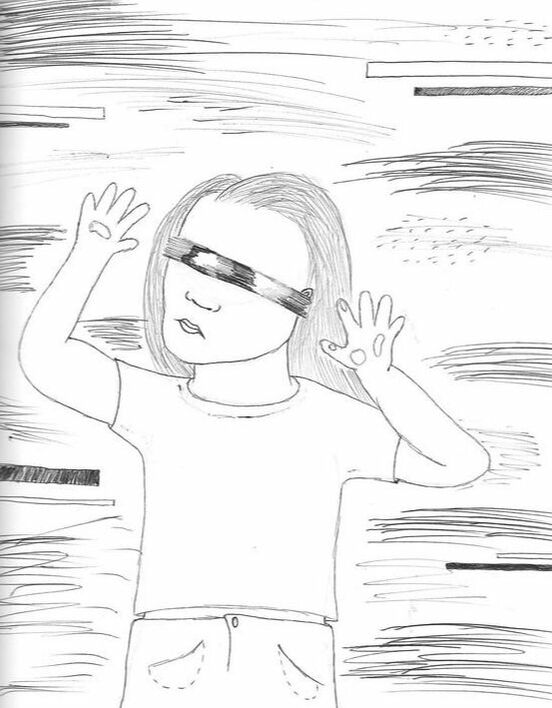
My final sketch conveys the hopelessness some teens may feel when figuring out their place in society and the adult world - literally portraying the figure trapped in the image, hands pressed against the "surface" of the piece. I thought that this was a pretty good emotional representation of the issue I was trying to explore, but there were small things about this idea that didn't seem accurate in portraying the same idea in my artistic and musical inspirations. In all three, there seems to be a sort of determination, whether it be in the stance or the lyrics - to try and add determination to such a vulnerable and fearful stance seemed like something that would be emotionally confusing.
|
|
|
|
|
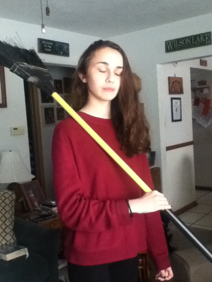
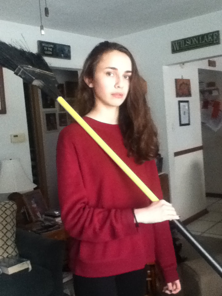
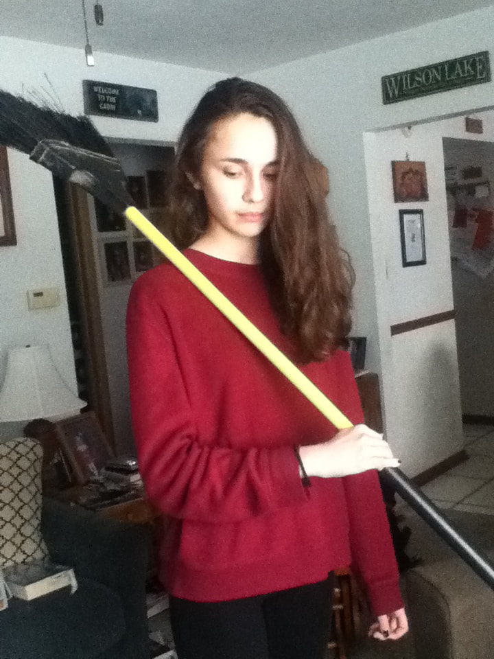
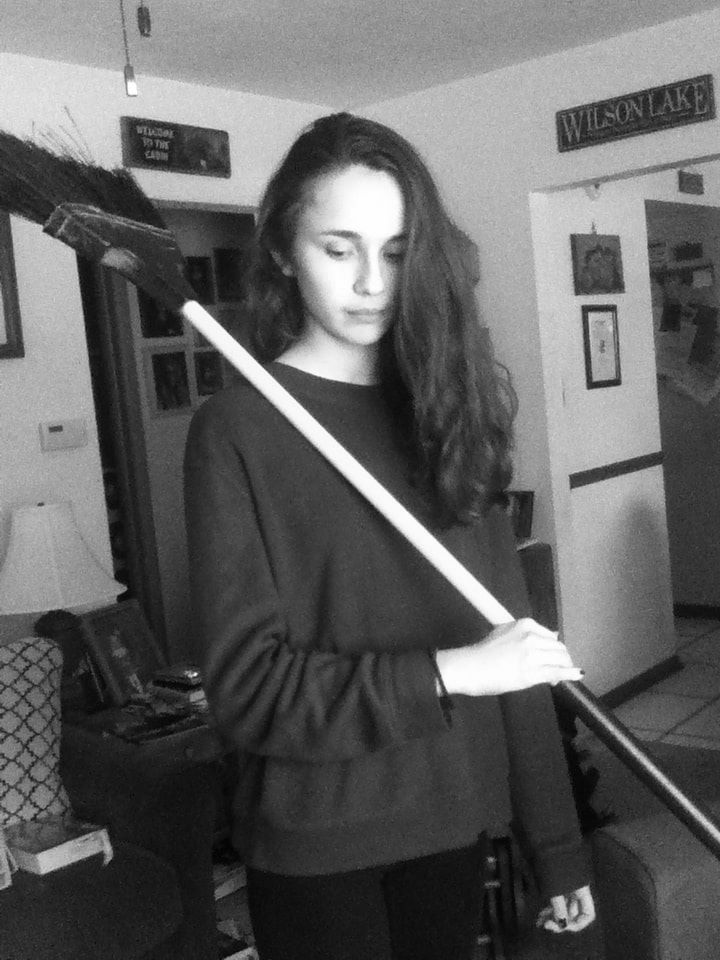
In order to recreate the pose from my first sketch, I needed a reference picture of me holding a large flag on a pole...only, I don't have one of those, and didn't want to buy one just for the sake of a few photos. Instead, I held a broom because the handle seemed to be about the right thickness for a portable flag pole; once I sketched it onto my canvas, I planned to get rid of the broom's end and extend the pole before freehanding a flag attached to it. Because I also planned on painting myself in a black-and-white color scheme, I had my sister photograph me in front of a large window so that my face would be illuminated with natural lighting (when I printed my reference in black and white, this allowed my skin to contrast with the darker shades that made up my hair and outfit). Of the three quick pictures we took, I decided to choose the third one as my reference. With the head tilted slightly down, I felt it appeared mildly subjugated and sad, which went with the whole idea of teens not knowing their place in society and in the transition phase between adolescence and adulthood. The body language was especially important to me when choosing a reference because, typically, emotion is mostly viewed in the eyes' expression, but for this piece I would be covering them. |
|
|
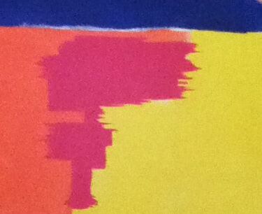
I had applied my colored sections in geometric patterns, but to try and replicate the visual effect of glitches, I took a Flat 4 paintbrush and, with pure color on the edge, made uneven horizontal strokes around the border of the section. While it sort of looked glitchy, "sort of" wasn't good enough - plus, keeping the sections more rectangular still achieved a computer look, just more pixelated that glitch. Yes, this strayed from my "Hyunjin" inspiration, but I think that the glitch effect is still present and looks more clean and unified than randomly putting lines all over the piece. |
|
Before
|
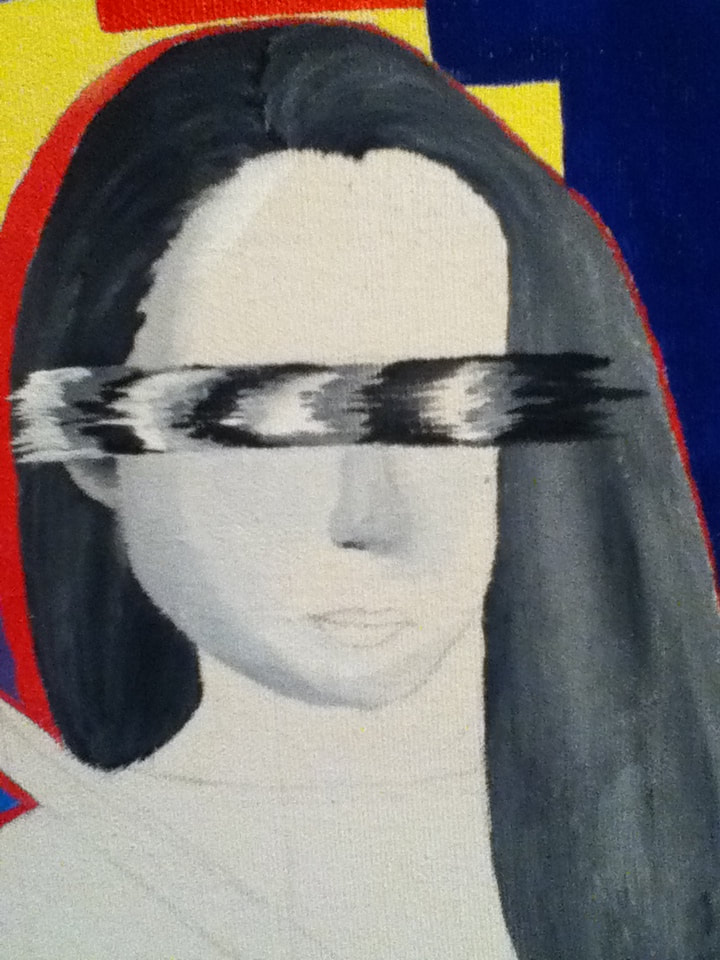
In my first practice sketch and based on my "A Sign" inspiration, I had planned on glitching out my eyes with a white/grey/black smear. However, when painting the face, I was really struggling with how to blend the nose and ended up creating a smear that just got larger and larger. To hide my mistake, I decided to extend the smear so that instead of covering just the eyes, it would cover the entire face. While this strays from my original intentions, I think that the idea of anonymity is intensified by doing this, which strengthens the idea that any teen could be going through this.
|

After
|
Back of the canvas
|
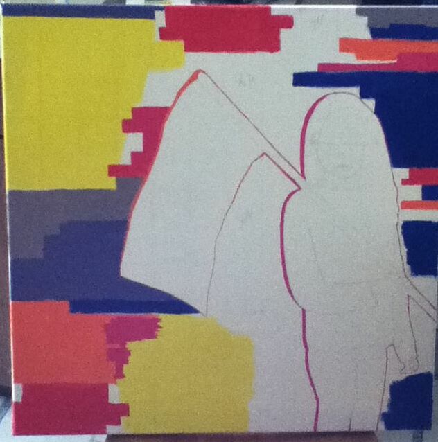
1) I started out by stretching a canvas with four 24-inch stretchers and about 676 square inches of canvas, using a staple gun to secure the edges and a pair of scissors to trim any excess material. With a large bristled brush, I then applied roughly 3 layers of gesso on the front of the canvas to create a good base for applying brighter colors. |
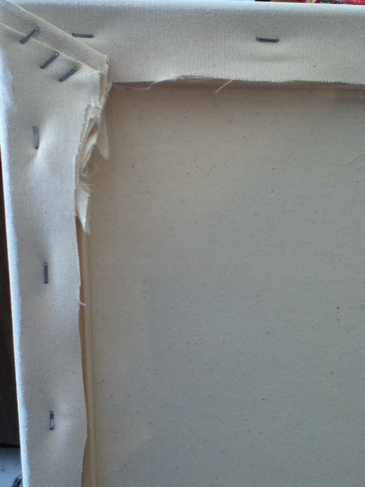
Close-up of staplework
|
|
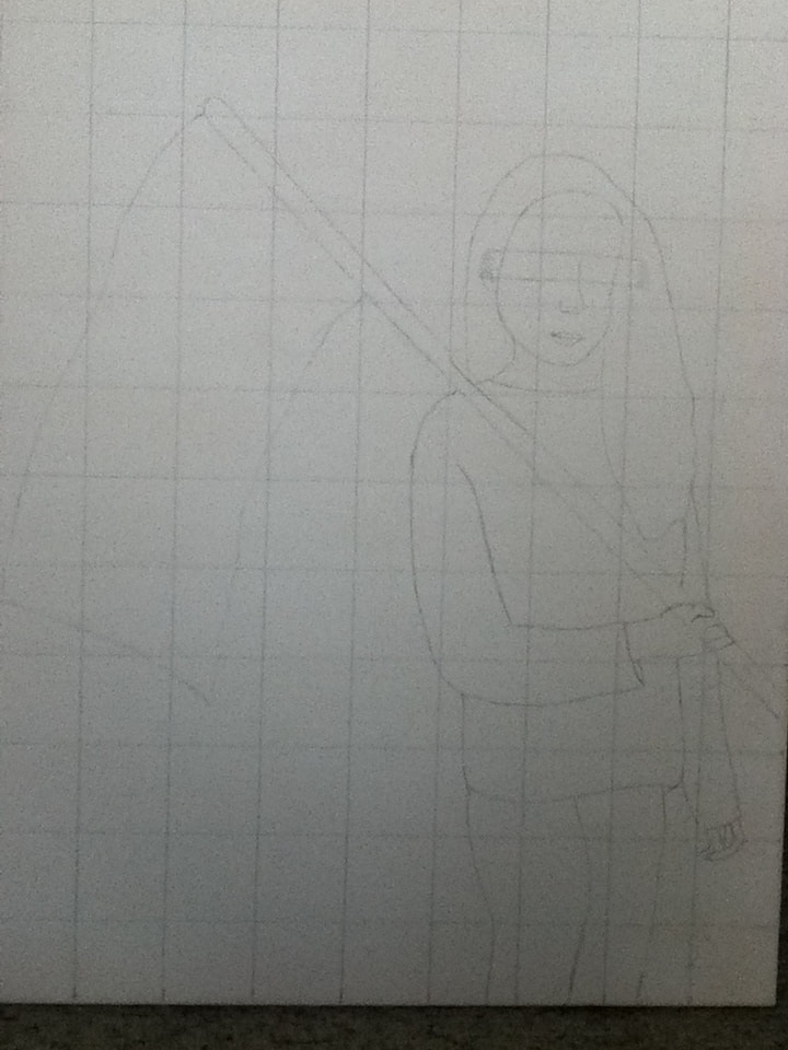
2) On my printed reference picture, I sketched a square (24 centimeters by 24 centimeters), making marks every 2 cm. so that, when connected, a grid of 12 squares x 12 squares was created. However, I altered it so that I was on the far right side of the grid, with lots of empty space on the left. I thought that this would be "safe" in making sure there was room for the flag, while also straying from my inspirations' symmetrical figures and giving my piece an asymmetrical twist. I already knew that my canvas was 24 inches wide and long and so, going off of my reference picture, I made a 12 square x 12 square grid, with each square being 2 inches in length and width. I then sketched out my reference image in the squares, freehanding a smear over the eyeball/eyebrow area to later be filled in with the glitchy smear. I also freehanded the broom handle in order to lengthen it, along with a flag at the end. |
|
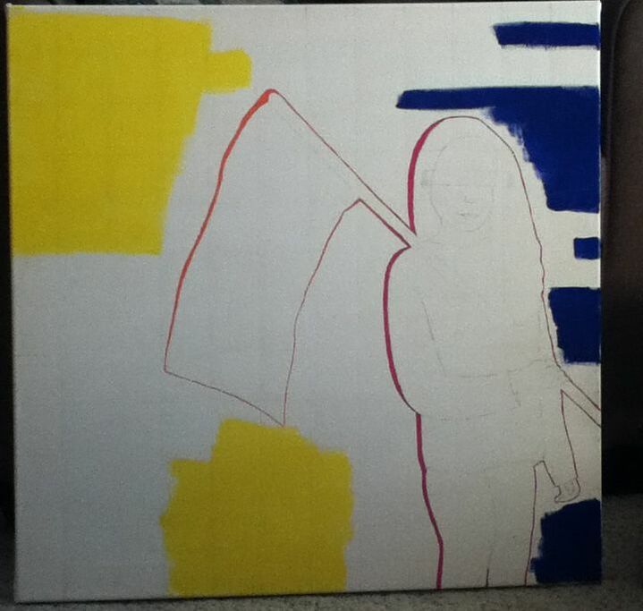
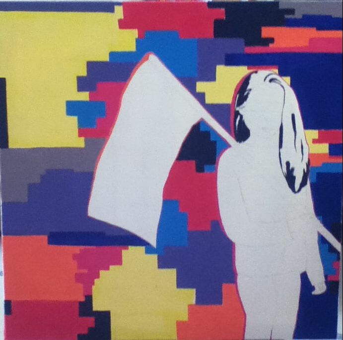
3) With "Hyunjin" as my reference for the background, I started laying down large patches of color to try and mimic my inspiration's background. The largest sections of color in the back seemed to be dark blue and a bright yellow, and so to achieve this I brushed Yellow and Dark Blue with a 1/4" brush.
To make sure that my figure wouldn't be lost/accidentally covered when applying paint to the background, I outlined myself in Hot Pink and the flag and pole in Orange. Imitating the effect in "Hyunjin", the outlining on the left side is thicker than the outlining on the right side of the imagery. |

"Hyunjin Glitch Edit", 2018.
|
|
4) The trickiest part of creating an entirely glitching background off of "Hyunjin" was that "Hyunjin"'s background is based off an actual background, whereas I was making a background from scratch. In a way, though, this also made the process easier, as I could pretty much lay geometric sections of color wherever I pleased. The only rule that I stuck by was making smaller areas on the right side of my figure than on my left side - I hoped that this would create movement and draw the viewer's eyes towards the person holding the flag.
Alternating between the 1/4" brush, a Flat 4 brush, and a Flat 8 brush, I applied these colors in geometric patterns:
|
|
5) I continued to cover the background in large patches of color, repeating the colors used in step 4 in addition to pure Brilliant Blue and later using Black to fill in small sections bordering the outer perimeter and one section in the middle. The Black contrasted nicely against the otherwise-neon color scheme; not only that, but setting it against the edges gives the impression that the "main" glitching is around the figure, with the rest of society (outside of the painting) being untouched/immune, as represented by being in the black. |
|
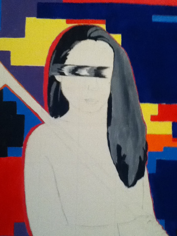
6) I created a grey mixture with 2 parts White and 1 part Black. Using my printed out reference photo as a guide, I mapped out solid sections of the hair (Black being the darkest sections, grey being the lighter sections). Once these colors were laid down as a base, I then began blending the colors by overlapping White, Black, and the grey concoction.
For blending, I found that what worked best was, in small sections, placing the base color down in dots, overlapping that with dots of its opposite color, then completely blend the two with a brush dipped in the grey paint (i.e. in the Black sections, more Black than White was placed down, then blended out with grey). With the Black, White, and grey, I also began to create the glitching effect over the eyes, using my smallest Flat brush so that the edges would be thinner. |
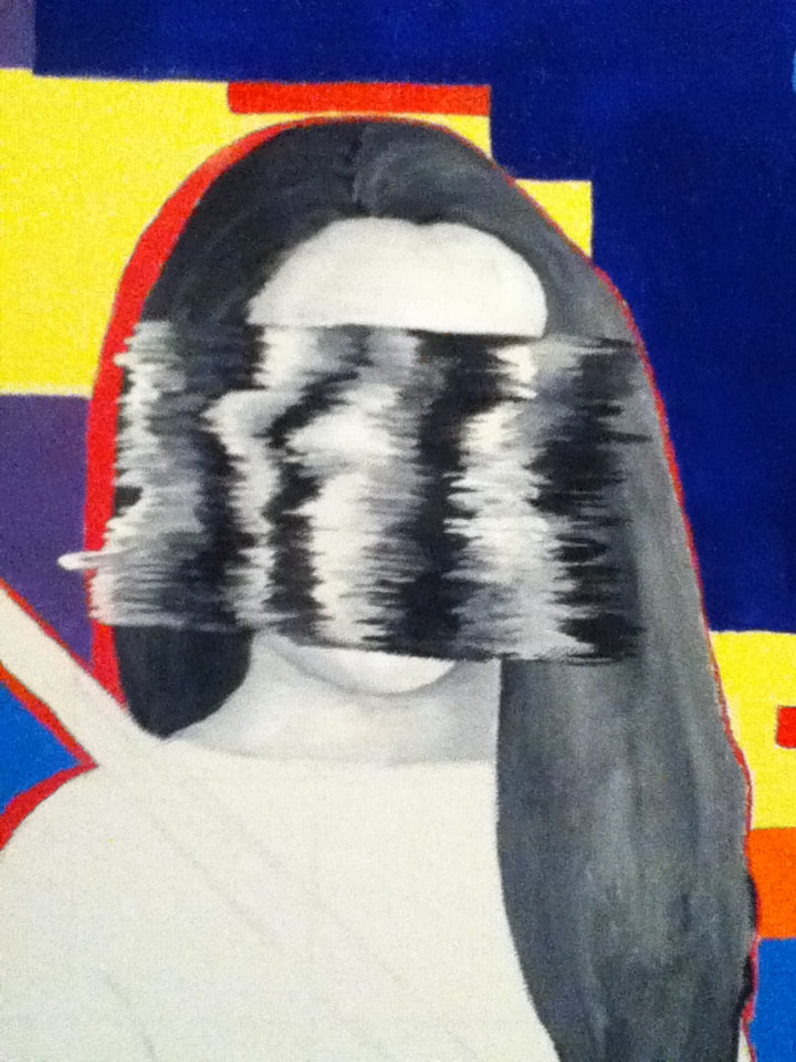
As mentioned in "Experimentation", the smear was later extended to cover the entire face.
|
|
7) To wrap it up, I solidly colored in the outfit in Black and outlined it in the same Hot Pink used to outline the rest of my body. Originally, I wanted to make the clothes textured, but due to my lack of time management I thought it would be safer to color the clothes solidly (I did try to add some grey to the bottom of the shirt, though); while this was lazy on my part, I really like the contrast between the Black and Hot Pink, not to mention how interesting it is to have textured hair emphasized over such a flat area. This used up the rest of my Black - with the leftover White and grey, I shaded in what little skin was visible (White for the base, grey for the shading) and then painted the flag pole and tried to create folds in the fabric by creating grey lines and softening them with White.
|
"Brainwashed Into the Same System" vs. "Hyunjin Glitch Edit"Similarities:
|
"Brainwashed Into the Same System" vs. "A Sign, An Omen, A GLITCH"Similarities:
|
"Hyunjin Glitch Edit", 2018.
|
"Brainwashed Into the Same System", Elizabeth Verkuilen, 2019.
|
"A Sign, An Omen, A GLITCH", 2018.
|
