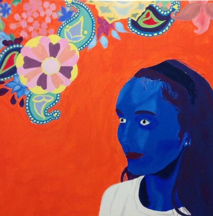
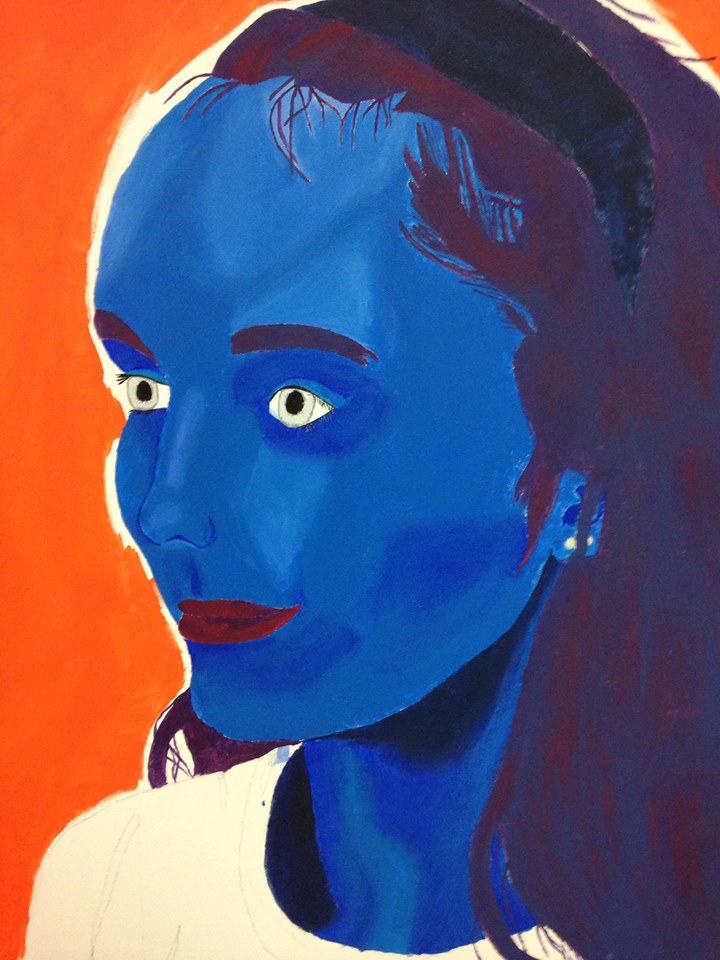
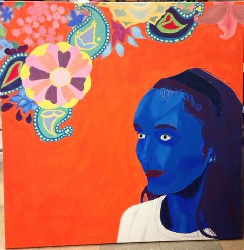
Artwork: Self-Portrait
|
Title: Interior Design
Size: 91.44 cm. x 91.44 cm. Medium: Acrylic on Canvas Completion: February 2019 |
|
|
Title: Interior Design
Size: 91.44 cm. x 91.44 cm. Medium: Acrylic on Canvas Completion: February 2019 |
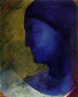
"The Golden Cell". Odilon Redon, 1892.
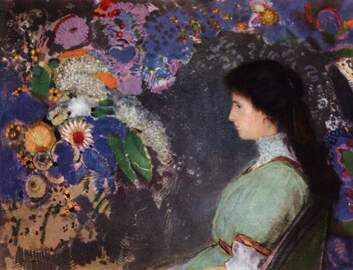
"Portrait of Violette Haymann". Odilon Redon, 1910.
|
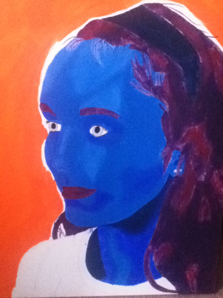
When I found out that we had to imitate portraits of famous artists for our self-portrait, my mind immediately went to the portraits of Redon. While I have used Redon's work as inspiration for my drypoint print already, I thought that his work would fit well in creating a self-portrait. Redon's works have always seemed to be whimsical, fairy tale pieces compared to other paintings/styles I've seen, with bright color schemes and imagery that is "normal" with a touch of weird. To me, this style would fit well in creating a self-portrait because that's how I feel everyday. In my opinion, I initially fit into social situations because I'm quiet and plain, but when I open up to people I can be loud, weird, and a tad bit strange.
To try and portray this, I have decided to take inspiration from Redon's "The Golden Cell" and "Portrait of Violette Haymann". Both of these pieces have an interesting perspective, with the woman in both facing the side. I would like to use this side perspective to show that I am not as typical as I think I appear, that I look at certain issues and "normal" things from a different perspective than most people. As for the individual aspects of each piece, I'm inspired to use "Cell" as inspiration for the foreground and "Violette" as inspiration for the background. If I were to give myself a cool, mostly-blue color scheme for my form, it would make me appear alien-esque and a little strange; this, to me, would make my exterior appear as my interior feels. To then surround myself with the floral chaos that surrounds Violette Haymann in her portrait would display the various odd thoughts that I think distinguish me from others. Instead of thinking about common things (i.e. work, school, relationships), my mind is full of a lot of "What if"s, which is sometimes good and sometimes bad. The good "What if"s will usually lead to interesting conversations, sometimes new friends, and always lead to new inquiries and/or new things to learn; the bad "What if"s increase my anxiety and low self-esteem. Together, they make up a large part of me, which would make sense to include in a portrait of myself. |
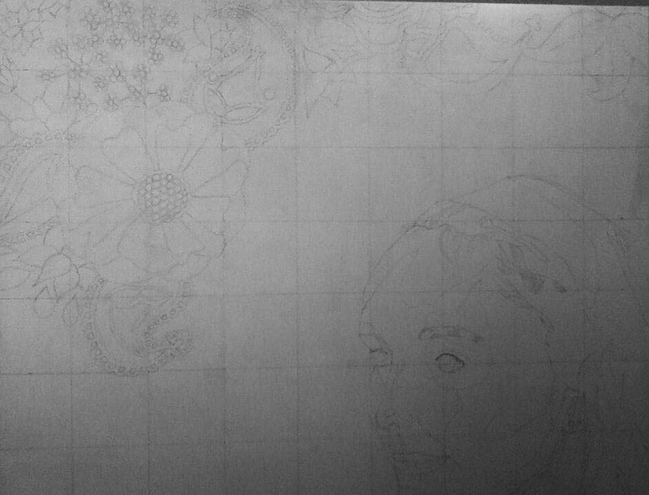
Sketch #1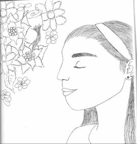
In this first sketch of mine, I tried (as much as possible) to combine the incredibly-close perspective and closed eyes of "Golden Cell" with the flowers in "Violette" . I ended up going with a revised idea of this sketch; I really liked the positioning of myself in the righthand corner to stay true to "Golden Cell", and positioning the flowers above a tilted face could help give the impression of the thinking process and the flowers representing the thoughts. However, I didn't like the way it looked with closed eyes...with the flowers in such close proximity, I felt like it looked like I was smelling them, which strays away from the symbolism I wanted. I hoped that, with this set-up minus the closed eyes, I would best be able to achieve the image/message that I desired.
|
Sketch #2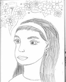
This sketch is pretty similar to #1 with the flower placement, but this time it shows me in the center of the piece with the flowers above my head. While I thought that this was a good use of the flowers as thoughts, I felt that having myself in the center looked very static and would then make the additional flowers look out of place. Because I want the flowers to look uniform with myself to show that they are, in a sense, a part of me, I began to lean more towards sketch #1; having myself in the bottom righthand corner of the canvas isn't "basic" positioning, and it would allow the flowers and myself to take up almost the same amount of space...which would go great with my idea that my weird/abnormal thoughts and ideas make up a large part of who I am.
|
Sketch #3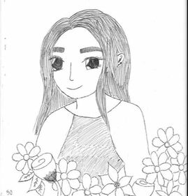
(NOTE: Yes, this drawing is in a different style than the other two...on this particular day, I was experimenting with drawing styles because I am interested in cartooning/animation and ended up drawing a girl in a position that would make sense for my self-portrait). . .In this sketch, I tried to stray a little farther from my inspirations and try to make it more of my own, with the only similarities being blue skin and flowers. However, while I do appreciate the individuality of this sketch, I felt like it didn't convey the message of my inner thoughts/self as much as the other two. Having the flowers near my torso and not above my head didn't go with their representation of my thoughts, and I wanted to challenge myself with a closer perspective of myself to try and attempt more detailing.
|
|
|
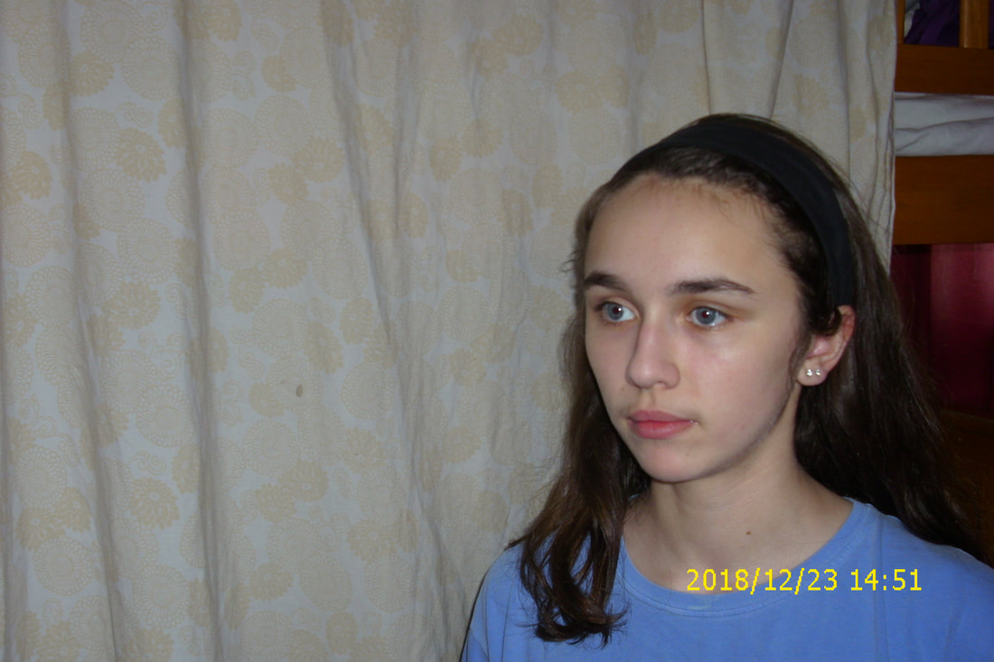
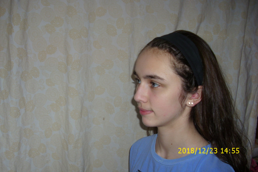
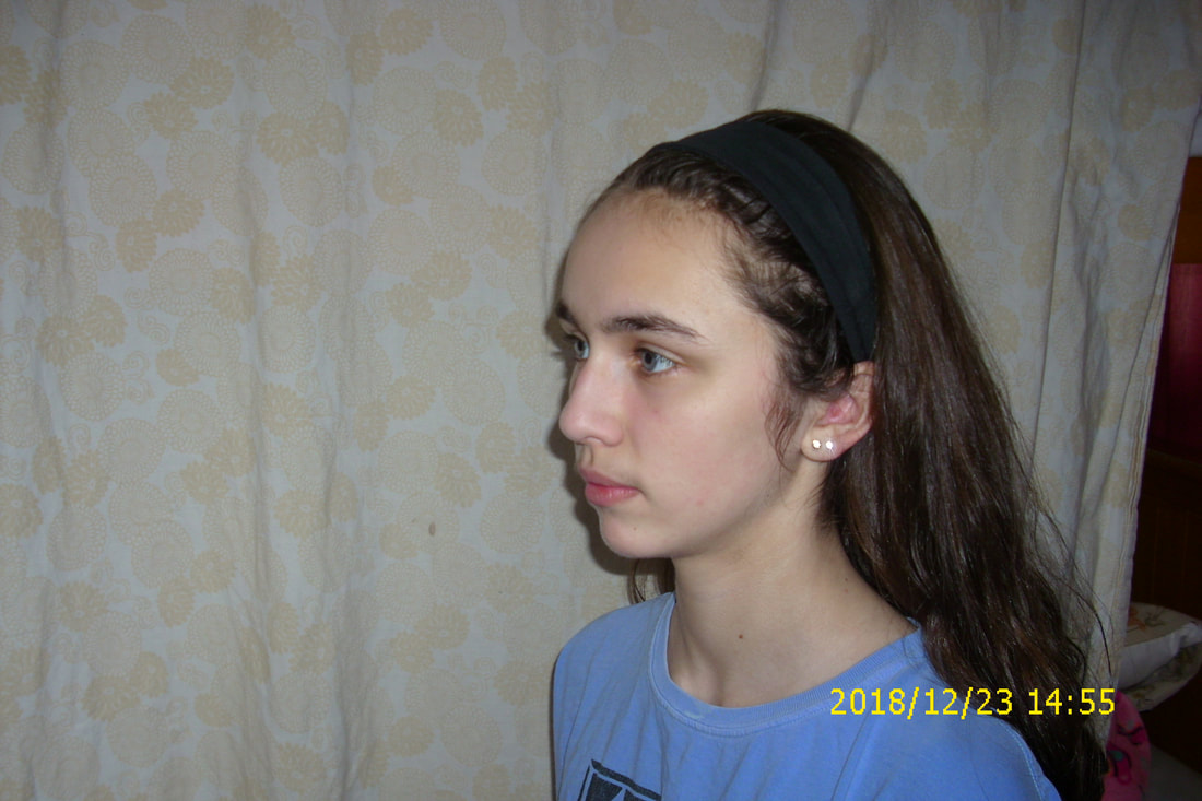
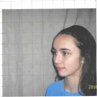
Before any painting could commence, I had to take a picture of myself to base my grid drawing off of. Both "Golden Cell" and "Violette" are portraits of women from their left side; with the help of my sister, I was able to experiment with which placement would be closest to that of the two separate ladies. Not only that, but "Golden Cell"'s subject has a slight grin, while "Violette" seems to be a more serious woman; I experimented with these two facial expressions to see which one I thought better represented me in my self-portrait.
At first, I experimented with tilting myself slightly to see more of my face, but that seemed to be much more different than the poses of both ladies in my inspirations. I then exposed almost all of my left side to the camera, which seemed to be closer to my inspirations. |
|
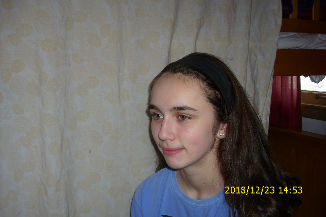
However, I ended up choosing this picture with my position in between the positions above. In this picture, I also have a slight smile like in "Golden Cell", which I thought would better represent my comfort with my weird personality and ideas; not only that, but I felt that the neutral expression would look out of place surrounded by happy, whimsical flowers. I then cropped the picture to better mimic "Golden Cell"'s position on the canvas, then printed out a copy to draw a grid over. |
|
|
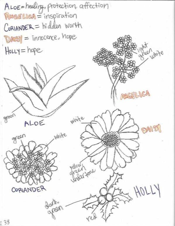
I was initially intimidated at the idea of drawing flowers, because some of them are very detailed and might be difficult to paint. I'm also not familiar with many types of flowers, and whilst researching various types I learned that certain plants are representative of emotions/traits. This seemed appropriate for a self-portrait, as I could possibly combine the idea of a floral background from "Violette" with flowers symbolic of who I am as a person or who I strive to be.
Keeping my lack of painting experience in mind, I looked for plants that weren't extremely intricate with meaning(s) that could fit with me and my aspirations and narrowed it down to five: aloe, angelica, coriander, daisy, and holly. I then sketched out each plant and labeled parts of them with colors according to pictures I found. After all of this, though, I decided to not go through with using particular breeds of flower for a few reasons...
|
|
I ended up mixing and swatching 41 different paint combinations to try and find colors that would best match the color schemes of my inspirations. Of 12 shades of blue for the skin tone/hair, I narrowed it down to 5 that I believed would blend well together and were close to "Golden Cell"'s skin tone. I also narrowed it down to 3 shades of purple for the bottom of my hair (the head scarf of "Golden Cell" fades from blue to purple to red) and then a pure paint in the color "Red" that has some pinky undertones to it.
Originally, I was going to try and mix a mustard color for the background, like in "Golden Cell", but I ended up mixing four colors that were all sorts of a pale orange/tan...though not what I originally desired, I decided to try and use a combination of these 4 lighter colors to both contrast with myself and the flowers while also complimenting the blue skin. As for the coloring of the floral background, I wasn't sure which colors to use, but ended up mixing together a few green and lilac shades with some pink thrown in - I might end up using some swatches from the other two categories to color the background to have some more variety and try to be as colorful as the flowers in "Violette". |
|
|
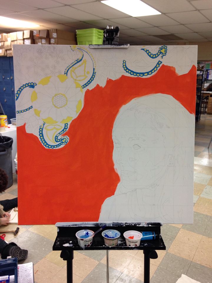
When I was beginning to apply paint to the blank canvas, I hadn't painted in over a year and didn't remember how to properly function. In this case, I began using too-large-of-a-brush to try and fill in the paisley border and ended up painting an area blue that was supposed to be some lighter shade. After this, I became much more careful with my brush selection and ended up favoring paintbrushes with smaller bristles to maintain better control over where the colors were to go. It was also because of this mishap that I decided to use a much darker color for that middle portion of the paisley. Originally, I wanted the background to be entirely bright colors, with the only contrast being with darker blues, but this mishap showed me that adding more dark colors would make certain background detailing stand out much more. |
|
When beginning to paint the background of my piece, I wanted to incorporate many bright colors to compliment the orange background while also off-setting the darker blue tones I planned to color my skin with. However, once I completed painting one of the paisley designs with intense colors, I realized that using an entirely-bright color scheme might be too harsh on the senses and that, perhaps, incorporating some lighter/darker pops of color would make it go together much nicer. To experiment with this, I went over a section of the completed paisley design with a dark indigo shade - this contrast between the dark and bright looked wonderful against the bright orange background! Since part of my speculation was beginning to appear like it would work, I then decided to incorporate some lighter pastel shades into the mix.
|
|
|
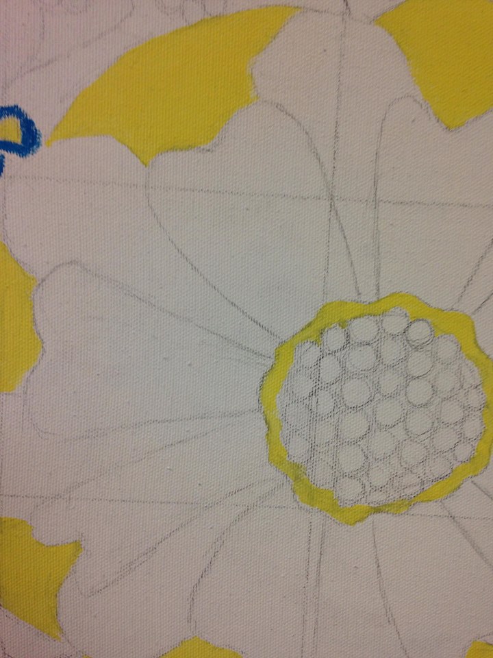
While the experimentation with the darker colors was successful, I was still a tad iffy at the idea of boldly applying a light color. I decided to mix a pale pink shade and apply it in the secondary layer of petals in the largest flower in the background because the outer petals were already a bright yellow. As yellow, even when neon, is quite a light shade, I thought it would be "safe" to apply another light color by it so that in case something went wrong, it wouldn't look too out of place.
Once again, I was happily surprised! The pale pink complimented the yellow wonderfully and the light color scheme only further accentuated the more intense color scheme of the paisley next to it. From all of this, I became less wary of mixing/experimenting with new shades. I was also given a small preview as to what types of colors seemed to work best together (warm + warm, complimentary colors, etc.), and having this type of reference/experiment had a strong influence on the rest of the colors I used in my piece. |
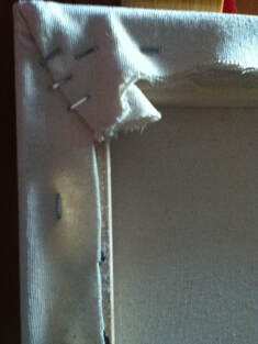
(1) The stapled/trimmed canvas on the backside
|
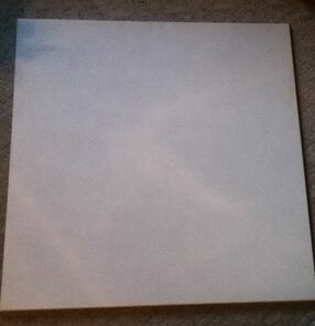
(1) The finished canvas' front
|
1) Before beginning the painting process, I first had to construct a canvas. To do this, I fashioned four 36"-long canvas stretcher bars into a square and attached them together with their corresponding slots. To make sure the bars stayed in place, I took a staple gun and stapled each corner thrice.
Then, I trimmed a piece of canvas larger than the frame (I'm not sure of the exact measurements, I eyeballed it) and positioned the frame on top of it. I then folded the canvas up and over the wooden frame and proceeded to staple it multiple times around the perimeter and especially in the folded corners. Once all the staples were in place, I trimmed any excess canvas material. |
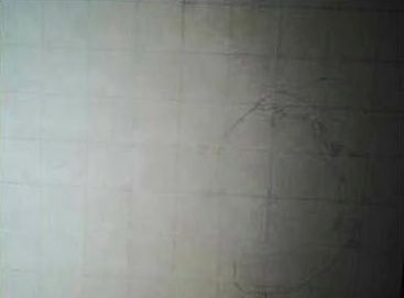
(2) Beginning to draw my face in the canvas' grid
|
2) On my printed image, I proceeded to draw a square border 18 cm. long on each side. With these dimensions, I was able to create a grid with squares 2 cm. in length and width - a total of 9 squares by 9 squares. I then took a yardstick and marked a 9X9 grid - these squares, however, are 4" x 4". Once both of the grids were complete, I began to sketch out my face in the canvas' grid. |
|
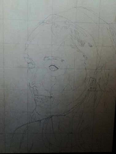
3) I completed the outline of my face, features, and upper torso, then began to add more details in pencil to aid me once I began painting. The picture I'm using was taken with flash, which allowed me to have certain parts highlighted and others slightly shadowed; I then sketched out the rough outlines of the areas of color on my face. I planned to use various shades of blue to fill these in and try to make my face more interesting and dimensional in the piece. |
|
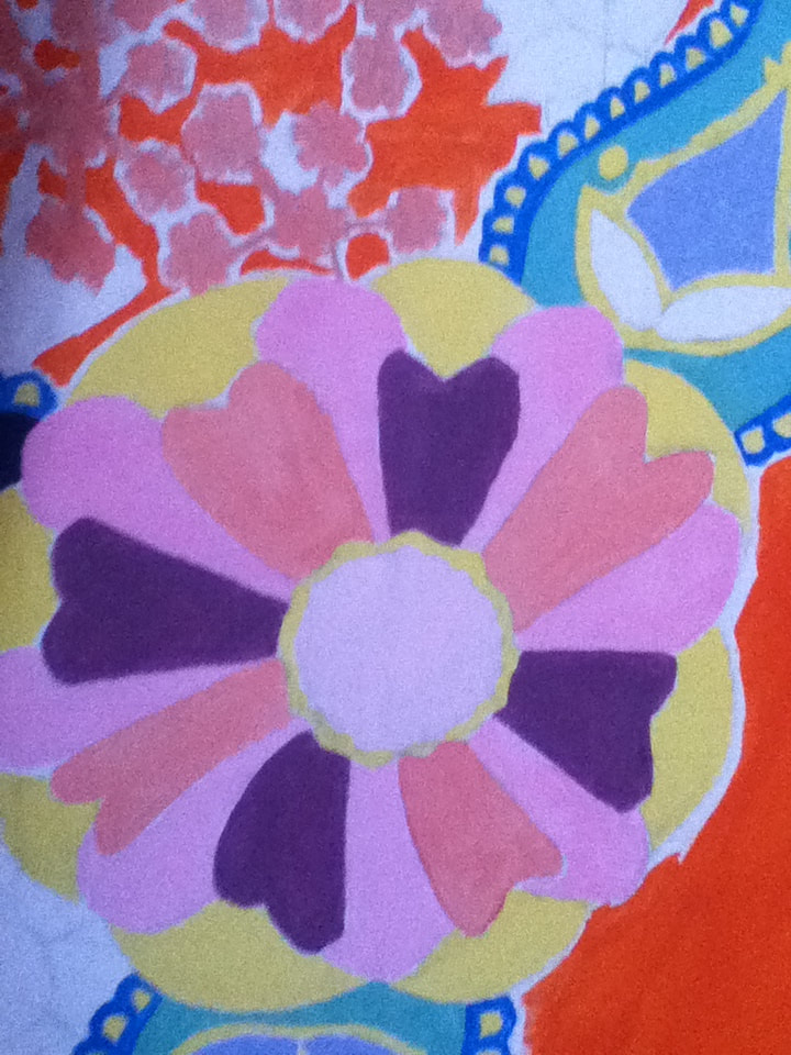
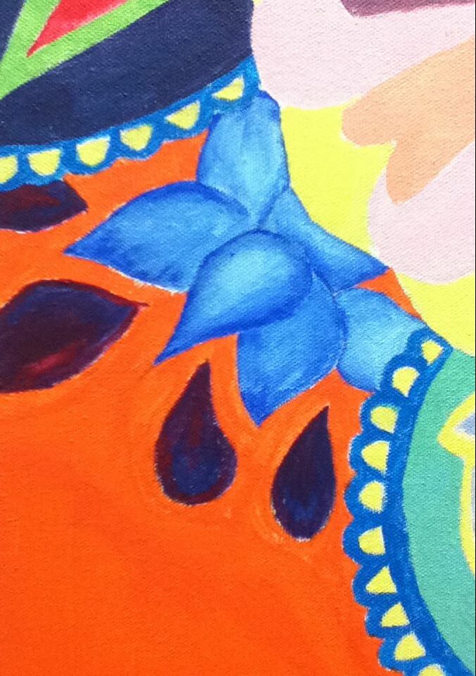
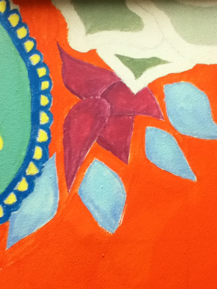
4) The flowers in "Violette Haymann" are, luckily, not extremely detailed, so I freehanded some floral designs similar to those in my inspiration and my sketches of various symbolic flowers in Experimentation. I placed these in the upper left-hand corner of the canvas to fill the large space, and continued them above my head to emphasize the idea of them representing my thoughts. To give the flora a bit more of a personal touch, I created used paisley designs as "leaves" scattered throughout the flowers. Not only did this give some more detail to experiment with, but it also displayed the abnormality of the flowers and how they are a figment of my imagination/thoughts. |
|
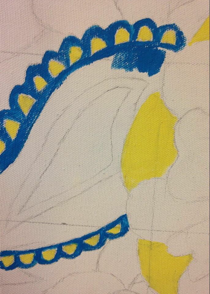
5) Alternating between a Flat 8 brush and a 3/4" brush, I began to apply pure paint in the color "Yellow" to the outer parts and the central perimeter of the largest flower on the canvas. I didn't have a planned color scheme for the background when I threw myself into this project, but decided that it would be best to start off with this color because it didn't require a certain paint combination that would need to be replicated if used again; yellow is also a light hue that is easy to cover with darker colors if I were to stray from the lines. |
|
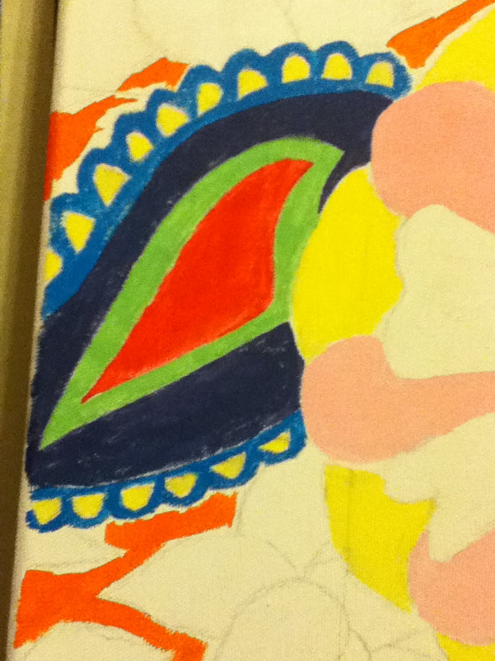
6) I also added the Yellow to the small half-spheres in the border of the paisleys, then proceeded to fill in the rest of the paisley border with pure Brilliant Blue. As the paisley borders take up a large amount of the border between a solid background and the rest of the flowers, I decided to incorporate small amounts of blue/orange complimentary action that would go well with the more-intense complimentary action that would take place between the bright orange and my soon-to-be-blue skin tone. I was having difficulty differentiating the flowers from the solid background, so with a large paintbrush I began filling in the empty space with pure Orange. Once the large spaces were covered, I went back in with a smaller Flat 4 brush to fill in the spaces between the flowers. |
|
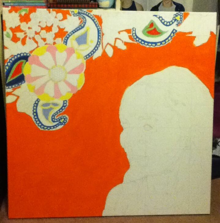
7) With the Flat 4 and 8 brushes, I continued to add bright colors to the paisley designs. Originally, I was going to use the same color scheme for all four of the paisleys to incorporate some repetition into my piece, but upon applying Yellow to part of the center of the paisley, I realized that using this color in that area in every single paisley would overlap the Yellow outer petals of the largest flower. To avoid this, I decided to make the two paisleys that could have the Yellow color in that area have the same color scheme and then give the other 2 paisleys a different color scheme to share.
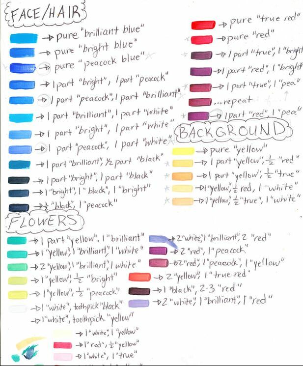
Colors used for filling in the paisleys at this stage -
|
|
|
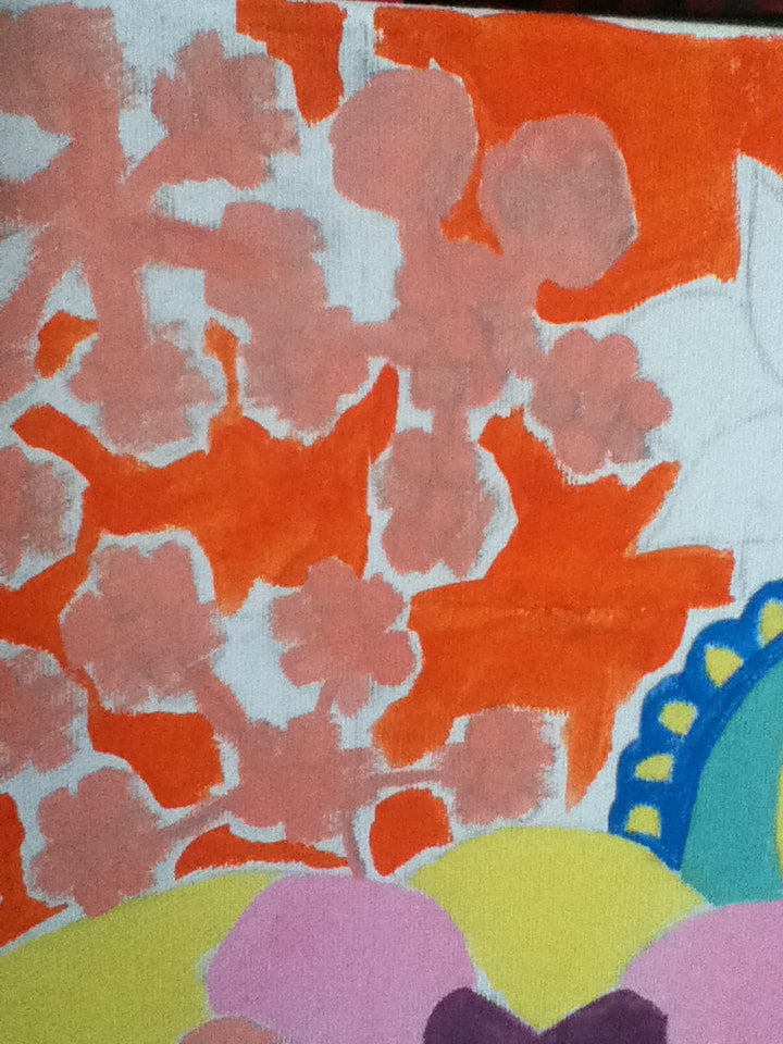
8) I planned on having some of the plants in the background be flat and some of them more intricate, with the more intricate ones having small, circular parts. Before starting to paint my face, I painted all areas in the background that I wished to detail later in a light color (in both of these photos, I chose a variation of a light pink). Once the base dried, I planned to go over it with a darker color to emphasize various parts.
|
|
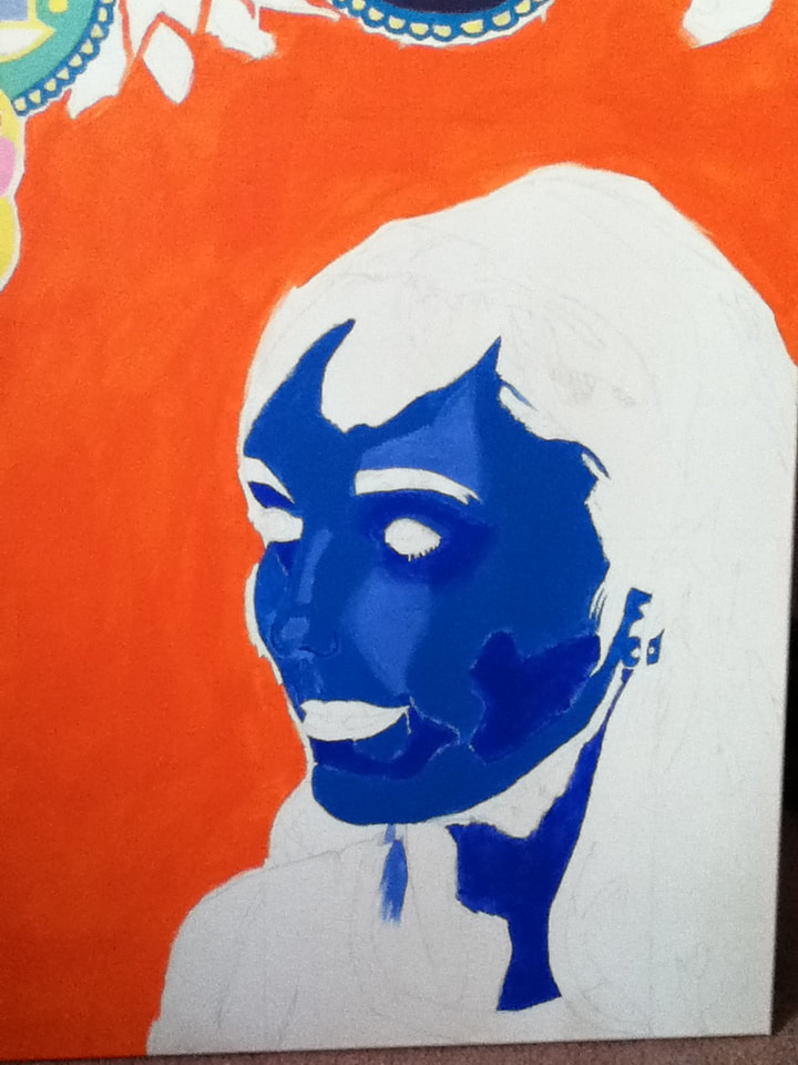
9) Alternating between the 3/4" paintbrush and the Flat 8 paintbrush, I began to fill in sections of my face. I roughly determined the placement of the sections by observing the various colors of my skin tone created by the flash when my picture was taken. I tried to break it down into 3 'main' shades of blue:
|
|
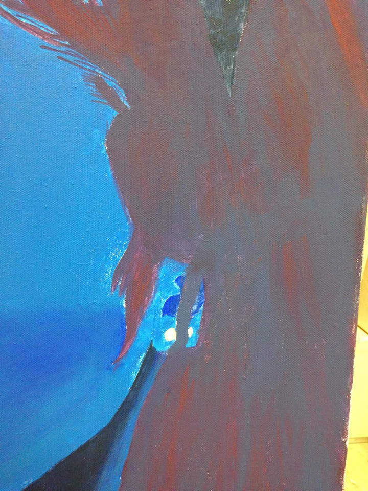
10) After applying the 'main' three shades of blue, I also mixed 1 part Peacock Blue with roughly 2 toothpick-head-amounts of Black to create a shadow for my neck and shoulder. While my shoulder seems to have some dimension in the reference photo, I thought applying just the blue/black color would make the neck stand out more and look neutral when put against the shirt (which I planned to shade with various colors).
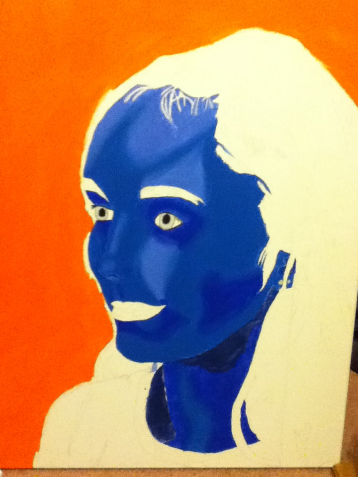
Then, with the Flat 8 brush, I applied more layers of the 3 blue hues to make the colors more solid. Once it seemed solid enough, I dampened the brush slightly and began to soften the edges between sections...it was during this that I realized that the 3 blues that I used were intensely different from each other and wouldn't be able to blend as smoothly as I would've liked. This frustrated me, so I took a break from painting the skin and colored my eyes. Using Black for the pupils and 2 shades of gray (1 part White, 1 to 2 toothpicks of Black), I was able to create a light eye color that contrasted against the dark blue skin. |
|
11) To try and rectify the skin dilemma, I once again applied fresh paint to each section, but this time overlapping the Peacock/Brilliant base color over the wet highlight and darker blue to try and make them closer in shade. I then applied the base coat around the edges and brushed it back and forth over the edges of the new and still wet colors to try and soften the edges. Looking back, it might not have been the best idea to try and tackle a blended appearance for this project because of my little-to-none painting experience.
While the multiple layers of blue dried, I began to fill in my hair, eyebrows, and lips with various purple shades I mixed. The basic combination I used was 1 part Bright Blue with either 1 part Red or 1 part True Red, but I would randomly add more blue or red to the paint in an attempt to give the hair dimension. I also marked off parts of my hair, brows, and lips that seemed to be highlighted and filled in these sections with a magenta shade (achieved by alternating between purple shades and pure Red over the sections). |
|
12) Using a variety of purples to paint the majority of my hair began to look patchy and sloppy in my opinion, so I went over it with a thick coat of darker purple paint mixed from 1 part Peacock Blue and 1/2 part Red. I painted all of the hair with this color, even the sections that I originally intended to leave for highlights. Once the purple partially dried, I lightly dipped the tip of the Flat 4 brush into Red and applied it in multiple areas to give the hair dimension, making sure to be a little careless to give a more realistic hair texture.
|
|
|
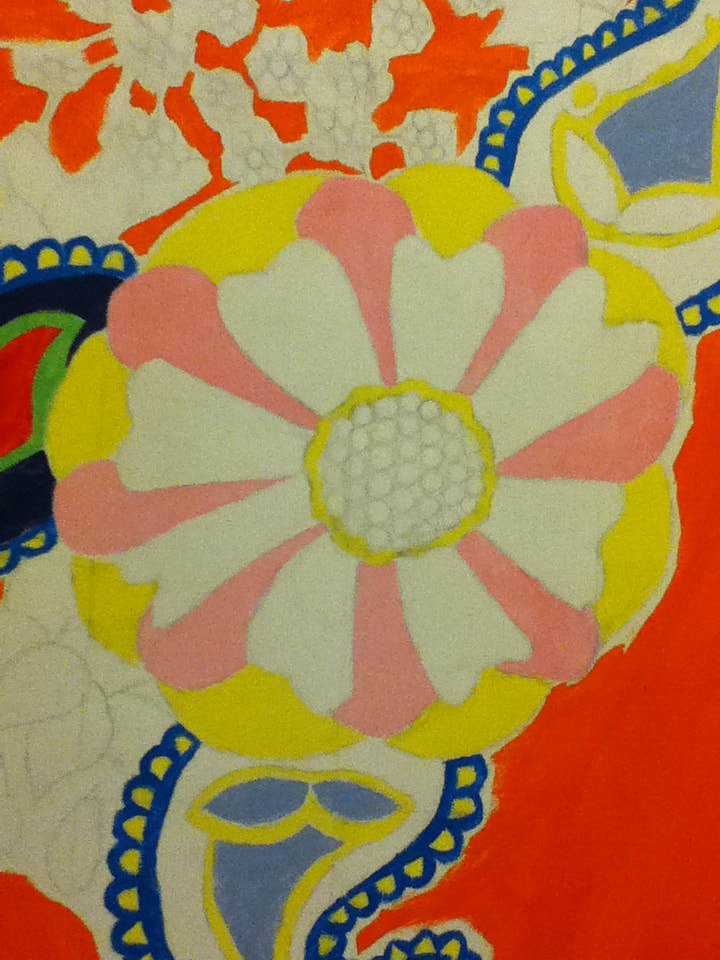
13) With the Flat 8 brush, I began to outline all of the teardrop-shaped petals/plants that I scattered around the background to fill the space. However, after filling them in with one solid color, I realized that they looked more like raindrops and less like the petals that I desired; to try and rectify this, I mixed a lighter color to the base color and began to alternate between the two on all the petals to try and look more flower-y.
|
|
|
14) Continuing with the Flat 8 brush, I filled in the rest of the flowers with a combination of leftover Orange paint I had with random spurts of Red, White, or Yellow paint to make it slightly different from the background color - this was because I didn't want every single background piece to be bright and overpowering, and decided that having some pale flowers close to the background color would look interesting and emphasize the brightness of the other flowers better.
I kind of liked the appearance of the white canvas forming my shirt because it contrasted with both the neon background and the darker colors of me, while also emulating the large white streak at the bottom of Golden Cell. To shade the white, I drew thin lines of Black paint in areas where my T-shirt creased in the photo, then blended White over it with the Flat 4 until it appeared to be grey creases. |
"Interior Design" vs. "Golden Cell"Similarities:
|
"Interior Design" vs. "Portrait of Violette Heymann"Similarities:
|

"The Golden Cell". Odilon Redon, 1892.
|
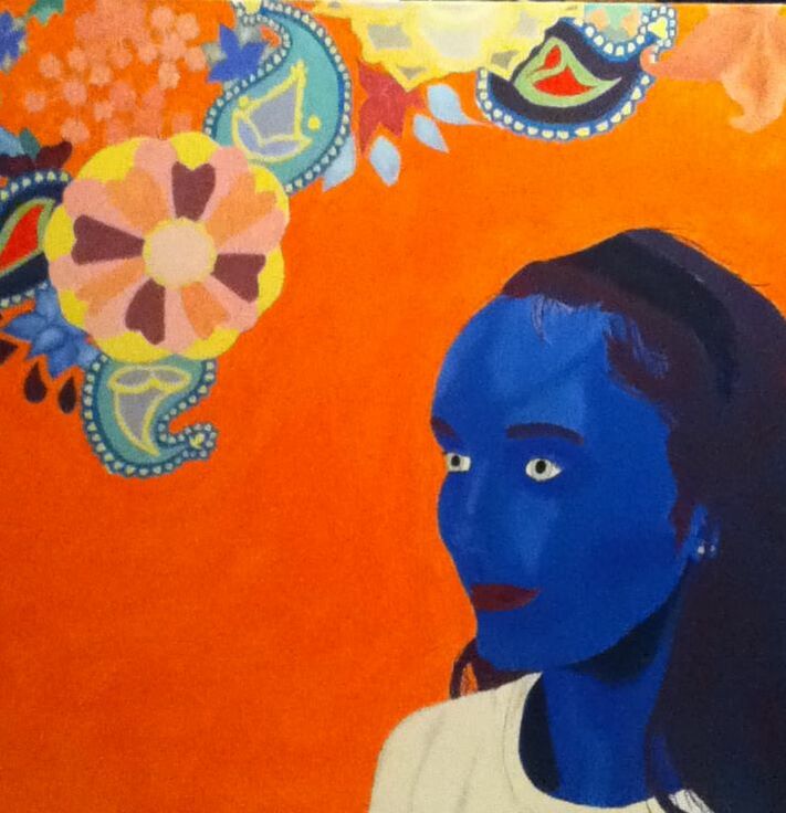
"Interior Design". Elizabeth Verkuilen, 2019.
|
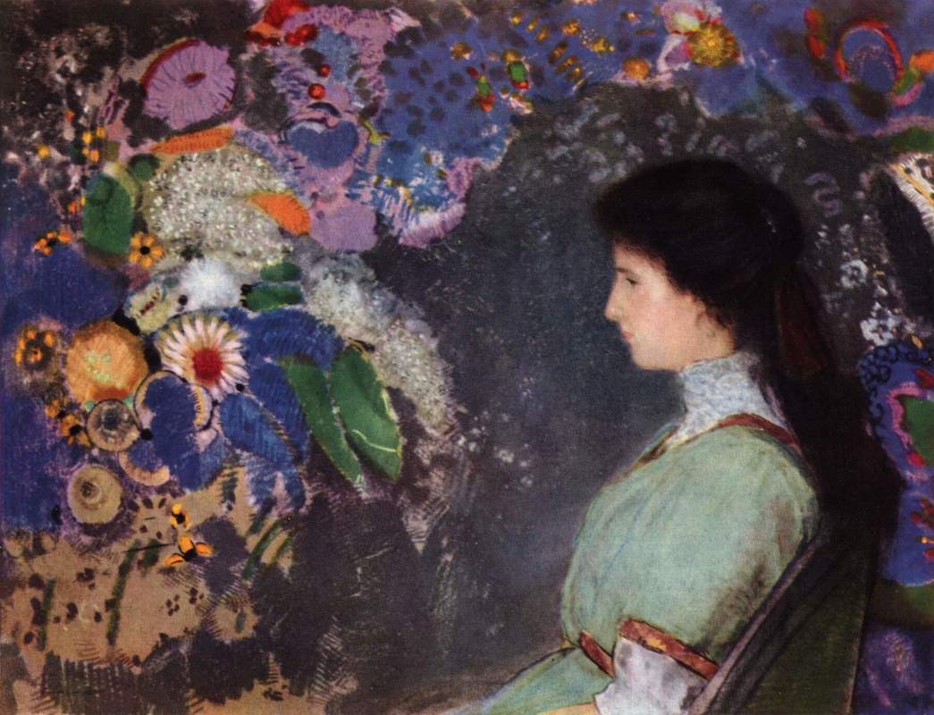
"Portrait of Violette Heymann". Odilon Redon, 1910.
|