"Familial Hues" Second Panel

|
Title: "Rose" Size: 30.48 cm. x 30.48 cm. Medium: Acrylic on canvas Completion: October 2019 |
|
|
Title: "Rose" Size: 30.48 cm. x 30.48 cm. Medium: Acrylic on canvas Completion: October 2019 |
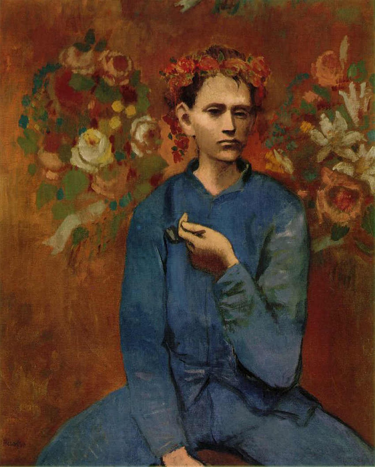
"Garçon à la pipe". Pablo Picasso, 1905.

"The First Day of Autumn". Aykut Aydoğdu, 2019.
|
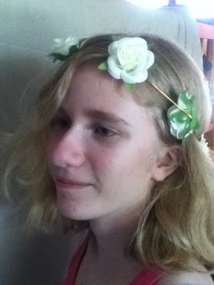
For each portrait in Familial Hues, I first had to decide which of Picasso’s artistic periods thematically represented each member most accurately in my opinion. After using the Blue Period as inspiration for my portrait in this series, I thought it fitting to use Picasso’s Rose Period as inspiration for the panel depicting my younger sister. The Blue and Rose periods are quite different in their emotional roots, with Blue depicting morose imagery with cool tones and Rose evolving to more cheerful images in color schemes primarily in pinks and oranges; nevertheless, the two are similar in that they are Picasso’s most emotionally-based art periods. When looking at my sister and I, you can tell obvious physical differences (i.e. skin tone, hair color), but we are most alike in our personalities; to me, this high level of contrast combined with similarities seemed to be a good representation of our dynamic. On her own, my sister also fits with the Rose Period due to her high level of optimism and a childlike youth she’s never lost over the years. I planned on using the warm color scheme of the Rose Period in my piece, along with incorporating some type of flora to connect literally to the Period’s name and symbolically to my sister’s constant growth as a positive person. To incorporate a more “modern” twist on such an old artistic inspiration, I decided to use one of my favorite illustrators, Aykut Aydoğdu, as my other artistic inspiration. Aydoğdu is a Turkish commercial illustrator who is best known for surrealist digital illustrations that are meant to focus on the daily dilemmas of life. Combining Aydoğdu with Picasso was a good thematic match for this piece because both take inspiration from real life scenarios, whether specific to the artist or blatantly relatable to most of the audience - for example, connecting the literal title of the Rose Period to the mild symbolism behind said flowers. I wasn’t sure of which specific piece of Aydoğdu’s to use, though, until I stumbled upon “The First Day of Autumn”. The depiction of a woman cut partially open to show something growing inside seemed like a wonderful illustration to use - by omitting portions of my sister’s face, I could depict flowers growing out of her to emphasize the symbolism of her growing positively as a person. |
Half-Open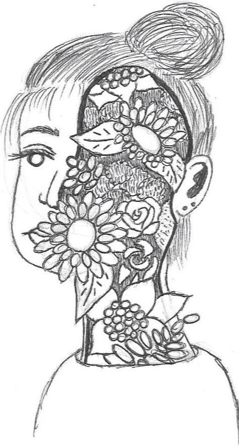
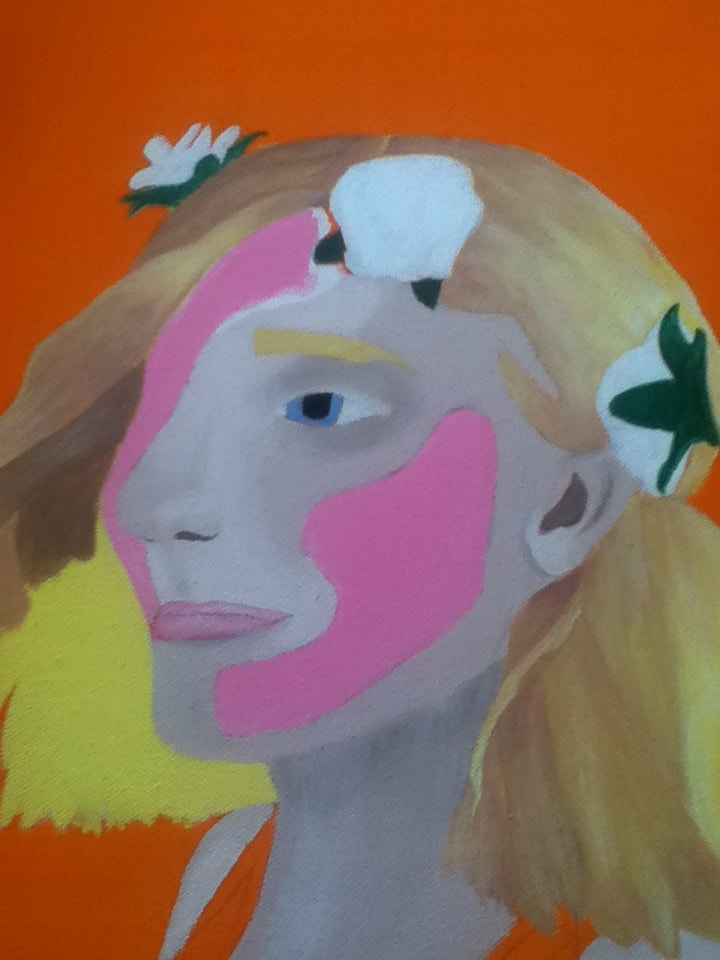
To kick off my sketches, I began by drawing the open side-profile seen in "First Day", filling the empty space in with various flowers. While I did like how this sketch turned out, I was worried it was too similar to "First Day" and didn't want to risk plagiarizing; I also knew that, by having so many flowers in the open space, a lot of the face would be obscured. This would be a problem because I wanted the portrait to be specific to my sister...yet any specificity would be lost if too many of the facial features were lost.
|
Phantom Mask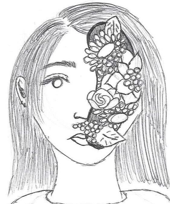
After encountering the issue of too much space/flowers leading to obscurity of the subject, I sketched a smaller portion of the face with flowers from a front view. For my final piece, I ended up using this sketch as reference but still incorporated the side profile shown in my first sketch and "First Day" - by combining these two, I ended up placing the smaller half-mask on the side of the face hidden from perspective. To me, this better emulated Picasso's Pipe piece where it would appear that flowers were surrounding her at first, yet further searching would showcase that they were coming from within.
|
No Face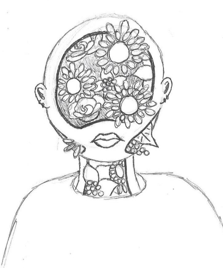
I also had the initial idea, when viewing "First Day" on its own, to carve away much more of the person so that they were more bloom than human. While I do think this sketch turned out interesting, it intensified the problem I had with sketch #1 where it would render the subject unrecognizable. As this painting series of mine was centered on being specifically towards my family members, it was important that my sister be depicted with flowers growing out, but to the point where she still looked human and like herself.
|
|
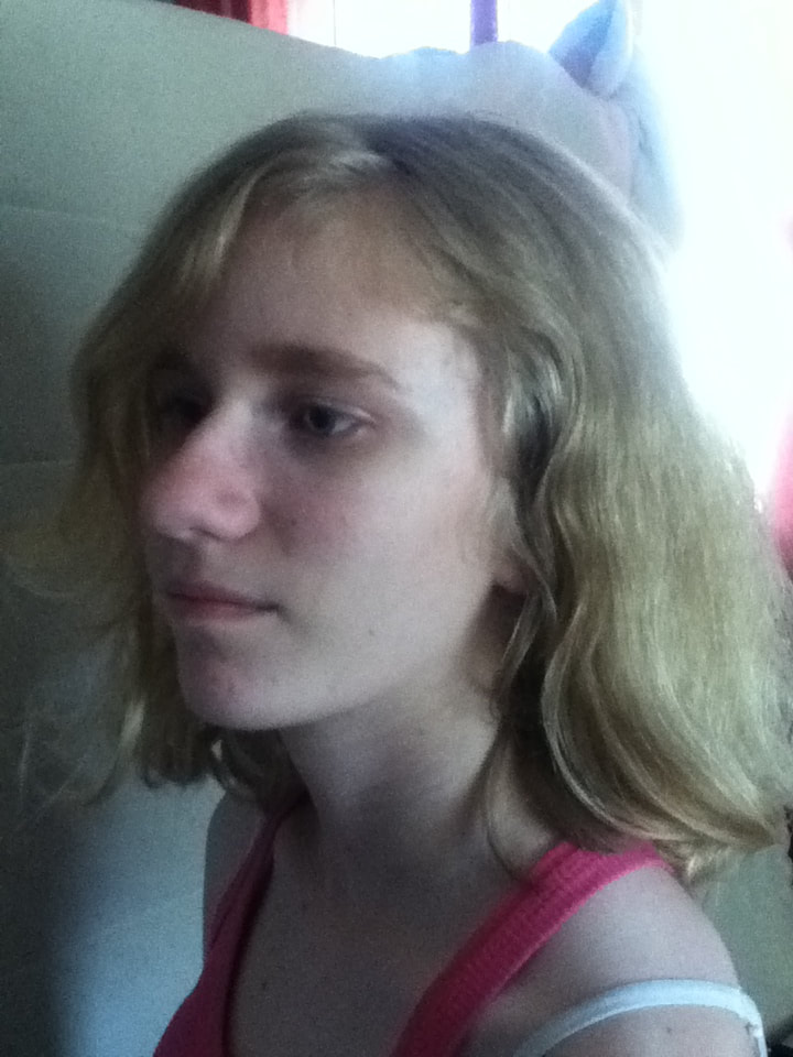
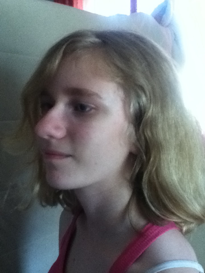
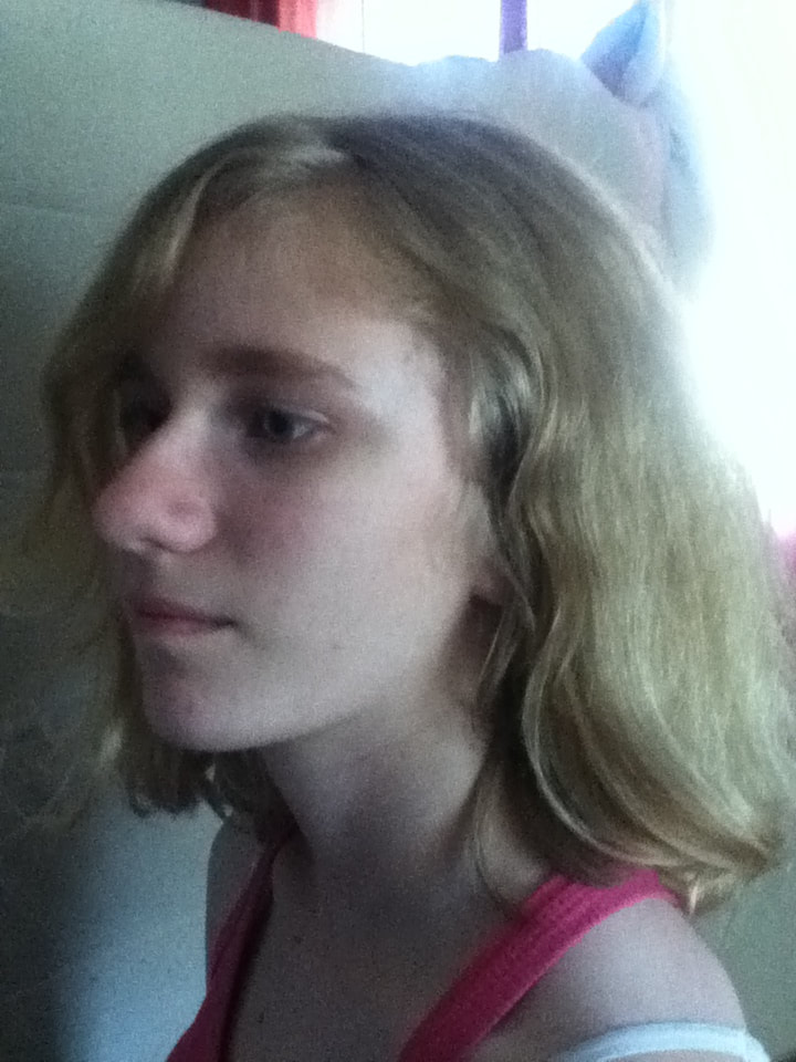
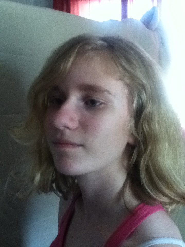
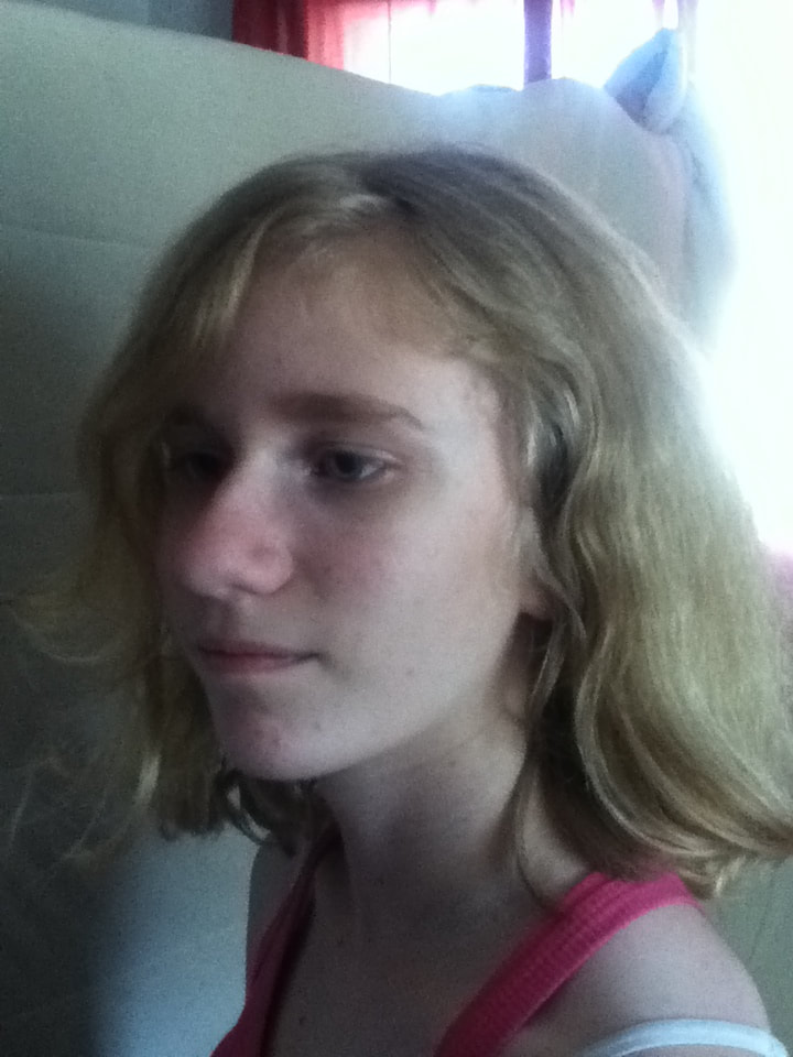
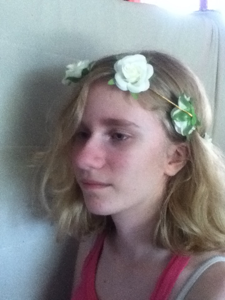
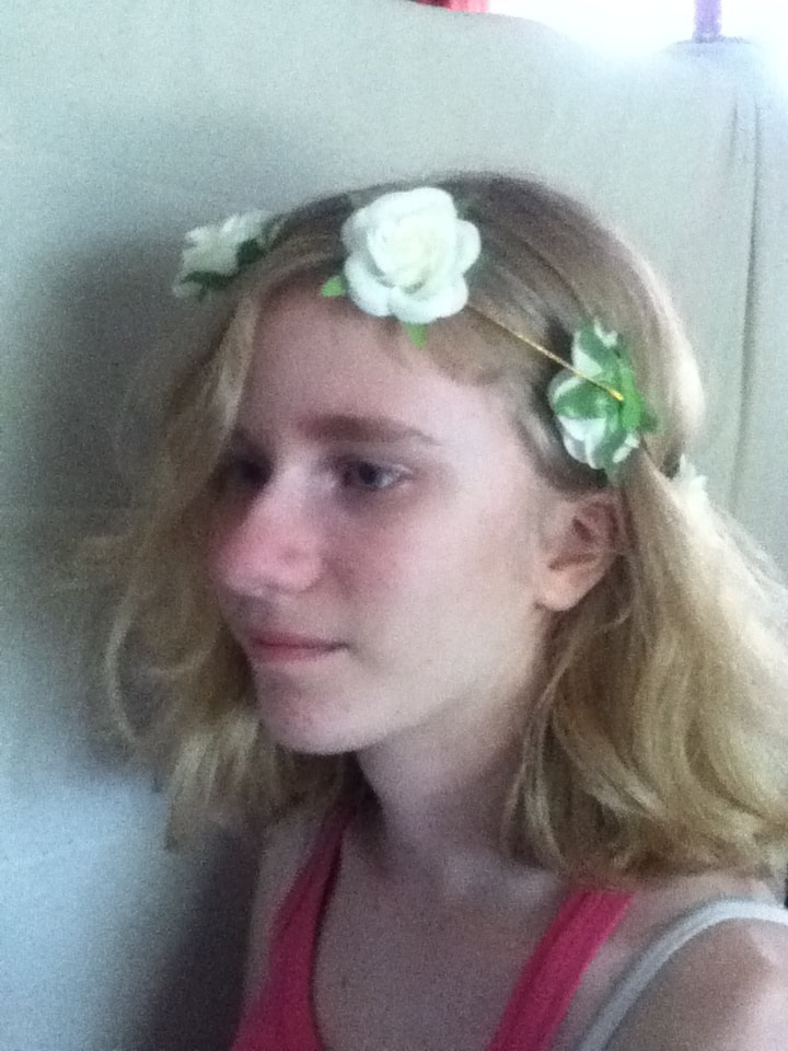
Going into this process, I already knew that I wanted to photograph my sister from the side and remove the part of her face farthest from the camera. To approximate where to begin the sectioning-of-the-face when it came time, I arranged her hair so that it parted away from the camera; I also photographed her standing in front of a window to get some natural lighting, as the extreme shadows further helped me map out where to sketch out portions of her face.
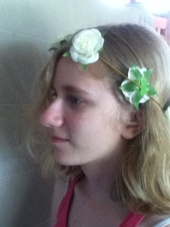
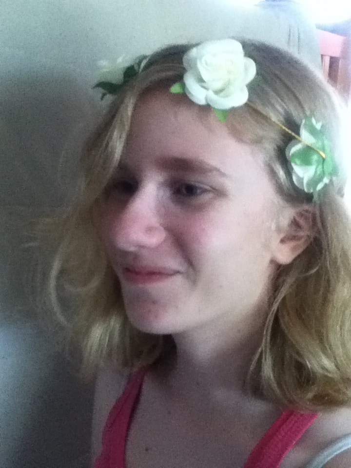
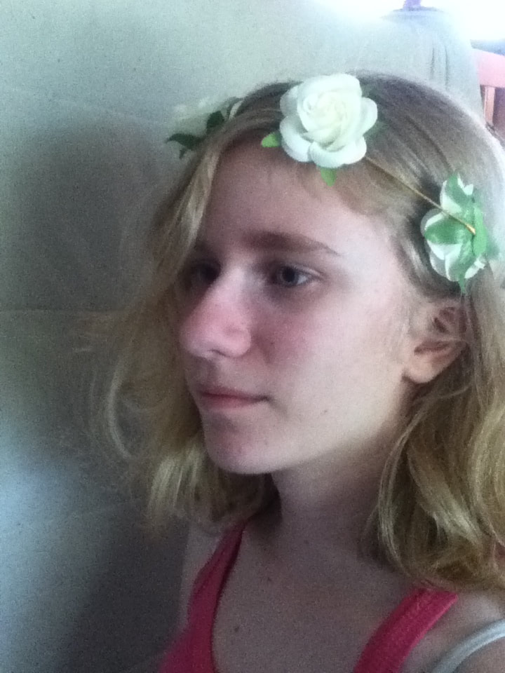
In the beginning, I took some photos of just her, only tweaking how her face was tilted and alternating between neutral and peaceful expressions. However, my sister owns a couple of flower crowns and decided to put one on when she saw that Garçon à la pipe's figure was wearing one - in the end, I decided to use this image because her facial expression seemed somewhere in between the dead-eyed look of Picasso's piece and the vaguely-bored expression of Aydoğdu's illustration. I hoped that having the flower crown incorporated into it would help diffuse the floral imagery instead of having it all concentrated in one area of her face. |
|
|
|
|
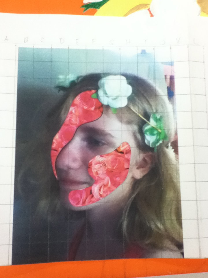
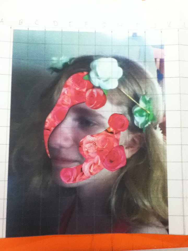
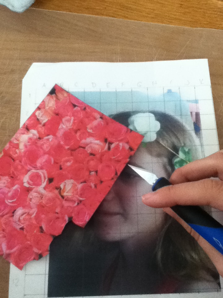
Initially, I was going to freehand flowers onto the canvas, but decided that it would be better to somehow attach roses to my reference picture so that they would be proportionate. In the end, I took an X-Acto knife and cut out the areas I intended to fill with roses. My sketch depicted one small section of the face cropped out, but I ended up carving out a second patch after seeing that the movement of my piece was weirdly placed. With the flower crown at the top, circular movement is created with two removed sections, versus diagonal movement sloping to the right with only the left side removed and the flowers at the top.
|
With the X-Acto knife, I also experimented by cutting out some individual roses from my reference image and placing them as though they're popping out from the face. I ended up not doing this for my final product for evolving reasons: firstly when I was going to do red/pink flowers because I was worried it would look like acne, then when the flowers became more simple because it looked strange, as though they were flying out of the face and not growing.
|
|
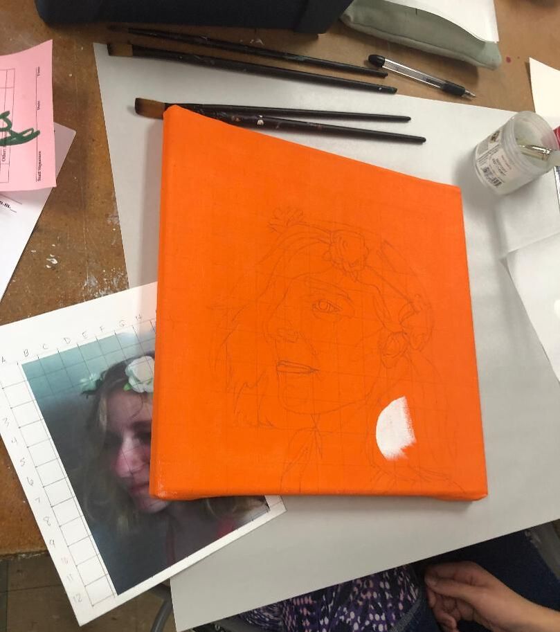
1) I began by stretching a 1 foot x 1 foot canvas and applying 3 layers of gesso to it. Once the canvas was bright white with gesso, I was able to apply 2 coats of Light Orange to the entire canvas to serve as a wash. While allowing the solid canvas time to dry, I printed out my reference image and sketched a square of 18 cm, with increments every 1.2 cm. to create a grid 12 squares long and wide. On my canvas, I sketched a grid with 1 inch increments to then transfer the image onto it. |
|
|
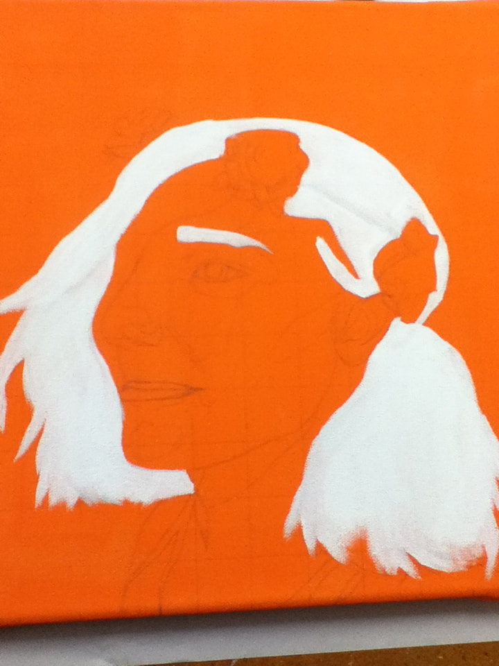
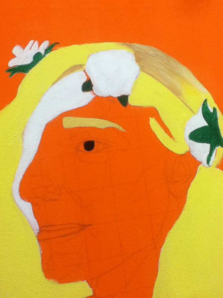
2) With a Flat 4 and 3/4" brush, I then applied pure White to the hair and eyebrows - this is because my sister has incredibly light blonde hair and applying that color against a white background would produce a brighter mix of colors. I also lightly sketched on the canvas with a pencil to mark where different sections of hair would be, along with what portion of the face I would be filling with flowers. |
|
|
3) Alternating between a Flat 4 and Flat 6 brush, I overlapped the following colors to try and achieve the right blonde:
|
|
|
4) Continuing with the colors mentioned above, I steadily tried to mimic the appearance of the hair in my reference photo, including the directions of the brushstrokes and the darker hairs caught in shadow. It was about halfway through this process when I decided to incorporate a second missing piece of face (more detail about that in Experimentation), so with my Flat 4 I painted another section with White, then went over both sections with 1 part White and 1 part Red to create a pink backdrop. This seemed an appropriate color at the time because I wanted the flowers blooming inside of her to be pink and orange (the two colors Picasso mainly used during his Rose Period), but I later discovered that applying pink/orange against it provided little contrast or emphasis to their presence. |
|
|
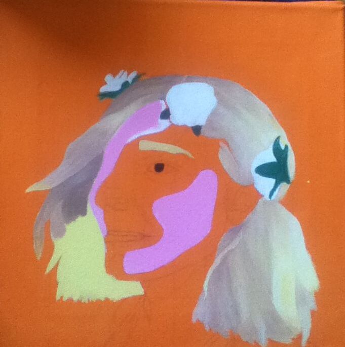
5) As long as I was applying color to the face, I decided to take a break from the hair and begin to apply color to the face. Initially, I was going to mix a base skin tone and a rosier tone because of the natural pinkness in her complexion, but I decided against the rosy color at the last minute because a paler skin tone would contrast against the colors of the background and flowers. Base skin tone: 3 parts Espresso, 6 parts White, 2 parts Yellow, and 1 part Red Transition shade: 11 parts Espresso, 5 parts White, 3.5 parts Yellow, and 1 part Red Shadows: Alternated between 1 layer of the transition shade and 1 layer of Espresso To try and blend the colors together, I first laid down solid blocks of each color as estimated from the reference image, then laid down a second layer of each color before blending adjacent edges of different colors with a dry brush. |
|
|
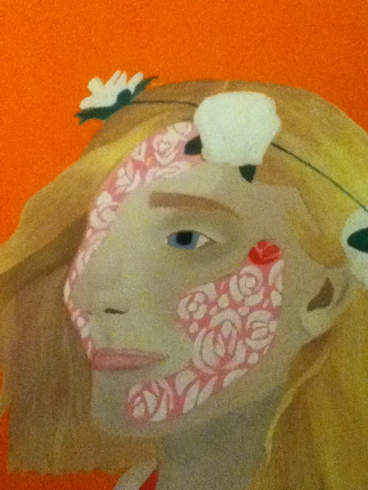
6) My sister's eyes are naturally a light blue/grey hue, but I was worried with already-pale skin and hair that her eyes would fade into her face. Instead, I mixed 2 parts White, 0.5 part Black, and 1 part Bright Blue to create an almost-lavender shade to solidly apply to her iris. To give it slightly more dimension I added another part White and patted it in the center of the iris. The pupil is was filled in with 2 layers of Black. For the lips, I mixed 1 part of the base skin tone with 1 toothpick of Red to create a light pink shade, which I then darkened around the edges by adding another toothpick amount of Red. |
|
|
7) With that Flat 6 brush, I began patting down strokes of White to the inside of the open sections, mimicking the simplistic abstract outlines seen in Picasso's piece. When those dried, I then painted Red, Orange, and 1 part Red with 2 parts White over the White sections...however, as foreshadowed in step 4, this color scheme seemed to fade into the pink wash and made many of the flowers difficult to see. |
|
|
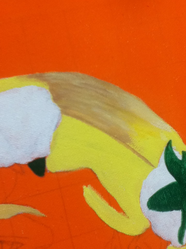
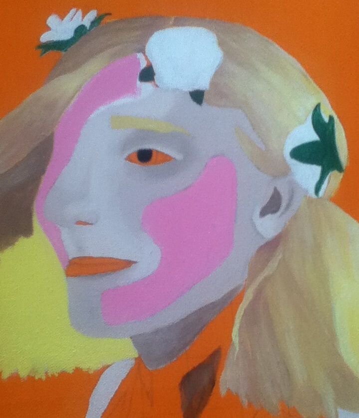
8) Instead, for the flowers inside the face, I patted Red, Royal Purple, Bright Blue, and Green onto the flowers, filling in additional space by dotting those colors with a Round 0 brush. With White and a small amount of Black, I then finished off the piece by outlining the edges of the flower crown's petals with the shadowy hue and immediately overlapping it with White to blend into the paleness of each bud. |

|
"Rose" vs. "Garçon à la pipe"Similarities:
|
"Rose" vs. "The First Day of Autumn"Similarities:
|

"Garçon à la pipe". Pablo Picasso, 1905.
|
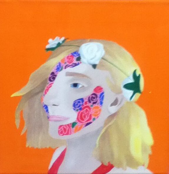
"Rose", Elizabeth Verkuilen, 2019.
|
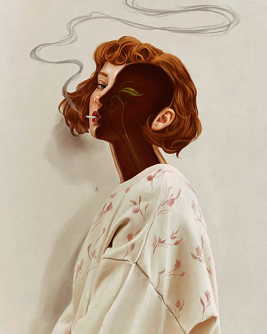
"The First Day of Autumn". Aykut Aydoğdu, 2019.
|