Reagan School Flag Project
Assigned by MIAD

|
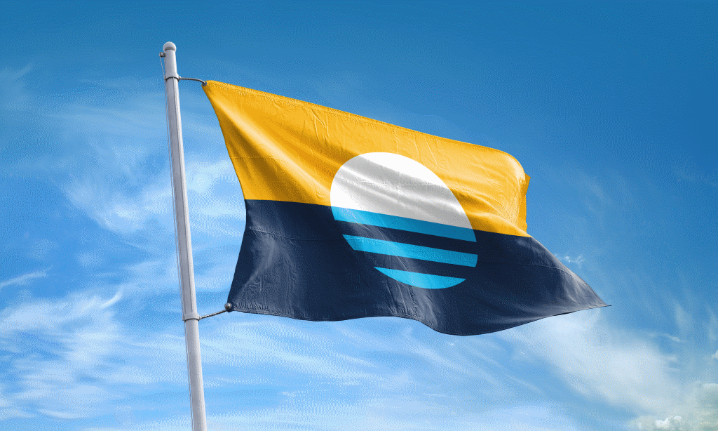
Title: "Reagan School Flag" Size: 30.48 cm. x 22.86 cm. Medium: Colored Pencil on Paper Date of Completion: April 2019 |
|
|
Title: "Reagan School Flag" Size: 30.48 cm. x 22.86 cm. Medium: Colored Pencil on Paper Date of Completion: April 2019 |
MPS Logo
|
For my flag, I wanted to represent as much of Reagan as possible, and it was with this idea in mind that I decided to focus on things that have a large impact on the way that Reagan is today and what distinguishes us from other schools. Immediately, I thought of how Reagan is a proud representation of an IB high school, which led to me looking at the International Baccalaureate program as my first inspiration. IB’s mission statements states that they “..aim to develop inquiring, knowledgeable and
|

IB Logo
|

Flag of Milwaukee
|

Husky Lunch Song insignia displaying Reagan's school colors.
|
|
Black
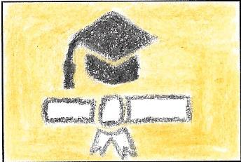
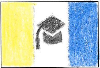
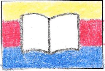
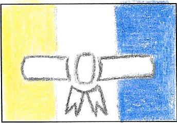
Graduation cap, diploma, book, and quill
|

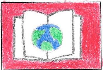
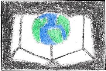
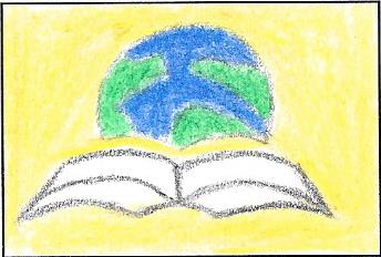
1) Of all of the designs I created on the flags, the symbol of the earth rising over an open book was most interesting to the professor - she said that it was very distinct and was a great symbol to represent our school, diversity, and global education. However, she wasn't entirely thrilled about the blank background and suggested placing this design against one of the 3 recurring backgrounds in all of my practice sketches.
|
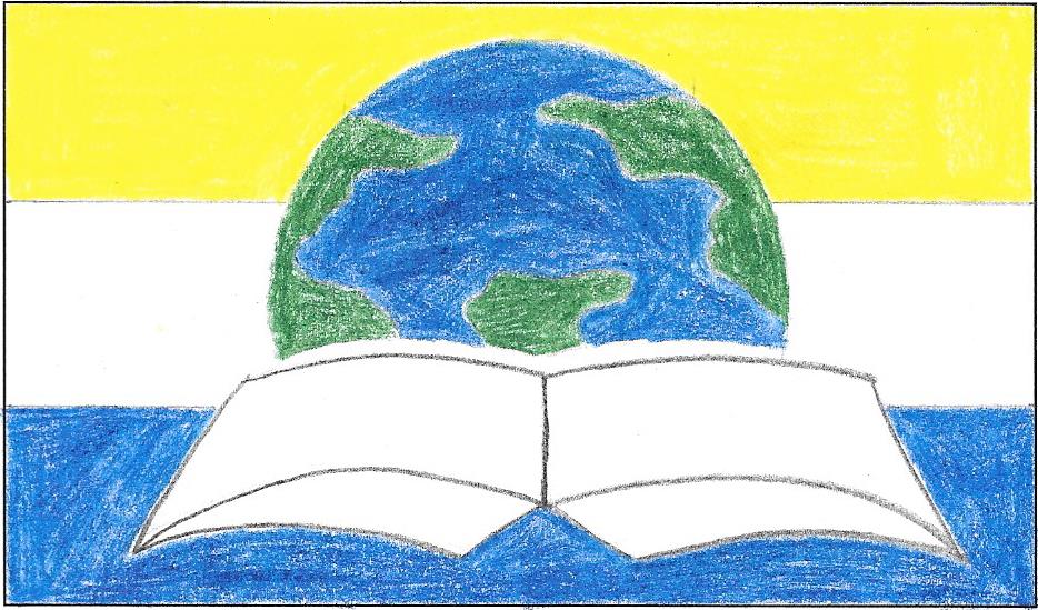
2) The MIAD professor was impressed when I explained the significance of the number, color, and order of the horizontal stripes, along with the fact that they're horizontal because I was a little inspired by the Milwaukee flag. By placing the globe/book symbol over the 3 stripes that represent MPS, Reagan, and IB as one, the flag could pack a powerful message about our school's current state and origins.
|
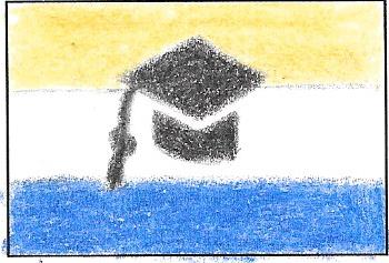
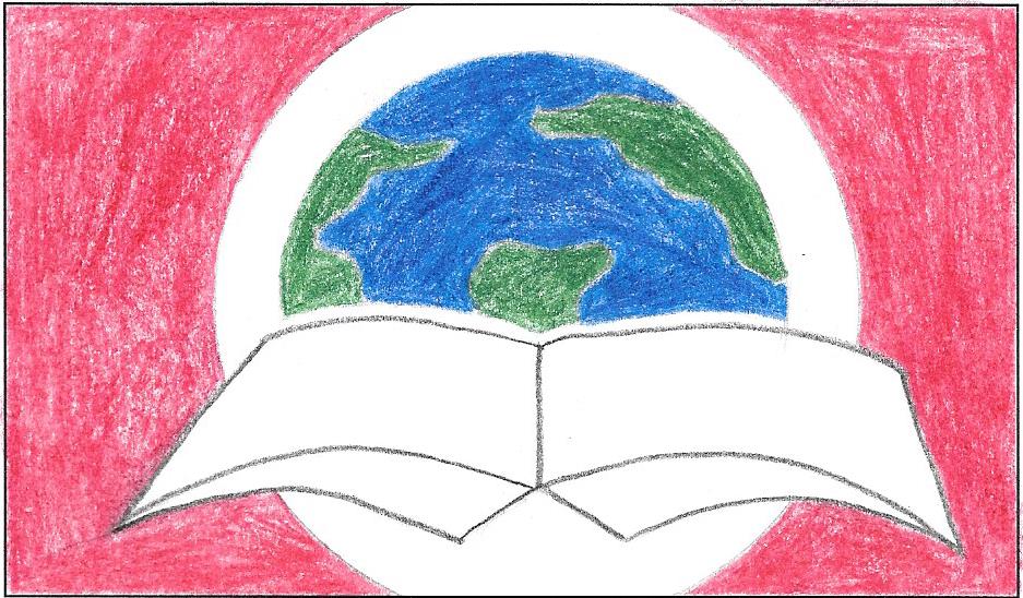
3) However, many other students had used a similar color scheme of blues and whites because of Reagan and IB, and so she suggested also placing the globe/book symbol inside of the red/white background in a few of my sketches. Encasing a symbol of diverse education inside of the circle that emphasizes said diversity, all on the red to symbolize our ambition and passion for learning, could pack a powerful punch.
|
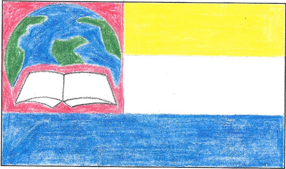
4) Lastly, it was suggested to me to try and place the globe/book symbol inside of the canton of the flag - this way, I could still incorporate the meaning behind the three stripes, but see whether the flag would look cleaner with the symbol in the center or the canton.
|
|
This flag merges the symbol of the globe and the book against the background of a white circle with red elsewhere. As mentioned before, this blends together the ideas of diversity, education, and the passion/determination behind it all here at Reagan. |
|
This flag merges the symbol of the globe and book against the three stripes that represent MPS, IB, and Reagan as a whole. When presented like this, I think there's a stronger sense of community, along with pride for Reagan's origin because of the significance of the stripes' order. |
|
This flag is similar to the previous one, only that there is a visible red canton with the globe/book enclosed in it. Though my practice sketch that I based this off of had a black canton, I thought that the red looked more pleasing to the eye and also allowed me to blend the ideas of ambition, diversity, and the origin/background of Reagan all in one. |
|
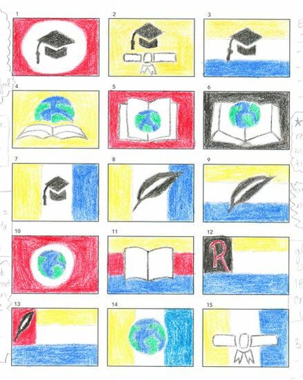
In my opinion, the graduation cap was the most simplistic of all of the symbols I considered due to its geometric shape.
|
Combining the world with a book seemed, to me, an easy way to represent the IB education that Reagan is so proud of.
|
|
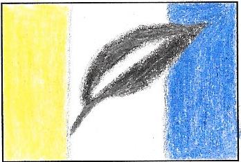
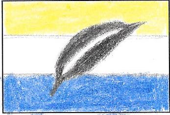
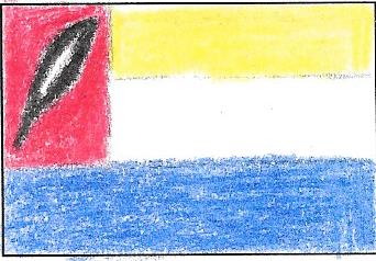
The quill is another symbol of education and, against a striped background, conveyed a lot of the same ideas as the graduation cap; it can also be tied to the Knowledgeable learner profile trait and Reagan's professional students. However, like the graduation cap, the quill didn't seem to be specific enough towards Reagan except for the stripes, but using simply stripes for the flag is a risky move because that's a common tactic of many countries (don't want to accidently copy).
|
Miscellaneous flags:
|
|
|
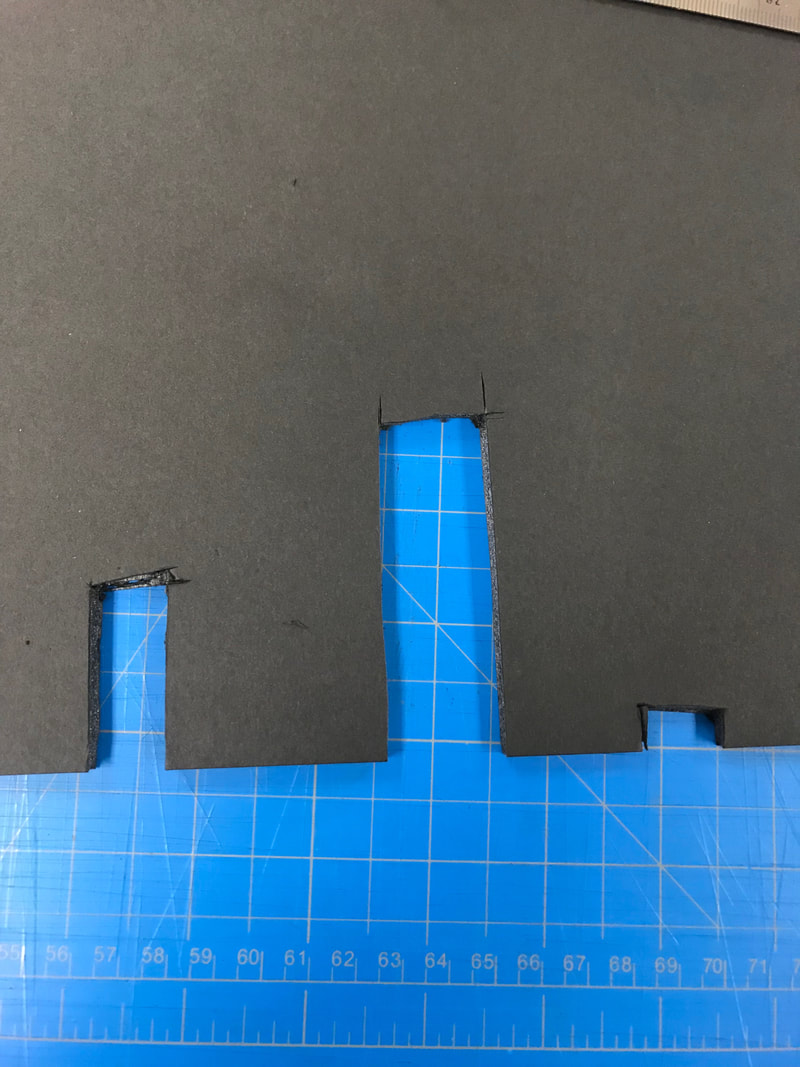
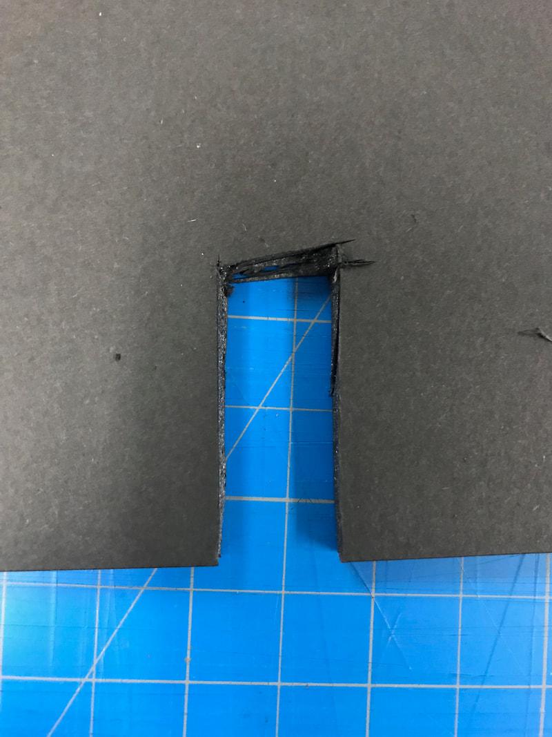
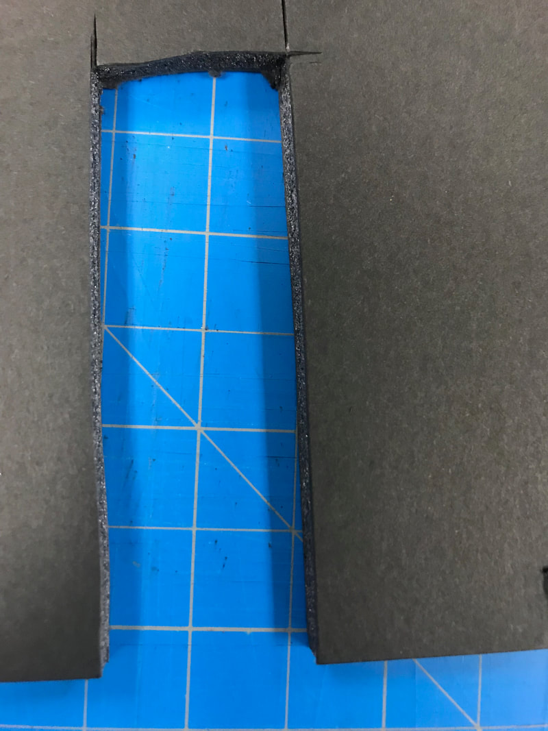
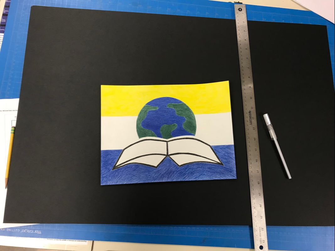
Before cutting the foam for mounting my flag, I practiced on some miscellaneous foam with my X-Acto knife and alternating between a T-Square and cork-backed ruler. Because foam has a tendency to rip/fray, the first cut had to go all the way through and be straight and clean. After experimenting with varying amounts of pressure and whether a T-Square or cork-backed ruler provided the straightest line with an X-Acto knife, I discovered that the T-Square helped me stay on track the most by applying a generous amount of pressure.
|
|
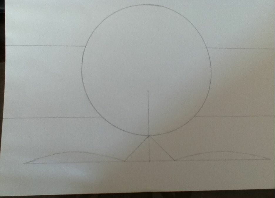
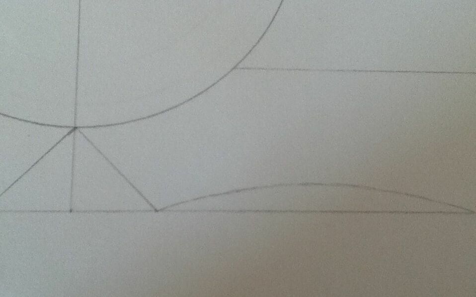
1) I began by drawing a 4-inch- wide circle with a circle tool and a mechanical pencil to get as thin of a line as possible. This allowed many of my lines to be much lighter than that of a soft-tipped pencil, while made erasing/covering it with pencil a lot easier at the end. As the width of the drawing paper was 9 inches, I was able to mark each side at 3 inch intervals, then connected parallel marks to create the three straight stripes (making sure to not intersect the circle in the center). |
|
|
2) With my ruler, I drew a straight line that began under the center of the circle and extended past the circle's end. This was my rough place for the placement of the book spine, and as most of it was to be erased, I didn't take any specific measurements.
To plan for the pages of the book, I drew a straight horizontal line about 1 1/2 inches below the circle with 1 inch of space between its ends and the end of the paper. I marked off 1 inch on both sides of this center line; by connecting these notches diagonally to the bottom of the circle, I was able to create (roughly) even bends in the book spine. From the bottom of the "bend" to the end of the line, I carefully freehanded the bottom of the pages of the book. |
|
|
3) Once the bottom of the pages was freehanded, I drew a diagonal line on each end upwards to form the sides of the book, then freehanded the curves that join them to the spine. Because my written critique urged me to make the book's outline more bold, I freehanded a border that separated and defined the book's shape/pages.
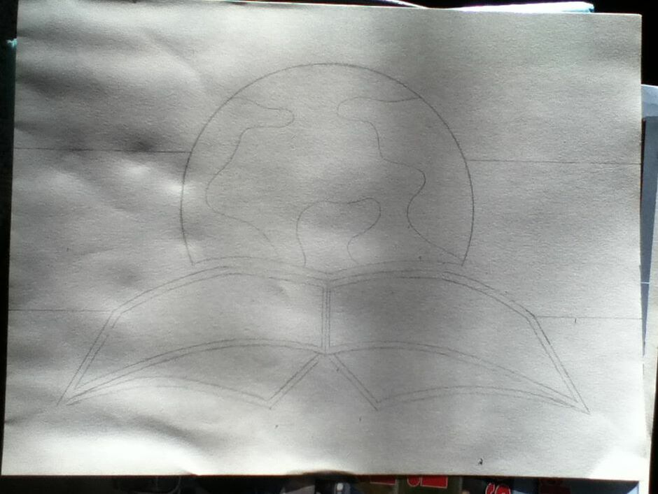
I then erased all of the placement markings for the book, along with the portion of the circle that overlapped the book. Afterwards, with reference to my practice sketches, I drew large, cartoon-y continents to create the globe. Originally, I was going to be more precise with the continents' shapes, but all of my inspirations were quite simple and I felt that any excess detail would stray away from the image of a flag/logo. |
|
|
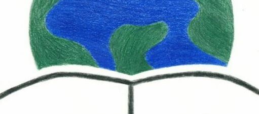
4) Taking the color Black, I colored in the border of the book as cleanly as I could, making sure to sharpen the pencil when it got dull to avoid any fuzzy edges. With Grass Green and Dark Blue, I colored in the land and sea portions of the globe; this process was identical to the process of applying Black, except that the blue and green are lighter than the Black and their pencil marks were more likely to show. To try and avoid this, I used large, overlapping pencil strokes to try and give the globe as smooth of a texture as possible.
|
|
|
5) At this point, the Dark Blue pencil was getting too small to sharpen, so I switched my focus to the top stripe and colored it in solidly with Yellow. I tried to be as neat with this area as I was with the globe, but the size of the paper frustrated me and strayed from uniform strokes into desperate scribbles. Luckily, this particular shade is quite bright, and so the scribbles are extremely obvious. I then tracked down another Dark Blue pencil and tried to have a more unified stroke pattern, which sort of worked...the shape of the book made it difficult to overlap as freely as I did in the globe, but I filled in the bottom stripe as smoothly and quickly as I could. |

|
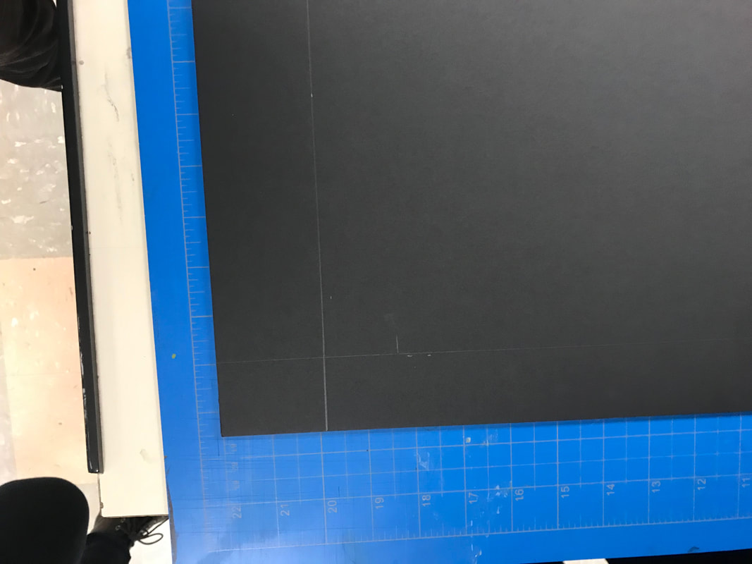
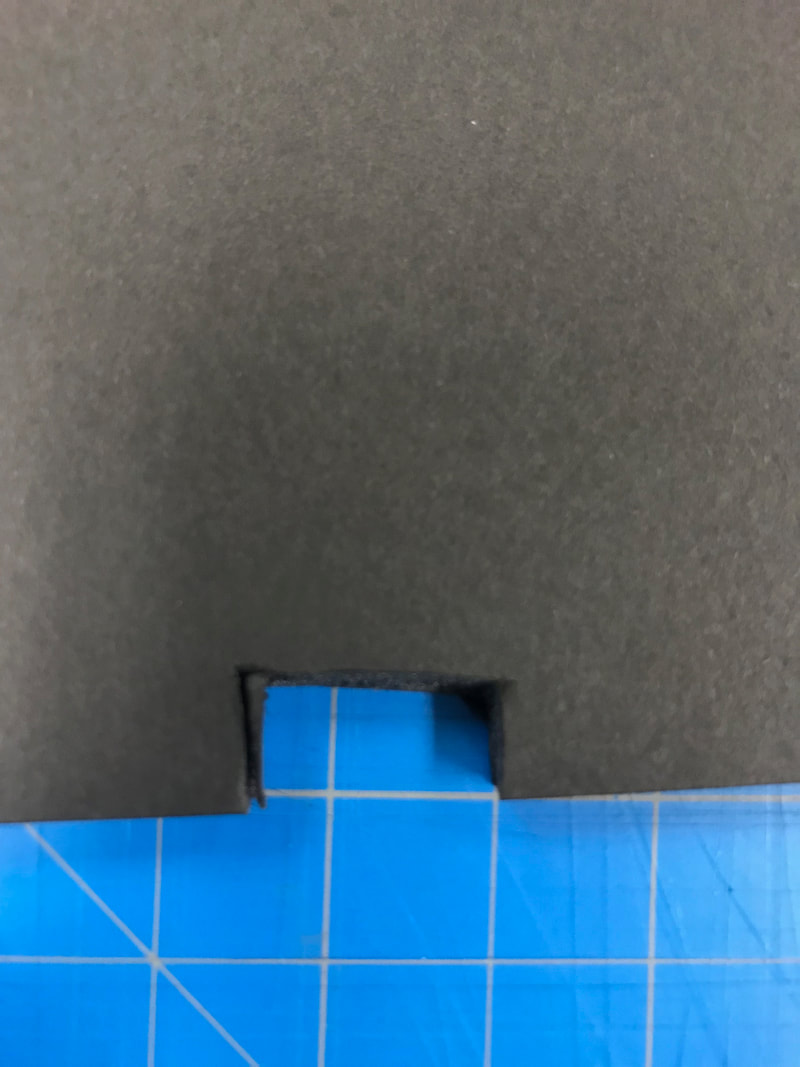
Marking off sections to cut off
|
6) Once the flag was complete, I cut a foam board according to specifications provided by MIAD with an X-Acto knife and cork-backed metal ruler, making sure to also mark the middle of the board for the flag's positioning. I then secured the flag to the board with spray adhesive. |
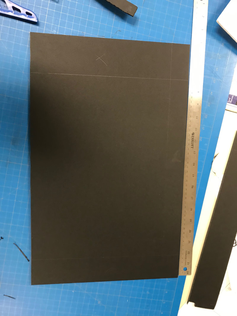
Trimming the board
|

"Reagan School Flag", Elizabeth Verkuilen, 2019.
|
|
"Reagan School Flag" vs. IB LogoSimilarities:

IB logo
|
|