Third Summer Project: Mixed Media
|
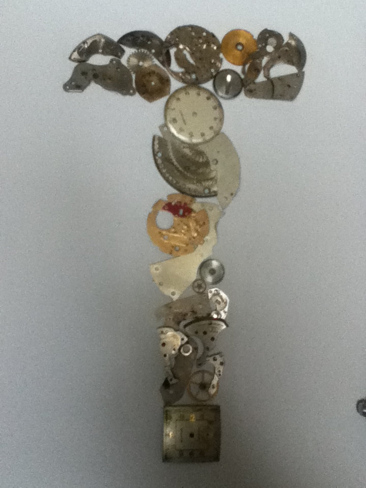
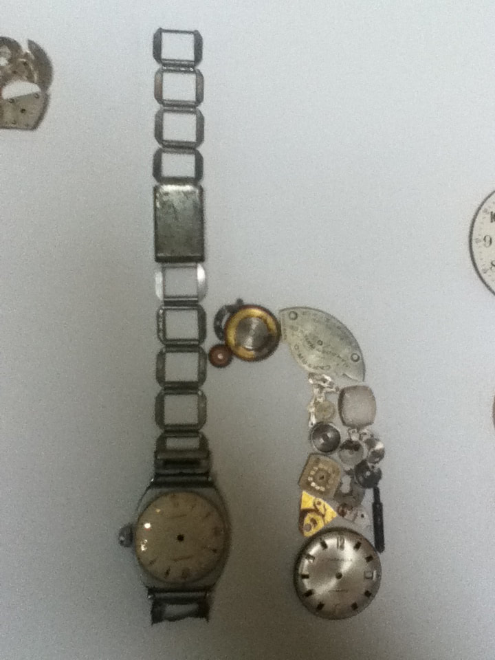
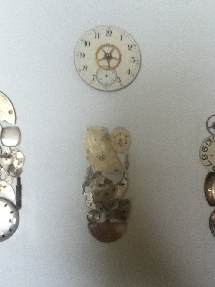
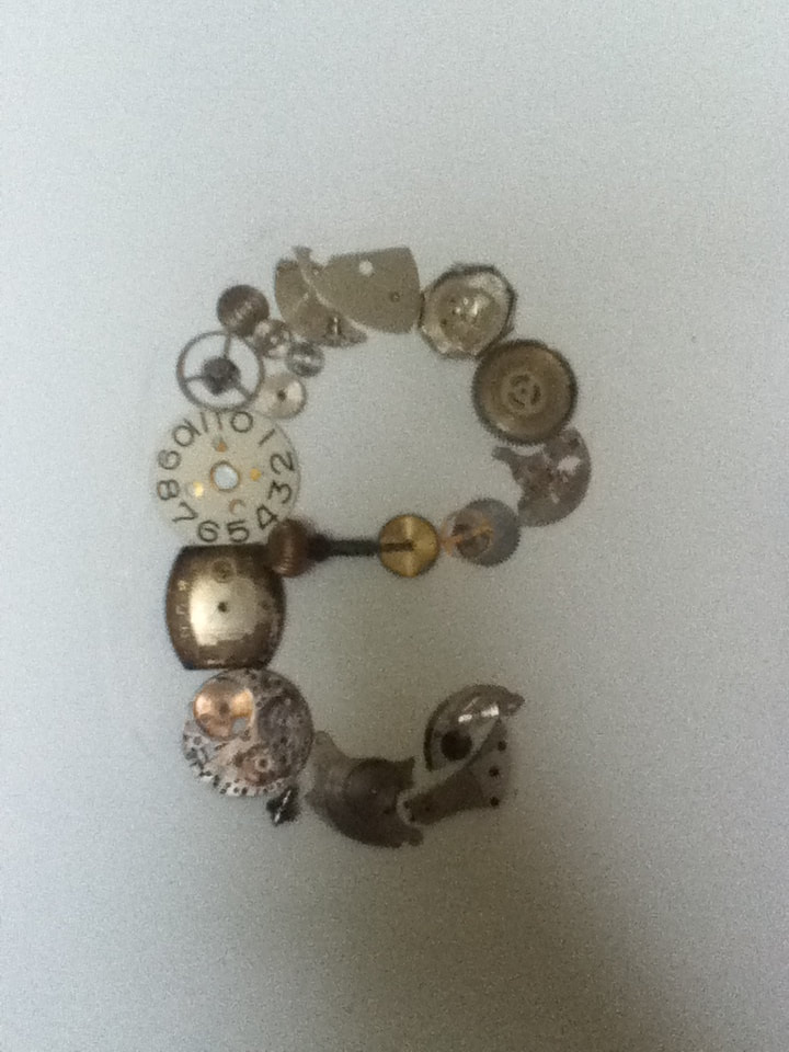
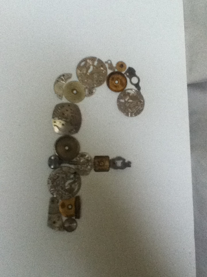
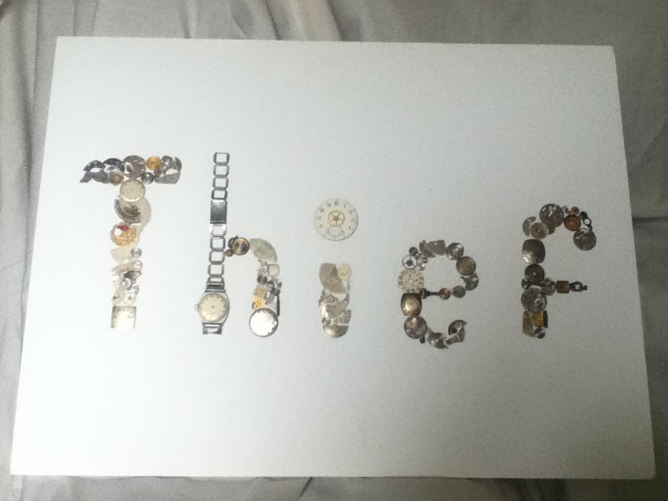
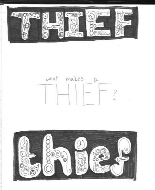
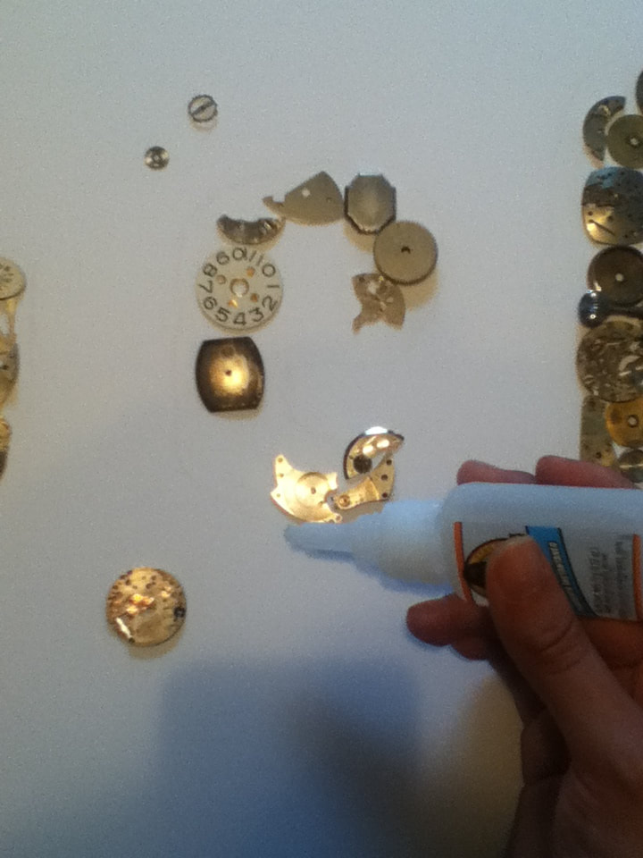
Title: "Thief" Size: 60.96 cm. x 30.48 cm. Medium: Mixed Media Completion: August 2019 |
|
|
Title: "Thief" Size: 60.96 cm. x 30.48 cm. Medium: Mixed Media Completion: August 2019 |
"Somethings Last a Long Time", Marc Cruz, 2018.

Untitled Piece from the "Things Come Apart" series by Todd McLellan, 2013.
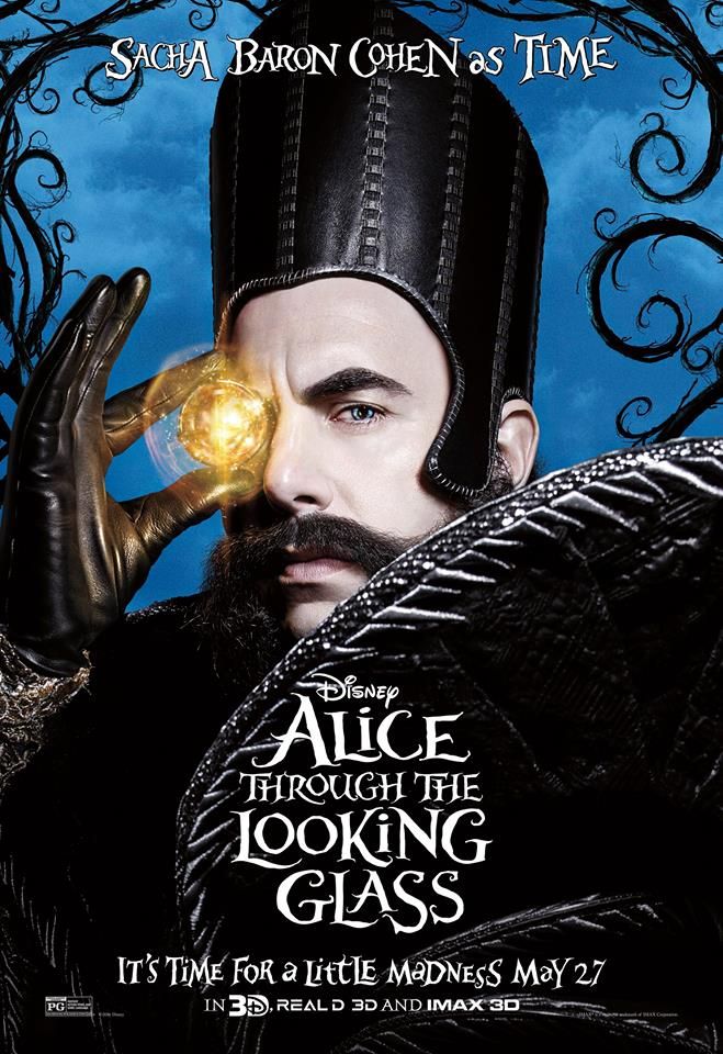
One of the promotional posters for Alice: Through the Looking Glass displaying Time as the main antagonist.
|
Inspiration While my first summer project focused on a happy theme/inspiration, I wanted to balance it out with a piece that was still personal, yet focused on experiences that weren’t as great. The best way to preface this is that this project stems from some personal artefacts of mine: an assortment of watch parts retrieved from my grandfather’s workshop after he passed away. His death marked the beginning of the roughest period of my life that is the root of present anxieties, unhealthy personality traits, and scars of all sorts that I’m not proud of. It was incredibly easy to place the blame of his passing and my reaction on anything, with me ruing the day when time would snatch more loved ones away from me until it was as though I was the last person left. Now that I have educated myself on loss and how to cope with it in a healthy way, though, my mindset on passing has flipped, and I have gotten better with other passings following his. Because clocks are a recognizable visual representation of time, I thought it would be cool and help to heal to channel these feelings into a piece about loss, dealing with it, and the feelings towards time that almost destroyed me. Using these parts pointed me in the direction of creating a mixed media piece, which is a medium that I struggled with junior year. During a summer art internship, I worked with UWM student Marc Cruz, who mentioned to me that he too had been inspired by watch parts and created a project with them. He also discussed the artist Todd McLellan as his primary inspiration, and it was when I visited McLellan’s website that I discovered his series titled “Things Come Apart”. McLellan is a photographer who is fascinated by how things work and their inner mechanisms - in this series of his, he dismantles many types of technology and photographs them either laid out or appearing as though they are bursting apart to allow his viewers to appreciate ordinary objects in a higher manner. With this series as inspiration for my art, I hoped to have the same creative mindset as McLellan and be able to arrange the watch parts in a way that allows anyone viewing my piece to regard them in a manner different than they would if the watch was whole. I later used some quotes from “Alice: Through the Looking Glass” as inspiration for my imagery, as the movie plot relates similarly to my experience with time. In the movie, Alice travels back to Wonderland and butts heads with the personification of Time in order to save the Mad Hatter, disregarding the effect it may have as her and many others view him as nothing more than a thief. However, at the end of the movie, they find solace in Time’s inevitability and his role in our lives, allowing both the movie and my art piece to reach their resolutions. |
|
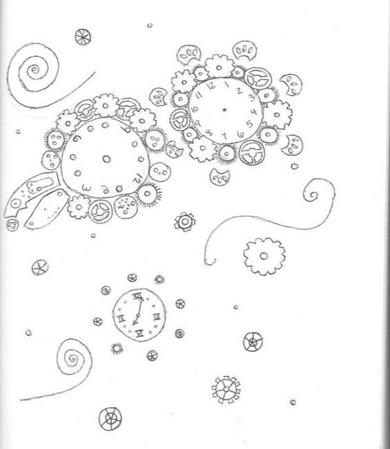
To try and evenly connect to all 3 of my inspirations, I thought it would be appropriate to create a image with the parts that relate to a quote from "Alice". After some consideration, I thought to use one of the quotes from the end of the movie, when Alice is saying goodbye to the Mad Hatter as she is leaving Wonderland. In the scene, it's remarked that we can forever be with someone by dreaming about them - while it may not be the real thing, it's still a wonderful way to hold off from saying the final goodbye. In particular, this state of dreaming is mentioned to take place "in the garden of memory"...as memory can either fade or be upheld through time, I decided to try and represent this mythical garden through watch parts in
|
Above: the approximate clip that contains the quote that partly inspired my imagery.
"In the garden of memory, in the palace of dreams, that is where you and I shall meet" |
^ my sketch scanned in 2 separate images, not sure why
|
As many of the watch parts I received were rusty/dusty/somewhat shabby-looking (note to self: gears stored in a basement for at least a decade will be dirty in some way), I realized that it might be easier to convey a more negative message that could be emphasized with how the grungy the parts are. This reminded me of how, at the beginning of her tangle with Time, Alice views him as a thief that steals away their lives and loved ones. Since this also connected to my personal meaning, I sketched a mask made up of watch parts to represent time's thievery. However, after sketching this, I realized that this image may be confusing - after all, masks such as these are more so worn by thieves in cartoons/old movies and are currently recognized more as a staple of a superhero's costume.
|
|
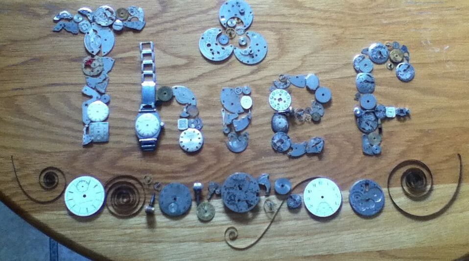
After the second sketch, I was riding a high of conveying time as a thief, but was stumped as to what symbol/image I could create to represent time as a thief. However, people may have different opinions of what makes a "thief"...out of frustration, I phrased this as a question in the middle of a blank page, hoping that seeing the visual words would inspire something. Seeing THIEF so large against the white background did end up sparking something, though it strayed from my inspirations a tad - against the white background, my eyes immediately went to the THIEF and thought that spelling the word blatantly with watch parts would display the message well without any misunderstandings. From this, I sketched upper and lowercase letters to spell "Thief", eventually experimenting to see which spelling would work best with the parts that I had. |
|
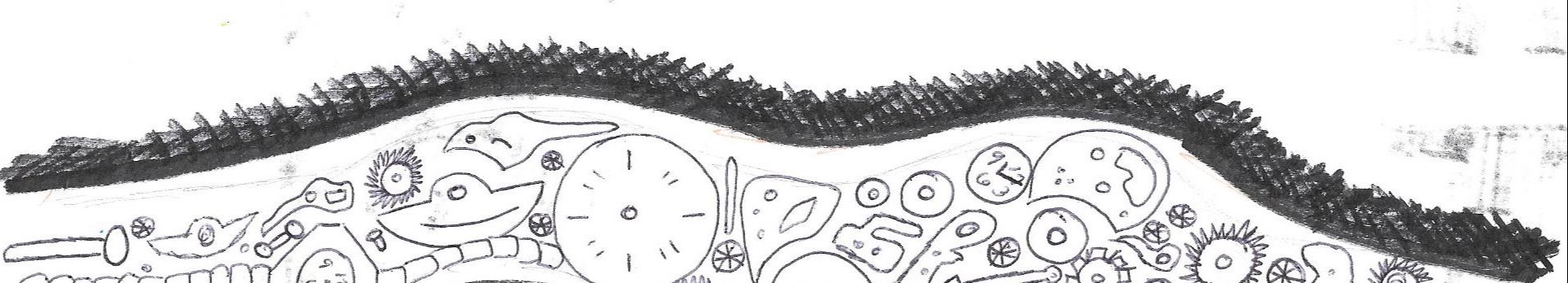
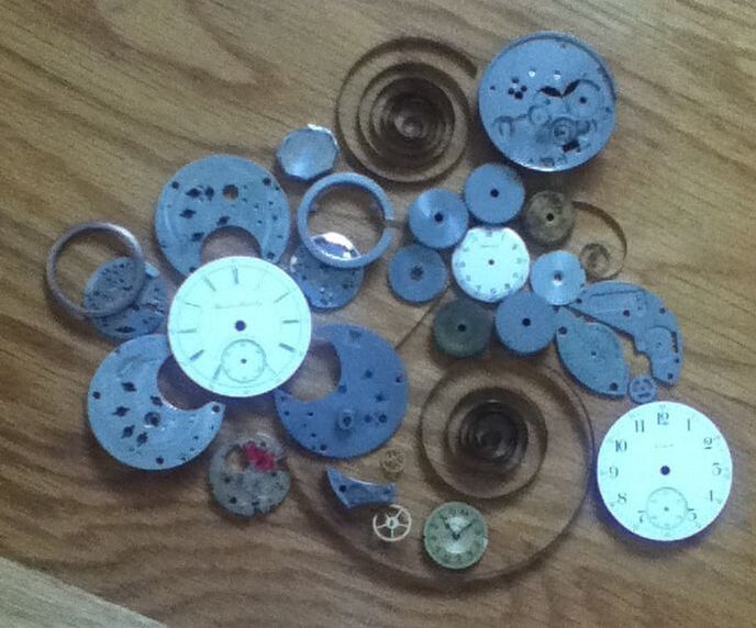
Initially, I was going to base my finished project around my first sketch because I liked how it was more of a positive opinion of time. Before anything was to be glued down, I wanted to experiment with the watch parts that I had to see if I could successfully make floral designs. In theory, it seemed like it would be easy to surround a large circle with a bunch of smaller circles to create a "bud" surrounded by "petals", but the result on my kitchen table looked like it lacked the intricacy of McLellan's works while also strange to have so much space in between each "flower".
To try and save it, I filled the spaces between each "flower" with miscellaneous watch parts (perhaps to make leaves? A bush?). While this looks more unified than widely-spaced flowers, the floral patterns were lost against the rest of the gears, making it nothing more than a jumble of parts haphazardly arranged. |
|
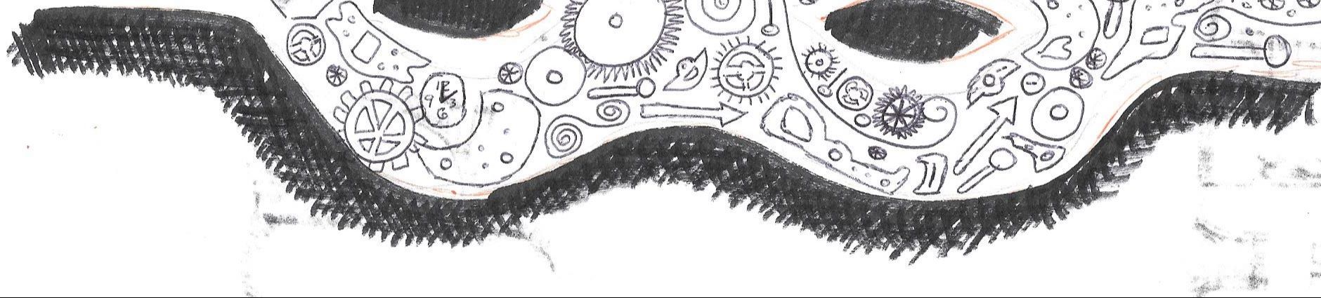
After experimenting with the flower sketch, I realized I would have to create a more defined and possibly geometric shape with the watch parts to make them distinguishable as a whole image. With this idea, I decided it would be best to go through with the "Thief" sketch - forming letters with the parts would be much more distinguishable and draw attention to the piece, while the idea of the burglar mask might risk being unrecognizable like the flowers.
Whilst mussing with the parts to see which letters would work best, I experimented with the idea of having a large "bloom" |
|
|
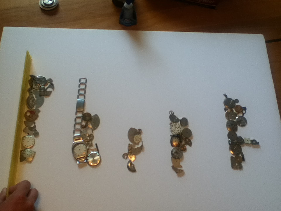
1) Before any assembly could begin, I organized the large array of watch parts just to give me an idea of what sizes/shapes I had on hand. This gave me an estimation as to what specific shapes I could use to spell out "Thief". Once I organized the parts by shape, I then split them into further categories by size - larger parts would be used as the foundation of each letter, with the empty space around them then filled in with smaller parts. |
|
|
2) I purchased a 12" x 24" solid foam board to attach the watch parts to. It was important for it to be a type of foam that did not bend - as I learned from the mixed media project we did in collaboration with UWM, attached metal to bendy foam can result in the parts popping off (no matter how strong the glue is). I knew that this board would be sturdy enough because when I held one of the shorter ends with only one end, the board stayed rigid. |
|
|
3) Using my Experimentation pictures as reference, I laid out "Thief" with approximately the same watch parts as seen in the images. Once the letters were laid out, I took a straight ruler and began to push the parts so that their left sides were parallel to the left edge of the board. While this did break the letters in the process and required reassembly afterwards, in that moment it was the best way that I could have spaced the word in the middle of the board while still being straight in some way. |
|
|
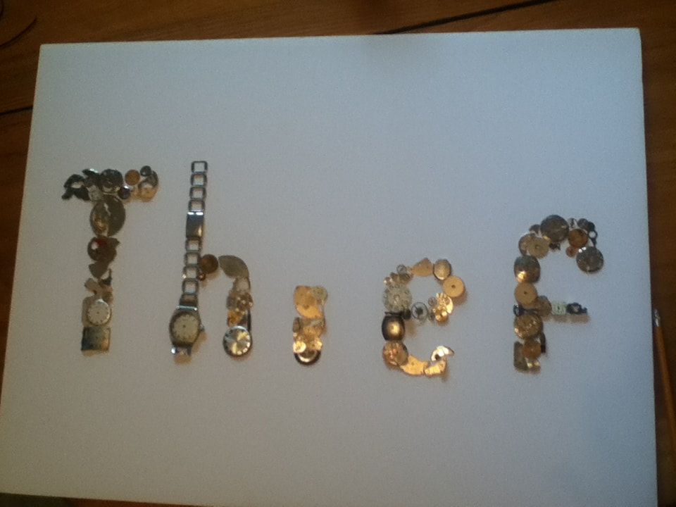
4) After reassembling the image, I traced a generous perimeter around each letter. Because I knew that I would have to take some parts off of the board during the gluing process, sketching the placement of each letter ensured that the pieces would be glued in the shape I wanted. |
|
|
5) With a bottle of super glue, I then started to secure one piece at a time to the board. Because I'm right-handed, I secured "Thief" from right to left; this helped prevent any pieces that weren't secured yet to be moved during the gluing process (i.e. If I glued down the "e" before the "f", my elbow could possibly jostle the loose "f" parts and move everything out of place). Because I already had sketched out the outline of each letter, I removed the small watch parts from each letter so that the large "foundation" was left. I then secured the larger parts in place with a small amount of super glue, then glued the small parts in crevices to make the letters appear more solid. |
|
|
|
6) Once all of the pieces that I laid out were glued down, I finished the piece by gluing down some last-minute parts, whether to the board directly or overlapping other parts. This was in an attempt to achieve the intricacy of McLellan's work. |
|
"Somethings Last a Long Time" vs. "Thief"Similarities:
|
"Things Come Apart" vs. "Thief"Similarities:
|

"Somethings Last a Long Time", Marc Cruz, 2018.
|
"Thief", Elizabeth Verkuilen, 2019.
|
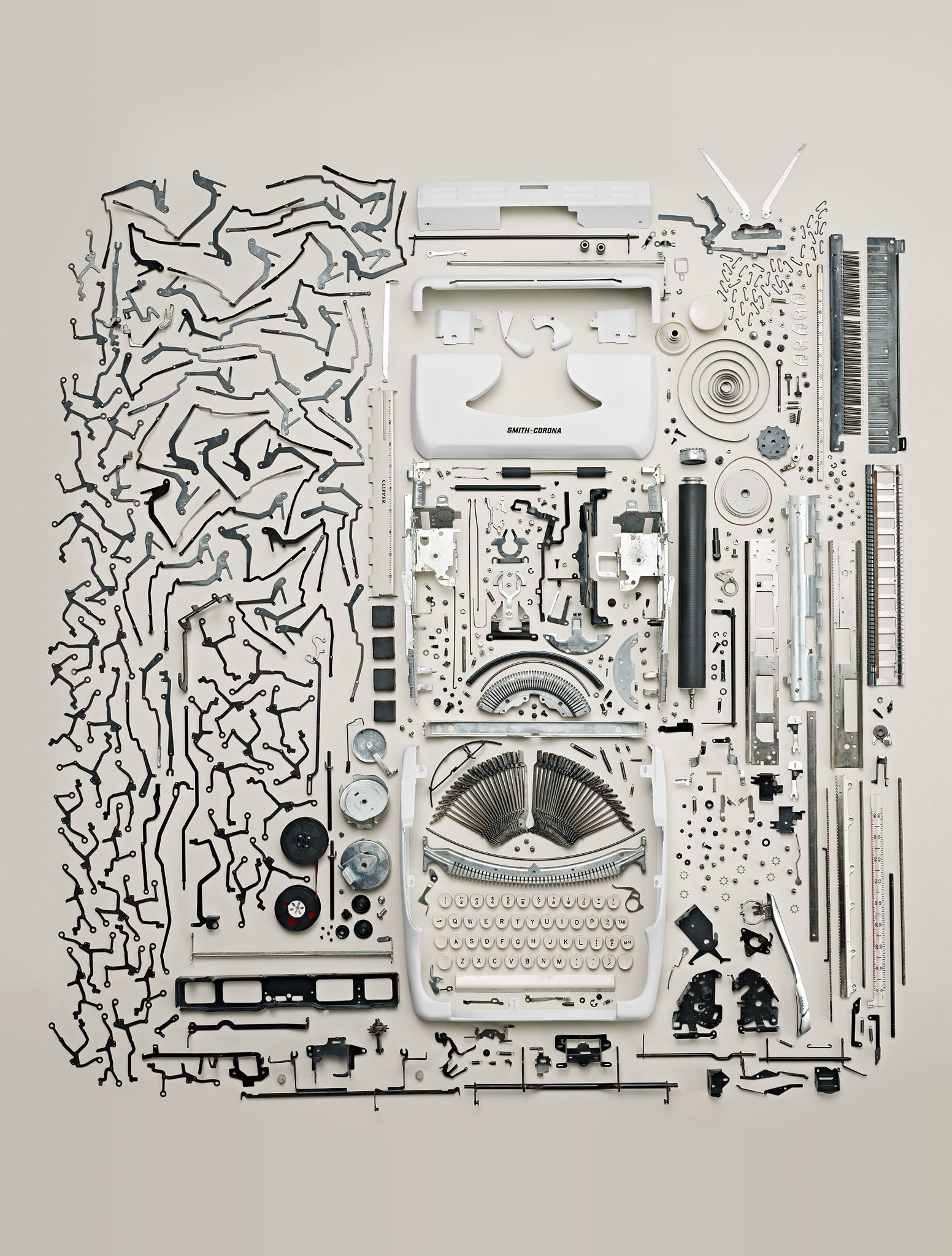
Untitled Piece from the "Things Come Apart" series by Todd McLellan, 2013.
|