"Familial Hues" Fourth Panel

|
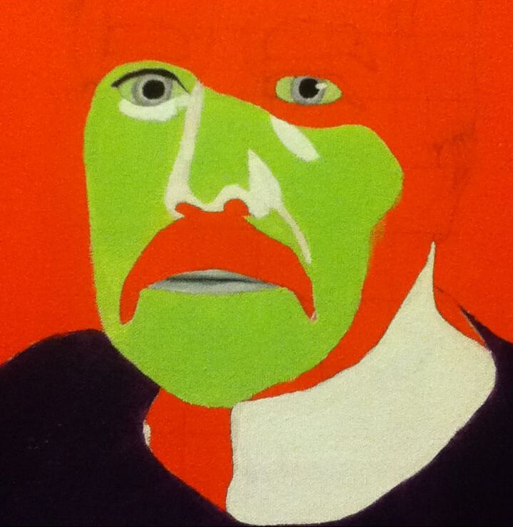
Title: "Cubed" Size: 30.48 cm. x 30.48 cm. Medium: Acrylic on canvas Completion: December 2019 |
|
|
Title: "Cubed" Size: 30.48 cm. x 30.48 cm. Medium: Acrylic on canvas Completion: December 2019 |
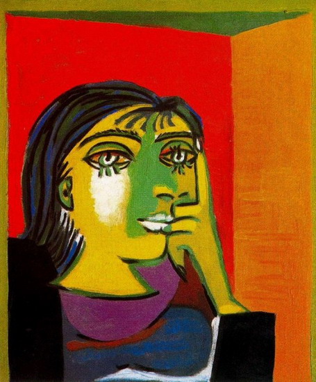
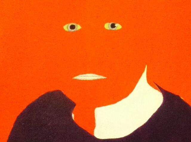
"Dora Maar". Pablo Picasso, 1937.

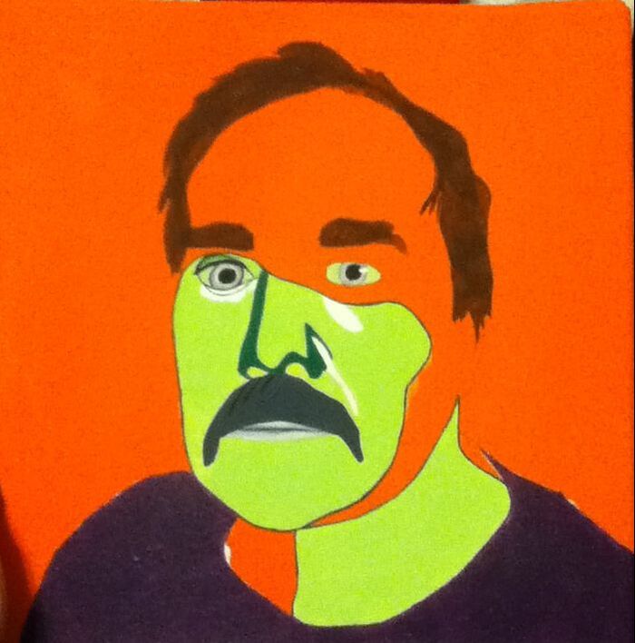
"The First Day of Autumn", Aykut Aydoğdu, 2019.
|
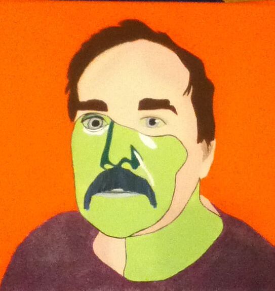
For each portrait in Familial Hues, I first had to decide which of Picasso’s artistic periods thematically represented each family member most accurately in my opinion. I had already used the Blue Period as inspiration for my self-portrait, the Rose Period for my sister’s portrait, and the Classicist period for my mother’s portrait. From my Picasso research, I knew that I had three periods left to choose from: the African-Influenced Period, Surrealism and Cubism. I knew from the start that, as my family and I are white, it would be risky to use the African-influenced Period as inspiration; the African-influenced Period is also an art period of Picasso’s that has little thematic inspiration and is mainly visual. I knew that I wanted whichever period I’d connect to my dad’s piece to be thematic in a way that could then connect to some trait of his. Between Surrealism and Cubism, I decided in favor of Cubism because of the heavy amounts of bright, abstract imagery to create pieces that were intricate in their simplicity. I take after my father in that we’re both reserved in certain situations but let our true colors shine in scenarios that we’re incredibly comfortable in. I wanted to tackle this idea of suppressing one’s personality in certain situations specifically in my dad’s portrait because he outwardly tends to seem like an extroverted person and I wanted to explore a side of him I feel only a few people actually see. I was specifically drawn to the piece Dora Maar by Picasso because of its depiction of a specific person using bright, contrasting colors in solid areas. I hoped that using these colors somewhere in my piece would represent the outgoing personality of my dad, especially because he tends to act someone childish from time-to-time and such neon colors remind me of childhood (crayons, bright clothing, etc.).
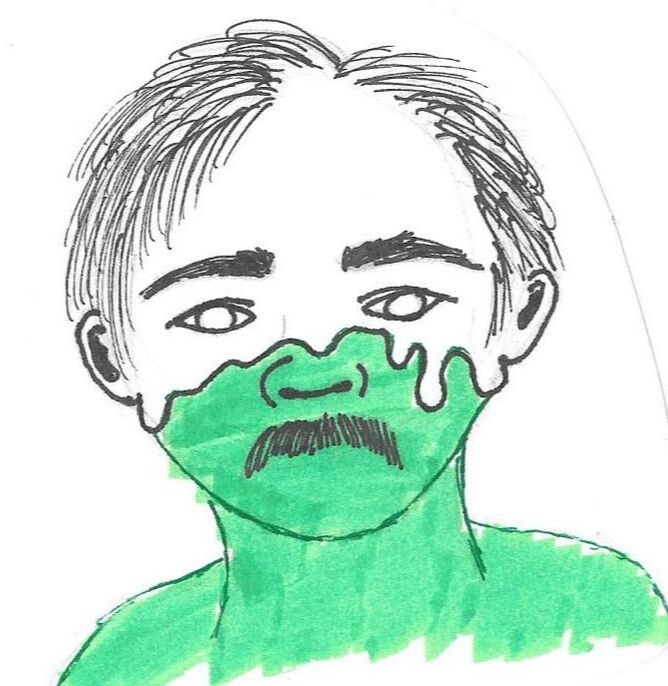
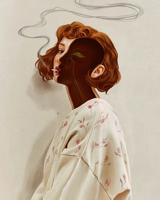
To incorporate a more “modern” twist on such an old artistic inspiration, I decided to use one of my favorite illustrators, Aykut Aydoğdu, as my other artistic inspiration. Aydoğdu is a Turkish commercial illustrator who is best known for surrealist digital illustrations that are meant to focus on the daily dilemmas of life. Combining Aydoğdu with Picasso was a good thematic match for this piece because both take inspiration from real life scenarios, whether specific to the artist or blatantly relatable to most of the audience - the theme of concealing one’s personality out of self consciousness and specifically connecting it to my dad seemed like an adequate match. I was particularly drawn to his illustration titled The First Day of Autumn because it both literally and symbolically shows someone’s inward self. I hoped that I could take this idea of opening someone up (once again, literally and symbolically) and apply it to my piece, with some portions of his portrait incorporating Cubist elements and the rest conveying what I believe is his “true” self. |
For my first sketch, I mimicked the pose in Autumn, with a tilted figure whose side closest to the viewer is open to reveal what's beneath. I usually like to start off any project with a sketch as close to my two inspirations as possible to see how the two ideas work together, yet for much of the time I never use it in fear of plagiarism - hence why I did not use this sketch for my final piece. However, it did allow me to start to visualize how the two differentiating parts could be combined together; for example, I was able to estimate just how much of each area would contain facial features (i.e. this sketch has an eye and half of the nose) to then begin to plan which specific features may have to be simplified.
|
The second sketch I completed strayed from my Aydoğdu inspiration with how the two sections were divided from each other. Instead of showing an open portion of the face displaying the Cubist self underneath, this sketch showcases more Cubism than realism with the "real" part, as the realistic face portion melts away to showcase the underneath. Though I think that, visually, this is a really cool idea, I feared it strayed too far from my inspiration and would be tricky to connect back to it. I also felt like showcasing the "real" portion as such an obvious outer layer might be misinterpreted as an idea revolving around hiding or wearing a mask. I wanted both sides of my dad to be conveyed on an even ground, to show that he isn't necessarily hiding himself from the world, but that there are times when he'll try to hide his true colors, even though they naturally come through.
|
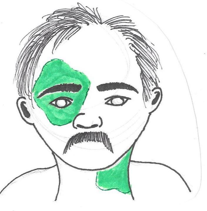
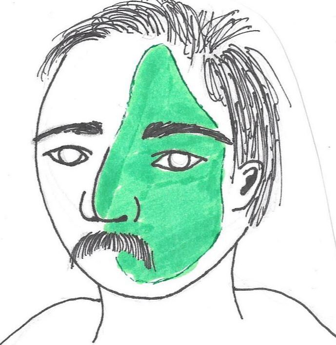
For my third sketch, I decided to be similar to my first sketch in taking inspiration for the placement of the Cubist facial sections specifically from my visual inspiration. After seeing the possibility of conveying a wrong theme from my second sketch, I tried to incorporate that idea of there being a somewhat-even distribution of the "real" and "Cubist" parts. Like in my Aydoğdu inspiration, portions of his neck and face are missing to expose what is underneath - however, by alternating which sides are Cubist and which aren't, it brings to life this interesting jigsaw of a person. I chose to use this sketch as my reference because movement is created from the alternating pieces; having such alternation would also avoid the idea that one side covers the other like a mask by having them together as one flat skin.
|
|
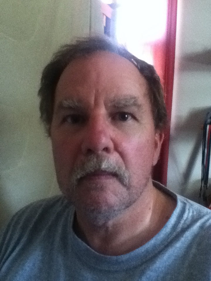
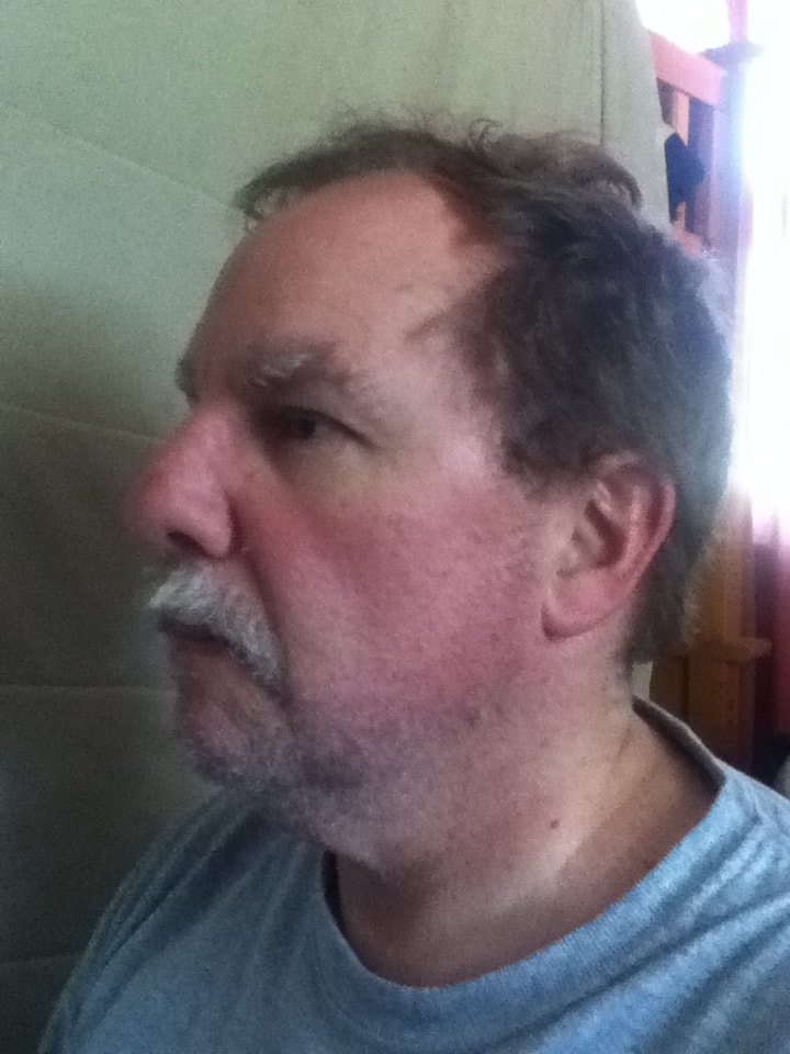
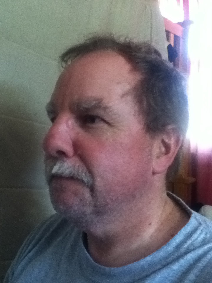
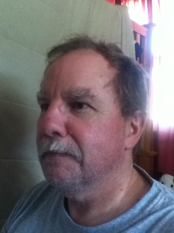
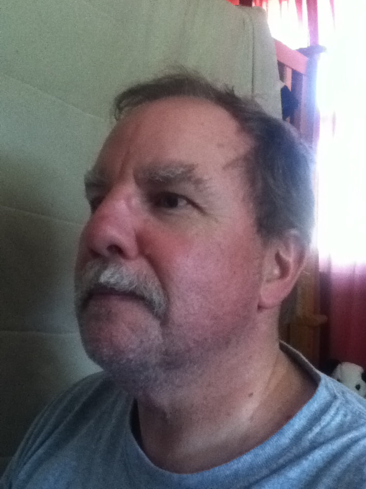
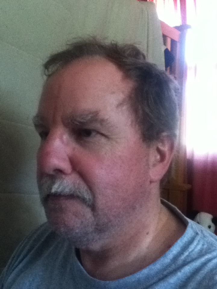
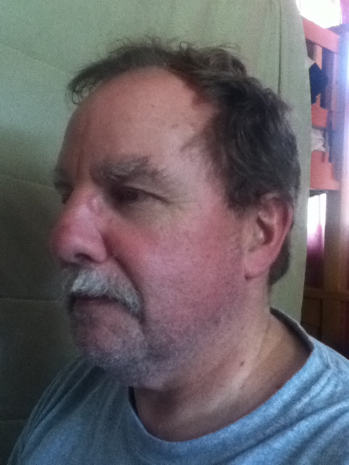
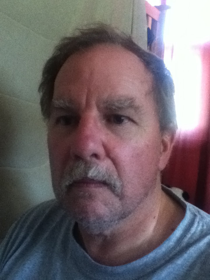
Though I stated in my Planning phase that I was worried a side profile with portions cut out would border on plagiarizing Aydoğdu's piece a tad, I ended up selecting this tilted position as my final reference picture. In each of my panels for the Familial Hues series, I tried to have myself and my family members depicted with what I believed their most prominent qualities on display (the hair color of my mom and sister, my eyes). My dad has, in my opinion, strong features that are particularly emphasized by his round nose and bushy facial hair. Because of these, any photos I took of him from a frontal perspective seemed to create too harsh of a shadow over the left side of his face; while this could have been useful in marking off which areas would be "real" and which would be "Cubed", I was worried that those shadows might be too dark and make features unrecognizable when it came time to print/grid the image. With a side view, more light was guaranteed to hit a large portion of his face to help me better sketch it out. In relation to the rest of the photos I experimented with, this one seemed to be most appropriate with a neutral expression (I felt unnerved to carve out parts of a face that was beaming), and not having him tilt his face extremely up or down allowed the his stature to appear calm and relaxed. |
|
Initially, I did not plan on laying down a white base for my entire figure due to the lightness of the orange background because I knew from previous experience that pale skin colors aren't hindered by warm backgrounds and also that the hair would be dark enough to be visible without white. However, when it came time to lay down the sections of the face inspired by Cubism, I quickly found that laying either of the green hues I used over the orange background dulled the color and appeared almost vomit-esque. To avoid this, I coated the two Cubist skin sections with two layers of White paint before applying the brighter hues. |
|
|
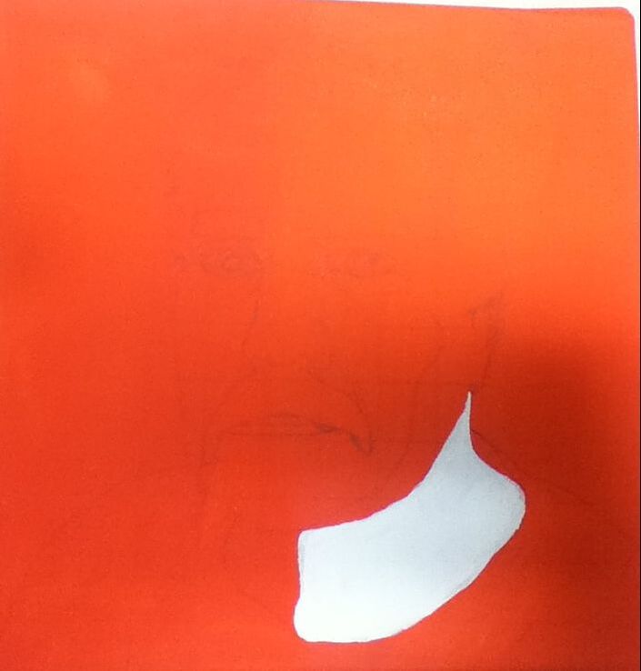
1) I began by stretching a 1 foot x 1 foot canvas, coating it with three coats of gesso using a 1-inch-wide brush. This allowed my canvas to be as bright white of a surface as possible to make all the bright colors I planned to use from my Picasso inspiration stand out. Once the gesso dried, I then applied two coats of Orange to the entire canvas to create a wash. Over the dried Orange, I sketched a grid of 12 x 12 squares with each square being 1 inch in height/width; meanwhile, over my reference picture, I sketched a 12 x 12 grid with each square being 1.5 centimeters in height/width. These allowed me to sketch my dad's image on the canvas with a pencil in accordance to the picture's proportions. |
|
|
2) With a 3/4" brush, I applied 3 coats of Royal Purple to serve as the my dad's shirt - the dark color contrasts with the lighter background and is specifically the uppermost shade on Dora Maar's shirt. I then began to coat the sections of skin that would be Cubist-inspired with two layers of White using a Flat 2 brush; while I intended to lay out the Cubist portions of the face and neck right away, I paused after completing the neck when I saw that Dora's lips are white. With a Round 0 brush, I alternated between White and a 1 toothpick of Black to imitate those lips with a grey outline/white center.
To further imitate Dora's coloring, I used the same combination of White/bit of Black to fill in the eyes' irises, before adding pure Black to the pupils and a combination of 1 part Green/2 parts Yellow to create the light green shade of Picasso's subject. This mixture actually turned out to be too green, though, so I went back in and patted down additional Yellow to lighten it. |
|
|
3) Over the aforementioned two layers of White, I applied the leftover yellow-green mixture used for the eyeballs, omitting the area where nostrils and mustache would go because I planned on shading those areas black (not as much of a priority to make the black appear bright, compared to the green shades). Using a Flat 4 brush coated in White, I went over the rough shape I sketched of his nose, then added thick streaks of white to where his eye bags and thickest wrinkles were. Initially, I thought that the white outline would be good on its own because Dora's face has a lot of white smeared on her cheek, but decided then to go back over the nose with Green to mimic the large shadow over her face and provide contrast between the otherwise-bright colors. This also added an interesting degree of emphasis to the nose on his face, which I found fitting because I think his nose is one of his most prominent character traits. |
|
|
4) To give a bit more definition to his facial features, I lined the entirety of the Cubist eye with Black on a Flat 2, with a thicker line over top to mimic the deep crease of his eye. On the same brush, I attempted to blend Green and the yellow-green mixture to attempt a shadow effect and create the appearance of an eyelid....this ended up being a muddy mess because I was careless with the brush and smeared some of this darker mixture into the lighter part of the eyeball. I cleaned this up by covering it over with the yellow-green mixture, before trying to salvage the eyelid with a line of Black. To me, this still looked strange, so I outlined a small lower eyelid as well.
With a Flat 6 brush, I applied a thick coat of 1 part Black with 1.5 parts White to create the base color for his mustache (mimicking the grey base of Dora's hair). Initially, what I planned on doing was to overlap thick strokes of Black, Navy Blue, and White over one another to mimic the hair strokes that Picasso created; however, it didn't match the texture of my dad's mustache, so I scrapped the idea of thick dried overlap in favor of blending all three colors together in downward strokes. 2 coats of Espresso were applied to his eyebrows and hair to serve as an initial wash. |
|

|
5) I then mixed three pale tones that I believed would serve well as skin colors:
I initially thought that the combination of these three colors would create a variety of hues that would create contrast between the "normal" part of the face and the "Cubist" part. In my mind's eye, the first hue would help create the appearance of a somewhat "normal" skin tone, the second hue would immensely lighten the face to create emphasis again the intensity of the background, and the third hue would both mimic my dad's natural redness while also contrasting with the green Cubist portions. However, these differences in color also made them difficult to blend seamlessly - in the end, I overlapped the first and second hue to try and tone down the white areas and blended that with the rosey hue. Though this overall gave my dad a flat appearance, the slight difference between the two skin tones ensures avoiding total flatness while still contrasting with the green. |
"Cubed" vs. "Dora Maar"Similarities:
|
"Cubed" vs. "The First Day of Autumn"Similarities:
|

"Dora Maar". Pablo Picasso, 1937.
|
"Cubed", Elizabeth Verkuilen, 2019.
|
"The First Day of Autumn", Aykut Aydoğdu, 2019.
|