Tryptic
|
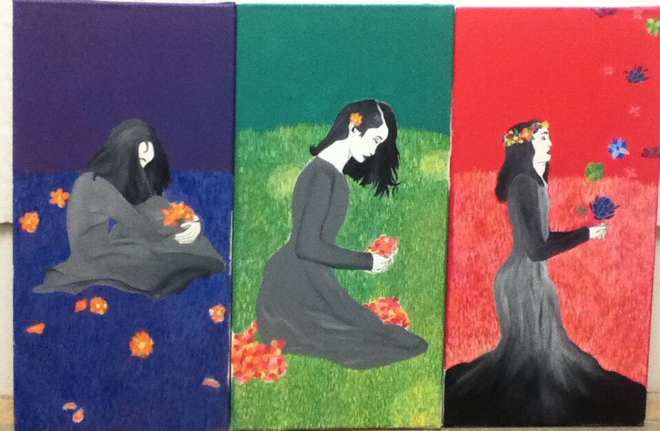
Title: "Growing Strains" Size: 91.44 cm x 60.96 cm Medium: Acrylic on canvas Completion: September 2019 |
|

|
|
|
|
Title: "Growing Strains" Size: 91.44 cm x 60.96 cm Medium: Acrylic on canvas Completion: September 2019 |
|
|
|
|
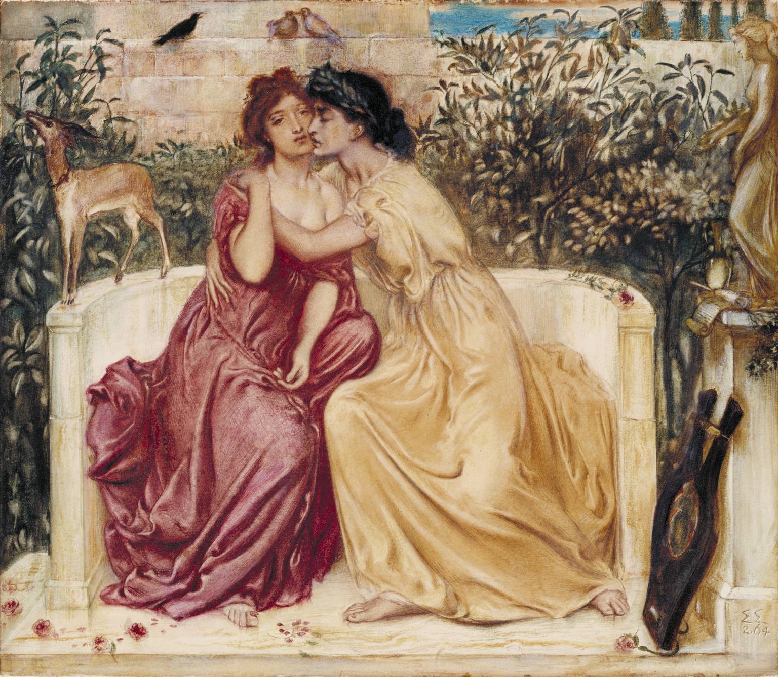
"Sappho and Erinna in a Garden at Mytilene", Simeon Solomon, 1864.
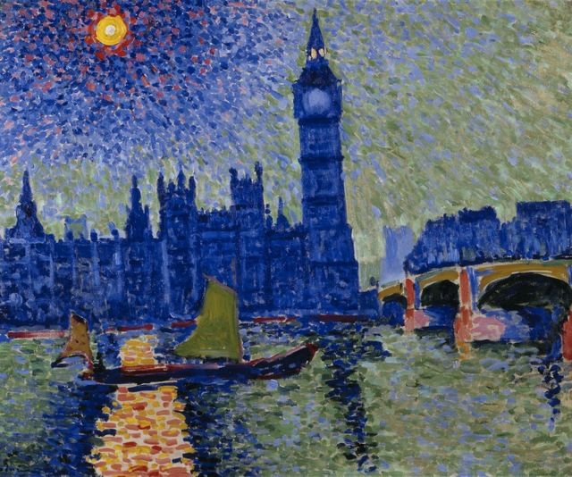
“Big Ben”, André Derain, 1906.
|
Over this past summer, I completed two handmade projects, with one of them being a painting inspired thematically by the two artists I was researching for my comparative study and visually specifically by one of those artists, Keith Haring. As we have to compare the works of our comparative study artists to works we have created inspired by those particular artists, I knew that I would have to create a piece formally inspired by the other artist I was researching: Simeon Solomon. Solomon was an English artist who gained notoriety during the Pre-Raphaelite art movement, with story-based paintings revolved around controversial themes involving homosexuality and practicing Judaism in the predominantly-Catholic England. Formally, his most famous works are paintings with a high degree of realistic blending and soft, muted color schemes containing perhaps one or two pops of slightly-brighter shades. I planned on emulating Solomon’s extensive use of blending in the imagery of my tryptic - I was set on creating a tryptic because I had planned on creating one during junior year, but never found the time to use the canvases I had already created.
However, the idea of using Solomon as formal inspiration daunted me - I pride myself on not being a realistic artist, with any slivers of realism in past pieces combined with fictional, somewhat-weird characteristics. To toe the line of that comfort zone, I looked to one of my favorite artists: André Derain. Derain is one of the founders of the Fauvist art movement, a movement best known formally for the use of “thick brushstrokes of vibrant colors, often unmixed from commercially produced tubes of paint” (MoMA). Imagery created in the Fauvist style is unrealistic, bright, and unblended, which starkly contrasts with Solomon’s artistic style. However, the colors used in Fauvism and telltale presence of small, linear brushstrokes to apply said colors are inspired by the emotions one may feel when looking at a certain scene or landscape. I planned to combine the bright colors ever-present in Derain’s pieces and small, overlapping brush strokes to create texture with the realistic styling of Solomon’s pieces. This would allow my final product to have some degree of realism, balanced by the almost-childlike feeling of viewing a Fauvist piece. |
|
The idea behind the design of my first sketch stems mainly from Solomon's more traditional, elegant subjects, with Derain being an influence later added to further sketches. Because I'm not confident in my abilities to realistically blend figures like Solomon, I decided that the best way to artistically emulate his work would be to sketch out figures dressed in the traditional garb many of his wear. In the case of "Sappho and Erinna", I would need to depict myself in a lot of fabric with some sort of flora present. Similar to Solomon, I knew that I wanted my tryptic to be story-based, with each panel an evolution of the story.
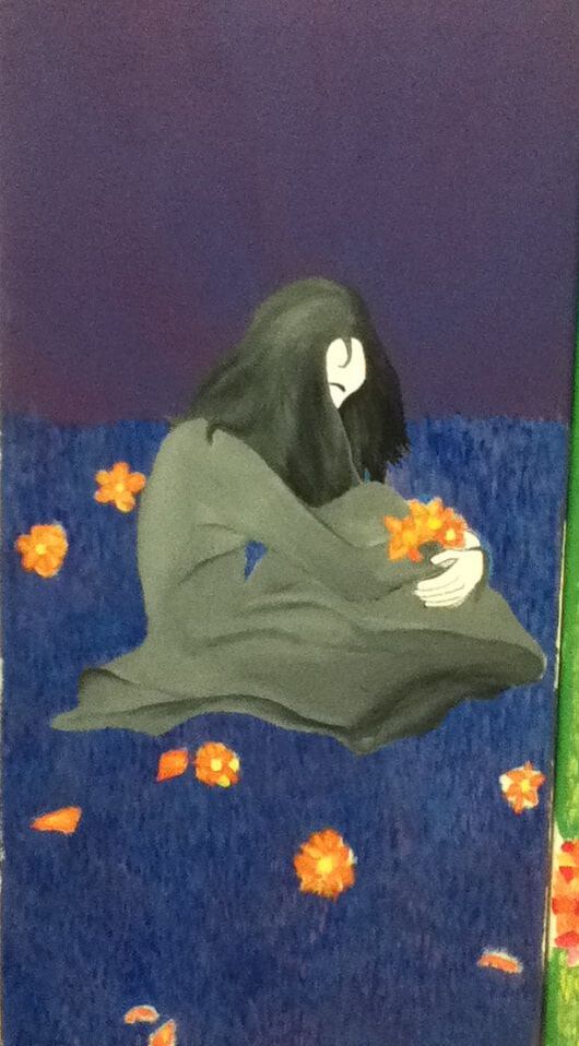
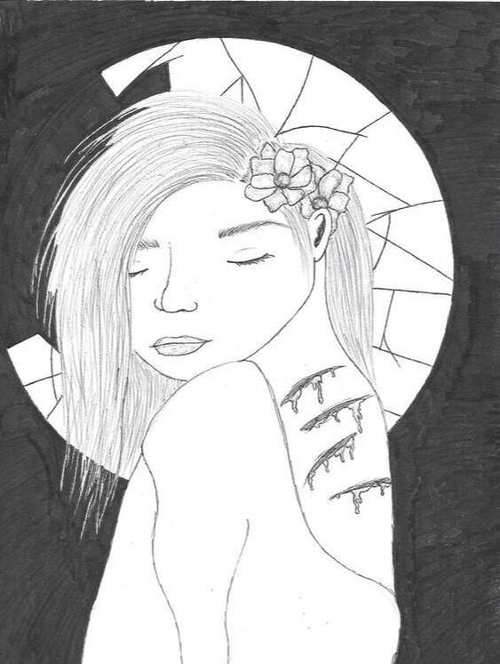
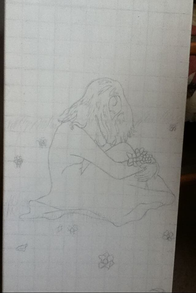
Many of my pieces during junior year revolved around mental health and/or sexuality - I decided to use that as a starting point for meaning. Based on my experiences with both of those themes, along with the knowledge that I had already created numerous negative pieces, I narrowed down my theme to the healing process of recovering from backlash/bad thoughts - my tryptic could display this idea with the panels evolving into happier images. To experiment with the mood of each panel, I drew this sketch for the saddest first panel. My idea was that the physical wounds on the person's back would represent any physical/emotional turmoil caused by being trapped in an unhealthy mental state, while the circular window/mirror (I'm not |
In my first sketch, a figure is shown encased in a bubble containing some grass and flowers, with flowers growing on the outside. My intentions with this image were to make is seem as though the figure is in their own world, isolated in their mental struggles and not interacting with the rest of the real world. The flowers on the outside of the bubble represent people who may recognize when someone is in a bad state and are trying to help, but don't realize how difficult it can be to let others in, especially when your mind is telling you that you don't deserve them.
For my final product, I used this as reference for my first panel because I felt that the position of curling in on one's self was a good portrayal on the loneliness and isolation experienced/initiated by people struggling with mental problems. |
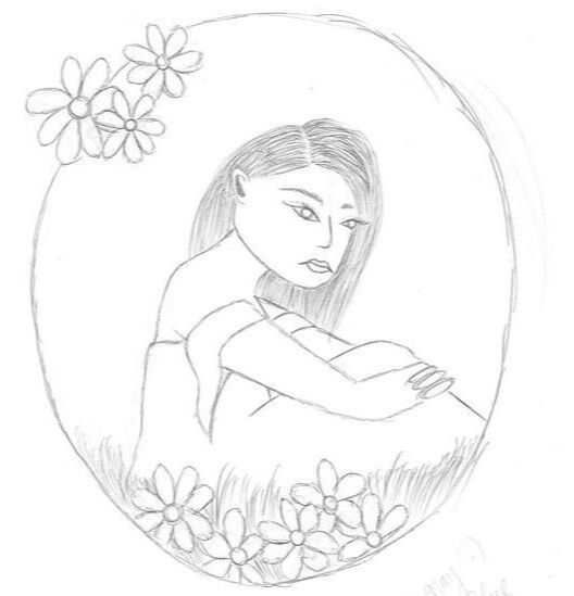
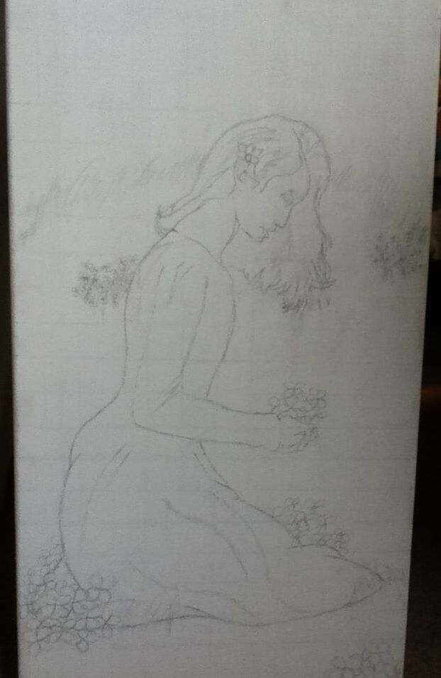
In my second sketch, the figure is beginning to get up from their sad position as they're assessing the abundance of flowers and the bubble around them is starting to break. My intentions with this image were that the figure is beginning to realize the unhealthy state of their mind and is slowly realizing that there are people out there to help them and that there are parts of life that make it worth living.
For my final product, I used this as reference for my second panel's figure's position, still clutching flowers but not in the sphere. I ended up altering the final image so that the figure is clutching flower petals instead of full flowers, with extra piles of petals around her. This makes it look like they've shredded the negative flowers that have grown and is taking the first step toward a healthy state of mind. |
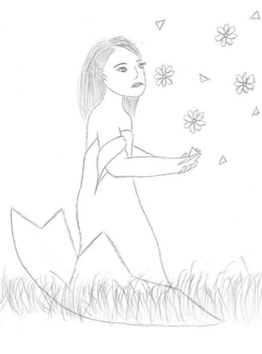
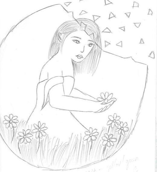
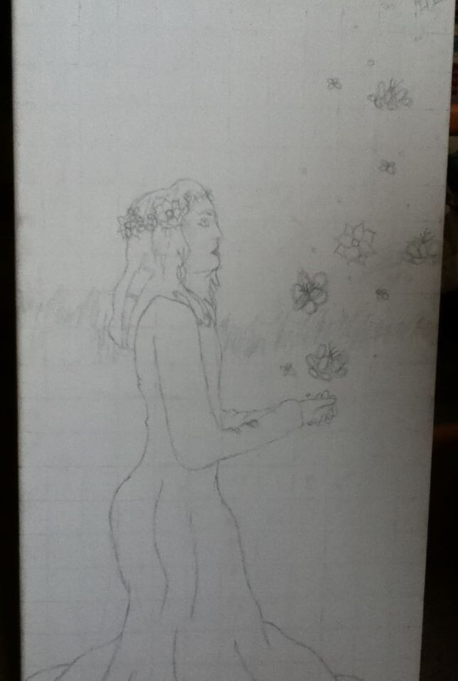
In my third sketch, the figure has risen to their full height and is releasing what flowers they have left out into the world. This is meant to represent people who have overcome their mental problems reaching out to help others who may be going through similar issues. Instead of completely eliminating the sphere, the figure is standing in remnants of it to show that the impacts of mental illness are never truly "gone" - that person, when they reach recovery, may still have trace emotions/thoughts left over, along with the memories of their struggle.
The sphere was eliminated in my final third panel, but I felt that the image of the person proudly standing strong while releasing positivity and support into the world was a perfect conclusion to this 3-part-story. |
|
|
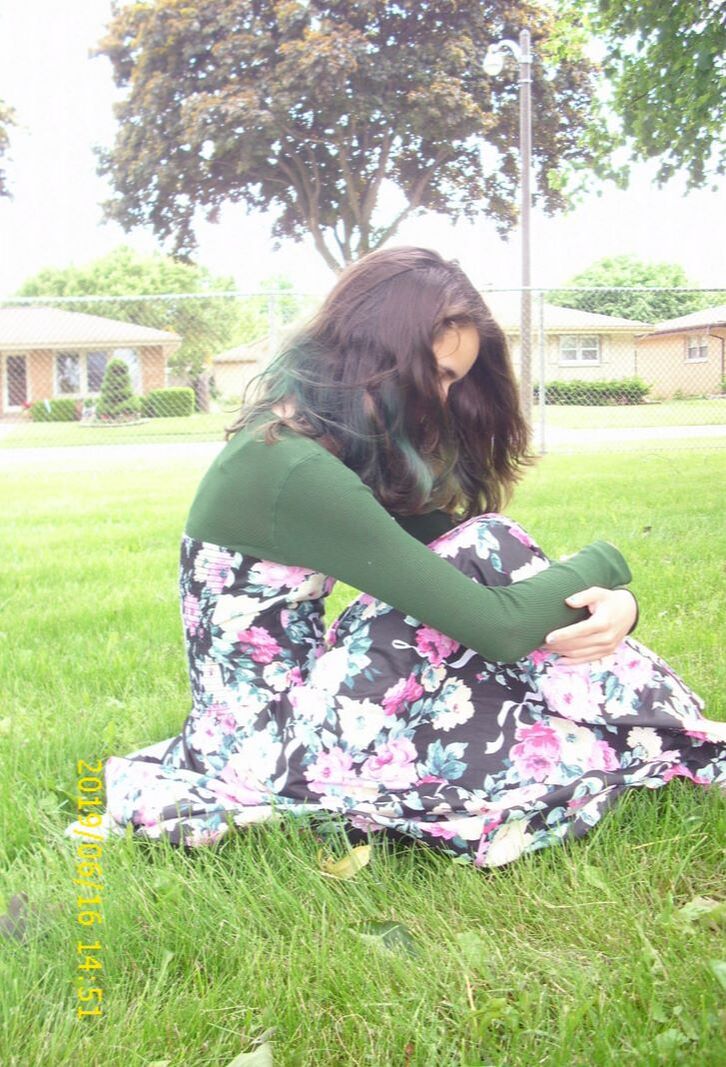
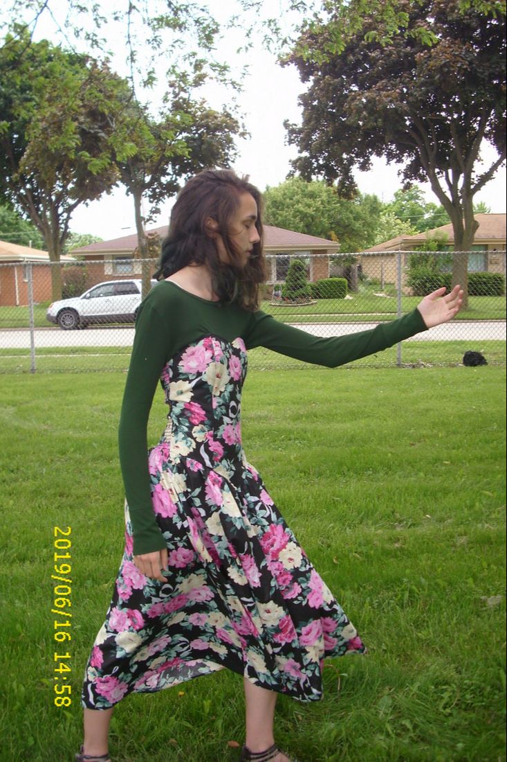
Starting with the image for my first canvas, I knew that I wanted to represent the fear and loneliness that dominated my mind during the lowest points in my life. To convey this, I sat down in an upright fetal position with my body hunched over my knees. I experimented with various head tilts and how to position my head to show an unwillingness to interact with |
|
|
the world and drawing one's self deeper into dark thoughts.
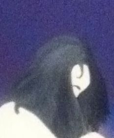
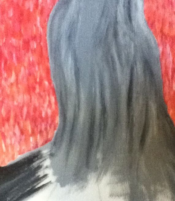
I ended up choosing this photo of myself that was captured just as the wind blew my hair over most of my face. I really liked having my face covered in the "lonely" panel because it emphasized the unwillingness to interact with others and how easy it is to shut yourself in with the thoughts because it feels as though they control you. That control is also displayed with the head bowed - it's as though I am surrendering to whatever thoughts are plaguing my mind. With the other images I took when experimenting with a specific pose, I mainly kept readjusting the placement of my arms and head. When I did that, I noticed that looking sharply down gave the appearance of an uncomfortable, almost hunchback-like slouch, while not tilting my head enough didn't achieve that idea of quiet surrender. Meanwhile, with my arms, I noticed that clasping my hands around the lower portions of my legs seemed stiff while also appearing unnatural with the how long my arms actually are. Clasping my arms together under my knees seemed to be the best placement because it made the overall position more upright and not hunched, while also allowing my left hand to be seen and display that both arms are hugging my legs to my body, |
|
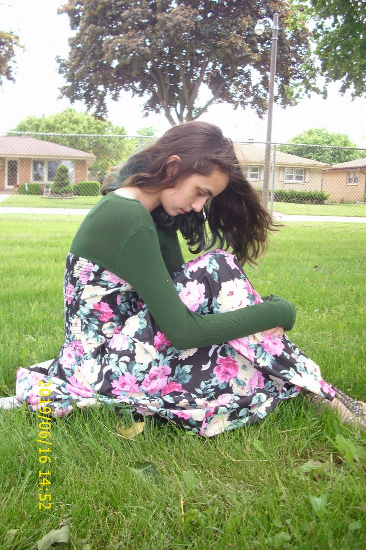
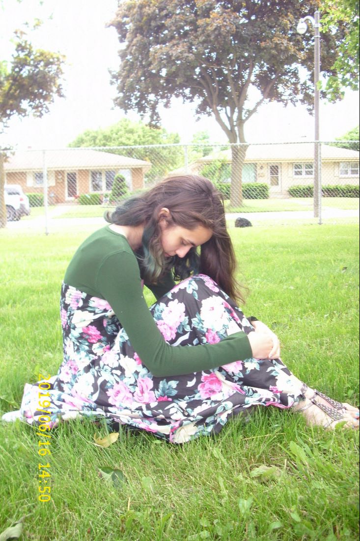
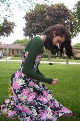
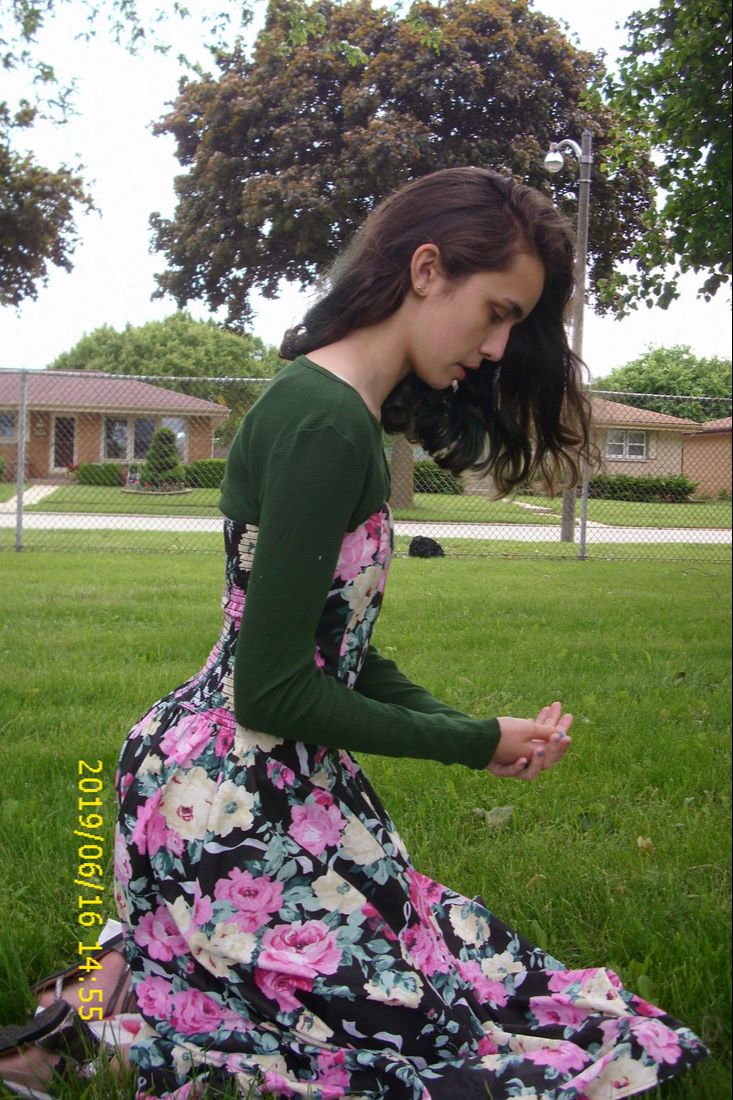
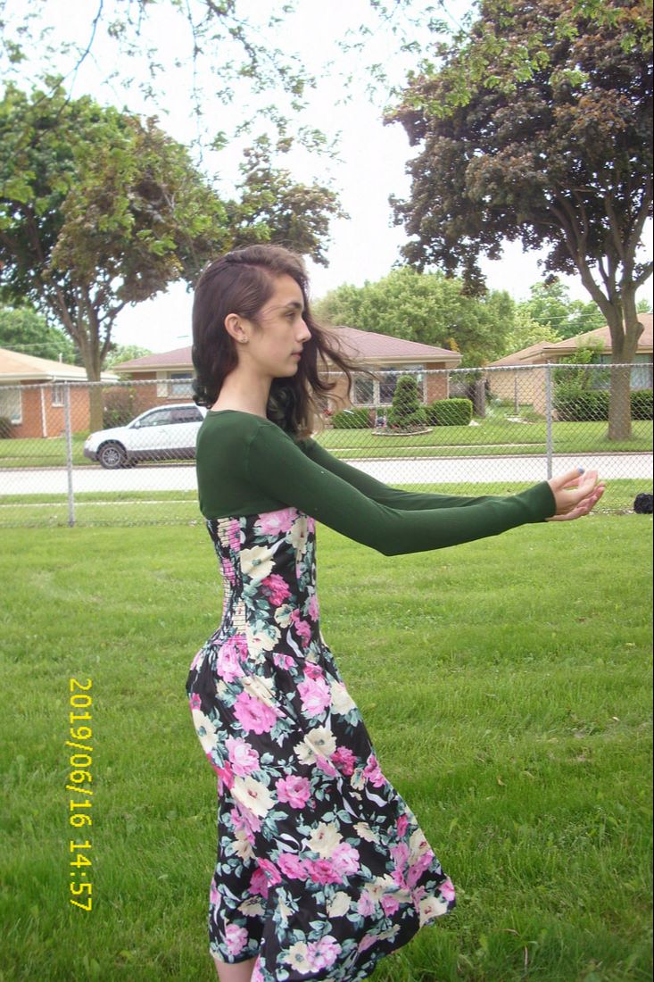
With my second image, I experimented with how I could kneel with my hands in front of me to accurately recreate the position drawn in my practice sketch. The difficulty with this was that the dress I was wearing has a corset top - I couldn't have a natural slope/bend in my spine when looking down because the dress made sure that my back was straight. This led to many of my photos looking like the one on the far right, where I am teetering forward at an almost-straight diagonal.
To rectify this, I ended up pulling the top of the dress down a bit over my undershirt to achieve a curved appearance at the top of my back - this allowed some of my back to have the appearance of a natural lean. |
|
|
|
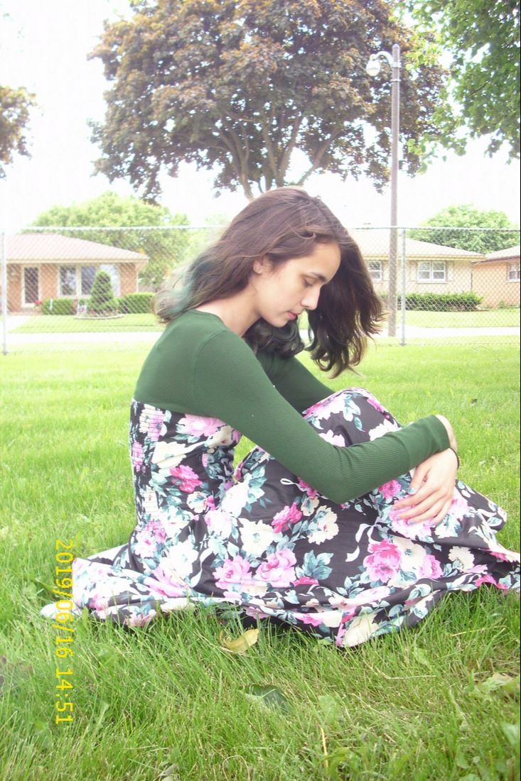
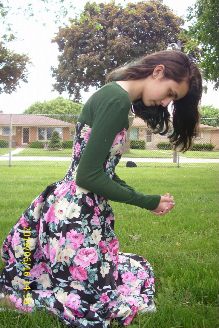
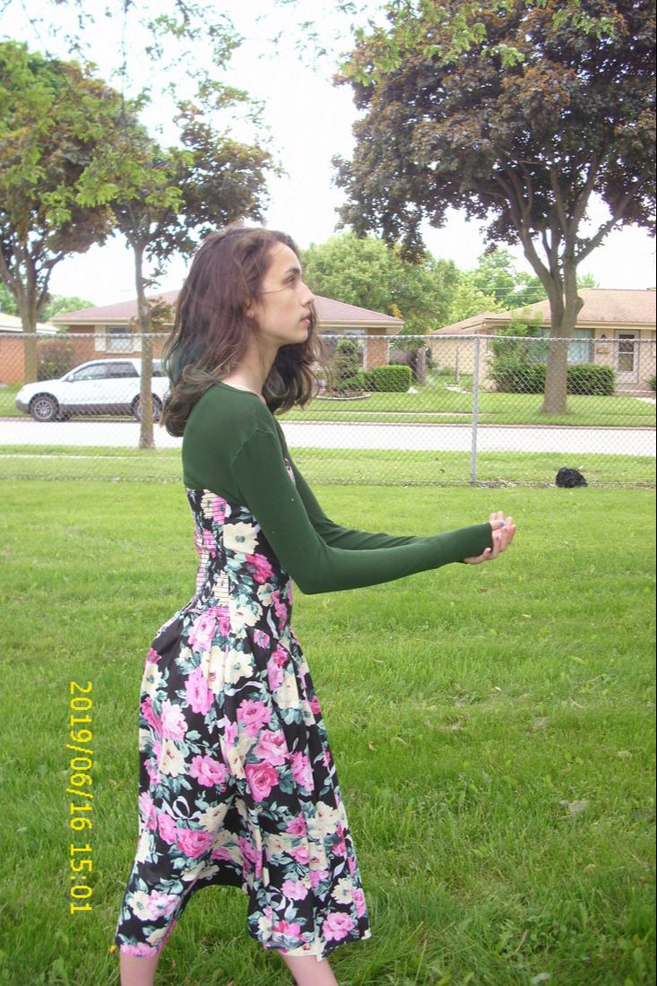
I ended up choosing this image for my reference because the tilt of my head gives the appearance of bending over, while my back is straight due to the corset. The tilt of my head in this image is also not as extreme as my head's position in other images - as seen above, my head was so extremely tilted at times that my neck was practically parallel to the ground. Contorting my body into weird angles would not emulate Solomon's work well, as his figures are positioned as sloped humans, not linear. I also thought that, in this image, the bunching of my dress at the bottom would be interesting to include in the tryptic because it spreads out mainly towards the right side. This creates movement that will lead the viewer's eyes towards the final canvas. To me, this is important because I view the overall message of this tryptic as a hopeful one, not a depressing one; any subtle emphasis on the importance of the final canvas' meaning shows the glory and importance of seeking help and getting better when it comes to mental health. |
|
|
|
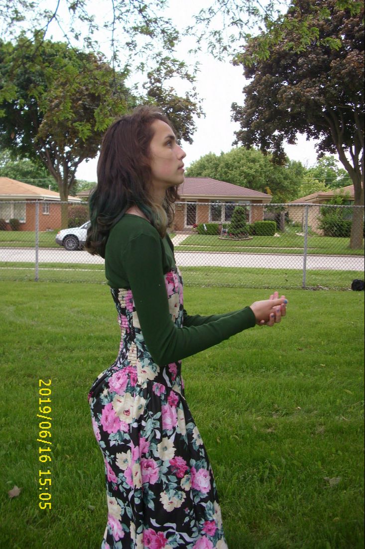
I struggled the most with figuring out placement for my last image, as all I remembered about the position I sketched for my final canvas involved reaching out while standing up. Looking back, I should've taken my sketchbook with me to reference the position I sketched - that would've made it much easier to figure out what the heck I was doing in the middle of this public area.
|
|
|
Of all of the poses I attempted, I settled on this one for my reference image because it was untouched by wind and looked the most serene. The stillness of my hair and skirt means that no unnecessary attention is brought to the skirt blown around my legs or hair flying in my face. While my two other reference images involved hair flying about to create movement and display any emotion I wished to tie to the piece, it was important to me that this image be still because this is hopefully the point in recovering from mental health issues/battles that isn't undergoing some sort of change. It is staying constant, as the person is staying in a place where they are happy, healthy, and safe while looking forward to a brighter future with this mindset. Initially, I had wanted this image's perspective to not be as close as it is in this image in order to focus more on the environment in the third panel growing and prospering. As you can see from my first few attempts above, though, zooming that far out led to a bunch of weird malfunctions with the dress...these were hard to avoid because my dress doesn't fall straight to the ground like the dresses that Sappho and Erinna are wearing in Solomon's piece. By being a bit closer to the camera in this shot, my dress appears longer and has more of the elegant appearance/texture that Sappho and Erinna have. |
|
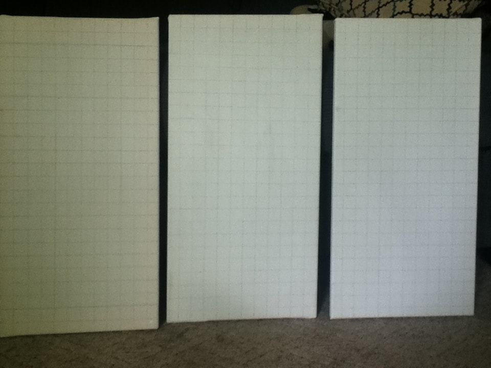
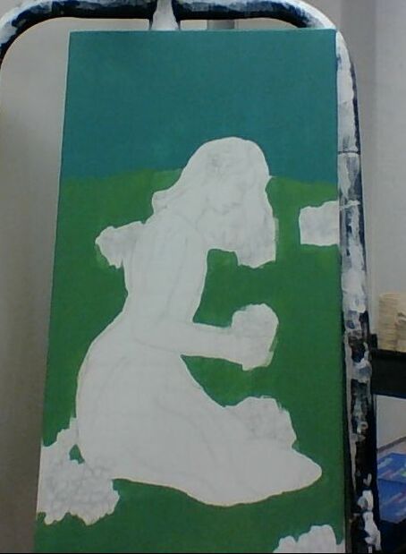
1) Before summer break started, I stretched 3 canvases, each one with dimensions of 12 inches by 24 inches. Each canvas was coated with approximately 2 layers of gesso and left to dry - however, one of my canvases ended up being much more yellow than the other two. As I ran out of time at school and did not have the resources at home to apply more gesso, I decided that the best way to try and "hide" the fact that that particular canvas wasn't as light as the others was to use the yellower canvas as the center canvas, with the lighter ones flanking it on either side.
I then printed out my 3 reference pictures and sketched a light pencil grid of 12 cm. by 24 cm on each of them. The same was done on the three canvases (in inches instead of centimeters) so that I was left with grids of 12 x 24 squares. |
|
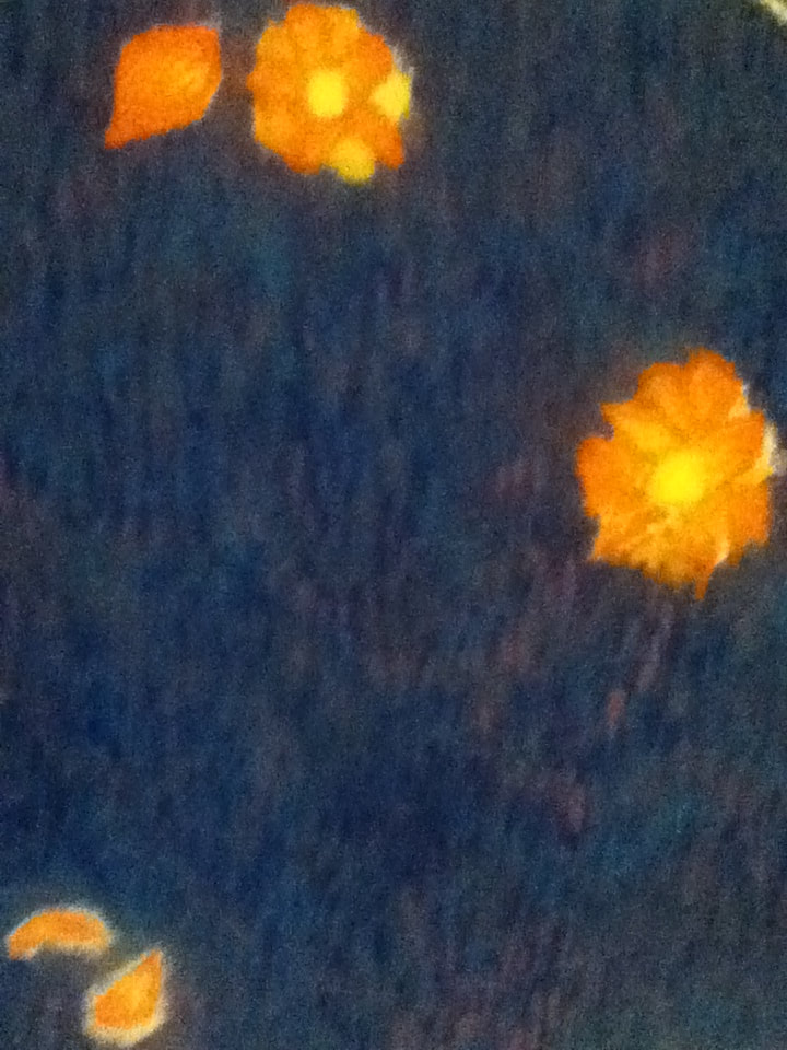
2) Starting with my first canvas and reference pictures, I sketched out my hunched figure and the blades of grass around my skirt and bordering the background. This gave me an estimation of how much sky/ground my piece would have. I then free-handed some blue poppies clutched in my hands and scattered throughout the field - thought I used the image on the right as reference, it was less for the complexity of the petals and more for the blue hues.
In my original sketch, the flowers were solely depicted scattered in the grass - their presence in the background was to represent the growing dark thoughts that made it hard to get in a better place mentally. However, by adding |
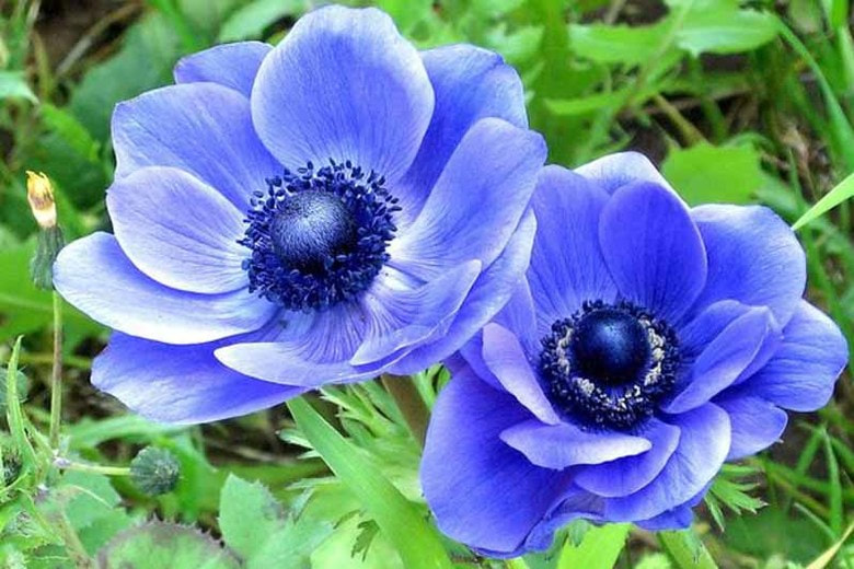
“Anemone Coronaria 'Blue Poppy'.” Gardenia.net, www.gardenia.net/plant/anemone-coronaria-Blue-Poppy.
|
|
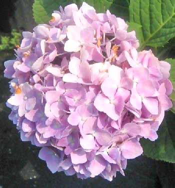
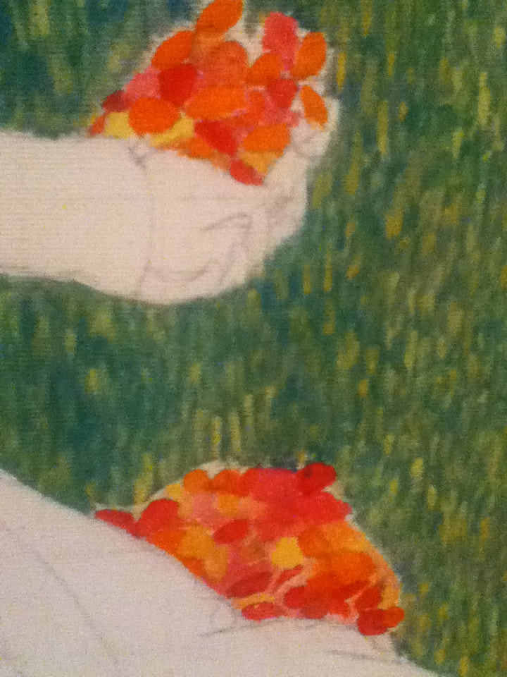
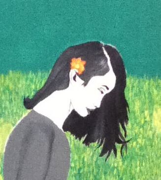
3) I then moved on to sketching an image on my second canvas, using my second practice sketch and the hydrangea reference picture shown on the right. As I did with my first canvas, I also sketched a border between the grass and sky before proceeding to freehand flowers scattered in the background, cupped in the hands, and behind one ear. The flower behind my ear is meant to be similar to the "depressing" flowers showcased in the first panel, to show that I still held on to some of the bad thoughts , while the buds cupped in my hands shows how I was taking my mental health into consideration and realizing that I would be healthiest if I sought out some form of help. |
“Flower Meanings by Type, Name, Color and Occasion.” The Flower Expert, www.theflowerexpert.com/content/aboutflowers/flower-meanings.
|
|
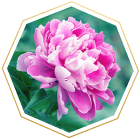
4) I finally rounded out my sketches by sketching my last gridded reference image onto my third canvas, using my third practice sketch and the peony reference picture shown on the right. I also sketched a border between the grass and sky, like on my other two canvases, along with free-handing the three varieties of flowers interwoven in a crown on my head while also being released into the sky. The crown is meant to represent me accepting and reveling in the ugliness of my past, while also releasing flowers into the world to spread positivity and support to those who may be going through similar issues.
|
“Flower Meanings and Symbolism.” FTD.com, www.ftd.com/blog/flower-meanings-and-symbolism.
|
|
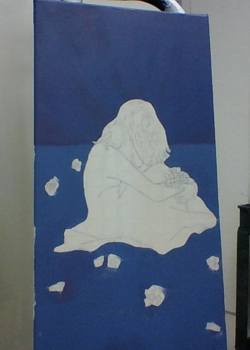
5) I had forgotten to paint a wash over all of my canvases, which meant that all background colors would have to be applied carefully around the images I already sketched. With a two-inch wide brush, I applied two colors to each panel to mark the ground and sky. The sky is darker in the first two panels so that lighter colors may move the viewer's eyes to the growth at the bottom, while the sky is lighter in the third panel to emulate the light brought upon by a new day, symbolizing hope.
Colors Used: 2 parts Brilliant Blue + 1 part Red >>> Panel 1's sky (1 part White was later mixed in to create the lighter grass base color) |
|
|
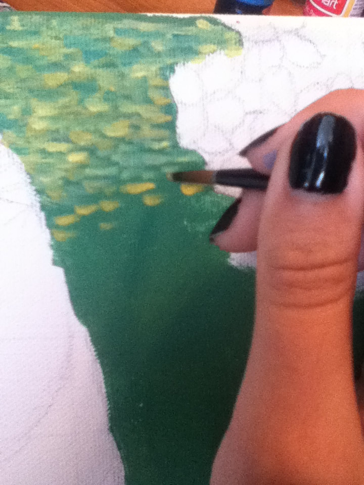
6) Then, taking a Round 4 brush, I began to apply small, linear brushstrokes of overlapping colors to the "ground" portions of each canvas. I found that, for me, the best way to make the brushstrokes appear straight was to rotate each canvas so that the longest sides were parallel to the floor, then apply the colors in horizontal strokes. Colors Used:
|
|
|
7) Alternating between a Flat 4 and Flat 6 brush, I painted the hair in each panel with a grey-scale color scheme. Though I initially had no specific technique, I found that the best way to lay out the colors of the hair was to apply pure Black to the darkest sections, pure White to the lightest sections, and mix 1 part Black with 1 part White to create a grey shade that acted as the base color. As these solid sections of color dried, I began to overlap the 3 colors in linear, hair-like strokes to create texture. |
|
|
8) As the hair dried on each canvas, I moved on to painting the flowers surrounding/being clasped/worn by each figure. My original idea was to paint the flowers a similar hue to the rest of the panel's color scheme, but after looking over some swatches from previous projects, I became worried that this idea would make it so that the flowers would be indistinguishable from the rest of the background. To try and avoid this, I decided to use warm colors for the first and second panels' flowers to contrast with 1's cool tones and 2's heavy emphasis on green shades; meanwhile, cool tones would be used for 3's flowers in order to be emphasized against the warm background.
|
|
9) Since the painted hair on each canvas was now dry, I applied a solid coat of grey (1 part Black/2 parts White) with a 3/4" brush to serve as a base color for each panel's dress. While the base was still tacky, I applied alternating streaks of Black and White with a Round 4, blending them with the grey first with upward strokes and then by thinning the paint by dampening the brush after application. I had never painted fabric before attempting this tryptic - as a result, every panel with a different texture of fabric served as experimentation of what would or wouldn't work. There were also personal errors that took place, such as spilling Black all over the bottom of my 3rd panel and having to therefore make the entire bottom of the skirt that dark. |
|
10) To finish each section, I had planned to blend White and various light grey concoctions to create an evenly-blended skin tone, but this ended up failing me when all attempts at grey definition were too similar to the greys in the hair and dress. Instead, with a Flat 4 brush, I applied pure White to all skin areas before outlining features with Black on a Round 0. Unfortunately, this strayed away from the realism accomplished by Solomon in his pieces, but this new flatness of the skin contrasted with the textures of the hair/dresses.
|
"Growing Strains" vs. "Sappho and Erinna in a Garden at Mytilene"Similarities:
|
"Growing Strains" vs. "Big Ben"Similarities:
|

"Sappho and Erinna in a Garden at Mytilene", Simeon Solomon, 1864.
|
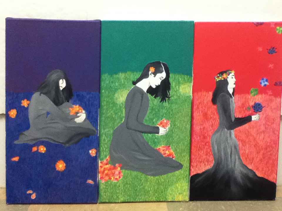
"Growing Strains", Elizabeth Verkuilen, 2019.
|

“Big Ben”, André Derain, 1906.
|
