Imag(e)ine: Second Work
|
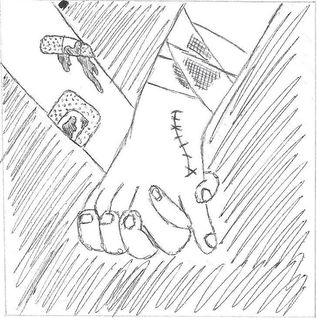
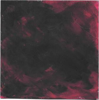
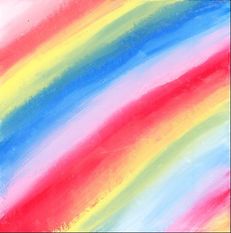
Title: "Healing" Size: 91.44 cm. x 91.44 cm. Medium: Silk Screen Completion: October 2018 |
|
|
Title: "Healing" Size: 91.44 cm. x 91.44 cm. Medium: Silk Screen Completion: October 2018 |
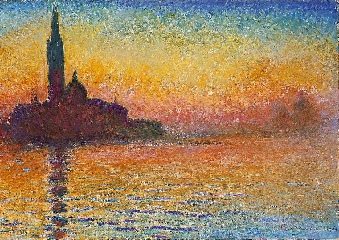
"San Giorgio Maggiore at Dusk". Claude Monet, 1908-1912.

"Water, Wind, Window." Jeanne Nikolai Olivieri.
|
My first inspiration is "San Giorgio Maggiore at Dusk" by Monet, which was a piece I recreated in my sophomore art history class. We were taught that the name of this piece is "Sunset in Venice", but my research showed that it's also known as "San Giorgio", which I decided to use as its title because I think it better references the inspiration behind the piece. At the time that Monet painted this, he was seemingly uninterested in continuing his artistic career - that is, until him and his wife went on a trip to Italy. There, he was inspired by the beautiful sights and rich culture, and set about painting works that he originally deemed to be just practice sketches, including "San Giorgio". This piece inspired me for this project because, in my opinion, Monet drawing inspiration from the Italian scenery reminded me of how many different communities inspire one another's causes and will also work together to achieve the same goals. While the piece looks very simplistic, I plan on creating a background with a color scheme similar to Monet's piece because the rainbow palette is universally known for being a unified color scheme that naturally occurs, both according to color theory and according to nature.
The other piece that I decided to take inspiration from is "Water, Wind, Willow" by Jeanne Nikolai Olivieri. All of Olivieri's works that I viewed in the Third Ward were related in some way to her hometown of Milwaukee, especially this painting that depicts the Milwaukee skyline at dusk. To me, this connected well with the theme of the project because it's a piece inspired by a community that I grew up in, and I also love how she used classic, familiar architecture to communicate a sense of unity within the city. This imagery, along with Monet's simplistic depiction of a cityscape, inspired me to incorporate buildings somewhere in my piece because it is a physical representation of a community and how people with similar interests can live together in harmony. |
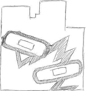
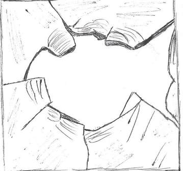
With this first sketch, I experimented with a very intense crack in the buildings (possibly showing intense damage) covered by two bandages. I also decided to take inspiration from Monet's buildings/city by sketching just a plain silhouette, which I thought could both make the breakage and bandages stand out more, while also possibly making it easier to silk-screen because it's not an extremely complicated design. However, I ended up not using this idea because I was worried that a break that large would cause the stencil to bend when I'd have to make it; also, I was already planning on creating a simple background and was told that if I stuck with that idea, I would most likely have to have more detailed stencils (this ended up frustrating me during the project, but I did it because I had already created this background and had to re-do the background for my other piece.
|
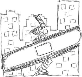
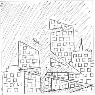
This sketch is probably the most detailed of the three, with three broken buildings detailed with buildings being repaired by one long bandage. I really liked the windows in the buildings because I felt like it made it easier to know that they're a skyline without having to create an intense, architectural masterpiece and then carve that out with an X-Acto knife. However, I was still worried about the intensity of the crack eventually bending/ripping the final stencil, and also though that the bandage looked disproportionate when stretched so far over all 3 buildings - it's as though it's more of a belt than a bandage, and I wanted to make it clear that it's a bandage.
|
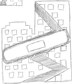
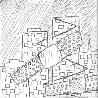
I ended up using this final sketch as a template for the final image of broken buildings that I silk-screened over my background image. It had the detailing of windows to show that they're buildings, but also a simple crack to show breakage, but not so much that the stencil would bend or break (side note: I ended up simplifying the break even more when it came to the final product). Also, the bandage looked more proportionate to me by not covering the entire width of the two buildings...therefore, in my mind's eye, it looked more like a bandage. This sketch also inspired me to add "normal" buildings to the artwork because the silhouette of these two buildings, out of all of the buildings I sketched, was the most basic; they seemed like the simple type of building that could be repeated throughout the city and not look repetitive, and this seemed like an excellent excuse to create unity in my piece.
|
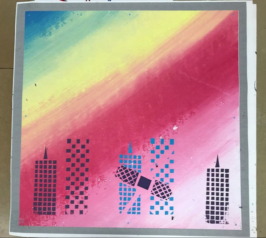
"Good" Background Experimentation
(1) Beginning to lay down large splotches of color for the "good" background.
(2) The point at which I decided to stop and try to create a different background.
|
Experimenting with Paint
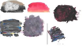
I wasn't sure how to "sketch out" a background, when my initial idea was to create a colorful background similar to Monet's and Derain's because, to me, they both created a positive, hopeful background; this is mainly in part because they're both a sunset, which brings about hope for a new day, and also because they use brighter colors (typically associated with happiness). With a Flat 4 paintbrush and a large amount of flat-headed toothpicks, I started to experiment with what could be different good/bad backgrounds (this was when I was still on that idea, before criticism). Above you can see all of the paint swatches I did, with all my "bad" ideas on the left and "good" ideas on the right. With both experiments, I started out by experimenting with various gradients, then trying to branch out from there. The "bad" background swatches were mostly made of hues that I thought represented bad emotions best (reds, blacks, and then some blues out of curiosity) and the "good" backgrounds took more inspiration from Monet/Derain with brighter colors that popped.
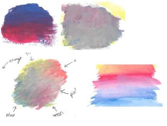
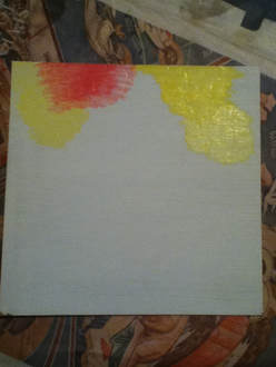
I then took a 7" x 7" board and decided to try and recreate my "good" swatch in the bottom left corner of the "good" swatches. However, I ran into a couple of problems:
|
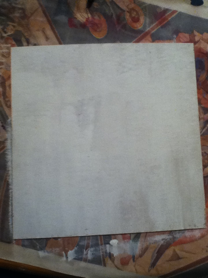
(1) Starting out with a freshly-painted board.
|
1) I started out by covering an entire 7" x 7" board with white paint to create a purely blank canvas. Looking back on this, it would've been a much more even coat if I had used gesso, but at the time that I did this, white paint was the closest thing that I could use with available resources.
|
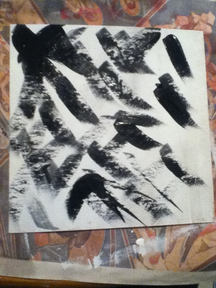
(2) Applying the strokes of black.
|
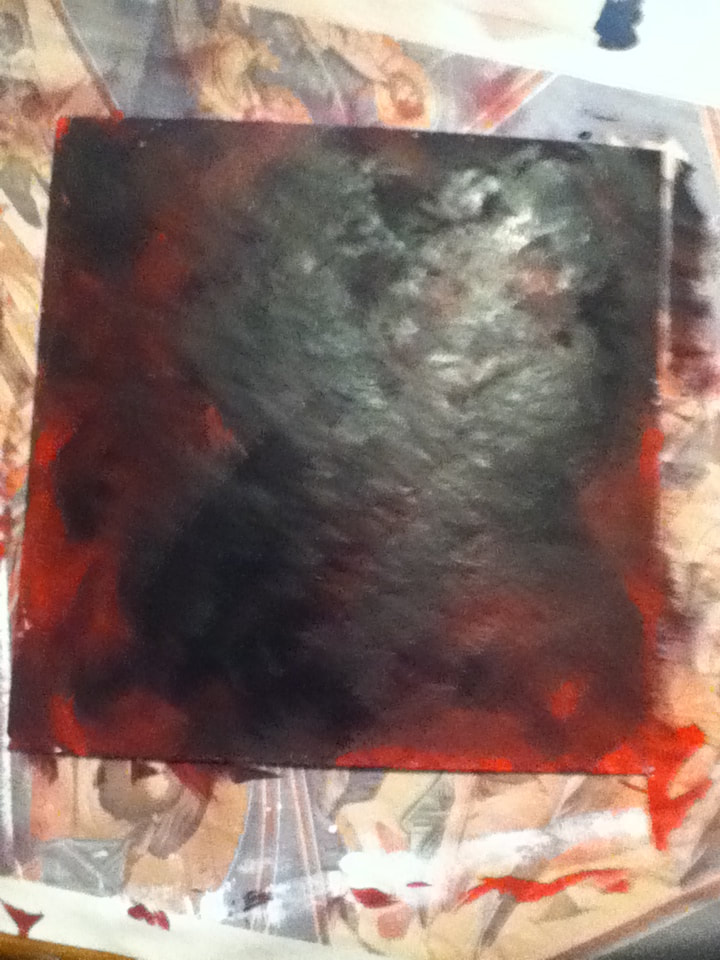
2) Then, with a Flat 6 brush, I began to apply thick, haphazard strokes of the color Black all over the board until my brush ran out of paint. Then, while the paint was still wet, I cleaned off my brush and began to apply more broad, uncoordinated strokes of paint until the brush ran dry, this time using the color Red.
|
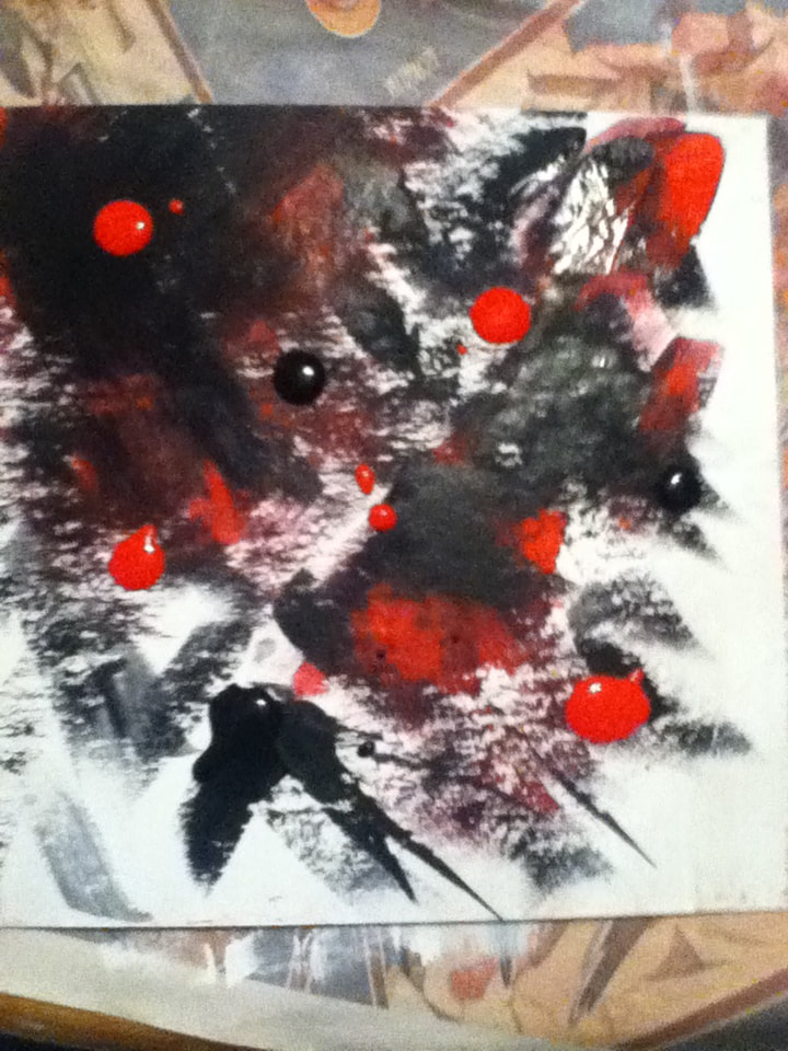
(3) Beginning to squirt pure paint onto the board in an effort to make the individual colors pop more.
|
3) I continued to alternate between large strokes of black and red, but soon realized that the fresh black paint was muting the fresh red paint. To try and avoid this, I squirted pure globs of the colors Red and Black directly onto the board to try and make the colors show up better. In areas that were too black, I added some Red, and vice versa.
|
(4) The finished painting.
|
4) This technique of squirting paint directly onto the board made it much easier to cover the entire board, so I continued to alternate between adding Red and Black dollops to the white parts of the board. If parts became too much of one color, I would go back in with squirting the other color over it. After repeating this process twice, I reached a point where I was satisfied with the amount of Red and Black in the piece.
|
|
Why not use this background?
|
|
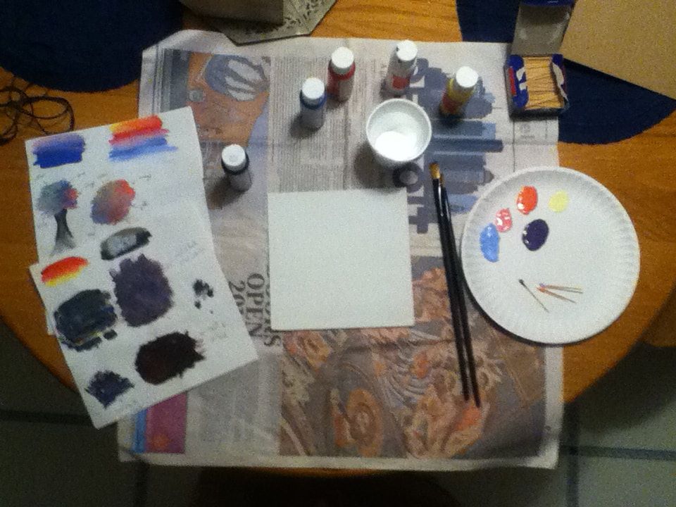
(right) The set-up in which I painted both of the backgrounds for my MIAD pieces. The paints that I used to create the swatches and eventually my backgrounds were the colors Black, Bright Blue, Red, White, and Yellow (though neither of my pieces ended up needing the Black). I also had my swatches on the side to reference for when I started painting, though neither of my backgrounds ended up looking very close to the practice swatches.
Also pictured: a 7" x 7" board, painted white; a Flat 4 paintbrush and Flat 6 paintbrush (though for the first piece, a Round 1 and Round 2 were used), the paper plate which I mixed colors on with toothpicks, and a disposable cup to rinse off my brushes in between paints. |
|
|
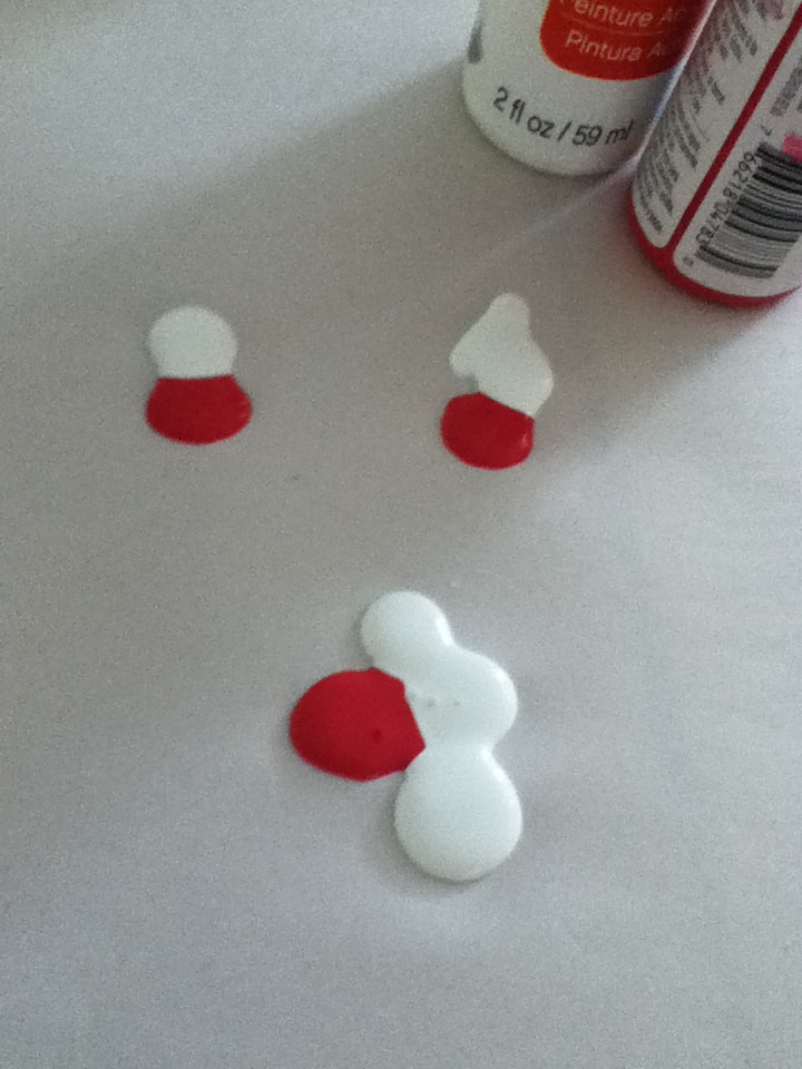
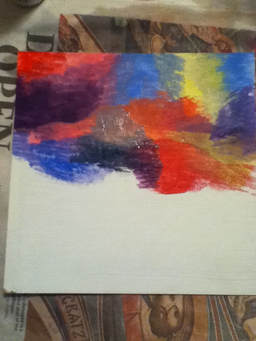
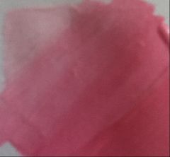
1) I began with a 7" x 7" board, already painted white. I then started to mix my paints together to create the basic colors of the rainbow, which I could then apply in order to imitate the rainbow background of Monet's piece. I already had pure red, yellow, and blue paint, but had to mix them to achieve a purple-y color (one part Red, two parts Bright Blue, and a small portion of White). Note: I decided to instead mix a series of pink colors (one part Red, with increasing portions of White) to expand the color scheme.
|
|
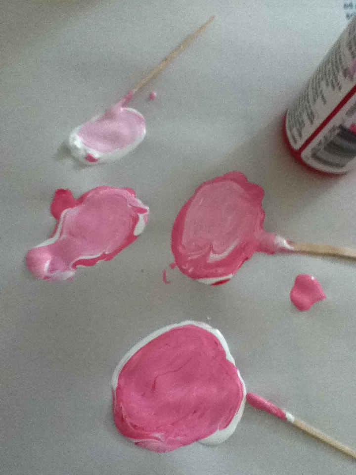
2) Taking my Flat 6 brush, I started in the top left corner of the board and applied a thick coat of the lightest pink shade that I mixed. While that was still wet, I applied a thick coat of the medium pink shade, rinsed off my brush, and slowly brushed back and forth between the two colors to create a gradient. I then repeated this process, this time by adding a darker pink stripe under the medium stripe and brushing the two together to create another gradient.
|
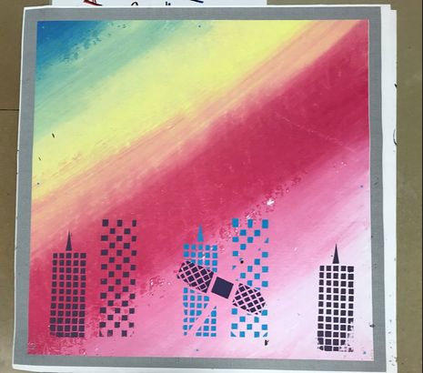
(3) The [technically] finished background, with a total of 11 gradients...seemed a little busy.
|
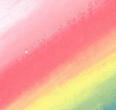
3) Quickly - because this was with acrylic paint, which dries fast - I continued to apply thick strokes of colors next to each other in rainbow order, then rinsed off my paintbrush to then blend the edges of the colors together. I messed up a little as I worked because I meant to put pure Red after the darkest pink and then blend that with the Yellow to create an orange hue, which led to an awkward red stripe slashing through the middle of the image.
Originally, I wanted this to be my final background, which is why I scanned it into the computer and made it a final digital image. However, the light of the scanner seemed to almost emphasize the obnoxiously bright coloring of the thing stripes, especially that one red stripe that I couldn't get over. |
(4) The finished product.
|
4) My mistake with the red, however, wasn't the only thing I didn't like about this background - I thought that the stripes were thick, but the size of the board actually dwarfed them and left me with a background that looked a little busy for silk-screening. However, I was determined to use this after my first failed attempt at making a background and ended up zooming in on the top left corner because it made the stripes thicker and also contained some of the lighter colors in the piece, which would be easier to silk-screen over. Once I cropped the image, I adjusted the resolution for printing before finishing.
|
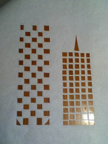
The finished solid buildings stencil.
|
Before cutting out my stencils, I measured and cut three pieces of freezer paper that were a little longer than the provided silk screen.
Solid Buildings Stencil:
|
The finished broken buildings stencil.
|
Broken Buildings Stencil:
|
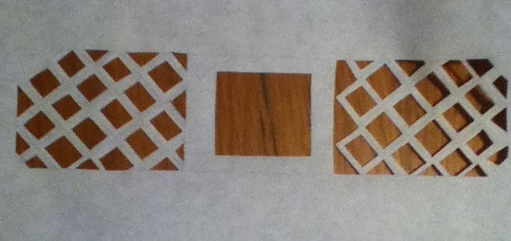
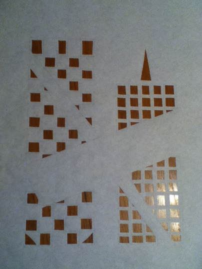
The finished Band-Aid stencil.
|
Band-Aid Stencil:
|
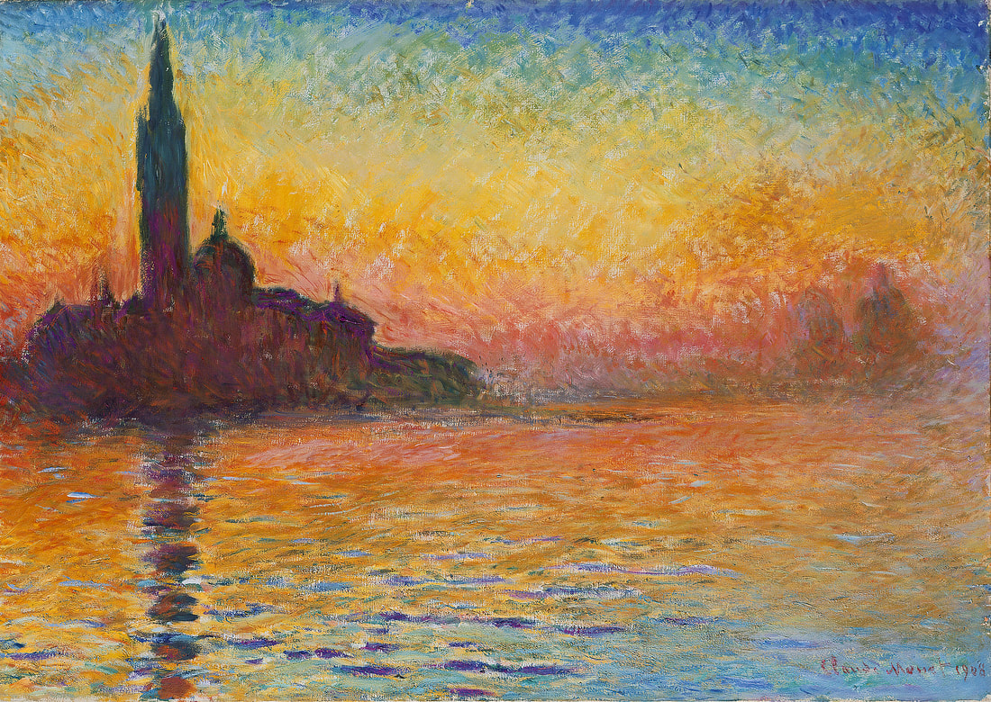
"San Giorgio Maggiore at Dusk". Claude Monet, 1908-1912.
|
"Healing". Elizabeth Verkuilen, 2018.
|
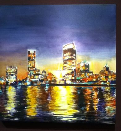
"Water, Wind, Window." Jeanne Nikolai Olivieri.
|
"Healing" vs. "San Giorgio Maggiore at Dusk"Similarities:
|
"Healing" vs. "Water, Wind, Willow"Similarities:
|