Second Summer Project: Painting

|
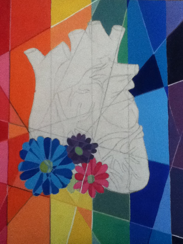
Title: "Welcome to the Community" Size: 30.48 cm x 30.48 cm Medium: Acrylic on plywood Completion: July 2019 |
|
|
Title: "Welcome to the Community" Size: 30.48 cm x 30.48 cm Medium: Acrylic on plywood Completion: July 2019 |
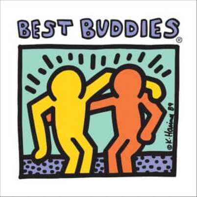
"Best Buddies", Keith Haring, 1990.
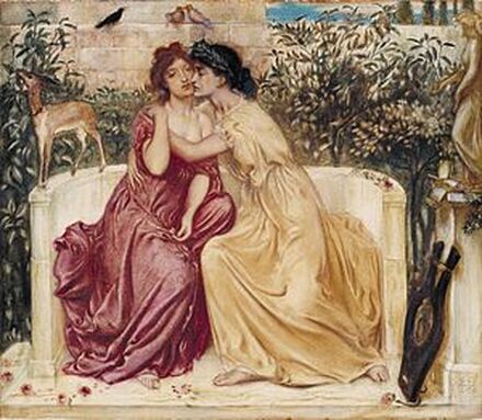
"Sappho and Erinna in a Garden at Mytilene", Simeon Solomon, 1864.
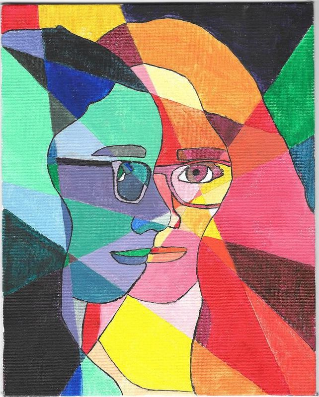
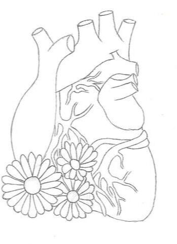
"Untitled Sophomore Piece", Elizabeth Verkuilen, 2018.
|
As someone raised in a quiet, semi-religious family, I learned from the get go that being “different” wasn’t always the best. If I stayed quiet, if I played along with what everyone else expected of me, I would make them happy and therefore make myself happy in the process...right?
Being the first openly queer person in my family is scary lots of ways, but the fear of being shunned, discriminated, etcetera is easily drowned out with the love and support I get from those close to me. This is something I especially learned when I attended my first ever Pride Fest in June of 2019, where I was able to walk in a parade surrounded by acceptant strangers and loved ones alike and feel an overwhelming bout of happiness. As this wonderful moment helped to kick off my summer, I found it fitting that it be the foundation of the first art piece that I would complete for school before senior year began - a year where I would have to take a look at myself, my future, and what I wanted to accomplish in order to make myself happy. When planning for this project, I kept both thematic and artistic inspiration in mind. I had already researched Keith Haring and Simeon Solomon for my comparative study - both are predominant artists from different periods of time/art and are similar in their support for the LGBT+ relations. While Haring used the bright colors and imagery of the American Pop Art movement to express his acceptance of queers and sarcasm at society’s attitudes, Solomon addressed the topic in a lighter fashion focused on stories normalizing same-sex relations. While the main connection between my piece and inspirations would be thematic, I wanted to also connect to their formal aspects - to me, Haring is most recognizable by bright colors outlining in black and Solomon is most recognizable by his pieces which tell a story. I planned to try to tell a visual story like Solomon, but in Haring’s color scheme as to draw viewers’ attention. For additional artistic inspiration, I decided to use the rainbow Pride flag. Created in 1978 by Gilbert Baker, his justification for representing Pride is that it “...came from earliest recorded history as a symbol of hope” (Gilbert Baker). By displaying this flag somewhere in my piece, I hoped to both make the message behind it more clear while also facing my internal fear of being ostracized, despite being happiest when I am myself. I had also stumbled upon a project completed during sophomore year with the image separated into geometric sections of color. Based on prior knowledge of the community, there are countless labels, subsections, etcetera that make it up, and while many view it as tedious and complicated, the labels don’t matter as much as the people themselves. I hoped to represent this diversity by breaking my final image up into these colored sections to represent both the divisions and similarities between members today. 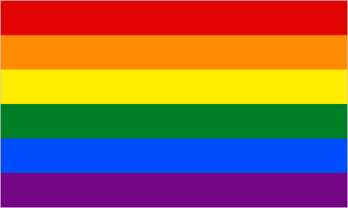
Pride Flag created by Gilbert Baker, 1978.
|
|
Because I already planned on dividing the image into various colored sections, I knew that my practice sketches couldn't be incredibly detailed - the more detail in the image, the more complications would arise when it came to filling it in precisely with paint.
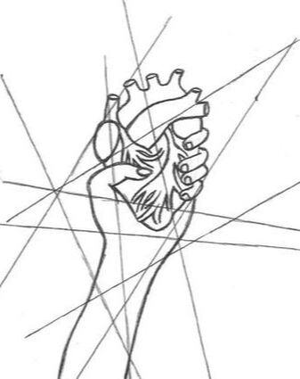
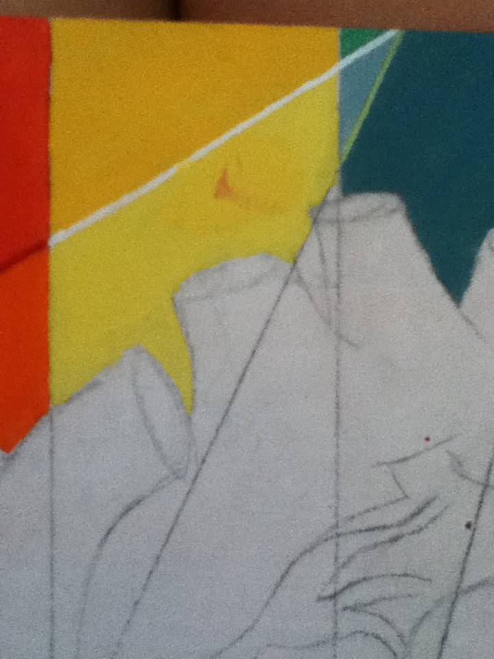
The idea behind this first sketch stems from the vulnerability and courage that is displayed/experienced when a person is first coming out. In today's society, though it's become more accepted in some countries, the LGBT+ community faces lots of backlash and all reactions to their coming out may not be incredibly positive. This makes them very vulnerable to any backlash, but also courageous by putting themselves out there to face that risk. I thought that these two conflicting emotions could be conveyed in this image of a heart being clenched tightly in a fist raised in the air - vulnerability is presented with the presentation of the most important organ to the viewer, but the fist's defiant placement represents the courage. Naturally, the fist is holding a heart, of all organs, to connect to the broad theme love. In this sketch, I also experimented with how to break the image up into sections - in this instance, it was with a small amount of diagonal lines that would create larger sections of color. I ended up using this technique in my finished product to make it easier to see the divisions of color in the background. |
|
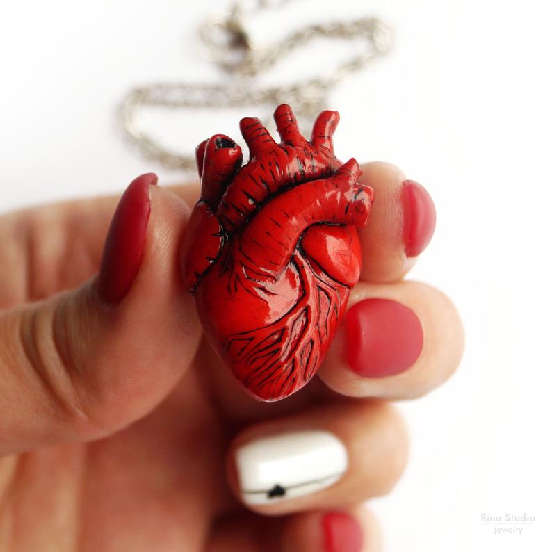
To try and create a somewhat proportioned/realistic sketch, I referenced these two images for the anatomical heart and fist (both images sourced from https://www.shutterstock.com/search/squeeze+the+heart). While I could have drawn a cartoon heart instead of an anatomical one, the realistic-looking heart was more attention grabbing and displayed a more realistic vulnerability compared to holding a cartoon heart aloft. If I did go with the cartoon heart, it would've not only softened my message, but basically copy the reference image on the right.
|
|
|
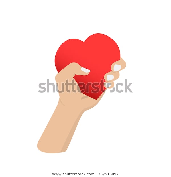
This second sketch stems from the idea of vulnerability presented in the first sketch through gripping a heart in a fist. However, instead of defiantly raising said heart up, this sketch shows it being presented to the viewer, dripping with blood. To me, this seemed to be an accurate depiction of some coming outs, where the person is repeatedly rejected/attacked for their sexuality, yet continues to be proud of who they are and keep putting themselves out there in the hopes of finding acceptance.
However, this sketch wasn't very original - it's exactly like my reference image, just with the minor addition of the dripping blood. I also experimented with a larger multitude of lines over this image, with a bit of a starburst in the center, but it seemed much more chaotic to the eyes compared to the larger sections in my first sketch. |
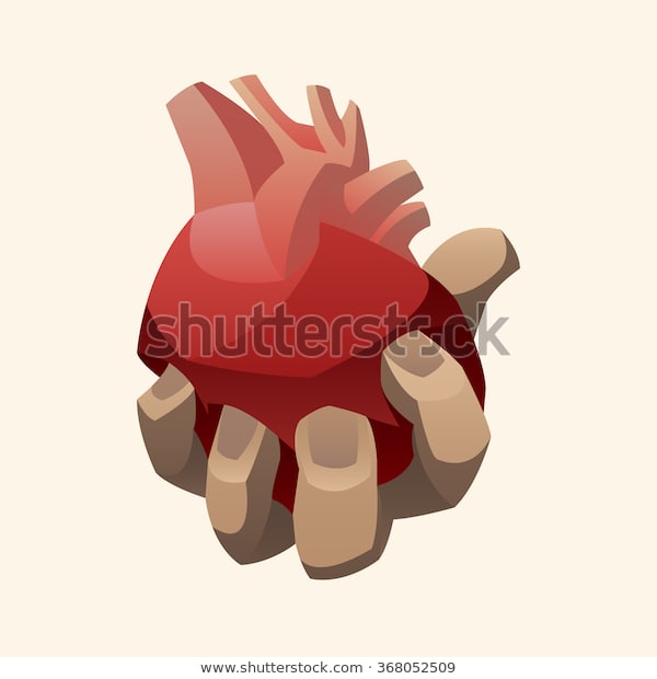
Sourced from https://www.shutterstock.com/image-vector/hand-holding-human-heart-368052509
|
|
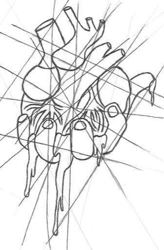
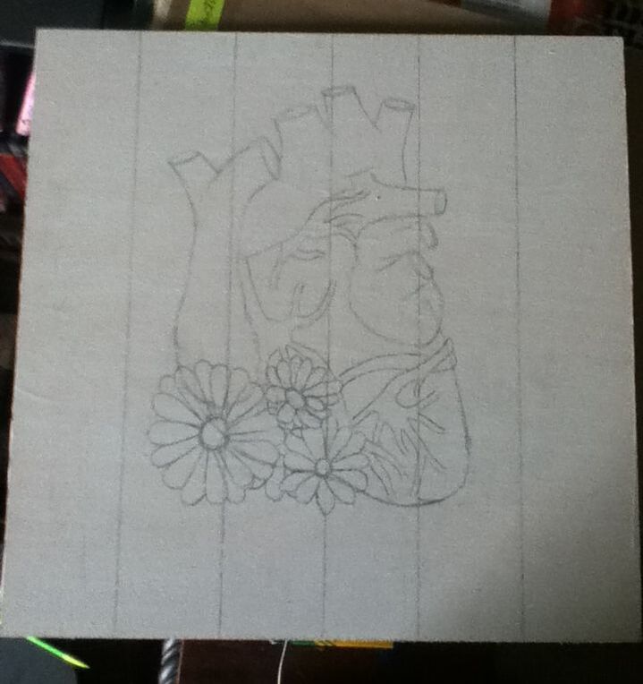
For my final sketch, I wanted to experiment with having a heart as the focal point of the image instead of the fist/arm gesturing it towards the viewer. While the first 2 sketches address the vulnerability and courage associated with coming/being out, I also had the idea to create more of an uplifting piece; instead of focusing on an outlook related to negative reactions, though, I wanted to focus on the growing number who accept that it's perfectly natural and okay to be a part of the LGBT+ community. To convey this, I added a small cluster of flowers at the base of the heart to show both nature and beauty in the community. Of all of my sketches, I thought this image would work best with the concept of breaking it
|
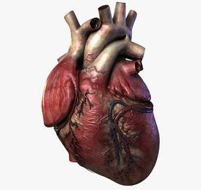
Sourced from https://www.turbosquid.com/3d-models/3d-human-heart/800569
|
|
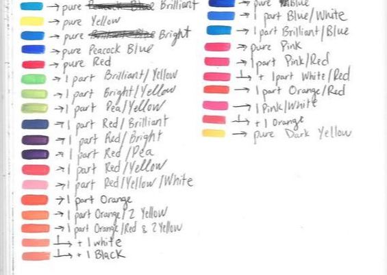
When mixing swatches for this project, I tried to keep 2 things in mind: the diversity of shades and the opaqueness of the color. I had hoped, when going into this project, that it wouldn't be difficult to mix shades that were distinguishable from one another while also similar to their cousin shades...but a lot of my attempts at creating shade ranges (especially pink and orange) resulted in colors that were almost identical. In the end, a large portion of the colors I mixed for this painting were incredibly random, with me adding various parts of different colors in the hopes of creating colors that were clearly different from each other. |
|
I'm not the neatest person, so I wasn't surprised when paint that was smudged on my hand transferred to the board...but it just happened to be on the lightest yellow section of the yellow stripe. I first tried to thickly layer more of the light yellow over the smudge, but the paint wasn't opaque enough to cover it.
By mixing one part Yellow, 1/2 part of Dark Yellow, and 2 toothpicks of Orange, I was able to mix a marigold color that was able to cover my mistake while also still fitting in with the other yellow hues. |
|
|
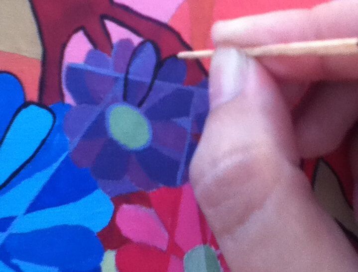
I was worried, at the beginning of outlining the shapes in black lines, that the paintbrushes I had on hand would create lines that were too thick - especially in the smallest areas around the flowers. To test other ways I could possibly trace thin lines, I dipped the thin end of a flat toothpick into Black and began outlining the smallest flower as carefully as I could. While this worked out pretty well in the beginning, I was working with acrylic paint that dried quickly on the wooden tip. Eventually, this led to clumped paint on the tip that thickened the lines. Because I didn't want to waste a large amount of toothpicks and risk lines that were incredibly uneven, I mainly stuck with the edges of flat paintbrushes to border my image. |
|
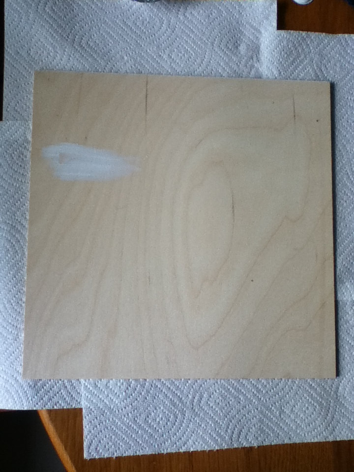
1) I started off by covering my wooden board with 2 layers of gesso using a 1-inch paintbrush to provide an opaque base to then apply paint to. While this was helpful in covering up the rings of the wood to create a solid background, the application wasn't as smooth as it could've been if done with a larger brush; on the plus side, using a smaller brush allowed me to cover the edges with more precision. |
|
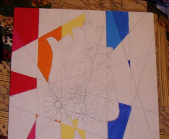
2) With my 3rd sketch as reference, I freehanded the heart/floral design in roughly the center of the board. I then took a ruler and divided the board into 6 vertical stripes (one for each stripe of the Pride flag).
Ideally, each stripe would be the same width - as the board I purchased is 1 foot long and wide, I thought that I could mark off stripes that were each 2 inches wide. However, the board turned out to be 11.8 inches long/wide. . .which isn't evenly divisible by 6. To try and rectify this, I started at the center of the border (5.9 inches) and made 2 increments of 1.9 inches on either side of this median mark. This allowed the 4 stripes in the center to be the same width, while the two stripes bordering them were slightly thicker. Originally, I was going to make the stripes horizontal like the Pride flag, but doing so would've made the heart appear much rounder, while the vertical lines made my sort-of-fat heart look a tad slimmer. The vertical stripes also help draw the eyes to the heart first, then down to the flowers, which I thought was a fitting presentation of my message. |
|
3) With a straight edge and the same pencil, I drew various diagonal lines that intersected the image and the stripes. While doing this, I had to keep in mind that the vertical stripes would still be visible so that, when it came to applying paint, I would be applying colors in the correct area(s). I then started to apply pure paint colors onto the stripes, alternating between a Flat 6 brush to fill in large spaces and a Flat 4 brush to clean up the edges and cover smaller spaces. Pure paint colors used (from left to right): Hot Pink, Red, Orange, Yellow, Bright Blue, Brilliant Blue, Blue |
|
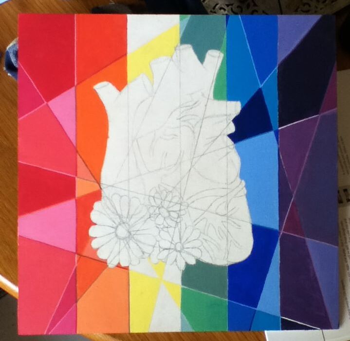
4) Using my paint swatches as reference, I then began to mix the rest of the colors I needed to complete the rainbow variety. To try and estimate how many shades of each hue I would require to create some variety in the stripes, I counted how many pieces made up each stripe. Red section: 9 sections >>> 3-4 shades could be repeated Orange section: 10 sections >>> 4-5 shades could be repeated Yellow section: 9 sections >>> 3-4 shades could be repeated Green section: 7 sections >>> 2-3 shades could be repeated Blue section: 11 sections >>> 5-6 shades could be repeated Purple section: 11 sections >>> 5-6 sections could be repeated All remaining colors were mixed with the paints mentioned in Step 3, along with the addition of White and Black for some colors. |
|
|
5) To emphasize the geometric sections, I used the flat tip of a Flat 4 brush to line certain sections with a shade that was lighter or darker than the color it bordered.
I then started to paint the 3 flowers at the base of the heart. Starting with the largest flower, I filled it in with alternating shades of blue that complimented the orange stripe that it was mostly against, using a Flat 4 brush for the linear portions and a Round 0 brush to fill in tiny portions and round the petals. Similarly, I alternated between shades of pink for the flower against the green stripe and shades of purple for the flower positioned over the yellow stripe. I had initially planned on painting the centers of the flowers yellow, but since their centers are mainly positioned over the yellow stripe, I instead opted for shades of green that gradually direct the viewer's vision towards the green stripe. After all the flowers were shades in, I wanted to separate their sections with a shade lighter/darker than the petals (similar to how the stripes' portions were lined), but that backfired on me when I drew a crooked line through the pink flower. Because the flowers were so small and made it more difficult to make straight lines, I ended up lightly lining the flowers' sections with one of the colors of the petals (Brilliant Blue for the blue flower, Hot Pink for the pink flower, and a mixture of Brilliant and Hot for a purple shade). |

|
6) To fill in the heart, I referenced the same picture I used for my 3rd sketch and saw that it was primarily made up of red, tan, and somewhat-pink hues. Alternating between a Flat 6 brush for larger spaces and a Flat 4 to clean up the edges, I alternated between 2-3 similar shades for each type of color I saw in my reference image.
Top portions: 1 part White and varying parts of Orange, Espresso, and/or Dark Yellow to create shades of tan Bottom portions: 1 part Red and varying parts Hot Pink, White, and/or Orange to create shades of pink Veins: Pure Red for the bright veins, 1 part Red/Espresso for the dark veins, 1 part Red/Brilliant Blue/Espresso for the dark blue vein. I then finished the piece by carefully tracing the image of the heart and flowers by alternating between a Round 0, Flat 4, and toothpick. The black lines separating the stripes were created with a Flat 6. Initially, I outlined everything carefully in black so that the tan portions weren't lost in the orange stripe, but the combination of stark lines and bright, unblended colors unintentionally mimics Haring's signature art style. As his work is already one of my inspirations, I decided to be a little more lenient with the line work, as his style is more cartoon-y than precise. |
"Welcome to the Community" vs. The Pride FlagSimilarities:
|
"Welcome to the Community" vs. "Untitled Sophomore Piece"Similarities:
|

Pride Flag created by Gilbert Baker, 1978.
|
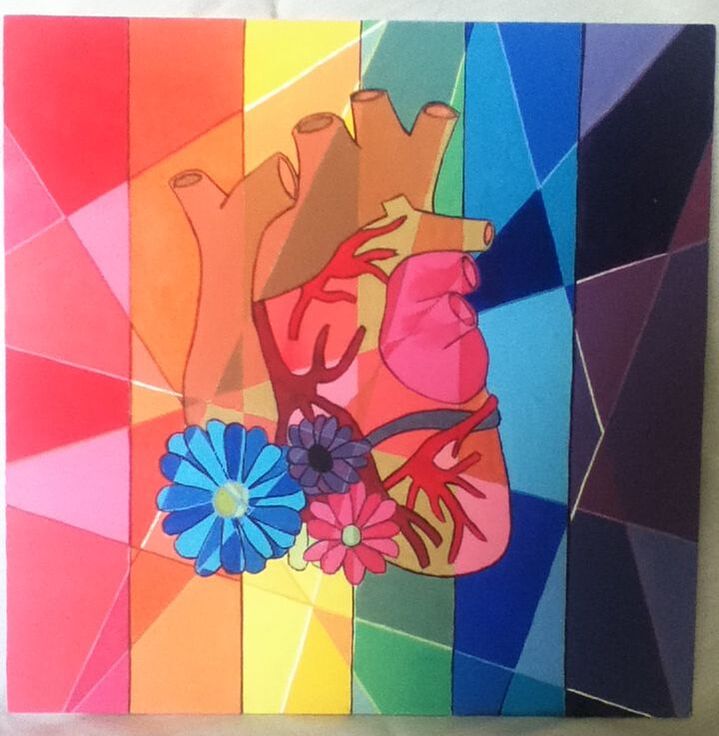
"Welcome to the Community", Elizabeth Verkuilen, 2019.
|

"Untitled Sophomore Piece", Elizabeth Verkuilen, 2018.
|
