"Familial Hues" First Panel
|
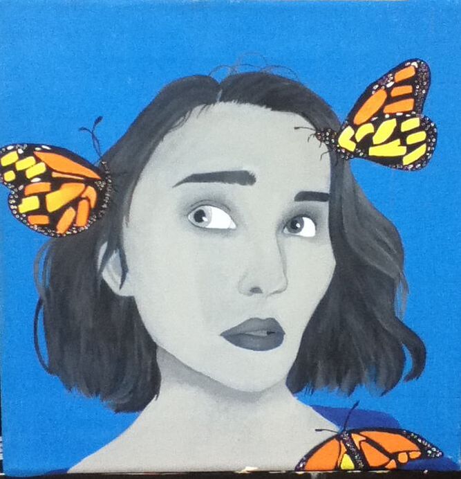
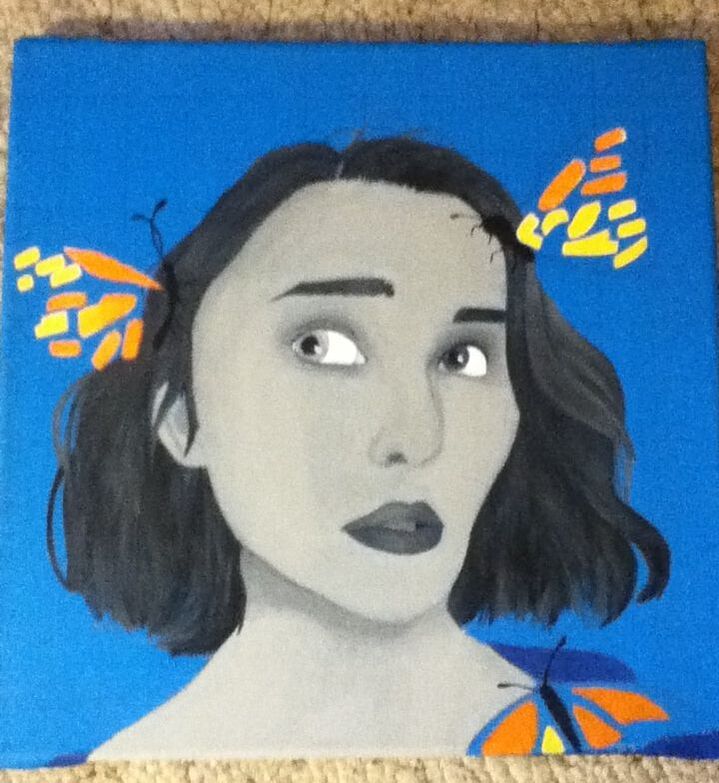
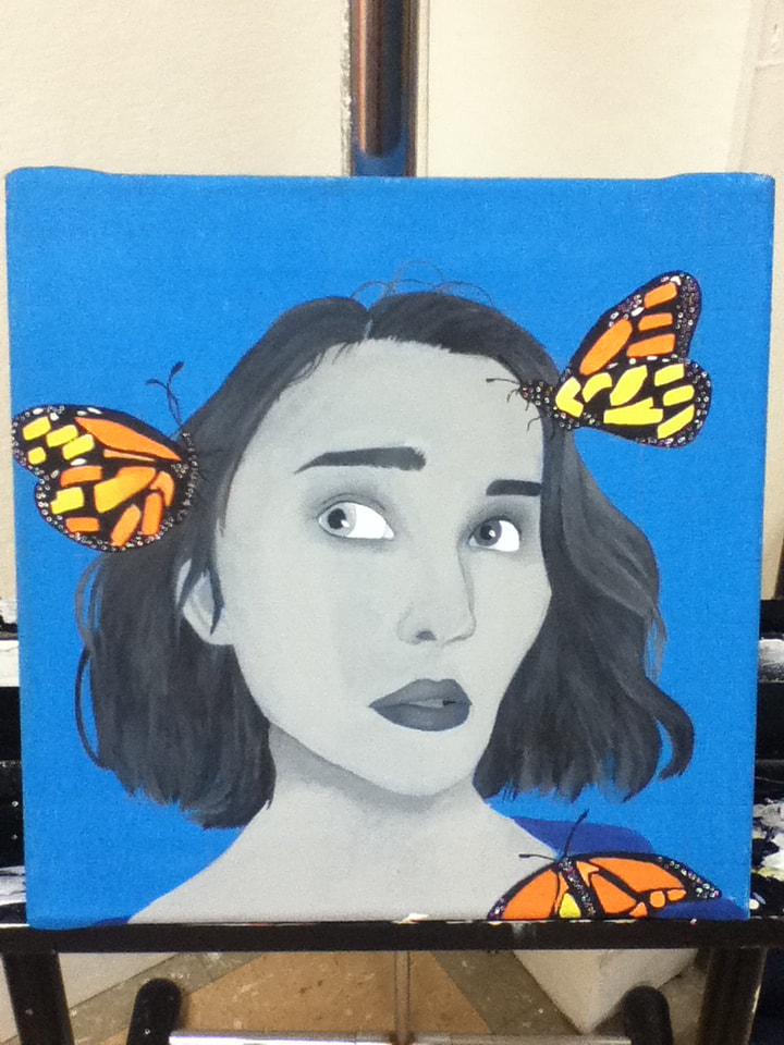
Title: "Blue" Size: 30.48 cm. x 30.48 cm. Medium: Acrylic on canvas Completion: October 2019 |
|
|
Title: "Blue" Size: 30.48 cm. x 30.48 cm. Medium: Acrylic on canvas Completion: October 2019 |

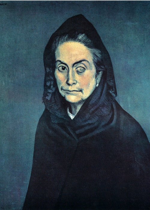
"Celestina". Pablo Picasso, 1904.
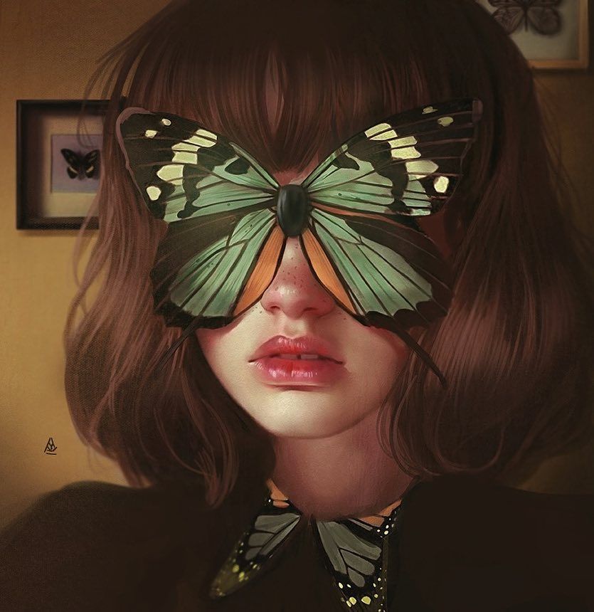
Untitled Piece, Aykut Aydoğdu, 2019.
|
For each portrait in Familial Hues, I first had to decide which of Picasso’s artistic periods thematically represented each member most accurately in my opinion. I ended up choosing Picasso’s Blue Period as inspiration for my portrait panel for a couple of reasons - mainly that, of my entire family, I am the most outwardly emotional and tend to be more honest when it comes to expressing my feelings. This shows a large evolution in my character, in my opinion, because it wasn’t long ago that I would shut myself off from the world and barely tell anyone of how my day went, let alone what I’m feeling and why I may be feeling that way. In my opinion, this connects to Picasso’s Blue Period because this period is a somber reflection of both Picasso’s viewpoint on happenings in Spain from 1901-1904, his experiences revolved around instability and poverty, and the suicide of a close friend. Picasso openly expressed these depressing thoughts in this period, primarily through monochromatic paintings in the titular shade and imagery that commonly depicted beggars, urchins, and persons disabled either physically or in terms of age. I hoped to emulate the serious emotional theme of this period in my final artwork by using the painting Celestina as inspiration - the stark blue background emphasizes that this is the Blue Period, while the contrast of black/grey hues to depict her displays a ghostly, yet still human, person.
To incorporate a more “modern” twist on such an old artistic inspiration, I decided to use one of my favorite illustrators, Aykut Aydoğdu, as my other artistic inspiration. Aydoğdu is a Turkish commercial illustrator who is best known for surrealist digital illustrations that are meant to focus on the daily dilemmas of life. Combining Aydoğdu with Picasso was a good thematic match for this piece because both take inspiration from real life scenarios, whether specific to the artist or blatantly relatable to most of the audience - the theme of myself overcoming past setbacks to become who I am today seemed to fit well into that overlapping category. I was particularly drawn to this untitled illustration of Aydoğdu’s depicting a girl’s face covered by a large butterfly. To me, this provided a great inspiration for symbolism in the piece (my English class, during this time period, was studying poetry and I was on a symbolic research high) because I knew from prior knowledge that butterflies are symbolic of change and evolution...another piece that fits well in the theme I wished to explore. While I wasn’t sure of how I would yet incorporate a butterfly into the final image, I definitely wanted to incorporate that symbolism into it and perhaps provide contrast between the brightness of the butterfly and the otherwise-morose color scheme of the work |
Blind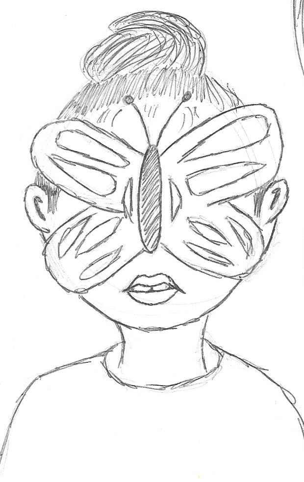
For my first sketch, I closely imitated Aydoğdu's piece by sketching a large butterfly over my eyes. To me, this placement of the butterfly could symbolize how I was blinded by my struggles to truly see how they were hurting myself and those around me. However, even with the incorporation of Picasso's blue-and-grey color scheme, I was worried that this would be copying Aydoğdu's design too much and decided to try and do something more original.
|
Silenced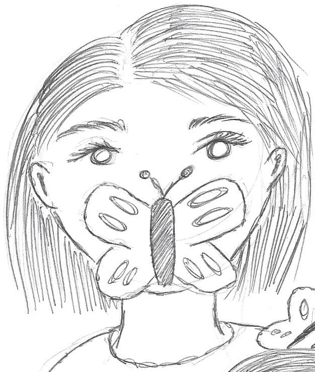
For my second sketch, I moved the butterfly down so that it covered the mouth in an attempt to symbolize my silence on my mental state while I was enduring it and how it stifled who I was for those few years. While I was initially leaning towards this one (mainly because it covered most of the facial features and, as you may or may not be able to tell from the final product, I'm not very good at painting noses - using this would be easier to paint), I decided against it after I realized it's similarity to a film poster from the horror film "The Silence of the Lambs". Even the possible association of my artwork's theme with something so negative would change what I overall wanted to convey: that I am a stronger, better person despite the struggles I've been through.
|
Embraced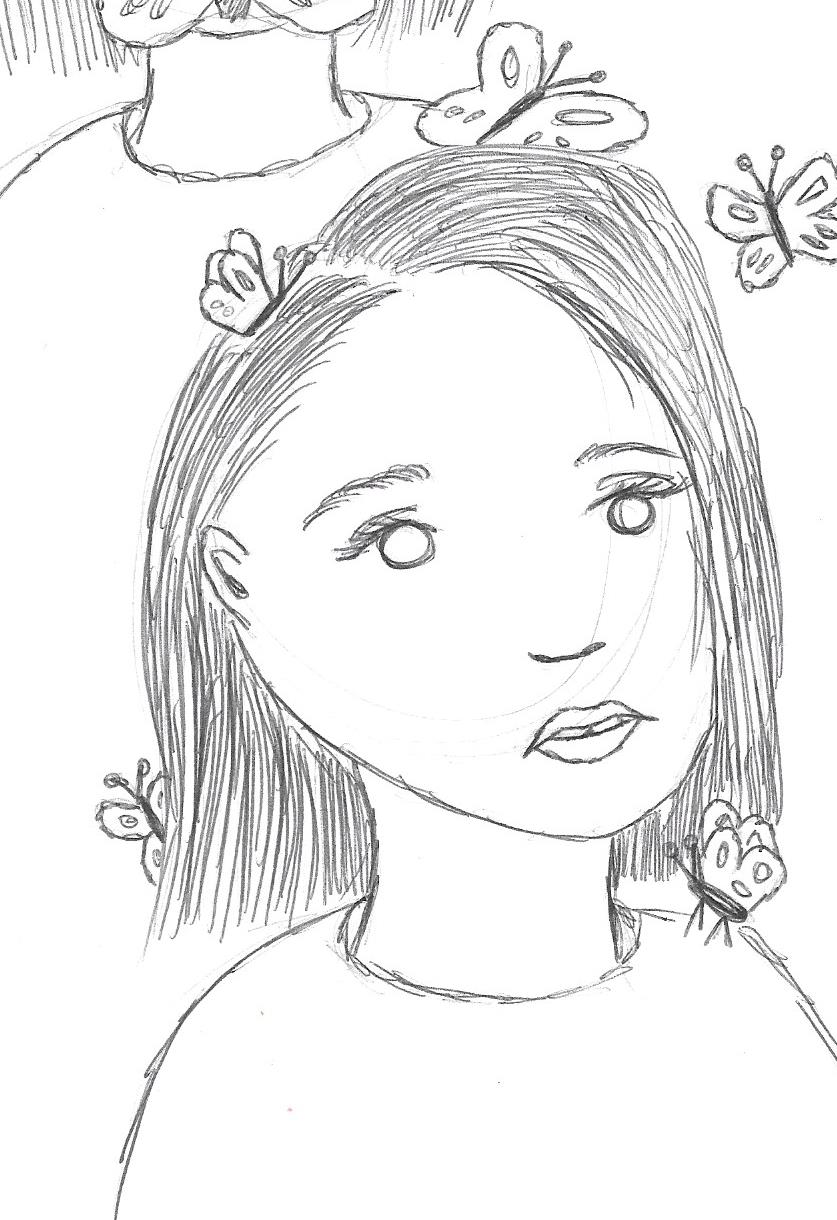
My final sketch still keeps in mind the visual idea presented by Aydoğdu of being covered with a butterfly - however, this sketch shows multiple butterflies covering the figure, allowing viewers to see her face and focus more on the person than the butterflies. To me, the small butterflies surrounding me would represent the hope/change that loved ones provided me with in my time of need and still provide me with to this day if I ever feel myself falling back into that void. Though it's not in my practice sketch, I later incorporated the blind eye present in Picasso's "Celestina" to symbolize how I would frequently turn a blind eye to those trying to reach out and help me and how, sometimes, I still struggle with recognizing when someone is there as a friend and not as someone who views me as a "bother".
|
|
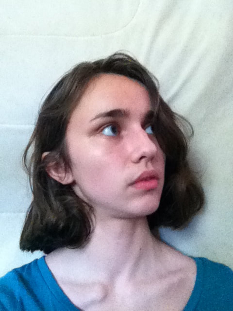
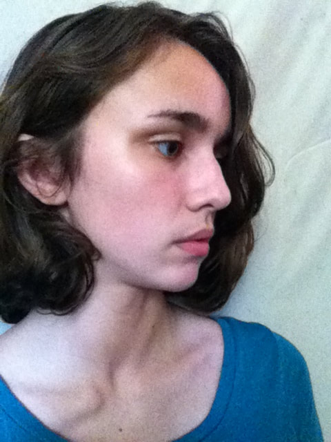
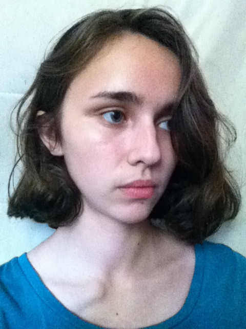
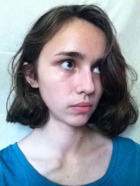
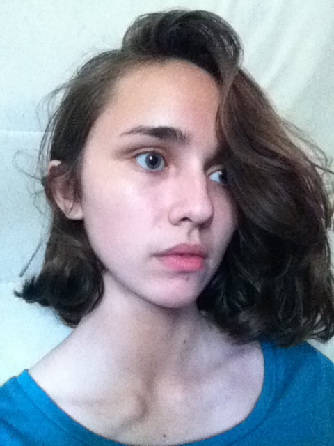
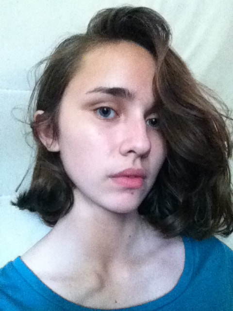
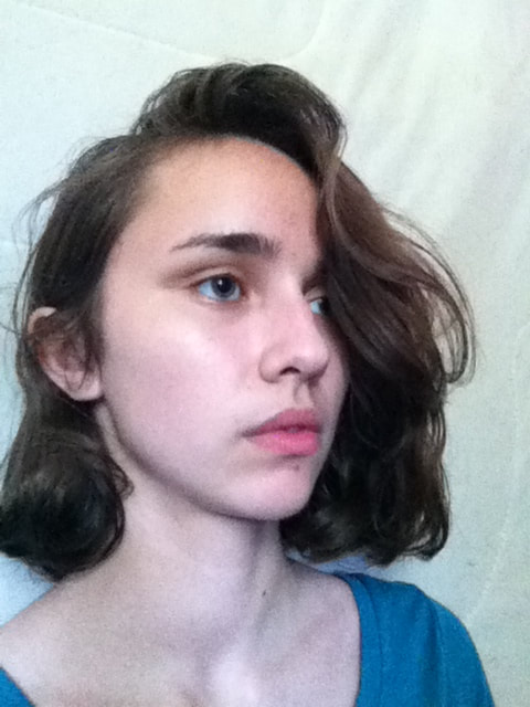
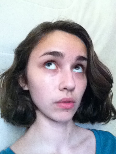
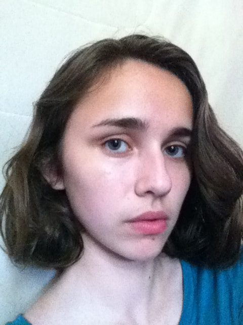
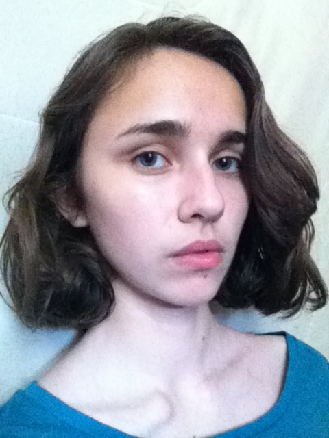
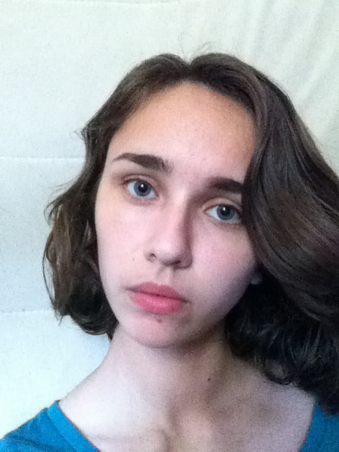
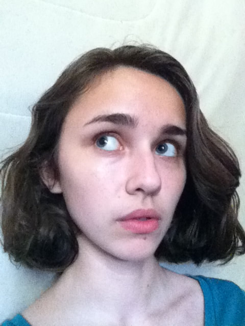
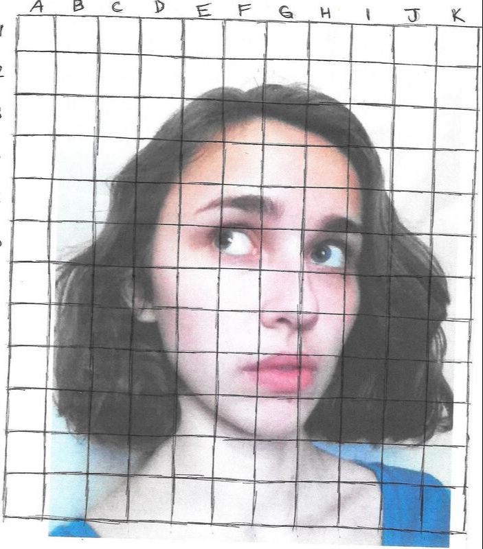
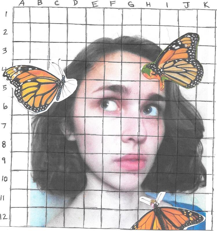
Because both of my inspirations are stylized in a realistic way that I'm unable to free-hand on my own, I needed a reference picture for both sketching the image onto my canvas via the grid method and to use for skin/hair color variation when it came time to attempt blending. For all of my attempts at a reference photo, I posed in front of a window to provide natural lighting, in front of my bunk bed with a sheet draped over the top; I had already known that my painting's background would be one solid color, and as such, wanted to avoid taking a picture with anything behind me.
Though both of my inspirations' figures are relatively positioned towards the camera, I first started taking pictures from a side angle (my attempt at avoiding any large amount of blending. . .once again, I don't know how to paint noses). However, I needed a straight facial expression like my inspirations, and doing so while being photographed from the side made me look murderous or dead inside. I ended up choosing this photo to reference for my piece because it would challenge me to paint more of a frontal view that's similar to the figures in both of my inspirations, while also creating movement with the eyes looking up at the butterflies. Positioning my gaze this way also signifies that I'm aware of those around me trying to help, later making the most-upward eye the "blind" eye to symbolize ignoring said help to instead wallow in my depression. |
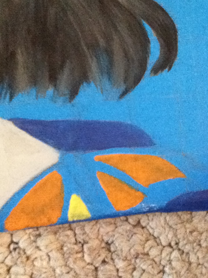
3 coats of Orange and Dark Gold over Brilliant Blue...
|
The highest level of contrast in my finished piece is between the blue background and the orange/yellow hues of the butterflies' wings - however, I hadn't thought it through, when applying the blue wash, that I would later have to go over it with the lighter orange and yellow. This mistake wasn't realized until I had already applied the colors to the lowermost butterfly - to avoid this mishap with the other two butterflies, the wings' spots were first applied with White, then overlapped with the Orange/Gold. The prior application of White avoided any darkening of the brighter colors due to the darker background.
|
...versus one coat of the same colors over White
|
|
1) Starting with a 1 foot X 1 foot canvas that I stretched, I applied 3 coats of gesso with a 1-inch brush to cover as much of the canvas's yellow hue as possible. Once this white base dried, I applied 1 coat of Brilliant Blue to the entire canvas with the same 1-inch brush to serve as a wash for the final piece. While I initially wanted to create a blue/black gradient similar to the background in Picasso's "Celestina", I was worried that the black present at the top of the gradient would combine with the black/grey hues I planned to use for the hair. The inclusion of a solid background instead of one textured with color ended up benefiting the final artwork, providing contrast between the shading of my person and the flatness of the blue. |
|
|
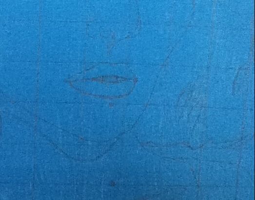
2) With a metal, cork-backed ruler and 0.7 mm mechanical pencil, I sketched out two square grids consisted of 12 squares on each side - one on my reference image of squares 1 cm. by 1 cm., the other on my canvas with increments every 1.3 cm. I then sketched my reference image onto the canvas' grid, using the pencil's precise tip to try and achieve as close of an image as possible (along with less pencil to erase/cover at the end).
|
|
|
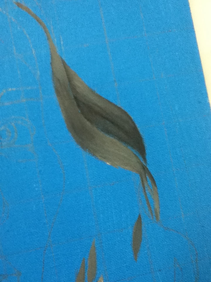
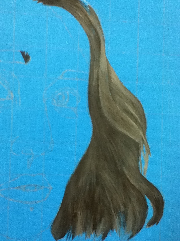
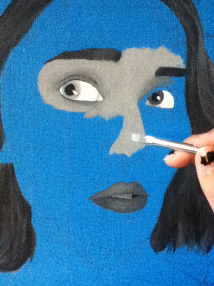
3) Taking a Flat 4 brush, I began laying down a wash of pure Black, White, and 1 part Black/White to create a grey hue to various sections of hair in order to know how intense of colors to use when it came time to texture it. However, my grey mixture wasn't entirely combined when I began painting, leading to a variety of grey shades being applied with varying amounts of unblended White at the bottom. Certain parts of this accidental gradient, while not solid as I hoped, actually emulated hair texture pretty well; instead of laying down a wash, I began overlapping light brushstrokes of the varying grey mixture to the section of hair lightest in my reference picture. |
|
|
4) I then continued this technique with the same size brush, but this time alternating between various grey mixtures and pure Black for the darkest portions of my hair. While it was easier to tell the texture of the wavy, lighter portions of my hair in the reference picture because of the light reflecting off of it, the darker portions were much more solid in the image - to try and make the hair appear unified, I freehanded what I believed to be passable texture at the bottom of the hair. |
|
|
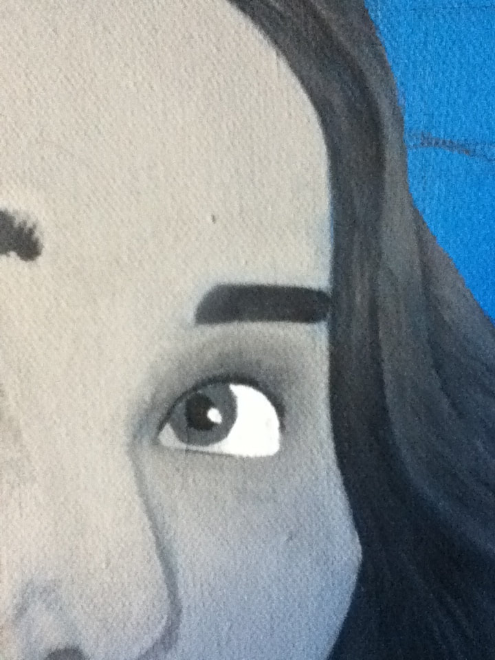
5) Continuing with the alternation of Black and grey mixture, I filled in my eyebrows with the combination of the same Flat brush and a Round 0 to try and achieve the appearance of my naturally hairy, thick brows. While I think I achieved thickness well, I wasn't sure how to make the brows look hairy, and all attempts at alternating between brushes led to brows that were solid yet with a gradient.
For the eyes, I wiped off excess grey paint from my Flat brush with a dry paper towel, then dipped it in pure White to fill in the eyeballs. By not cleaning my brush with water, this created an off-white that's closer to the natural tint of an eyeball than the brightness of solid white. I then applied one coat of the grey mixture sandwiched between 2 coats of White for the "blind" eye and one coat of the grey mixture blended with 1 toothpick of black for the other eye. The varying degrees of grey were applied to the eyes and the skin around it, with me later going over the eye lid/crease with a thin line of Black on the Round 0 blended out with water to give them more definition. The lips were filled in with my smallest Flat brush, alternating between the grey used for the normal eye and the grey used for the blind eye for highlight. Greys and Black was used on Round 0 for open part of the mouth. |
|
|
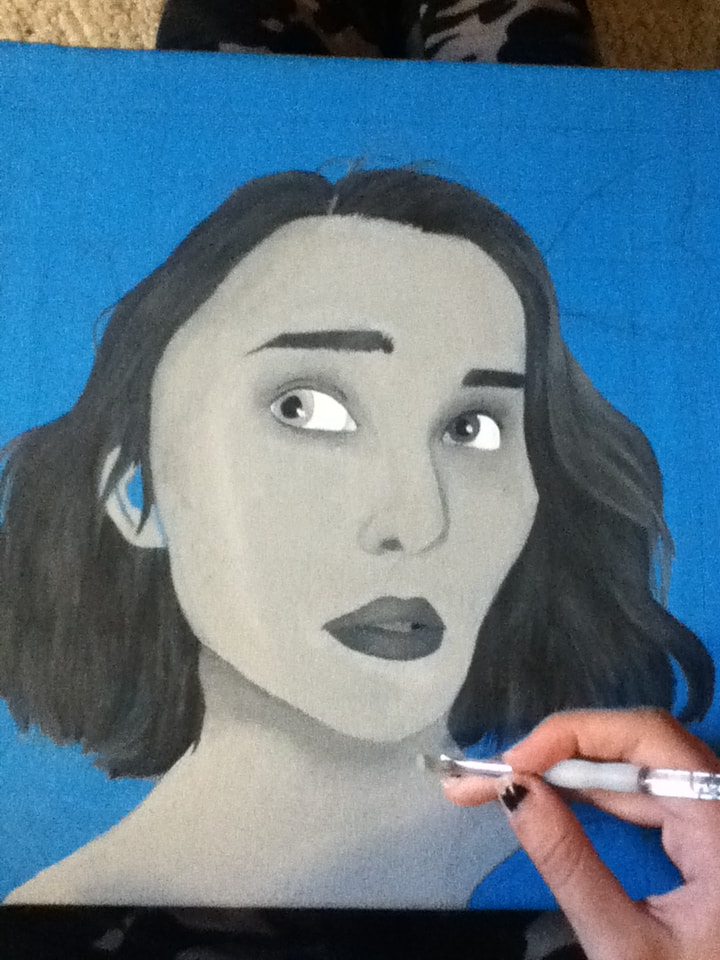
6) Continuing with the varying grey mixtures, I alternated between a 3/4" brush, a Flat 2, and a Flat 4 brush to try and create dimension on my face. While the layers of skin tone are quite thin in these photos, I later applied additional layers after finishing the rest of the painting.
|
|
Sites where butterfly images are sourced from are cited in the bibliography below
|
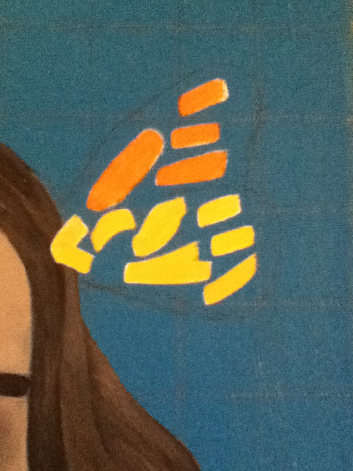
7) Because my access to Photoshop was limited at this stage of the process, I printed out small pictures of monarchs, cut them out, and glued them to my reference image. With this, I was able to sketch out the placement of the butterflies and start to lay out pure Orange and Dark Gold with a Flat 4 for the brightest parts of the wings that contrast with the blue background. |
|
|
8) To finish with the butterflies, I alternated between Flat 4 and Round 0 with pure Black to fill in the rest of the butterflies' wings. Taking advantage of the Round 0's tiny tip, I carefully dipped it in pure White to dot the perimeters of the wings with speckles. While I could've ended this here, I later went on to add small hairs to the scalp and thickened the portions of my eyebrows that I accidentally got rid of with the darkest grey mixture on the same Round 0. |
"Blue" vs. "Celestina"Similarities:
|
"Blue" vs. Untitled PieceSimilarities:
|
"Celestina". Pablo Picasso, 1904.
|

"Blue". Elizabeth Verkuilen, 2019.
|

Untitled Piece, Aykut Aydoğdu, 2019.
|