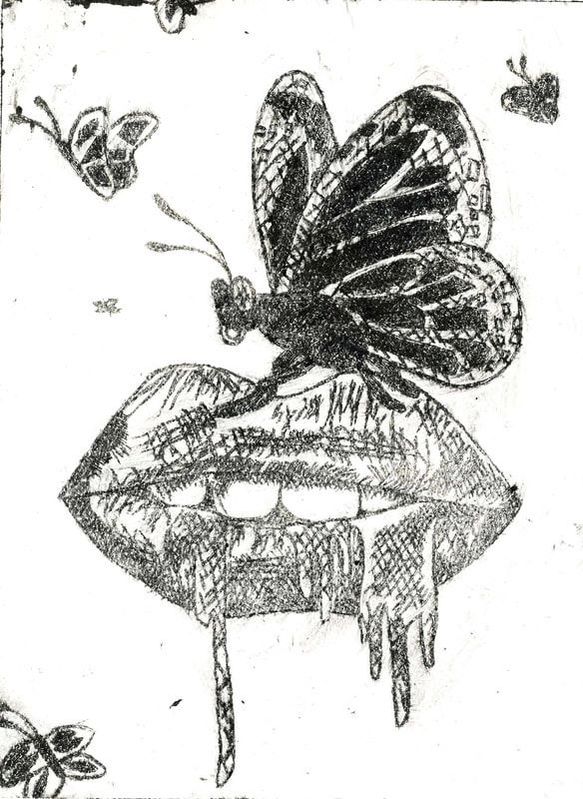
Artwork: Drypoint Print
|
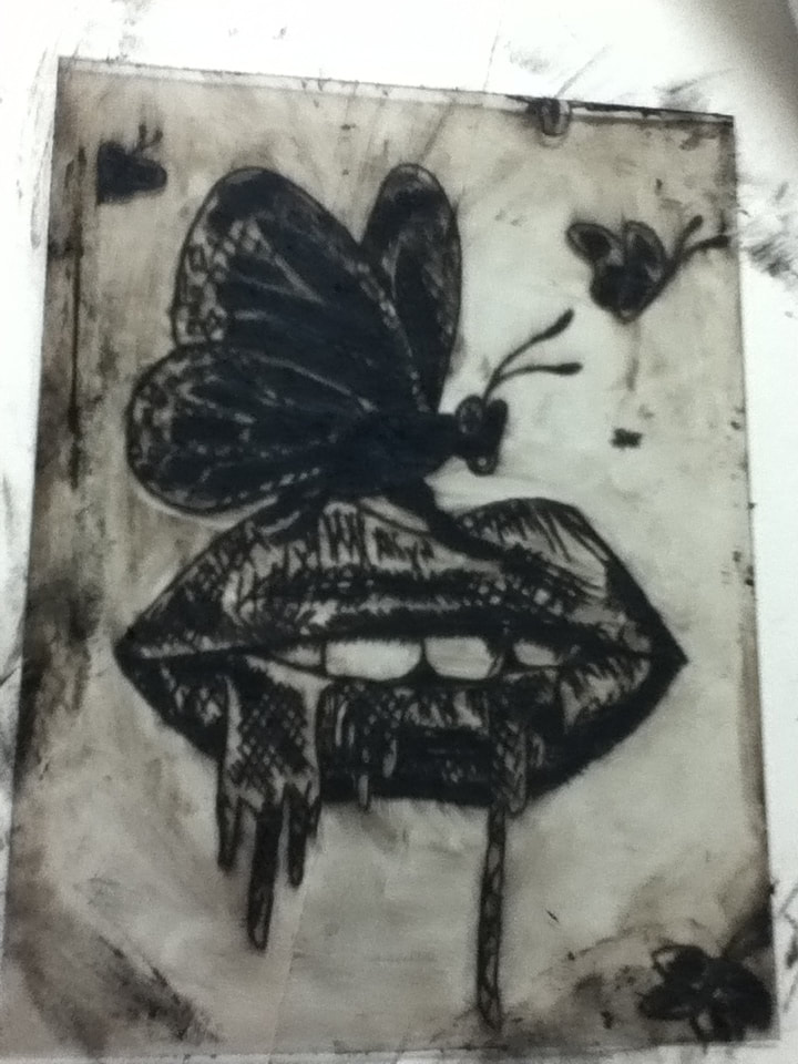
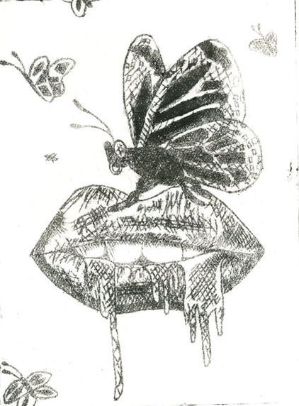
Title: "Bad Trip" Size: 15 cm. x 20 cm. Medium: Drypoint Print Completion: November 2018 |
|
|
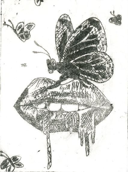
Title: "Bad Trip" Size: 15 cm. x 20 cm. Medium: Drypoint Print Completion: November 2018 |
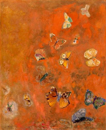
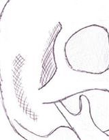
"Evocation of Butterflies". Odilon Redon, 1912.
|
I thought it would be interesting to perhaps create an artwork related to my low self esteem that fueled my desire to be a "perfect" version of myself, stemming off of the subject of my digital collage. However, I didn't have an immediate idea as to what could inspire my piece until I was listening to music one day. One of the lyrics in beginning of the song "Wasteland" by Against the Current seemed to almost perfectly describe my budding relationship with my esteem: "Candy-coated lips/you're the sweetest kiss/but a bad trip". This line, to me, represented the intoxicating relationship that I still have with my low self-esteem. I feel it creeping over me everyday, with every task and social interaction, and even though it makes me think negatively and feel extremely lonely, to get rid of it feels like a nonexistent option. I was influenced by the scenery and color scheme of the music video as well - the extreme use of black/dark colors combined with beautiful landscapes and outdoor shots gives the viewer a gothic feel. This connects with my take on my relationship with my low self-esteem. It's beautiful, in the sense that I've accepted it as a part of who I am, but dark because it harms me mentally and emotionally.
I was also influenced by Odilon Redon's numerous butterfly paintings that he created not long before he died; in particular, I was drawn to his work "Evocation of Butterflies". The imagery of migrating butterflies, combined with a warm color scheme dotted with cool tones, gives the viewer a sense of hope and happiness. However, upon further inspection, we can see that the large brown butterfly in the image is actually a winged girl, looking terrified. When I first saw this piece, I thought that the wings were controlling the young girl, who is forced to migrate with the other insects against her will. While my subject would be conveyed wonderfully with me creating a similar girl with wings - with the wings symbolizing my self-esteem - I didn't want to use an idea that's not my own. However, I believe that butterflies have an admirable sense of endurance, both with monarchs' yearly migration and the metamorphosis caterpillars undergo to become a butterfly. I plan on using butterflies or something related to butterflies in order to represent my endurance of my low self-esteem over the years and how stubborn I am to endure it instead of try and rid myself of it. |
Sketch #1
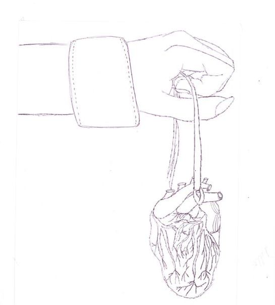
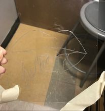
My initial idea was to connect this piece to my digital collage by discussing my sexual orientation and how I felt when coming out as bisexual. The heart dangling from a string represents how vulnerable I felt when coming out, as I wasn't sure how others would react. However, as I worked on this sketch, I didn't like the idea of seemingly defining my sexuality as my identity - while I'm not hiding in the "closet", I don't think that my sexuality strongly defines me as a person. Yes, it is a part of who I am, but it's never really impacted me or how I've evolved over the years. Not only that, but this sketch wasn't inspired by anything, which made it a flimsy idea without roots.
|
Sketch #2
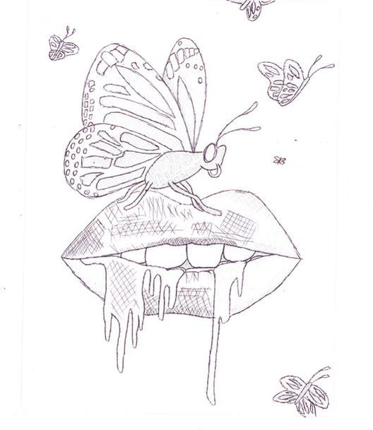
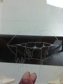
This sketch incorporated the "candy-coated lips" lyric, with icing dripping from the lips representing the candy. Not only that, but I added butterflies flying in the background of the image, similar to Redon's piece, while also placing one front and center on the lips to both enunciate that those are, in fact, butterflies, and to also make it seem more dramatic (or at least, in my mind, I thought that a butterfly balanced precariously on dripping lips looked dramatic).
|
Sketch #3
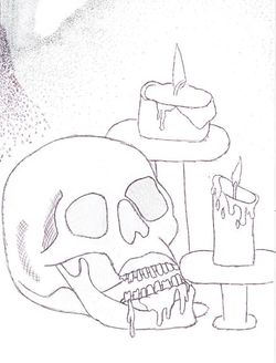
At the last moment, I researched other symbols that I could incorporate into my work and found that a skull represents dread/dismay. I thought that maybe I could use this to convey how a part of me is disappointed that I've retained such low self-esteem for so long, while also displaying that it's all in my head. I originally thought that I could put a butterfly perched on top of the skull, but that seemed too similar to #2. However, it's a known fact that moths - which are similar to butterflies - are attracted to light, so I decided to add some dripping candles in the background. I then tried to add dripping lips to the skull to connect directly to the ATC lyrics (kind of like I did in sketch #2), and while I was initially pleased, I soon saw that they looked more like cartoon-y lips than actual lips...because, after all, skulls don't have lips.
|
|
Since a dry-point is creating by etching an image into a sheet of plastic, I had to be extremely careful with how I would shade my piece. The two options were to use crosshatching or stippling, and I decided to experiment with these options in my practice sketches. I shaded in sketch #2 with crosshatching, and then played around with a possible mash-up of stippling and crosshatching in sketch #3.
Based on this, I concluded that I would shade in my image with crosshatching for the following reasons:
|
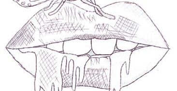
Crosshatching the lips
|
|
|
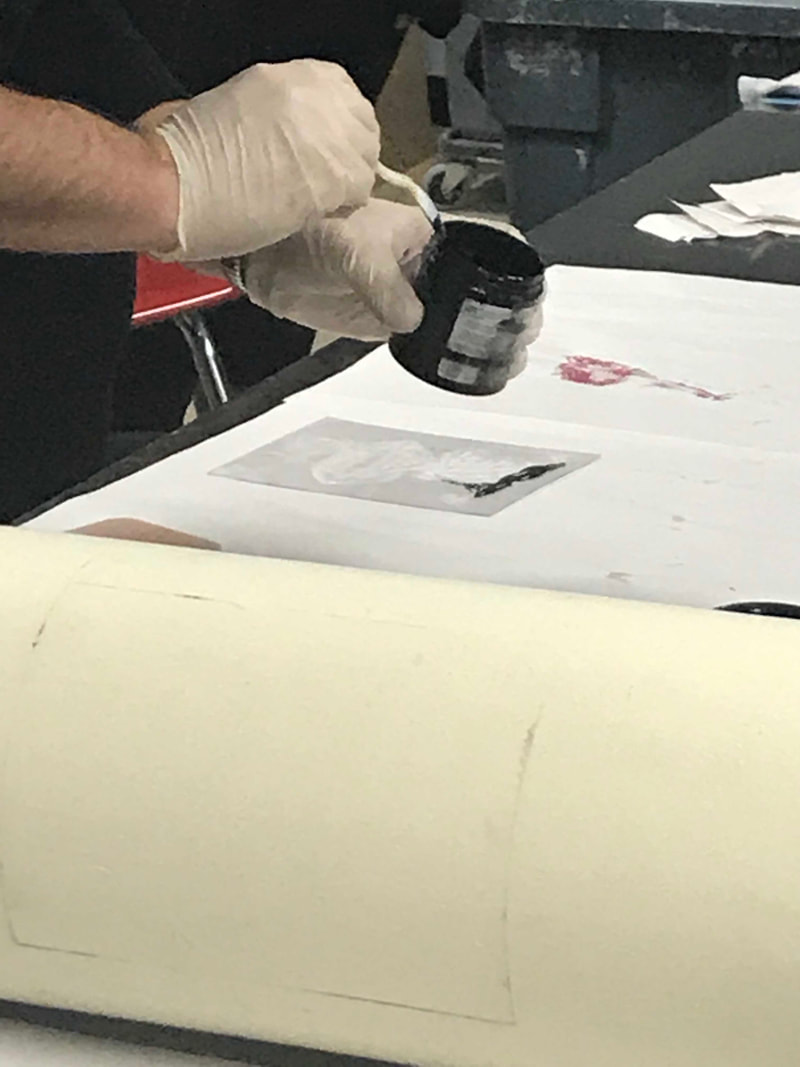
1) Before printing, Chad laid down a few sheets of newsprint and gave some more sheets to one of my classmates to begin to rip into strips. He filled a bucket about an inch tall with water, then submerged a small piece of watercolor paper in it for 8 minutes. As the paper soaked, he took a plastic spoon and spread a small amount of intaglio ink across the upper part of my stencil.
|
|
|
2) Then, with a small plastic squeegee, he dragged the ink down and across the stencil, until all of the etchings were filled with the ink. Once that happened, he bunched up the strips of newsprint and cautiously rubbed the ink off of the stencil so that only a moderate amount filled the etched design.
|
|
|
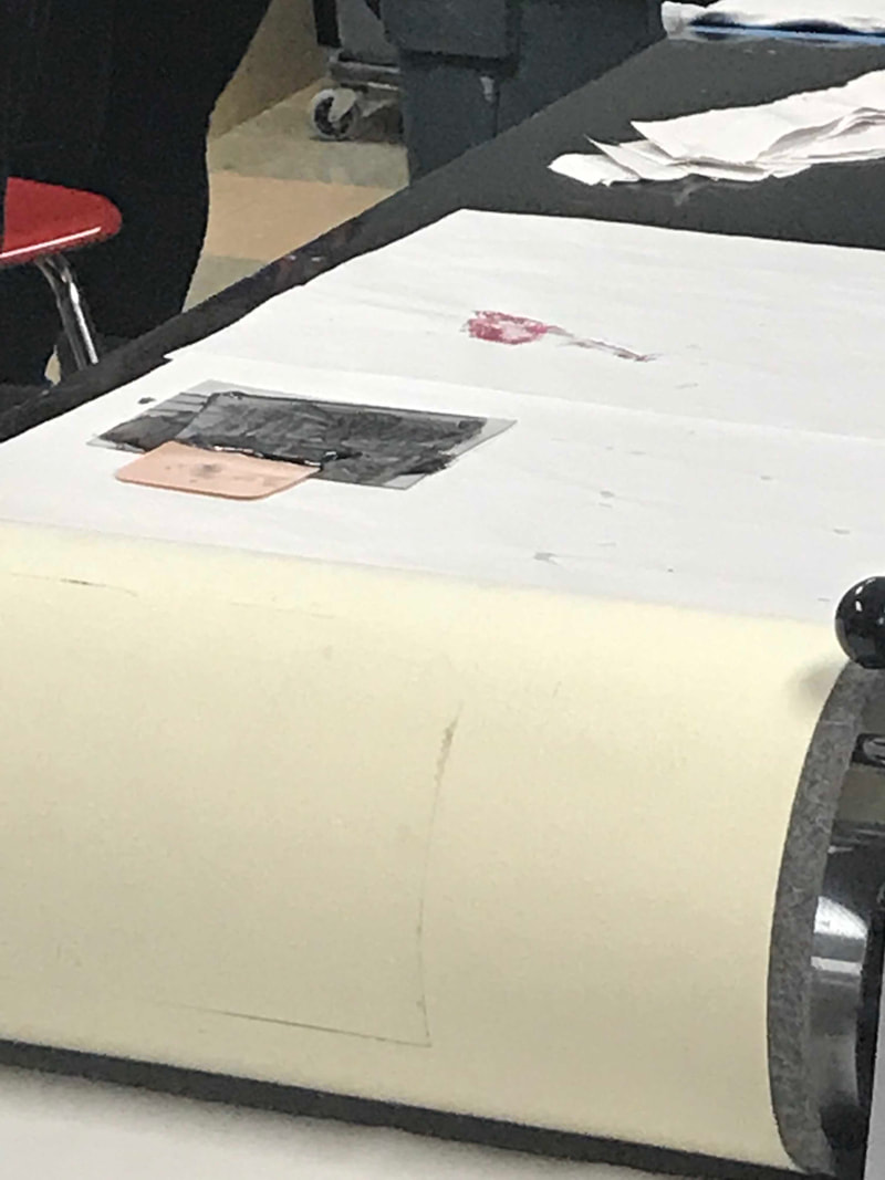
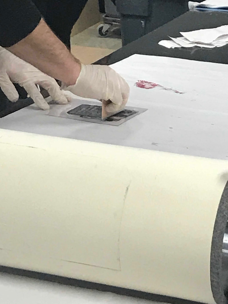
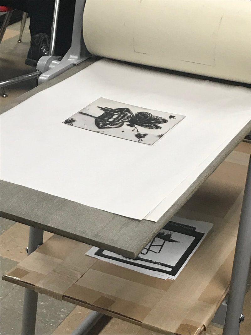
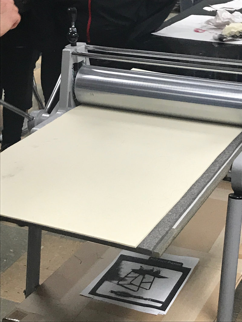
3) Once the stencil was rubbed free of excess ink, he placed it ink-side-up on the rolling press and then covered it with the damp piece of watercolor paper (I later found out that he let it air dry a bit in an old T-shirt - I used this for my process). Then, he covered both of those with the protective wool layers of the press before rolling the image through the press.
|
|
|
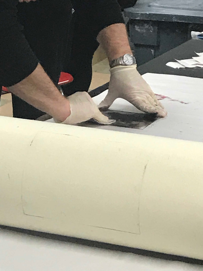
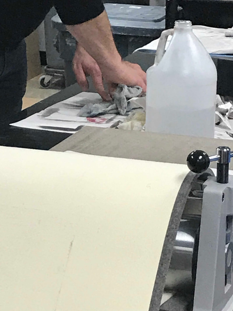
4) Setting aside the print to allow it to dry, Chad then took a rag and put a small amount of odorless spirits on it to clean the ink from the stencil. This allowed the design to be as cleanly-etched as before as possible, to help with continuous use to make other prints.
|
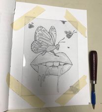
(1) Taping down the plastic sheet over my sketch.
|
1) I began by taping down a 15 cm. x 20 cm. plastic sheet over my finished practice sketch. I had already outlined key features of my practice sketch because I was worried that I wouldn't be able to see my pencil marks through the plastic. That turned out not to be the case...but the pen outlines definitely made it easier to trace the image.
|
(2) Outline of lips and drips.
|
2) Then, taking a drypoint scraper tool, I began to etch the basic outline of the lips and drippings into the plastic with small, overlapping scratching motions. This helped me to keep control of the tool and scratches, while also ensuring that I scratched deep enough so that ink would fill the grooves during the printing process.
|
(3) Crosshatched spaces in-between the teeth.
|
3) As long as I was on the lips, I decided to shade in the gaps in between the teeth and the lips. With the same controlled, overlapping-scratches method, I carefully crosshatched the sections until they were entirely scratched at an acceptable depth.
|
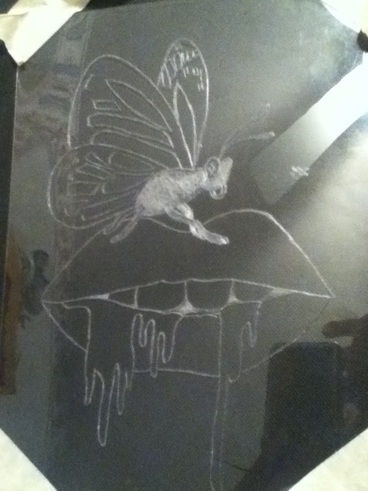
(4) The finished outline of the butterfly and the crosshatched body.
|
4) I wanted to get the basic outline of the design etched before doing any shading, so I then etched the outline of the butterfly and its pattern into the plastic. I also began to crosshatch the entire body of the butterfly to ensure that it would transfer fully black during the printing process.
|
(5) The finished stencil.
|
5) I quickly finished the basic outlining of the smaller butterflies in the background, then started to use a varying amount of crosshatching to shade in the image. For the drips, I mainly focused on giving the centers a much more intense shading to try and give it depth, while the crosshatching of the lips was guided by an image of lips and the natural lines in it. If I were to do this again, I'd crosshatch the top lip much more in a neater fashion - the image I referenced had a top lip lighter than the bottom, and I tried to imitate that by crosshatching less on top...but it ended up looking slightly sloppy.
The butterflies, meanwhile, contain much less-detailed shading, since they're flatter creatures and not as 3D as lips. The designs of their wings were entirely crosshatched to stand out on the print, and I decided to try and give the largest butterfly a little more detailing with small, scattered "X"s placed where more color would usually be. |
(6) Soaking the paper in water.
|
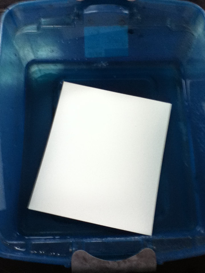
6) Before beginning the stenciling/printing process, I cut out an 8" x 10" piece of watercolor paper and submerged it in a box of water for 8 minutes. Once the 8 minutes were up, I carefully placed the damp paper in an old T-shirt and set it aside to dry.
|
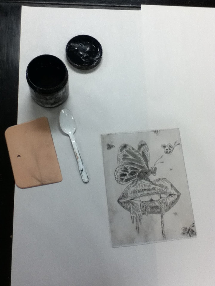
(7) Prepping the workspace and gathering materials.
|
7) To prepare for the printing process, I placed 2 sheets of newsprint on my table to protect from any possible ink spillage. I then retrieved a small plastic squeegee, a container of intaglio ink, and a plastic spoon.
|
(8) Laying down a small amount of intaglio ink on top of the stencil.
|
8) Taking the plastic spoon, I spread a small amount of the intaglio ink on the upper portion of the stencil, trying to spread it evenly to make dragging the ink easier.
|
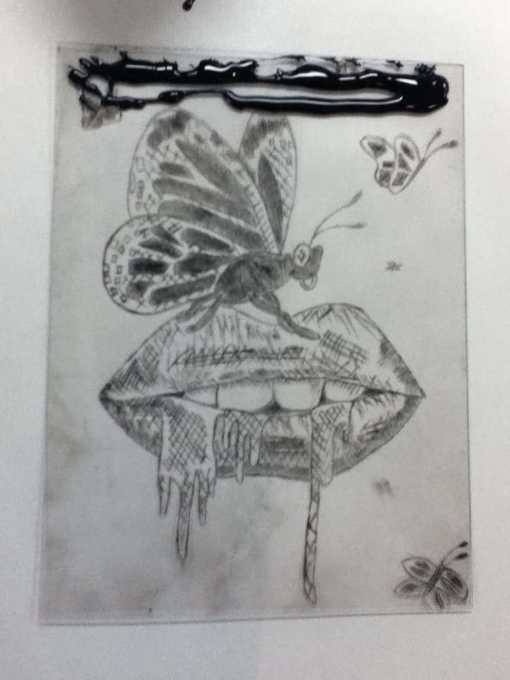
(9) Stencil completely covered in ink.
|
9) Then, with the squeegee, I dragged the ink across the stencil until it was fully covered. To try and get the most ink in the etched image, I alternated between horizontal, vertical, and diagonal strokes to cover it.
|
(10) The stencil, almost completely wiped clean of ink.
|
10) Once the stencil was covered, I ripped up some strips of newsprint (about 1" wide) to bunch up and begin to wipe away the excess ink. I was initially frustrated with this because the paper had to be dry, but I found that the easiest way to rub the ink off was to be patient and rub in a small area clockwise.
|
(11) Placing the paper over the ink-covered stencil on top of the roller.
|
11) I then placed the stencil ink-side-up on top of the roller, then placed the damp watercolor paper on top of it. To the best of my ability, I positioned the paper over the stencil so that the image would be stenciled. I then placed the 3 protective wool layers over the paper and slowly rolled it through the press.
|
(12) The 3 prints, still drying.
|
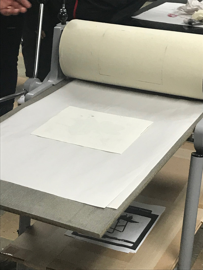
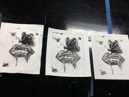
12) Once the paper and stencil had been completely rolled through the press, I peeled the wool layers away and the separated the paper from the stencil to look at the image created. My first print didn't go very smoothly (too much ink in the stencil) so I cleaned the ink out of the stencil with a small amount of odorless spirts on a rag, then repeated the printing process two more times.
If I had more time and patience to complete this project, I would've created more prints to get a crisper image; however, on my third attempt, I created an image that had a nice balance of ink and looked crisper than the first two and decided that this would be my final product as to not jinx things. |
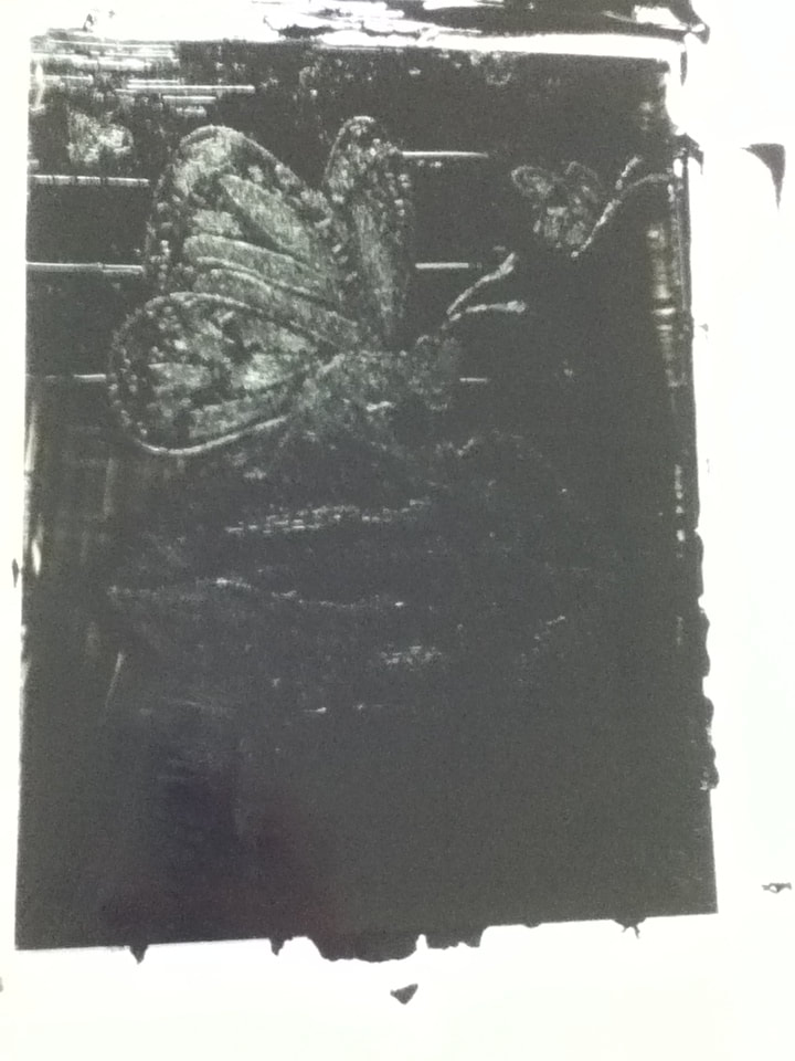
This is my first print. I made the mistake of focusing more on the teeth/inside of the mouth than the etchings of the butterfly and lips - this resulted in the inside being much too light, while the surrounding images have excess ink. This, in turn, gave me a sloppy-looking image, which made me unsatisfied.
|
My second print went by much quicker once I had already done the process, but this time the problem was the opposite of the first print: I had wiped off too much ink in some areas, and those parts of the image fade into the white background.
|
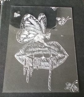
My third print is the one I'm most happy with! The lips and butterfly look exactly as how I imagined it, and while the butterflies in the background are a tad smeared, I think that it fits with my Redon inspiration. The fuzzy edges give the background butterflies an appearance that, to me, is reminiscent of the fuzzily-painted edges of the butterflies in "Evocation of Butterflies".
|
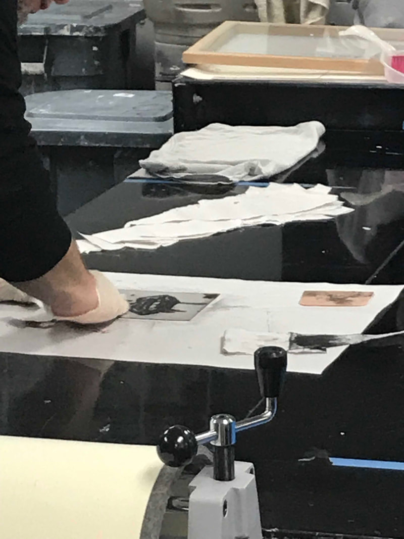
 (above) Wiping the ink off of the stencil with dry paper was the most time-consuming and, overall, frustrating part of this project.
"Wasteland" vs. "Bad Trip"
Similarities:
|
"Evocation of Butterflies" vs. "Bad Trip"
Similarities:
|
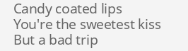
Selected lyrics from "Wasteland" by Against the Current, 2016.
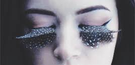
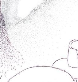
Opening sequence from "Wasteland" by Against the Current, 2016.
|
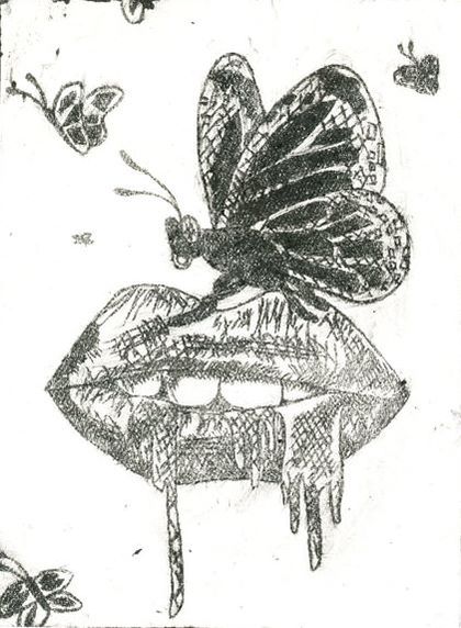
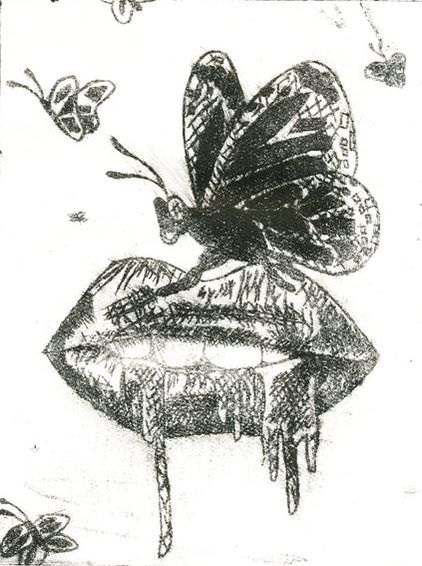
"Bad Trip". Elizabeth Verkuilen, 2018.
|
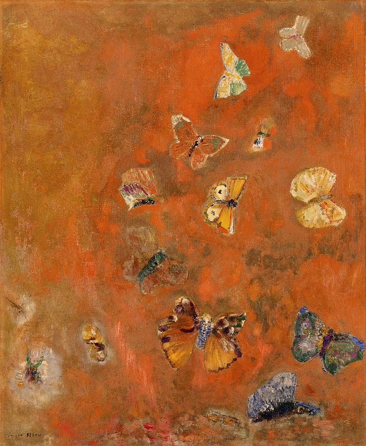
"Evocation of Butterflies". Odilon Redon, 1912.
|