Imag(e)ine: First Work
|
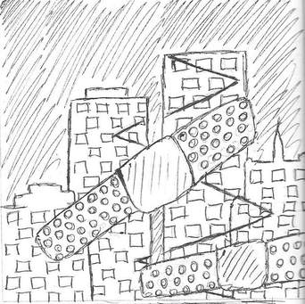
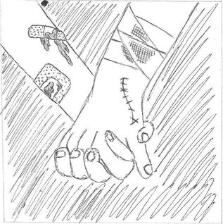
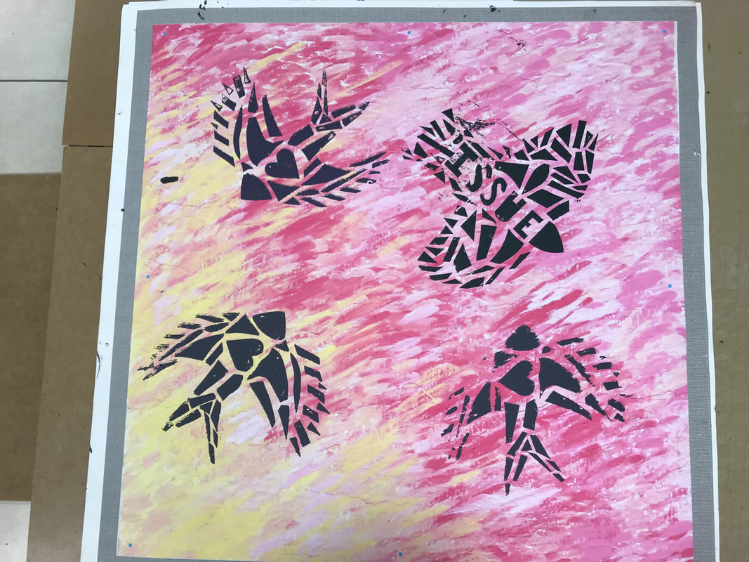
Title: "Strength in Numbers" Size: 91.44 cm. x 91.44 cm Medium: Silk Screen Completion: October 2018 |
|
|
Title: "Strength in Numbers" Size: 91.44 cm. x 91.44 cm Medium: Silk Screen Completion: October 2018 |
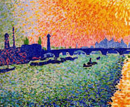
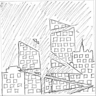
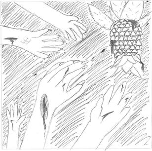
"Waterloo Bridge". André Derain, 1905.

|
Since I already had two artistic inspirations for my first piece, I was a little worried about being able to find 1-2 more pieces that could relate to community and inspire my final product. While I could've repeated my inspiration, I wanted to challenge myself to use different inspirations for each piece. In this case, I ended up finding one artistic inspiration and two cultural inspirations.
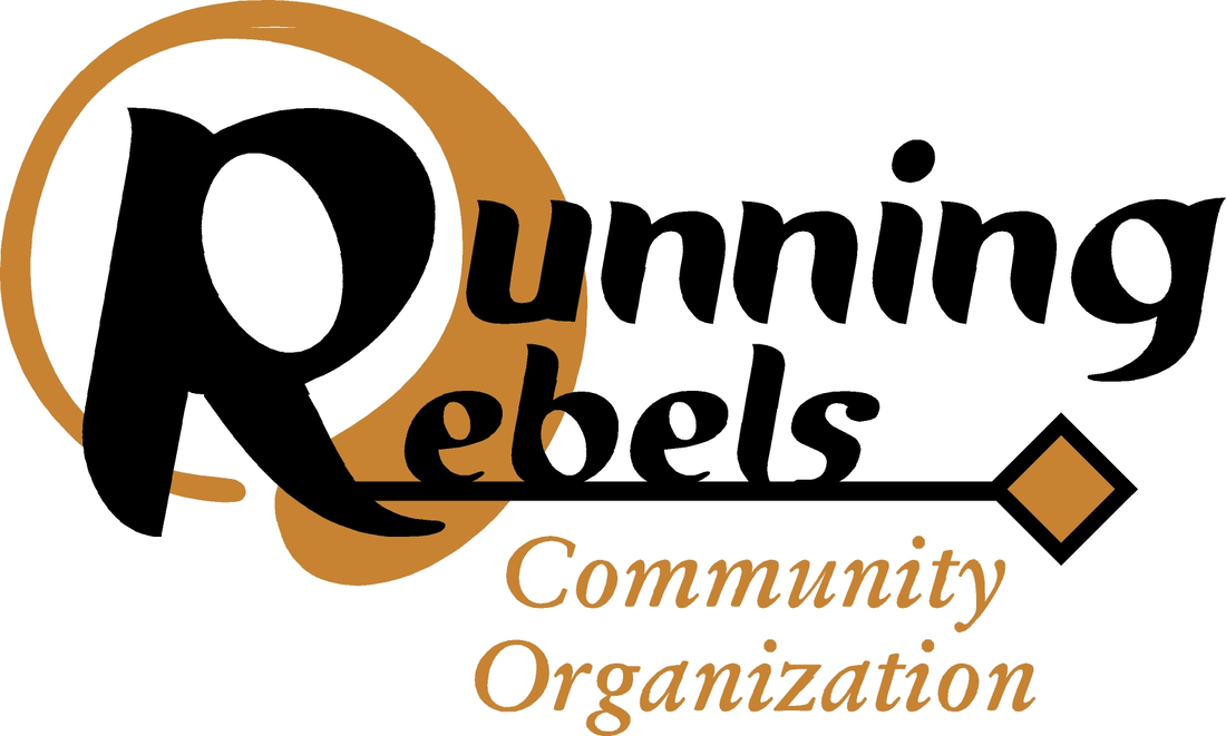
My artistic inspiration for this piece, similar to my Monet inspiration, is another piece I recreated in my sophomore art class and one I discovered had another title, other than the one I was taught. In this case, Derain's "Bridge View" that I learned about last year is also known as "Waterloo Bridge", and it's specific reference to its inspiration is the reason why I will refer to it as "Waterloo Bridge". This piece was commissioned by the French dealer Ambroise Vollard and inspired by the British capital and Thames banks. To me, this seemed fitting for a project revolving around community because communities can be consisted of people from different backgrounds who share similar interest; in this case, two French men are interested in art and the scenery of another country. While I wasn't particularly inspired by the imagery of this piece, I love the technique of using tiny specks/slashes of paint to fill the canvas, and decided to use that as inspiration for my piece's background. My cultural inspiration comes from two Wisconsin organizations: Running Rebels and Pathfinders. The two groups both are an excellent example of a community because they both work together in a diverse group to solve similar problems and rectify certain issues. Running Rebels mainly focuses on helping teens in Milwaukee escape/recover from gang violence and activity, while Pathfinders covers a wide variety of issues from homelessness to many types of violence. The way that both of these organizations come together to get things done in their community is very inspiring, and I wanted to create some sort of image over the Derain-inspired background to represent both the organizations' efforts and how it relates back to community. |
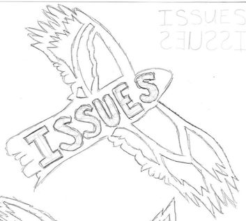
This practice sketch was inspired partly by the idea of migrating birds - in this case, how birds flying in a "V" formation will be following a leader that guides them. Since I changed my main idea to the good resulting from the bad (see more details about that in Experimentation), I thought that it would be a good idea to have numerous birds following a leader bird representing issues. This, as a whole, would represent how when an issue impacts a community, it is then followed by love and support to eradicate what the issue created. I also thought that the symbolism would be clearer if I wrote "ISSUES" on the bird. For the final product, I did end up creating a stencil with this sketch as a reference, but I had to write the word backwards because we had to draw the stencils backwards due to the nature of the freezer paper.
|
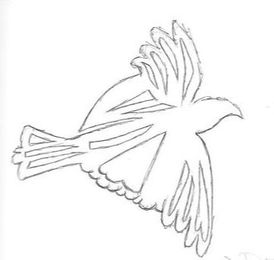
Stemming off of the "issues" bird, I planned on creating small, basic bird silhouettes that I could repeatedly silk-screen behind the leading bird. However, I wasn't entirely happy with this sketch because it didn't seem as obvious as the other two sketches I created symbolism-wise. Originally, I wanted to use all three of these stencils and scatter heart birds and basic birds behind the leader bird, but that made me think that it showed that not all community members responded to an issue with love and support. While that is (unfortunately) the case in some scenarios, it wasn't the message that I wanted to portray, so I decided to not use this stencil.
|
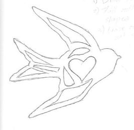
This stencil is much more similar to the first stencil than the second because its symbolism is much more obvious than that of a normal bird silhouette. The heart in the center of the bird's pattern shows that this stencil represents the love and support present in a community; I planned to repeat this stencil a couple of times behind the main "issues" bird to show that every issue faced by a community is responded to with love and support - whether it is by helping others recuperate from an event, start an event to help rectify events caused by the issue, etc.
|
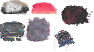
"Good" Background Experimentation
(1) Starting to lay down colors on a larger surface, "Good" experimentation.
(2) The point at which I stopped painted and decided to create a different background.
|
Experimenting with Paint
I wasn't sure how to "sketch out" a background, when my initial idea was to create a colorful background similar to Monet's and Derain's because, to me, they both created a positive, hopeful background; this is mainly in part because they're both a sunset, which brings about hope for a new day, and also because they use brighter colors (typically associated with happiness). With a Flat 4 paintbrush and a large amount of flat-headed toothpicks, I started to experiment with what could be different good/bad backgrounds (this was when I was still on that idea, before criticism). Above you can see all of the paint swatches I did, with all my "bad" ideas on the left and "good" ideas on the right. With both experiments, I started out by experimenting with various gradients, then trying to branch out from there. The "bad" background swatches were mostly made of hues that I thought represented bad emotions best (reds, blacks, and then some blues out of curiosity) and the "good" backgrounds took more inspiration from Monet/Derain with brighter colors that popped.
I then took a 7" x 7" board and decided to try and recreate my "good" swatch in the bottom left corner of the "good" swatches. However, I ran into a couple of problems:
|
(1) Starting out with a freshly-painted board.
|
1) I started out by covering an entire 7" x 7" board with white paint to create a purely blank canvas. Looking back on this, it would've been a much more even coat if I had used gesso, but at the time that I did this, white paint was the closest thing that I could use with available resources.
|
(2) Applying the strokes of black.
|
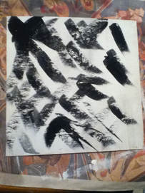
2) Then, with a Flat 6 brush, I began to apply thick, haphazard strokes of the color Black all over the board until my brush ran out of paint. Then, while the paint was still wet, I cleaned off my brush and began to apply more broad, uncoordinated strokes of paint until the brush ran dry, this time using the color Red.
|
(3) Beginning to squirt pure paint onto the board in an effort to make the individual colors pop more.
|
3) I continued to alternate between large strokes of black and red, but soon realized that the fresh black paint was muting the fresh red paint. To try and avoid this, I squirted pure globs of the colors Red and Black directly onto the board to try and make the colors show up better. In areas that were too black, I added some Red, and vice versa.
|
(4) The finished painting.
|
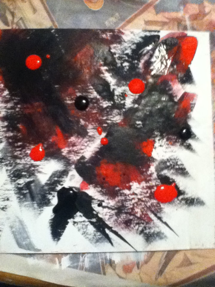
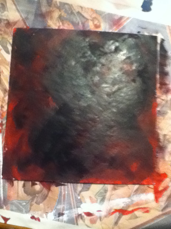
4) This technique of squirting paint directly onto the board made it much easier to cover the entire board, so I continued to alternate between adding Red and Black dollops to the white parts of the board. If parts became too much of one color, I would go back in with squirting the other color over it. After repeating this process twice, I reached a point where I was satisfied with the amount of Red and Black in the piece.
|
|
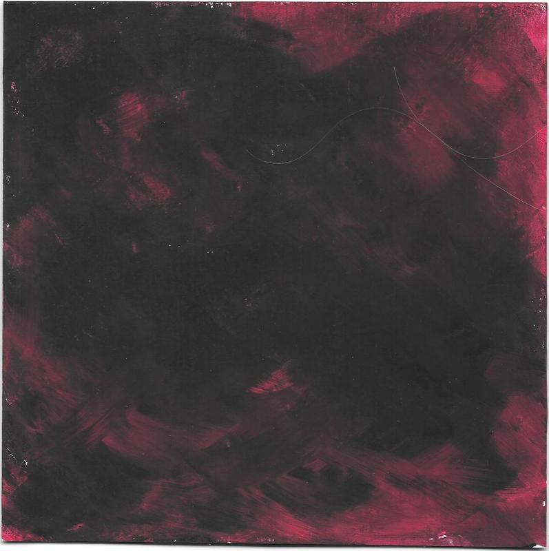
Why not use this background?
|
|
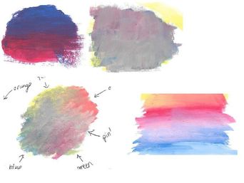
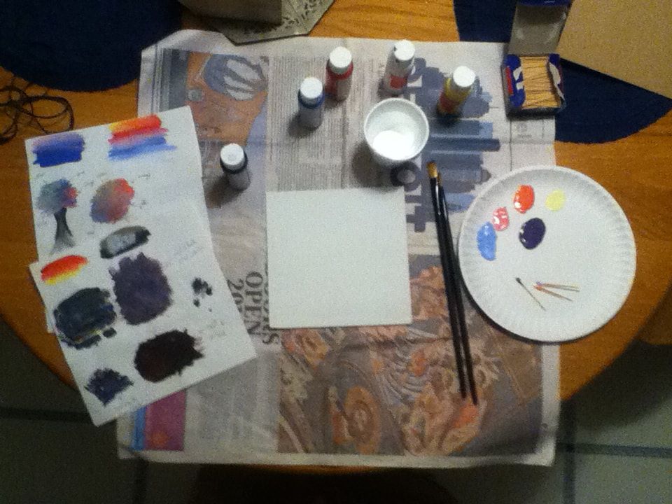
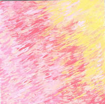
(right) The set-up in which I painted both of the backgrounds for my MIAD pieces. The paints that I used to create the swatches and eventually my backgrounds were the colors Black, Bright Blue, Red, White, and Yellow (though neither of my pieces ended up needing the Black). I also had my swatches on the side to reference for when I started painting, though neither of my backgrounds ended up looking very close to the practice swatches.
Also pictured: a 7" x 7" board, painted white; a Flat 4 paintbrush and Flat 6 paintbrush (though for the first piece, a Round 1 and Round 2 were used), the paper plate which I mixed colors on with toothpicks, and a disposable cup to rinse off my brushes in between paints. |
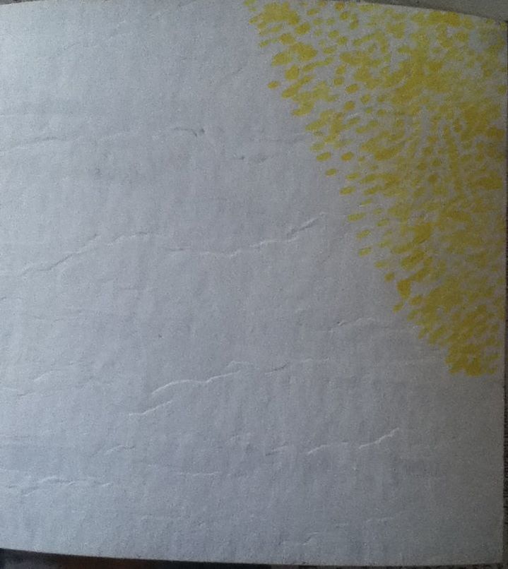
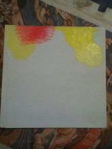
(1) Applying small, pure strokes of Yellow to the board.
|
1) I started by taking a 7" x 7" board and painted it white to create a blank canvas (looking back, gesso would've worked much better, but at the time that I did this, I only had white paint). Then, taking a Round 2 paintbrush, I began applying tiny diagonal strokes of pure paint in the color Yellow and only in the upper right corner of the board, making sure to leave space in between strokes.
|
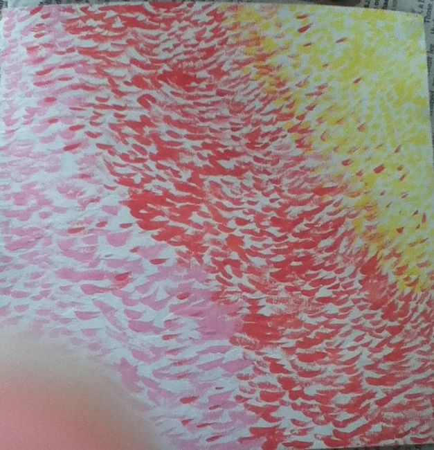
(2) Waiting for the paint to dry after applying stripes of tiny strokes of the three main hues.
|
2) While the yellow section was drying, I mixed up an orange hue with one part White, one part Red, and one part Yellow paint. Then, taking the same paintbrush, I began to apply small strokes of the orange color diagonally in the middle third of the board. While that dried, I mixed a pale pink color with two parts White and one part Red paint, which I then applied with the same technique and brush in the bottom left corner of the board.
|
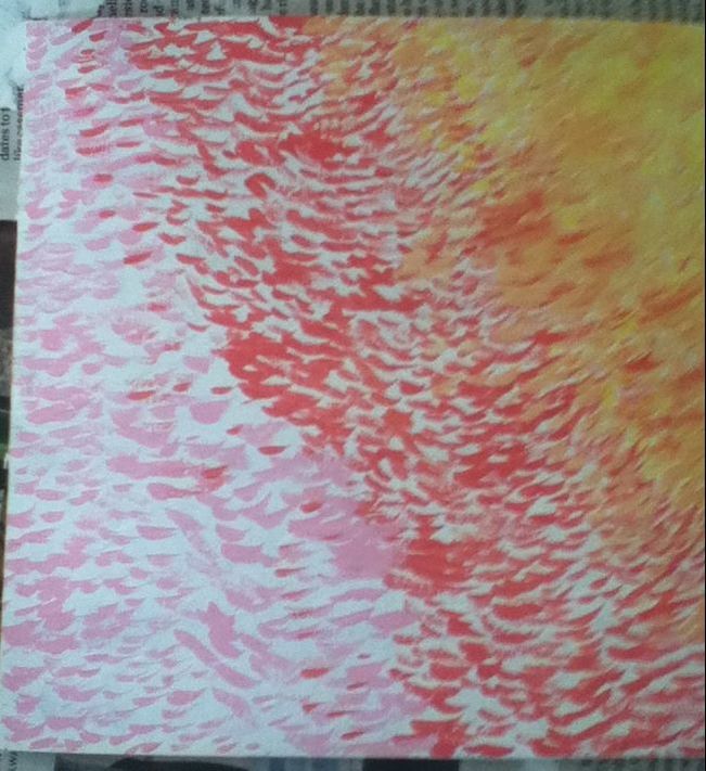
(3) Beginning to alternate from Yellow and a mixed golden color to fill the white spaces in the top right.
|
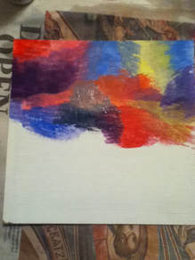
3) To fill in the white spaces in the yellow section of the board, I mixed one part pure yellow with a small amount of the orange color to create a golden color; taking a Round 1 brush, I applied that color in the white spaces, then going back in with the pure Yellow to soften the edges of the small paint strokes. With the yellow and gold, I began to cross over into the orange section to start blending the sections together.
|
(4) The finished background.
|
4) I then mixed up two more colors: a pale orange (one part gold mixed with one part orange) and a darker pink (a small addition of red to the pink color). With the same Round 1 brush, I filled in the white spaces of the middle with the pale orange and the white spaces of the bottom left with the darker pink. To finish off, I also crossed those colors throughout other sections to blend them together.
|
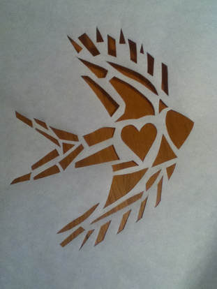
Finished heart-bird stencil
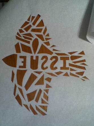
Finished "issue" bird stencil
|
Before cutting out my stencils, I measured and cut two pieces of freezer paper that were a little longer than the provided silk screen.
Heart-Bird Stencil:
|

"Strength in Numbers". Elizabeth Verkuilen, 2018.
|

"Waterloo Bridge". André Derain, 1905.
|
|
Similarities:
|
Differences:
|