Artwork: Mixed Media
|
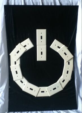
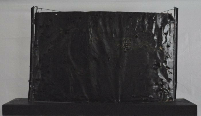
Title: "Power" Size: 50.8 cm. x 76.2 cm. Medium: Mixed Media Completion: January 2019 |
|
|
Title: "Power" Size: 50.8 cm. x 76.2 cm. Medium: Mixed Media Completion: January 2019 |

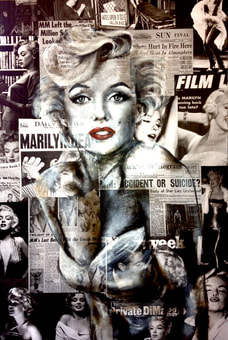
"Marilyn VII". Kelley Ryan, 2012.

"Puffer Fish". Rhea Carmi, 2018.
|
When told that I would have to create a mixed media, my mind immediately went to the idea of painting over newspapers. I have always been attracted to this style because it communicates so much with the combination of words and images; I was particularly inspired by Kelley Ryan's "Marilyn VII" because it conveys the message that a lot more goes on inside than we may think. Marilyn Monroe is a pop culture icon, whose public life made everyone see her as a classic starlet. However, with this piece, Marilyn's portrait over newspapers relaying her death by overdose gives the viewer the sense that inner struggles are shown. To me, her body blending in with headline such as "Accident or Suicide?" mixed in with glamour shots shows the influence the media has on our opinions...glamour shots portray her as the beautiful starlet she was famous for, yet it is only when newspapers relay details of her death and drug use that the public truly sees her as a person with her own personal issues. I wanted to use this idea of the media's influence to convey our dependence on technology and its takeover of our lives, and thought it would be an interesting background to mix in articles of current events/"normal" things with anything publicizing/glorifying technology.
However, we were greatly encouraged at the start of this project to branch out from 2D work into 3D, so I thought that it would be appropriate for me to have a 3D mixed media work as one of my inspirations. My research led me to the website of artist Rhea Carmi, and one of her newest works caught my eye. The mixed media sculpture "Puffer Fish" is a lot less busy than "Marilyn VII" and is made of wood, paint, and paper; when I first looked at this piece, the blackened paper that makes up most of the sculpture reminded me of ink or tar, which are both substances that are difficult to get rid of and leave their mark. To me, I thought that this was very representative of the effect that technology has on everything in today's society; all sorts of technology impact today's world, and many children are being raised in households where they are exposed to it at such a young age that they soon become dependent on it. |
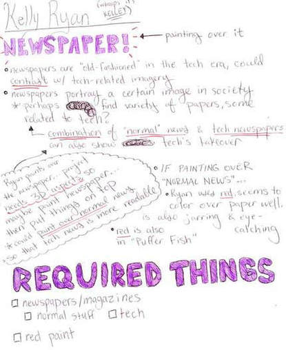
Thought process while researching Kelley Ryan.
|
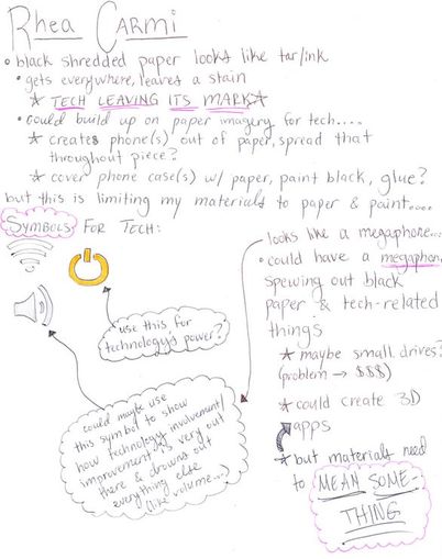
Thought process while researching Rhea Carmi.
|
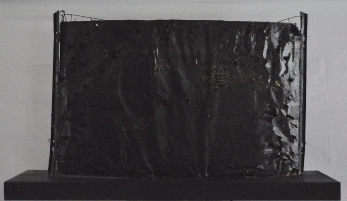
"False Security". Rhea Carmi, 2018.
|
I decided to focus on one artist for an inspiration after being critiqued and incorporate only one of my ideas stemming from them to make the piece more uniform. The woman from UWM seemed intrigued by my interest in Rhea Carmi and how some of her works’ shiny black material reminded me of black ink, which easily stains things and gets everywhere and therefore could represent tech’s mark on society. I then decided to use “False Security” as inspiration for my backdrop, as it is simply this material that helps with my symbolism/meaning behind the piece.
|
|
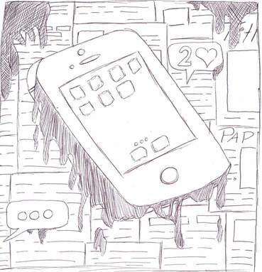
I actually really like my first sketch, which has newspaper in the background and a phone in the foreground to represent technology; however, the phone is dripping, and we can see that the drips are slowly beginning to engulf the newspapers as well. Against the newspaper background is also some bubbles (taking inspiration from Instagram notifications and text conversations), which are untouched by the drips. While I think that it shows my views on how tech is slowly taking over our lives/attention to things happening elsewhere in life, I wasn't sure how to make this more 3D and didn't just want to have a flat piece when one of my inspirations is 3D. Not only that, but I felt as though the most "found-object" -like part of this was the newspaper background...and nothing else.
|
|
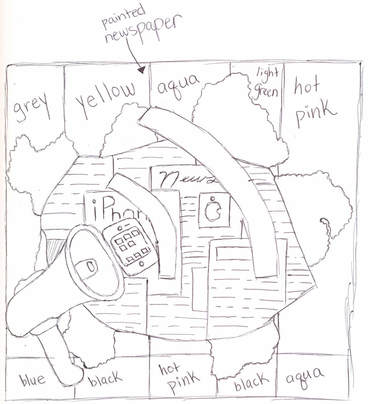
Out of all three of my sketches, #2 is the one I believe to be the easiest to execute - that is, if it's easy to acquire a megaphone. This background is still completely newspaper, but the middle is ripped from the back to expose a layer of technological propaganda underneath. To draw more focus to the tech, all of the "normal" news events surrounding it are painted with the colored-bar design of a technical difficulty message. I did this because I wanted to represent tech's hold/influence over everything; with this, it's as though a technical "glitch" is messing up the newspapers, which allows tech companies to take advantage of it and advertise their products even more. The megaphone adds a third dimension to the piece while also adding to the overwhelming sense of tech. The sound waves emerging from the megaphone take inspiration from the volume button on many devices to further tie in with tech. Initially, this was the sketch that I wanted to do, but I struggled with finding a megaphone, a large supply of tech adverts, and how to rip the paper neatly.
|
|
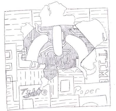
When I drew Sketch #2, I immediately knew that I wanted to create a piece based off of it, but as I needed a third sketch I quickly sketched out something that has similar aspects, but one I would deem "not right" for this project. However, as I drew this sketch of a power symbol emerging from newspaper with a motherboard underneath, I found myself really liking the use of the power symbol. It's very simple compared to having to find a megaphone, although I knew immediately that I would probably not be able to achieve the motherboard design underneath.
It was because of this sketch that I decided, for my final piece, to combine my 2 favorite parts of my 2 favorite sketches: the technical difficulty message in the background from sketch #2 and the power symbol in the foreground from sketch #3. |
Rippage present in sketch #2
Rippage present in sketch #3
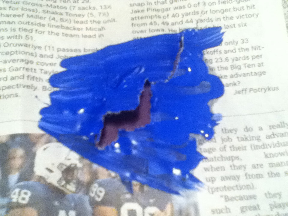
(continued) After 15 minutes, I decided to try and rip the paper from the back to achieve the look I desired in my sketches (I found it was easiest to poke through with the butt of a paintbrush handle and let my fingers do the rest). When ripping through the untouched and slightly painted newspaper, it was easy to damage but stubborn when it came to holding the edges in place without some folding...to me, though, the folding didn't look as "natural" as I wanted the rips to look. The heavily-painted paper was also easy to rip, but the weight of the excess made it so that the rips wouldn't stay open very wide. Overall, I was very dissatisfied with this process, and decided to scrap it from my finished project because (a) it didn't directly connect with either of my inspirations and (b) I wasn't sure how to achieve this on a large scale with something 3D under it...when I struggled enough getting "good" rips without anything underneath.
|
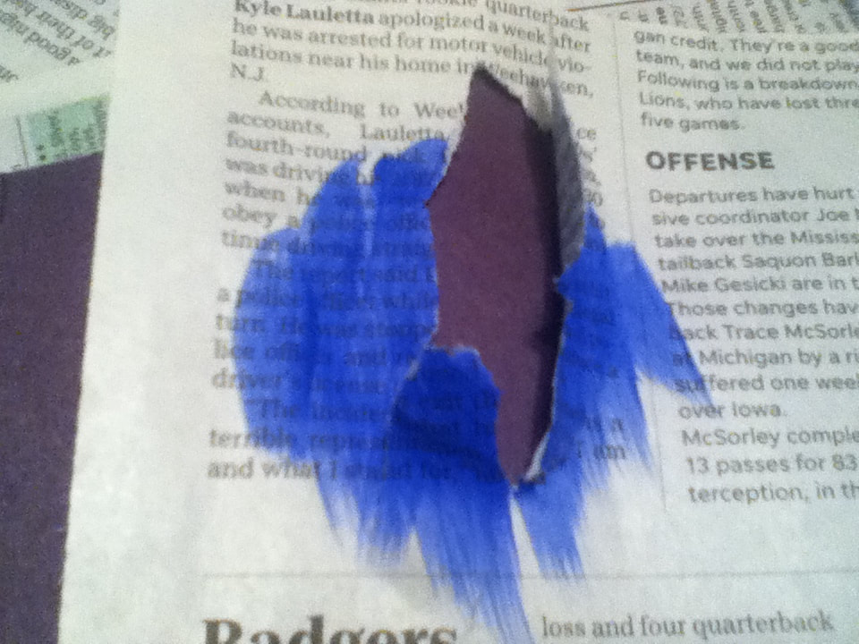
The two sketches from which I was taking components from to create my final piece both involved a newspaper background being ripped from a force behind it. While it seemed like a really cool idea in my head, I soon found myself worrying about whether or not this was easily achievable, especially with having 3D things underneath it. Not only that, but the consistency of newspaper is very fragile and the consistency of painted newspapers is difficult to maneuver; as my piece's background was going to be entirely newspaper, with some parts painted, I decided to test whether ripping through them would work in my favor.
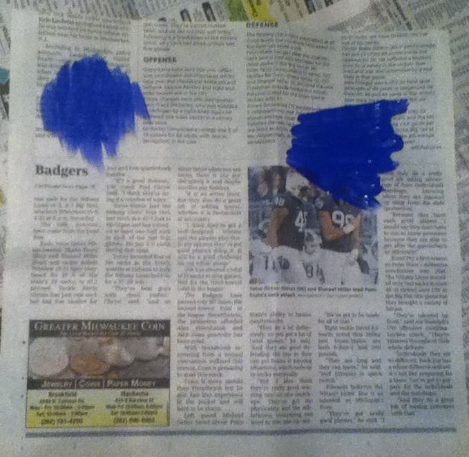
(above) To test the ripping, I painted a light swatch of blue on the newspaper and then a heavy swatch of blue next to it.
|
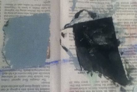
Grey vs. Black
|
When painting the background of the piece, I ended up mixing way too much grey paint for the background and didn't feel like wasting it. I then wondered if I could possibly paint some of my ripped pieces of newspaper with the excess grey to try and give the border of paper some dimension. However, the light grey was much paler than the black - if it were a darker shade, it would've been much more subtle and not so far of a leap from the incredibly dark ripped paper in Carmi's work.
|
|
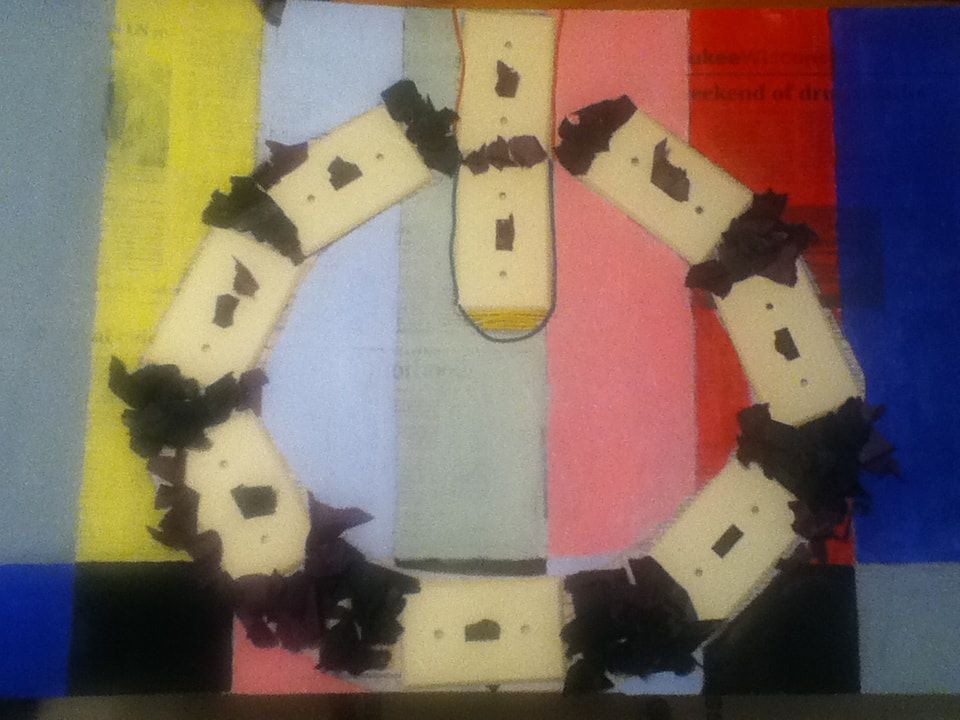
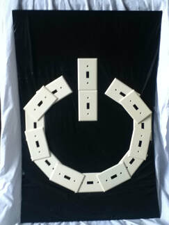
I made the mistake of looking at other people's finished pieces right after finishing mine...and immediately because discouraged because I felt like mine was clunky and uncoordinated in comparison. This discouragement led to me ripping some of the items that were not very well-glued on the board off of the entire piece, which was basically all of the light switch covers and most of the wiring. At first glance, I actually liked this simplified version, but then I put it side-by-side with the picture of the finished piece and liked the original much better. The solid color of the light switch covers made the piece seem more uniform; without them, the newspaper peeking through looks a bit hectic, and the surrounding paper looks sloppy and strange.
|
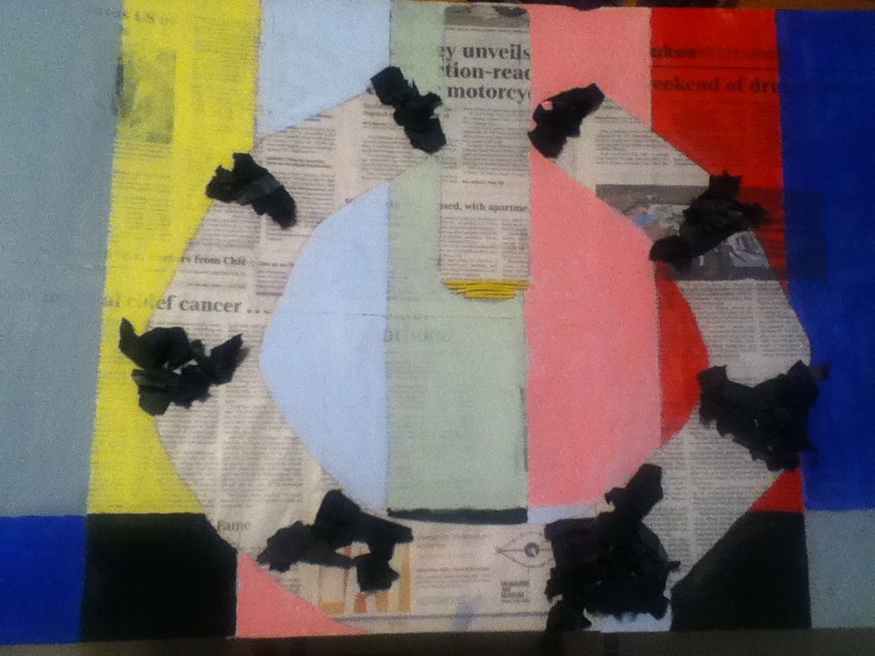
The final piece...minus some components.
|
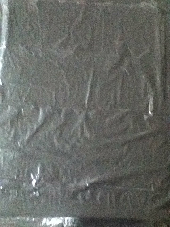
Experimenting with the garbage bag
|
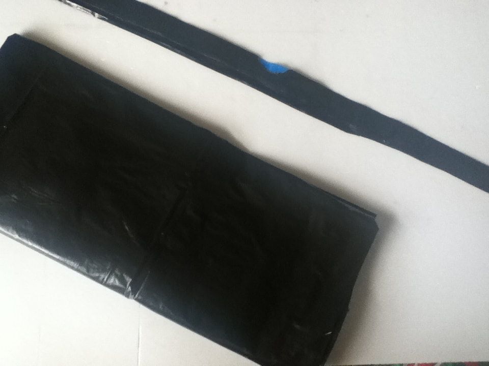
As my new inspiration for the background of my revised piece is Carmi's "False Security", I had to try and find some type of material that could mimic the black shininess of the piece. When being critiqued by the UWM professional, she suggested I use roofing tar paper; while this was my initial goal, I went to multiple stores that claimed to have it online who didn't have it in stock. This, combined with the fact that it would leave me with an excess amount of paper that I would most likely not use, led me to explore other options.
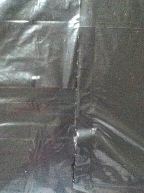
I decided to test out how a black garbage bag and black plastic tape would photograph, as the photo is the final product for this project. Both materials had some natural shine without the flash on, but the tape has distinct lines where I overlapped pieces, while the garbage bad appeared more seamless and similar to the texture of "False Security". |
Experimenting with the plastic tape
|
|
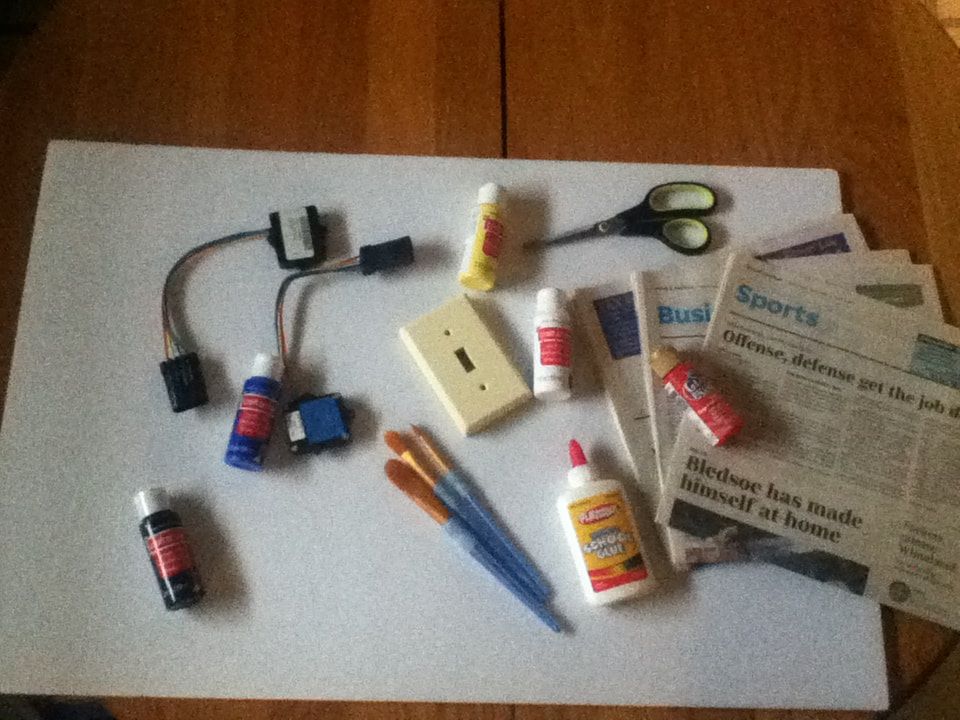
1) First, I gathered the materials for this project, which are as follows:
|
|
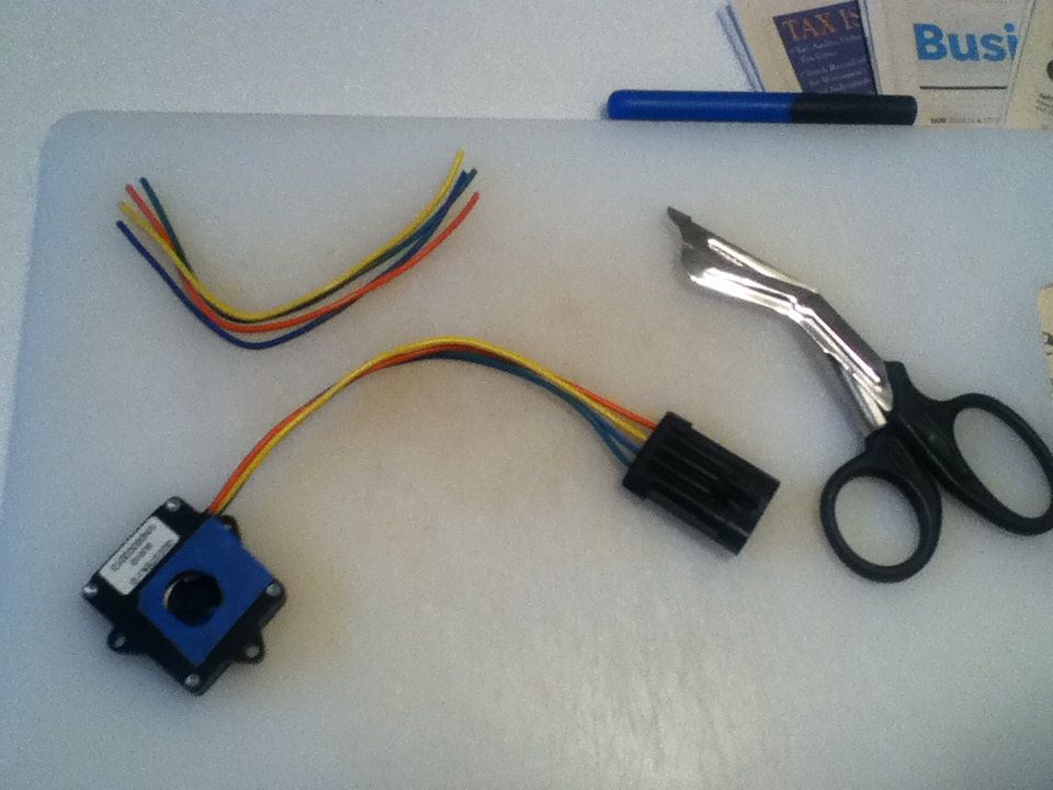
2) Taking the pair of heavy duty scissors, I cut the wires off of the infrared decoders as close to the black ends as possible. Once they were free, I also made to sure to trim the edges once more to avoid any wire poking out from the colorful wrapping.
When starting this project, I thought that I could create the power button entirely out of light switch covers and the wires, but I didn't have enough wire to achieve a neat shape. I later purchased 2 more decoders and repeated this process to get more wire. |
|
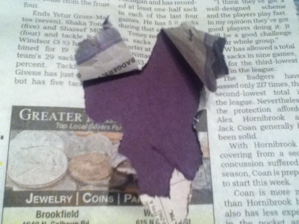
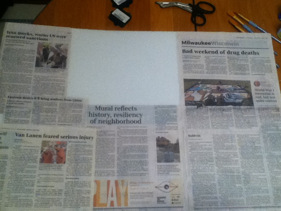
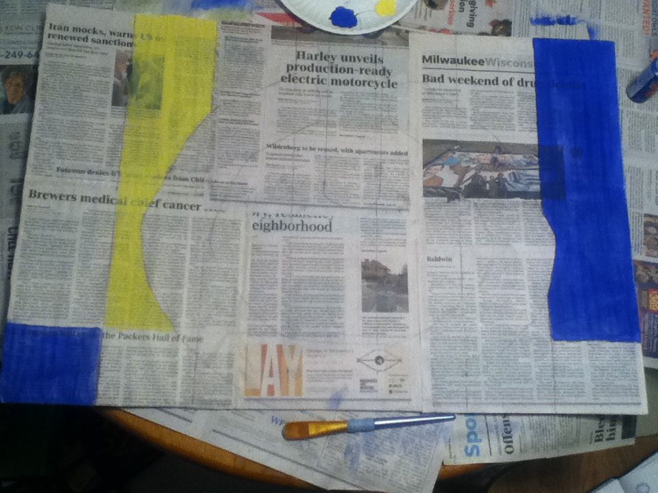
3) Setting aside the wires, I began to cut the newspapers in half with the regular scissors to make them easier to glue down to the foam. To represent various events we may overlook because we're absorbed in technology, I purposely placed large headlines relating to major events (both positive and negative) in areas that wouldn't be covered by the power symbol.
|
|
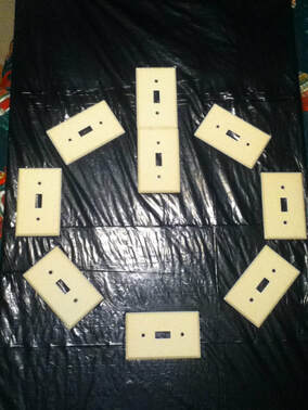
3) Once all the newspapers were secured, I took a yardstick and ballpoint pen to divide the board into 7 even columns for the bars, then laid the light switch covers down in the shape I wanted and traced their placement. Since the covers are rectangular, they didn't fully fill in the symbol; I ended up free-handing the rest of the outline.
I then colored in the bars, starting with the paint colors straight out of the bottle. In this image, I had already applied one coat of Peacock Blue and one coat of Yellow. |

The technical difficulty message I was trying to replicate in the background - this was the image I referenced for the approximate color scheme I needed.
|
|
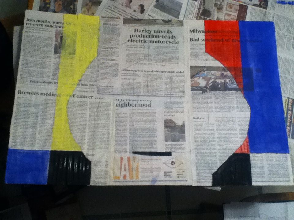
4) I then continued to apply pure paint to the newspaper, this time with Red and Black. Like the Peacock Blue, Black was extremely opaque, but I was surprised to see that the Red covered the paper easily while still allowing the words underneath to be visible. Later, though, I remembered that this red I used is actually a few years and a little more runny than my newer bottles of acrylic paint.
To fill in the bars, I initially started by using the 1.9 cm brush, but I then used the Round 8 brush to fill in the smaller areas and the perimeter of the bars to try achieve a clean perimeter. |
|
5) Continuing to use the 1.9 cm brush to fill in the larger portions of the bars and the Round 8 for the perimeters, I filled in the rest of the background with grey, light blue, light green, and pink shades that I mixed, making sure to leave the silhouette of the power symbol empty.
|
|
|
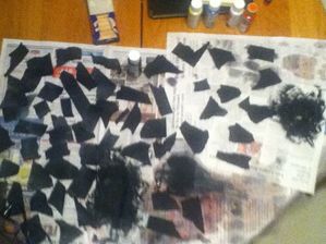
6) Once the background was completely painted, I set it aside to dry. With the leftover newspaper I had from trimming squares for the background, I ripped small pieces smaller than the palm of my hand. I then painted them black and set those aside to dry.
Originally, I wasn't going to do this step because I was worried that my piece would have too much painted newspaper and not enough variance, but the main thing that inspired me from Rhea Carmi's work was the ink-black ripped paper. If I hadn't done this, none of my piece would've connected to my inspiration without stretching it a bit. |
|
|
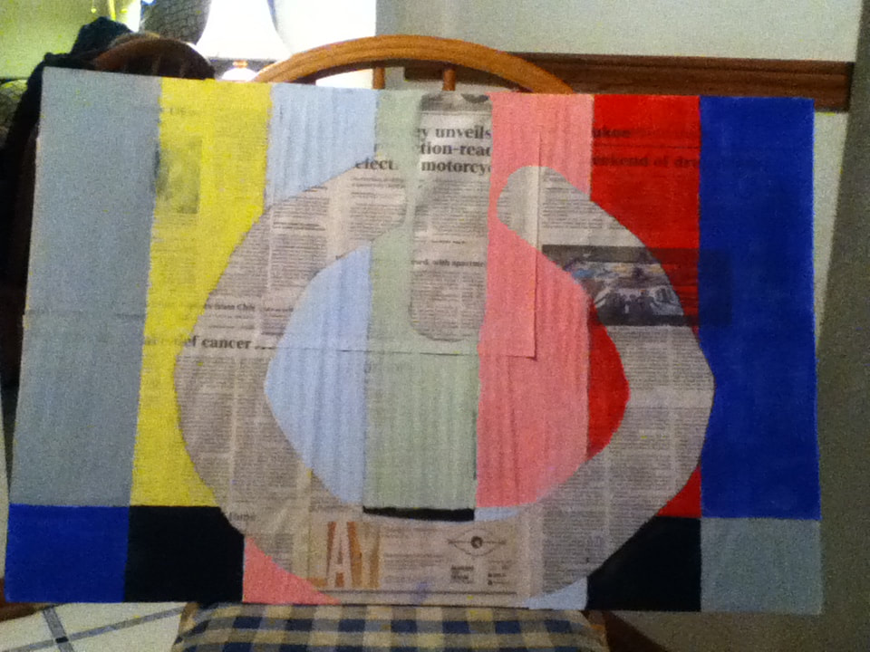
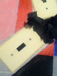
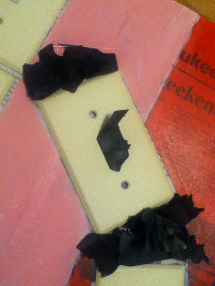
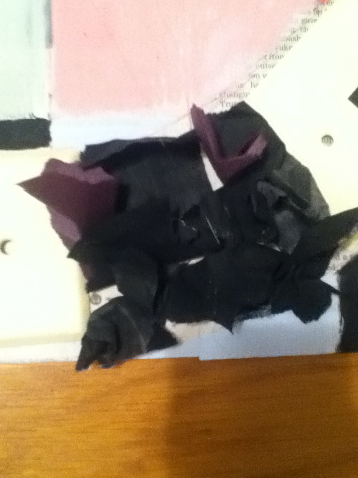
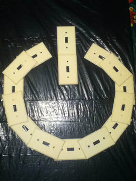
7) Once everything was dry, I began crumpling the small pieces and arranged them on the board to see what placement would work best. I decided to go with filling in the symbol with the light switch covers and the shredded black paper filling in the gaps; this would help to symbolize technology's power (represented, almost literally, through the light switch covers) and it's lasting imprint (the inkiness/tar-like quality I first saw in Carmi's work).
To play with the spaces in the light switch covers a bit, I put some flat black paper under some of them and pulled black paper through others. |
|
8) I then surrounded the rest of the perimeter of the circular part of the symbol with the black paper. I left the middle rectangle free of paper because I still had to use the wire in some way - I knew I wanted to incorporate the wire into the perimeter, but that plan was a little thrown off because of my forgetting the black paper.
|
|
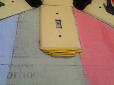
9) To try and better accommodate the slightly-curved bottom of the rectangle (because it's actually more of an oval and not a rectangle like I thought....oops) I measured and then cut my yellow wires to try and give that appearance. Out of all of the wires, I thought yellow would look more uniform with the off-white color of the light switch covers, compared to the green, orange, and blue wires.
|
|
|
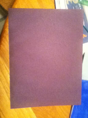
10) Painting the small pieces of newspaper black on both sides was becoming time-consuming, so I decided to revisit the idea of having a slightly lighter color of paper to make the black paper look more interesting (see Experimentation). I found a book of construction paper and found this paper that, in my basement lighting, looked black. However, exposure to light made it look more dark purple - either way, it wasn't too far from the opaque black paint, so I decided to rip that up into small pieces and fit it into spaces in the perimeter.
|
|
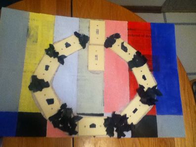
11) As for the leftover wire, I decided to continue with the emphasis of the ovular shape of the power symbol's middle piece. I already used yellow wire to fill in the bottom curve, so I outlined the perimeter with the leftover orange, green, and blue wires.
As for the spaces in both the light switches, I decided to fit some of that dark purple in them so that they would look unified with the rest of the filled light switch covers. |
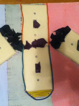
My first "finished" piece for this project
|
12) To keep them in place, I hot-glued the wires into place right away. I had some difficulty gluing the light switch covers down because they're made of a metallic substance, so I left those alone; the paper surrounding them, though, helped to hold them down once they were hot glued on.
For this project, the picture of the finished piece counted as the final project. Ideally, this picture would be taken in natural light, but the short winter days made that difficult to achieve without taking my final product to school in order to photograph it; this picture was taken in the remaining natural light I had after school, with a bit of help from 2 small lights in the room. My only concern with this picture is that the off-white/slight yellowness of the light switch covers looks yellower than normal, but everything else looks about the same as it does in real life. |
|
13) Since I both barely have any money and don't tolerate waste, I began by peeling off the light switch covers and painted newspaper from the foam board. This was pretty easy to do because the newspapers were glued in a way where they could be removed together as one piece.
|
|
14) I then grabbed a black, 13-gallon garbage bag and proceeded to cut off the top of it because the tie was a bright blue and stuck out against the black. While I realize now that this wasn't necessary because I ended up folding the bag over the board, it was mainly a precaution to keep the plain black background.
|
|
15) Once trimmed, I placed the foam board inside of the trash bag and folded the excess around the perimeter. Then, with a old and tacky glue stick, I sealed the folded corners down (left) to put it in place.
|
|
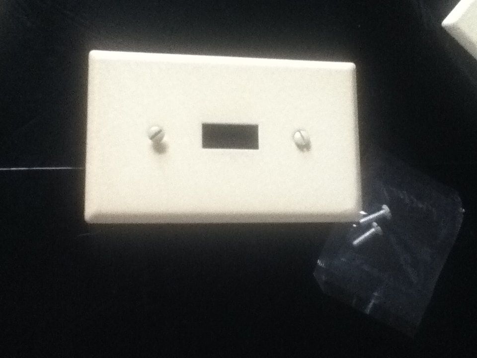
16) With a mechanical pencil, I scratched into the plastic in the places I wanted to place the light switch covers. Initially, I wanted to attach the covers with the screws that they came with because I was worried that hot glue would damage the bag, but I soon realized that that wouldn't work in the case of overlapping the metal covers.
|
|
17) I then resorted to using Gorilla Glue. With the pre-sketched markings, I laid out the base of the power symbol and attached the covers with a tiny amount of glue on each corner. As the middle section of the symbol didn't require overlapping, I also secured those two covers down with a small amount of glue.
|
|
18) Once the glue dried, I lightly outlined the placement of the overlapping covers' corners to make it easier to know where to glue. I then repeated the technique of using a small amount of glue on each corner, then secured the remaining covers to give the appearance of a circular shape.
|
"Please Stand By" vs. "Marilyn VII"Similarities:
|
"Please Stand By" vs. "Puffer Fish"Similarities:
|
"Marilyn VII". Kelley Ryan, 2012.
|

"Please Stand By". Elizabeth Verkuilen, 2018.
|

"Puffer Fish". Rhea Carmi, 2018.
|
"Power" vs. "False Security"Similarities:
|
"Power" vs. "Puffer Fish"Similarities:
|
"False Security". Rhea Carmi, 2018.
|
"Power". Elizabeth Verkuilen, 2019.
|
"Puffer Fish". Rhea Carmi, 2018.
|