"Familial Hues" Third Panel

|
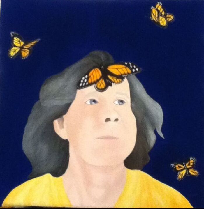
Title: "Classic" Size: 30.48 cm. x 30.48 cm. Medium: Acrylic on canvas Completion: November 2019 |
|
|
Title: "Classic" Size: 30.48 cm. x 30.48 cm. Medium: Acrylic on canvas Completion: November 2019 |
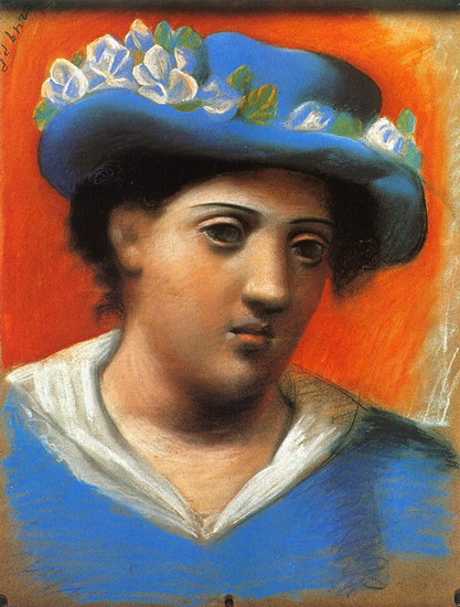
"Woman With Blue Hat Flowers". Pablo Picasso, 1921.

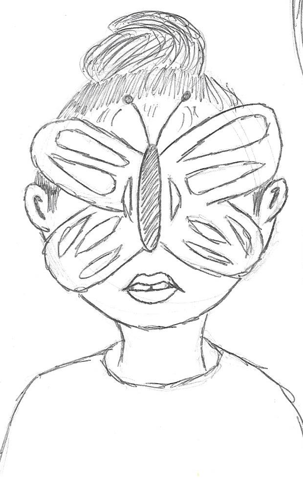
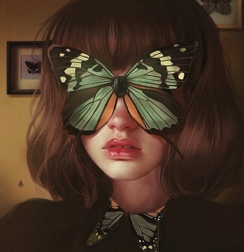
Untitled Piece, Aykut Aydoğdu, 2019.
|
For each portrait in Familial Hues, I first had to decide which of Picasso’s artistic periods thematically represented each family member most accurately in my opinion. After using the Blue Period for a self-portrait and the Rose Period for my sister’s portrait, I settled on the Classicism Period for my mother’s portrait. Classicism was a style of Picasso’s that harnessed a softer, more realistic appearance to its imagery compared to previous periods which relied on symbolism/color to carry the meaning behind the piece. Picasso experienced many joys in his personal life including fatherhood during this period, which inspired one of the most common themes in his Classicism pieces: motherhood. The literal specification of “motherhood” in my thematic research for this period was the first sign that this would be the best representation of my mom. Though there were many pieces from this period that literally depicted a scene between a mother and child, I ended up taking Classicist inspiration from the piece Woman With Blue Hat Flowers. I was initially drawn to the complimentary contrast between orange/blue hues, yet it was the darkened expression that intrigued me the most about this piece. During my research, I knew that I wanted to convey some sort of message related to my mother but was unsure how, when I figured out which to use, I would be able to connect it to a Picasso inspiration. Seeing the intense expression on the Woman’s face emphasized against the cheerful background inspired me to do something similar - contrasting the mood/tone of the fore and background while adding further contrast between orange/blue colors. I hoped that this would make my final work as visually interesting as Woman, with both being simple-appearing pieces that seem more complex when you observe the small details.
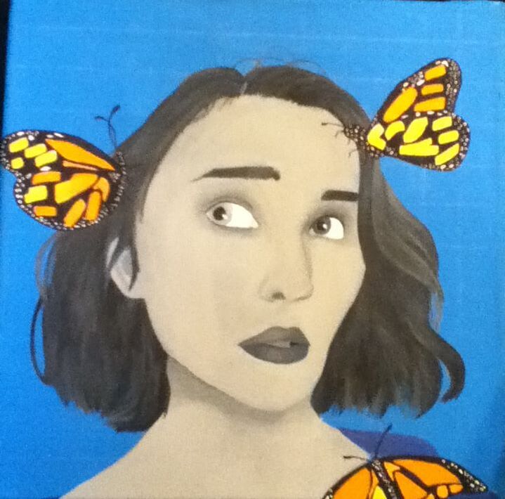
To incorporate a more “modern” twist on such an old artistic inspiration, I decided to use one of my favorite illustrators, Aykut Aydoğdu, as my other artistic inspiration. Aydoğdu is a Turkish commercial illustrator who is best known for surrealist digital illustrations that are meant to focus on the daily dilemmas of life. Combining Aydoğdu with Picasso was a good thematic match for this piece because both take inspiration from real life scenarios, whether specific to the artist or blatantly relatable to most of the audience - the theme of myself overcoming past setbacks to become who I am today seemed to fit well into that overlapping category. I was particularly drawn to this untitled illustration of Aydoğdu’s depicting a girl’s face covered by a large butterfly. To me, this provided a great inspiration for symbolism in the piece because I knew from prior knowledge that butterflies are symbolic of change and evolution...another piece that fits well in the theme I wished to explore. While I wasn’t sure of how I would yet incorporate a butterfly into the final image, I definitely wanted to incorporate that symbolism into it and perhaps provide contrast between the brightness of the butterfly and the otherwise-morose color scheme of the work. I had already used this particular inspiration and symbolism in my self-portrait panel, and I thought that perhaps having such similarity between similar pieces could be useful later on in the overall thematic expression. |
Sketch #1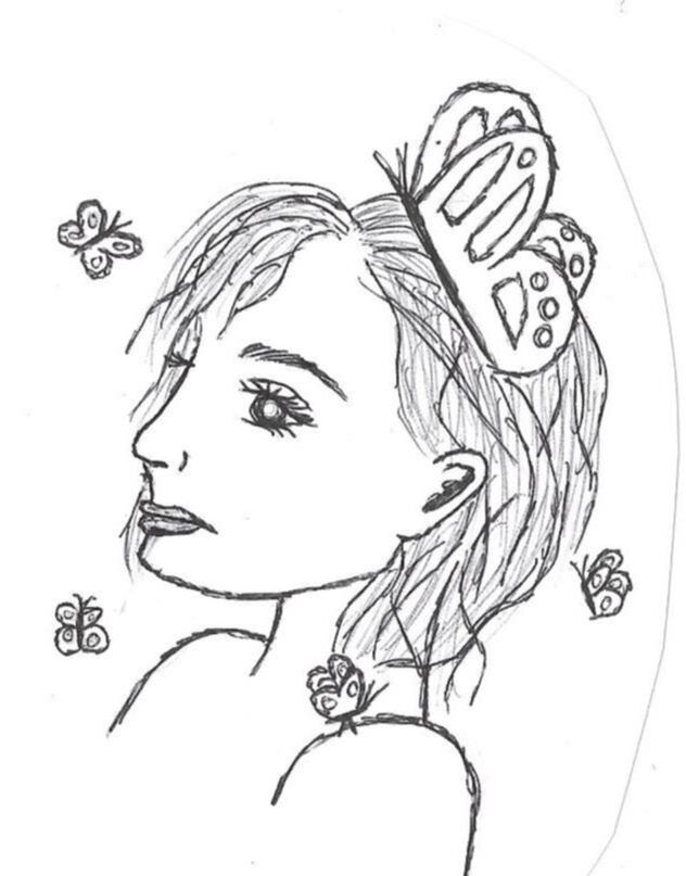
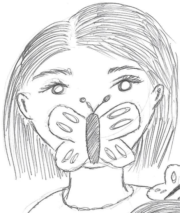
With this first sketch, I tried depicting my mother's side profile in the hopes that it would emphasize wherever the big butterfly would be placed. After some brainstorming, I realized that I wanted the large butterfly to be somewhere on her head to symbolize her mental struggles, with the contrast between its size and the size of the smaller butterflies representing those around her there to represent how she sometimes ignores her problems building up and everyone else can see them...but she doesn't give her attention to it or those around her trying to convince her otherwise. While I did like the placement of her back towards the large "mental" butterfly and the literal ignorance of the help around her, I was worried that the side profile gave off an unattached/uninterested emotion. I wanted to figure out a way for her to be aware of it to demonstrate growth that she has accomplished over time.
|
Sketch #2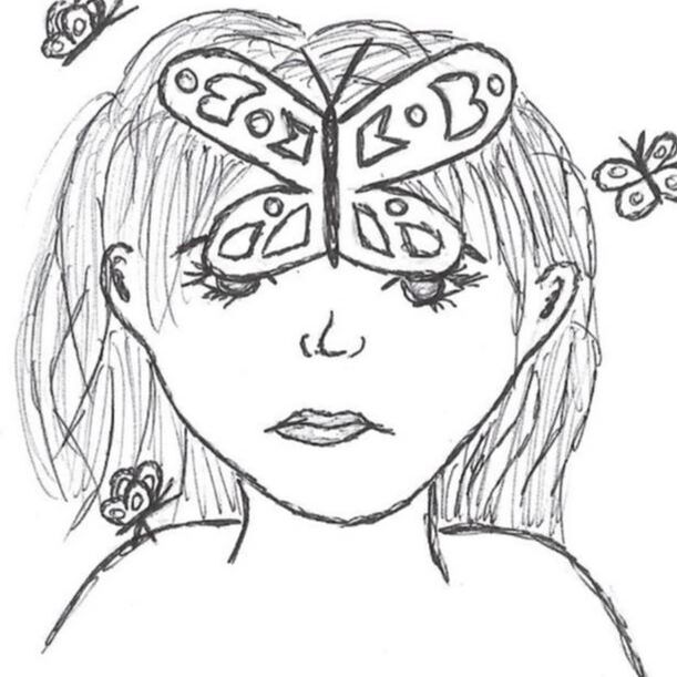
My second sketch still incorporates the large butterfly and smaller surrounding butterflies as I hoped, but this time would call for her to be facing the viewer head-on with the large butterfly partially obscuring her vision. Of all three of my sketches, I think that this one is most similar to both of my inspirations: a static position with a neutral expression, as seen in both pieces, with a large butterfly over the forehead as inspired by Aydoğdu's piece. I then added additional, smaller butterflies hovering around her to incorporate that original symbolism I desired.
While I think this could have been a strong sketch to use for as inspiration for my final piece due to those similarities, I felt that it would be rude to obstruct my mom's face with the butterfly over it and make it unclear that she's the specific subject of the piece. |
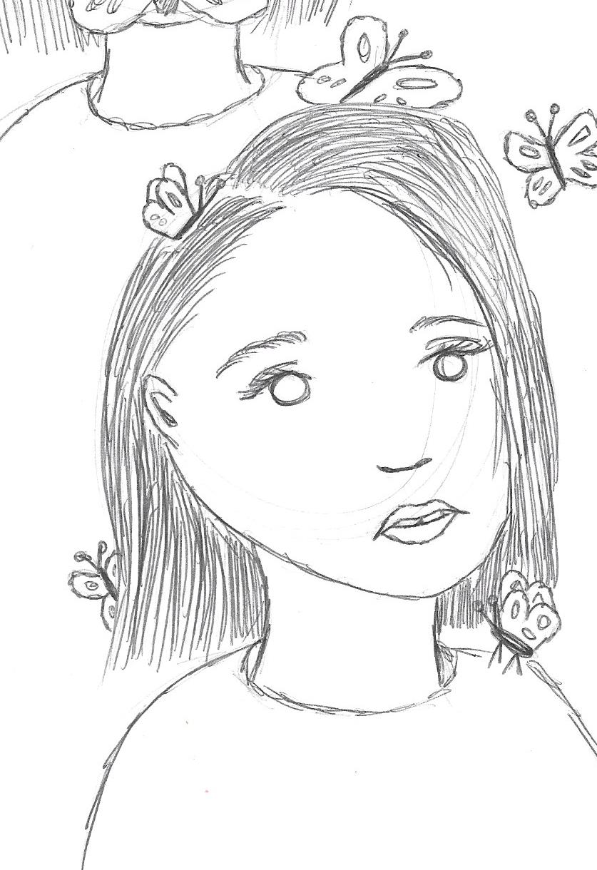
Sketch #3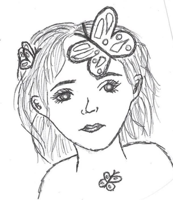
Since I liked my second sketch so much except for the large forehead butterfly's, I decided to revise it in my third sketch. In this, she's still situated in a static, front-facing position with a neutral expression and small butterflies hovering around her, but her features are fully visible while still having the symbolic placement of the large "struggle" butterfly on her forehead. Seeing as this contained the inspirational and personal components that I desired in my piece, I used this sketch as reference for my final piece.
|
|
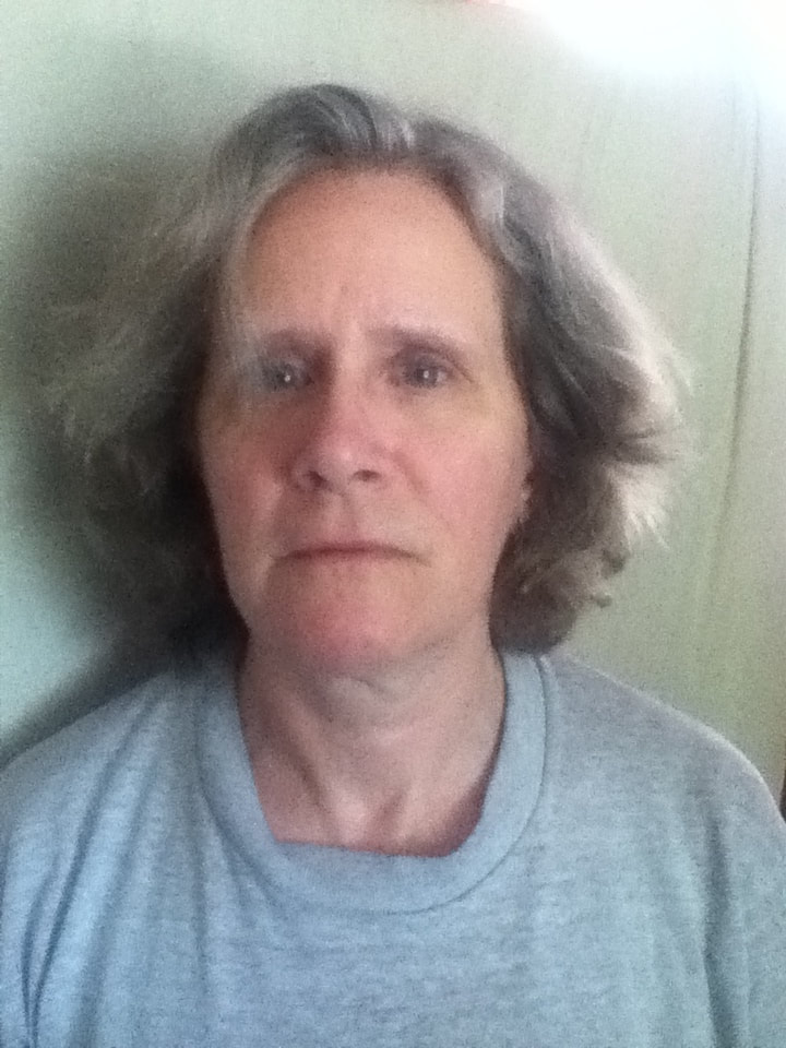
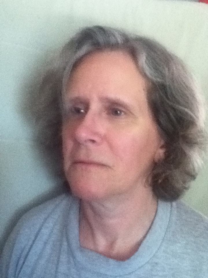
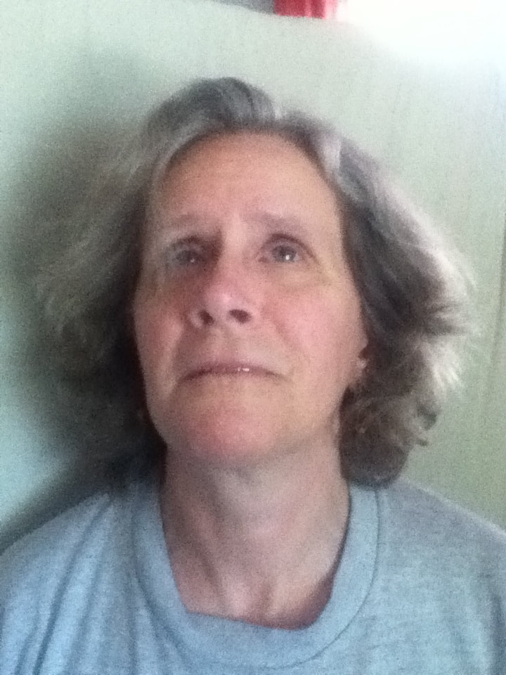
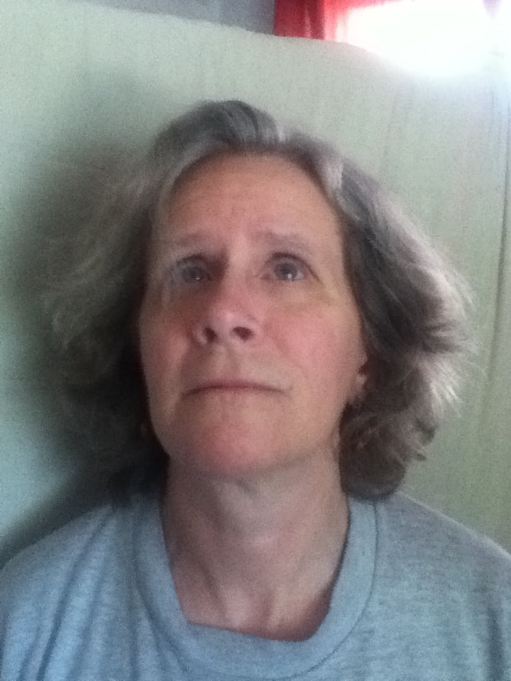
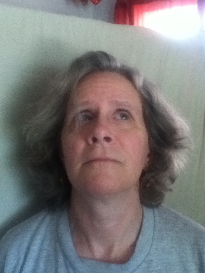
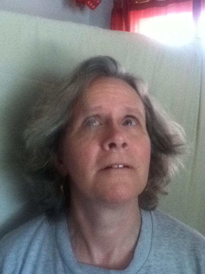
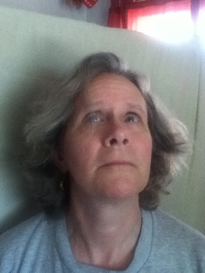
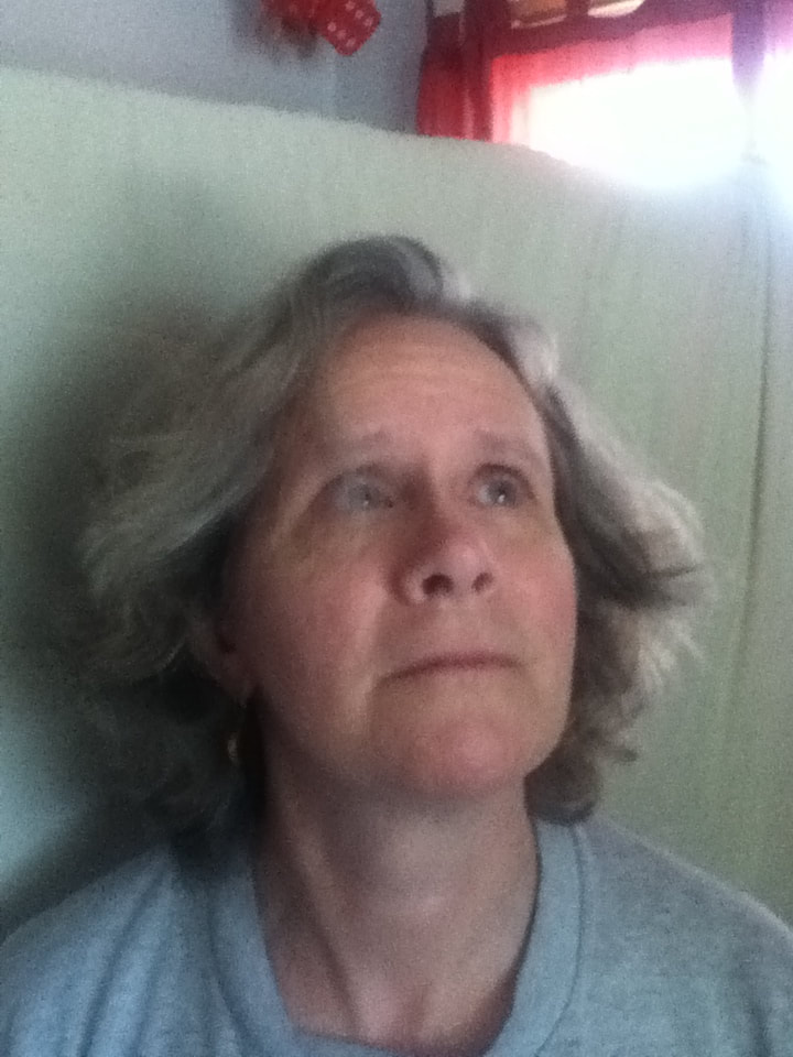
Because both of my inspirations are stylized in a realistic way that I'm unable to free-hand on my own, I needed a reference picture for both sketching the image onto my canvas via the grid method and to use for skin/hair color variation when it came time to attempt blending. For all of my attempts at a reference photo, I positioned my mother in front of a window with natural lighting with a partial-blanket backdrop - this would imitate the solid background I planned to place her in front of. While the natural lighting brightened her face while also creating shadow, though, the pictures didn't turn out in the best quality due to the cloudy day.
I knew that I wanted my mom's facial expression to be mostly-neutral, like the subjects in Picasso's and Aydoğdu's pieces, so I had her alternate between a completely straight face and a neutral expression bordering on a small smile. Because I knew that I wanted butterflies to be flying around her head, I also suggested that she look in different directions for some shots as though she's aware of the butterflies around her head. In the end, I ended up picking this shot for my reference picture because her expression suited the neutral requirements provided by my inspiration while also having a hint of a smile that avoids her looking dead/robotic. I also hoped that having her positioned in an obvious static manner but still aware of her surroundings with her tilted expression would create additional symbolism when combined with the butterflies: showcasing that there is always love and support surrounding my mother that she is aware of, yet not always quick enough to take/accept. |
|
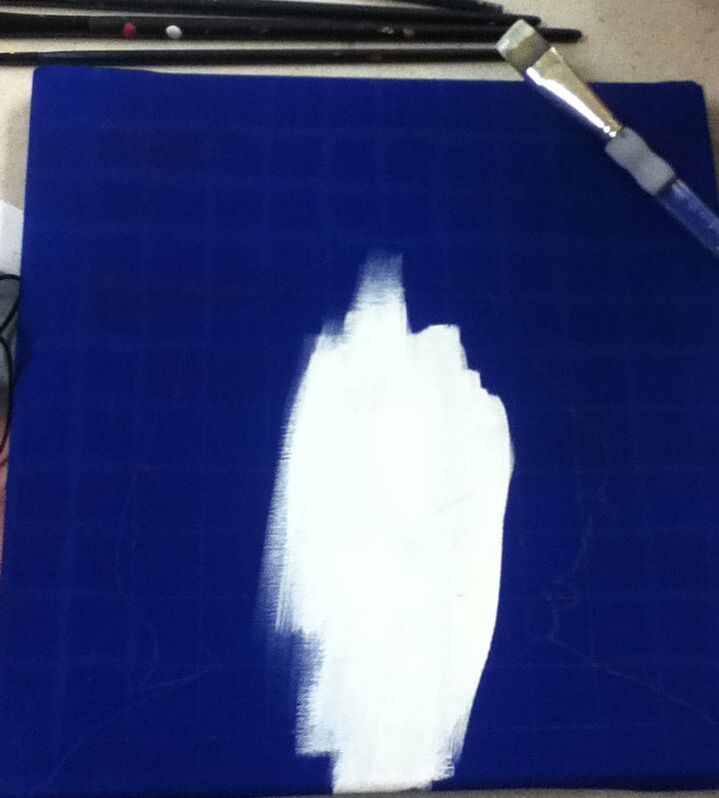
1) Starting with a 1-inch brush, I coated a 1-foot-squared canvas in 2 coats of gesso, followed by 2 coats of Blue once it dried. While this blue color is pretty dark and gesso wasn't entirely necessary, I wanted it to be applied to as light of a background as possible to distinguish it as blue - not only would it tie in with the blue hues of my inspirations, but it would also appear unified with the other Familial Hues blue panel. |
|
|
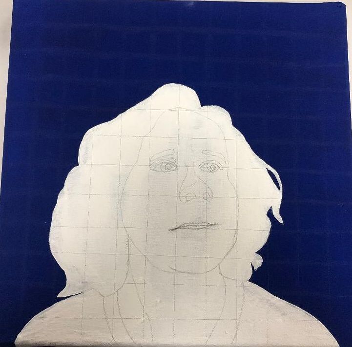
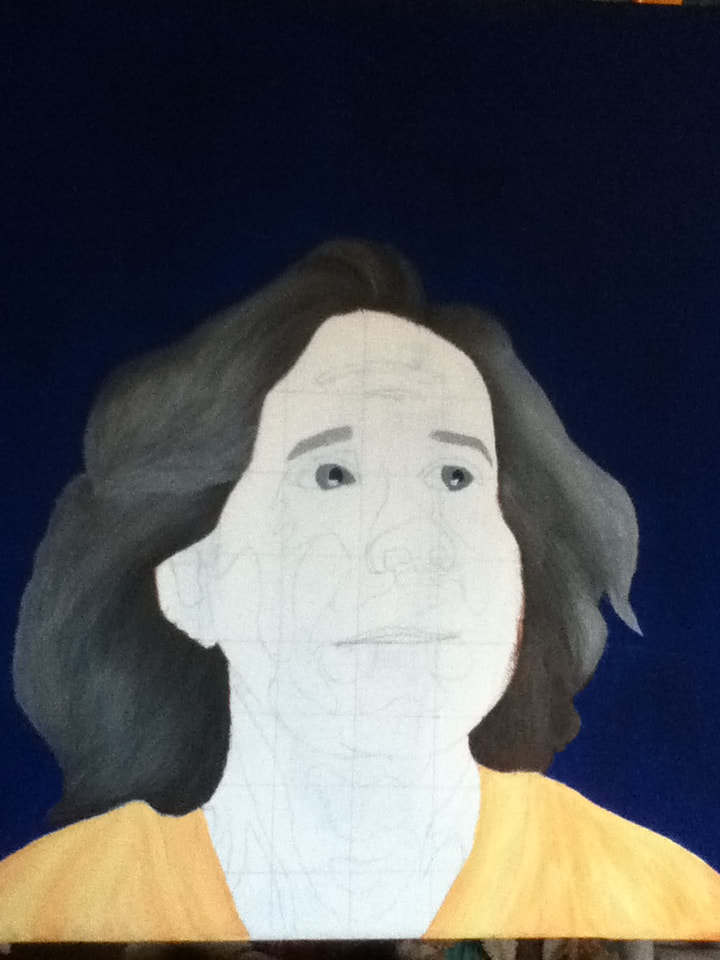
2) Using a T-square, I was able to sketch a square grid with squares 1" in height and length, so that a grid of 12 squares x 12 squares was created. Over this grid, I lightly sketched the silhouette of my mother before filling it in with White acrylic paint - this would make it easier to see details of my mother's face when it came time and lay lighter colors over it. I then re-sketched the grid over this and drew her facial features in accordance with the reference picture. |
|
|
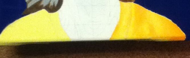
3) With a 3/4" brush, I applied one coat of Light Yellow to serve as the base color for her shirt - I knew that I wanted the shirt to be a warm color to provide the prominent contrast of Picasso's piece, and because the Blue I used is incredibly dark, I wanted to provide further emphasis by having the warm color be much lighter.
Once the Light Yellow dried, I went in with a Flat 4 brush and applied pure Orange in the areas of the shirt that are shadowed. While still wet, I alternated between Light Yellow and Orange to try and blend the colors together to give an overall soft, wrinkled appearance. This was hard for me because I've never really painted fabric - and the end result is slightly abstract - but overall I think it gives the subject more depth compared to the opaque Yellow shade. |
|
|
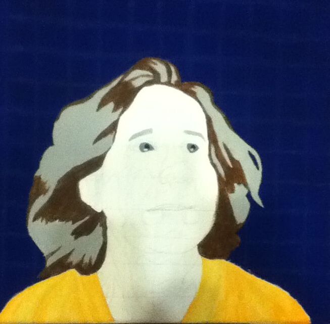
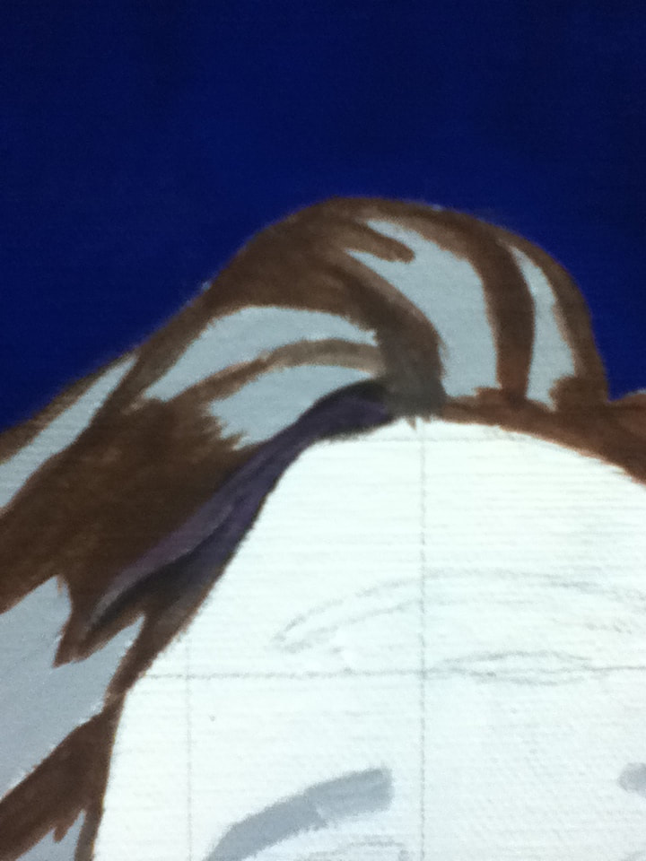
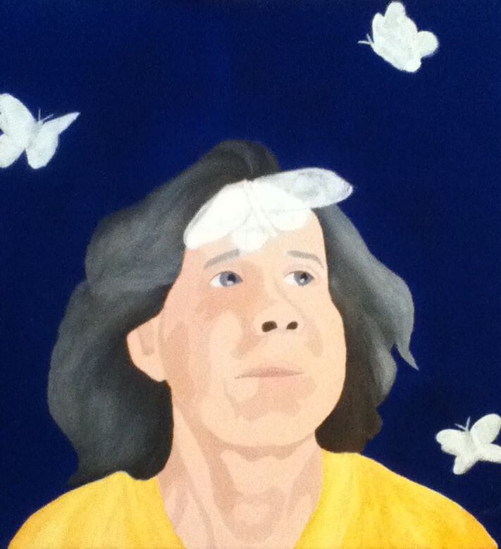
4) Going in with a Flat 2 brush, I began applying a wash for my mom's hair to provide me with a rough estimation of where the areas with the most grey/brown should be. For the brown sections, I started by applying a mixture of 1 part Espresso, 1 part Light Yellow, and 1 part Black, then went over that with a layer of pure Espresso because the previous mixture dried a much darker color than I intended. I initially was going to apply just pure Espresso as the base color for the brown portions, but that specific paint is incredibly thin on its own and wouldn't produce as solid of a result as I would've hoped. For the grey sections, I mixed one part Black with two parts White. It was at this point that I also decided to fill the eyebrow section with grey so as to not lose them when it came time to fill in the skin tone. I mixed Navy Blue with the remaining grey mixture to create the eye color, which I applied with a Round 0 brush. The same brush, with pure Black, filled in the pupils. |
|
|
5) With that Flat 2 brush, making sure to keep a cup of water handy, I began to alternate between various colors using light brushstrokes to mimic hairs.
Colors:
|
|
|
6) Once the hair was complete, I began to apply various shades of skin tone with that Flat 2 brush in solid sections I sketched out based on my reference image. After this wash dried, I went back in and applied a second coat of each color over their corresponding sections, blending the border between each section with a slightly damp brush.
Colors used:
|
|
|
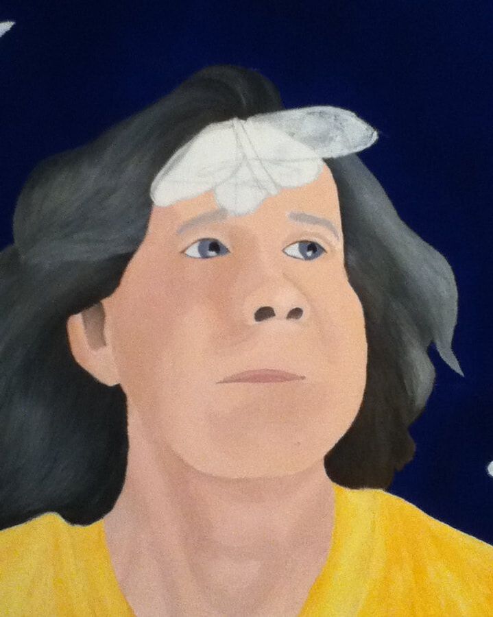
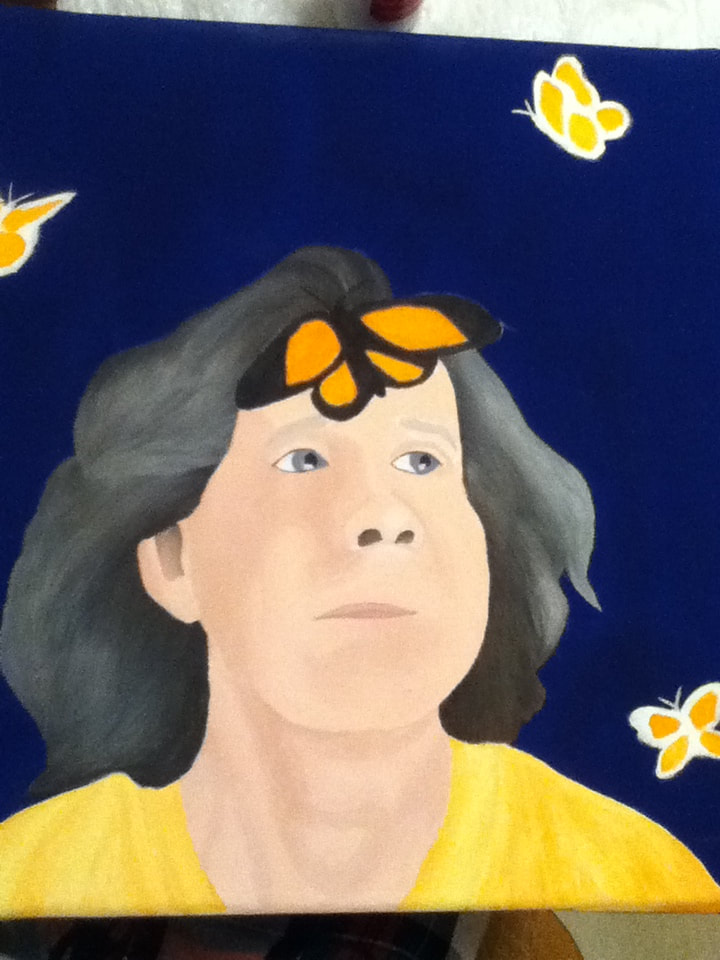
7) To finish the piece, I lightly sketched the areas where I planned on placing butterflies, then filled in those areas with pure White on a Round 0 brush. With such a dark background, the white foundation would allow the brighter hues I planned on using for the butterfly to appear brighter. To create further contrast against the blue background, I modeled my butterflies after monarchs for their orange tones.
With a Flat 4 brush, I lightly patted down Orange, Dark Gold, and Yellow paint to estimate where the colored portions of the wings would go. I then filled in the perimeter of the butterflies with pure Black on the same brush, before using a Flat 2 brush to try and mimic the black linear design over the colored sections, then placing dots of White on the tips of the butterflies' wings. |
|
"Blue", Elizabeth Verkuilen, 2019.
"Classic", Elizabeth Verkuilen, 2019.
|
While I'm not disappointed with how this piece turned out, I definitely think that I held myself back by trying to incorporate distinct similarities between my mother's portrait and my self-portrait in the Hues series. If I had set aside more time for planning, I think I could've explored Aydoğdu's work further to find an illustration that I had not already used for artistic inspiration; further exploration may have also led to a more original theme instead of piggybacking on one I already did. I think this laziness is also reflected in the overall composition of the piece, as Classic's butterflies seem sporadically-placed compared to the deliberate placement evident in Blue. However, as Blue was not a deliberate inspiration and all comparison between the two ended up being accidental, I must try to reflect on Classic as its own piece as well. I don't think that the image itself turned out horrid, but a big thing that bothers me about the final piece is that the different textures aren't unified throughout the piece. As I have limited painting experience, the techniques that I used to create the different textures were random and don't really match one another (hence why each half of her hair has different texture, why each half of her shirt has different texture, etc). I am happy with the level of contrast in this piece and find it interesting that I gravitated towards an inverted scheme to my Picasso inspiration. Though I did mention how the butterflies were placed randomly and that I'm worried it's obvious, I do like how this random placement led to various degrees of movement and how her upward-tilted eyes create further movement. |
"Classic" vs. "Woman With Blue Hat Flowers"Similarities:
|
"Classic" vs. Untitled PieceSimilarities:
|

"Woman With Blue Hat Flowers". Pablo Picasso, 1921.
|
"Classic", Elizabeth Verkuilen, 2019.
|
Untitled Piece, Aykut Aydoğdu, 2019.
|