Positive Illustration

|
Title: "Better Than Fine" Size: 27.6 cm x 35.2 cm Medium: Colored Pencil on Illustration Board Completion: March 2019 |
|
|
Title: "Better Than Fine" Size: 27.6 cm x 35.2 cm Medium: Colored Pencil on Illustration Board Completion: March 2019 |
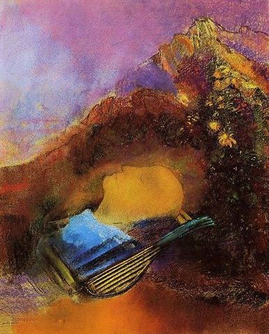
"Orpheus", Odilon Redon, 1910.

Cover of "Shawn Mendes", 2018.
|
As per usual for any project I tackle, one of the first artists I looked to for inspiration was Odilon Redon, who is one of my favorite artists due to his child-like, dreamy paintings and exuberant use of color. It was while I was flipping through my sophomore art history sketchbook that I found his image “Orpheus”, which is a pastel drawing inspired by the mythological musician who traveled to the Underworld to rescue his true love from residing with the dead whilst still living. In said image, Orpheus’ head appears to be floating in a golden sea with his lyre, his expression tranquil as he is about to be engulfed by an incoming wave. Redon is well-known for being involved with the Symbolist movement, and it was with this prior knowledge in mind that I was inspired to do a piece related to mental health. To me, the specific placement of the head among the waves reminded me of a sort of mental state - Orpheus remains at peace even though he is about to be drowned in the wave. This idea of mental health was also a strong basis for this project because we needed to create two pieces - one positive, one negative - and I believed that mental health was a wonderful subject to convey the pros and cons of through art. However, with Redon, the only idea that I had involved using a head...I didn’t yet have any idea as how to make it positive/negative.
While experimenting with inspirations for this project to build onto this theme, I stumbled upon the cover of Shawn Mendes’ self-titled album - I’m not very familiar with his music, but the idea of flowers blooming from within inspired me to use flowers to represent the positive side of mental health because flowers are known for being resilient and blooming during/after the harshest conditions. However, when researching this album cover and the basis behind it, I stumbled upon the works of Marcelo Monreal...who used the same concept on Mendes’ cover for his Faces [UN]bonded series 4 years prior. Because I didn’t want to use a rip-off of someone else’s work as inspiration, I began to channel my focus on Monreal, who I learned is a Brazilian artist that specializes in digital collages such as these in order to reveal the beautiful selves he believes many of us hide behind our faces and actions. This idea of his went along perfectly with my ideas from Redon’s piece - by separating the head to display flowers within, I could create a piece that demonstrates someone *literally* blooming and showing their beautiful thoughts to strengthen the importance of keeping one’s mental state in a healthy place. |


|
This sketch was completed before I "officially" had an inspiration and was supposed to represent the positive side of LGBT equality and acceptance. I used a poster advocating for the LGBT community for reference to depict a lesbian couple standing (well, sitting...) strong together against all the hate that is still directed towards same-sex couples to this day. I did like this sketch as a first idea, but I wasn't really inspired to turn it into a more realistic illustration because I struggled with what type of negative image would pair best with this.
|

Poster advocating for the LGBT community
|

|
This sketch took inspiration from the broken face/head idea going on in Monreal's works, but instead of having a part of the head or body being pulled away as a separate piece, I thought it would be interesting to re-position the top of the head like a jar of sorts and display flowers inside to represent positive mental health and how, when properly taken care of, one's mental health can flourish, grow, and overall benefit you...like flowers (although maybe minus the part about being beneficial on your behalf). In the end, I decided to use this because of my play on Monreal's style and how the main focus was on the head like in Redon's piece - however, I planned to show a closer perspective of the head in the final illustration because I was worried it didn't look "close" enough to my Redon inspiration.
|

For reference, I took this picture of my cookie jar with the lid similar to how I wanted the head to look - as I sketched, I referenced this to try and achieve that jar look. When using the jar as reference, I was inspired to draw the figure with their hair in a bun to mimic the top of my cookie jar and give the head a handle which could be pulled in order to open the head like that.
|

|
Unlike the other two sketches, this third one was free-handed and didn't have any specific reference/meaning behind it...only that it involved separating the head like in Monreal's works. While I liked the appearance of the gears in the head, I wasn't sure what I could have it represent and/or how I could connect it to a positive thought/idea, not to mention that I felt it seemed to have a connection to technology. I tried to explore a theme related to technology in my mixed media piece first semester, and it was something that I was so unfamiliar and uncomfortable with that I was iffy throughout the creative process - I didn't want that to happen again! However, the one good thing that did come from this sketch was that it made me realize my appreciation for the open-head-is-a-lid idea because it looked more "real" with bits of 3D elements compared to the flat subtraction in this sketch. |

I planned to turn this cover negative by having the mother push away a child for being LGBT...but I didn't think that there was enough detail in this to make it obvious that that's what was happening...while I could have added detailing of my own, I was already struggling with the idea of realism, and the combined challenge of the 2 greatly unmotivated me...I didn't think I could make a satisfactory piece when I wasn't inspired or motivated.
|
When introduced to the illustration project, the only well-known illustrator that I was familiar with was Norman Rockwell because of his covers for the Saturday Evening Post. I proceeded to look for any covers that I thought I could tweak and ended up finding these two...at first glance, I an idea to tweak them to create a positive and negative piece related to the LGBT community (which I am a part of). However, Rockwell's style is incredibly realistic, while my go-to style is more cartoon-y; I knew that emulating his work would require emulating that realism as well, and I wasn't comfortable challenging myself to complete 2 realistic pieces in about a month while keeping up with other schoolwork.
|

I planned to turn this cover positive by having four people placed like these, each representing a certain sexuality (straight, gay, bisexual, asexual). This idea really excited me, but because I was struggling with the negative counterpart, I scrapped it.
HOWEVER, I am considering this inspiration/idea for a choice piece in the future...
|

"Three Cheers for Sweet Revenge", My Chemical Romance, 2004.
|

"From Under the Cork Tree", Fall Out Boy, 2005.
|

"Cataclysm", Monstercat, 2016.
|

"Finale", Monstercat, 2017.
|
|
|
In order to best imitate Orpheus, while also having a good angle for me to create the look of the head opening, I had to have a reference picture of the side of my head. Not only that, but I thought that pulling my hair up would make the open-head-drawing process and final image look neater compared to having my hair down. I stood in front of my bedroom window to get some natural light, but it was tricky because I was taking the picture myself - this resulted in some trial and error due to me having to look away from the camera, while also holding it far enough away so that you could easily see the top of the head. I also wasn't sure which facial expression I should have and experimented with a neutral expression and a small smile.
|
|
In the end, I decided to use this photo for reference. The perspective is far away enough so that the top of my head is visible, and neutral expression seemed more fitting for an open head than a happy face (not to mention less creepy, in my opinion). |

|

|
1) I started by sketching a grid of 16 squares x 21 squares on my illustration board. On my printed reference picture, I made a grid with the same dimensions - on that image, each square ended up being 1 in. x 1 in. on my printout. I also sketched out a rough approximation of which part of my head would become the "lid" portion; I decided to take advantage of the squares to rotate the top portion of my head to create the opening I desired.
|

|

|
2) I was originally going to use a reference picture for the flowers in the head, but after absentmindedly free-handing some flowers on my board to figure out a good arrangement, I really liked what I drew and decided to keep them. Beginning with the flowers with the smallest petals, I lightly shaded the center and darkened the edges by adding more pressure as I went outward - this helping the petals appear less flat and more 3-dimensional. I then repeated this technique of coloring lightly and then increasing pressure outwards to define the rest of the plants. |

For the purple plants, I used the color Violet darkly around the edges and lightly in the center - however, to give it more definition, I went over the center in the color Lavender, which then gave the middle portions more of a pink-y tint.
|

For the orange flowers in the center, I colored the center with the color Orange, then darkened the edges with Carmine before covering the entire petal in a light amount of Vermilion to blend the lighter Orange with the reddish Carmine. The leaf in the center, however, proved to be difficult, as I wanted it to have a "signature" line going down the center of it...but that would mean that I would have to use a different coloring technique than the one I used for the flora. I ended up darkening the edges and center line with Dark Green, then alternating between layers of Yellow and Grass Green to lighten the rest of the leaf.
|

For the small blue flowers, I increased pressure of Light Blue from the inside out, then further darkened the edges with Dark Blue. In my opinion, this was the section I was most unsuccessful with when shading because, no matter my effort, there's still quite a divide between the darker and lighter blue. If I were to re-do this, I would just use the Dark Blue all over the plant because it's more visible than the Light Blue and would blend better because it's alone.
|

|
3) I was initially daunted at the idea of blending a realistic skin tone, so once the flowers were completed I began to shade in the hair. Because I was going off of a reference picture of myself, I decided to use the color Brown to shade almost all of the visible hair, including the little baby hairs on the back of my neck. To try and give the hair some highlights, I began to sporadically place highlights of what I thought was a tan colored pencil...but it turned out to be the color Indian Red which, for some reason that annoys me whilst writing this, looked like a tan colored pencil but apparently I'm colored blind or something I'm fine. Naturally, to hide my mistake, I added more of this reddish color to the hair, then attempted to blend the two by overlapping Brown directly over Indian Red.
However, one good thing about the Indian Red was that, when lightly applied to the illustration board, looked pretty close to the pink undertones of my skin in the reference picture. I decided to use this to my advantage and shade certain parts of the ear with that color. With a large amount of pressure, I began applying the color Peach to areas of my face that seemed darkest in the image, then softened the edges with various layers of the same color. |

|
4) I wasn't entirely sure what type of background to create for this piece at the start, but decided to go with a solid background, similar to the one in Monreal's untitled piece. I wasn't confident enough with the pencils to create a background such as the one in Orpheus and also thought that a solid background was the safer choice. However, I had to choose a color different from Monreal's piece because it was close to the skin tone I used in the piece and I was worried the person would then blend into the background. Because the green leaf in the head seemed to be at the very center of the piece, I decided to shade the background mainly with Dark Green, but then lightening the inner portions of it with Grass Green and then Yellow - this helped the piece appear more unified with the outer and center being the same color(s), along with giving the piece a more positive connotation because green represents positivity. |

|
5) Because there was so much space to fill with layering just those three colors and I didn't want to just have un-uniformed scribbles fill the background, I ended up using a large, swoopy motion with the pencils - not only did this help cover the board quicker, but it also gives the piece movement as it directs your eyes to the foreground.
Because the flowers were already pretty detailed, I solidly colored the centers of the orange flowers with Marigold without any excess pressure/shading. I also darkened the leaf with Light Blue around the edges and in the center line to give it more definition, especially because against the green background prior to the shading, it looked kind of like there was a hole in the plants that showed the background. Then, with the color Red, I shaded in the lips darkly on the edges and lightening pressure as I reached the center. I wasn't sure what color to use for the eyes, but since I was basing it off of a picture of myself, I used Dark Blue for the iris (my eyes are sort of a blue-grey mashup) and Black for the pupils. I also used Black to draw stripes onto the shirt - though it's a small amount, I thought that including black and white in the shirt was beneficial to the piece because the more-neutral shades helped balance out the rainbow colors in the head. |
"Orpheus" vs "Better Than Fine"Similarities:
|
"Untitled Piece from Faces [UN] Bonded Project" vs. "Better Than Fine"Similarities:
|

"Orpheus", Odilon Redon, 1910.
|

"Better Than Fine", Elizabeth Verkuilen, 2019.
|

"Untitled Piece from Faces [UN] Bonded Project", Marcelo Monreal, 2014.
|


